CP

Pastel Grey Color Palette — Morning Fog

A soft four-color scheme built around a gentle pastel grey, layered with cool dove and warm linen for a low-contrast, airy feel — every color matched to real paint you can buy.

By Jessica Williams · Color Stylist & Interior Editor

Morning Fog
Dominant
Kompozit Old Grey Mare · 0545
#DAD7D3
LRV 68
Dove Mist
Secondary
Kompozit Sacred Spring · 0510
#C7CBCE
LRV 59
Soft Linen
Base
Kompozit Luna Moon · 0017
#ECEAE1
LRV 82
Pale Sage Grey
Support
Kompozit Marble Green · 0454
#CBD4C8
LRV 64
Smoke Slate
Accent
Kompozit Sparrow · 0554
#999494
LRV 30
View palette in

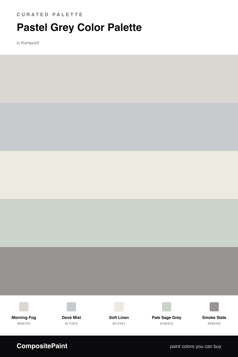
Pastel grey is having a quiet moment, and this scheme leans all the way into it. Morning Fog is the dominant grey, so pale it almost reads as light itself, while Dove Mist sits just beside it with a cooler, slightly bluer breath for gentle depth.

Soft Linen warms the whole thing from underneath, keeping the greys from turning clinical, and Pale Sage Grey adds the faintest green whisper that feels very 2026 — barely there, but it stops the palette from going flat. Together they hold a soft, low-contrast hush.

When you want a little weight, reach for Smoke Slate and use it sparingly. One darker note is all this airy scheme needs to feel finished rather than washed out.

Buy These Colors

Each color matched to the closest real paint in every brand, by ΔE2000. Kompozit first; take any SKU to the store — these mix on demand.

Morning Fog
#D6D8D6 · LRV 68 · Dominant
Kompozit Old Grey Mare · 0545 ΔE 2.49
Backdrop Real Real · BD-RR ΔE 7.36
Behr Gray Shimmer · MQ3-25 ΔE 1.69
Benjamin Moore Graytint · 1611 ΔE 0.87
Clare Seize The Gray · PNT100-LT-07 ΔE 1.52
Dunn-Edwards Cloud · DEC791 ΔE 1.61
Farrow & Ball Dimpse · No. 277 ΔE 1.87
Magnolia Home Yarn · JG-132 ΔE 2.8
PPG / Glidden Fog · 1010-2 ΔE 1.52
Sherwin-Williams Olympus White · SW 6253 ΔE 0.99
Valspar Aerodynamic · 8006-10A ΔE 0.63
Dove Mist
#C4C9CC · LRV 58 · Secondary
Kompozit Sacred Spring · 0510 ΔE 0.73
Backdrop Real Real · BD-RR ΔE 10.04
Behr Burnished Metal · UL260-17 ΔE 2.15
Benjamin Moore Metallic Silver · 2132-60 ΔE 0.58
Clare Grayish · PNT100-LT-10 ΔE 4.98
Dunn-Edwards Bay of Hope · DE6331 ΔE 2.46
Farrow & Ball Calluna · No. 270 ΔE 5.26
Magnolia Home Cement Pots · JG-93 ΔE 2.67
PPG / Glidden Solitary State · 1009-3 ΔE 3.21
Sherwin-Williams Gray Screen · SW 7071 ΔE 1.58
Valspar Milky Way · 8004-37B ΔE 3.28
Soft Linen
#EDEAE3 · LRV 82 · Base
Kompozit Luna Moon · 0017 ΔE 1.18
Backdrop Jane · BD-JA ΔE 1.69
Behr Silky White · PPU7-12 ΔE 0.51
Benjamin Moore Dune White · 968 ΔE 1.6
Clare Classic · PNT100-LT-12 ΔE 2.53
Dunn-Edwards Frostbite · DE6274 ΔE 0.99
Farrow & Ball Wevet · No. 273 ΔE 3.05
Magnolia Home Panna Cotta · JG-111 ΔE 1.06
PPG / Glidden Linen Ruffle · 1075-1 ΔE 0.62
Sherwin-Williams Snowbound · SW 7004 ΔE 0.98
Valspar Pearly Gates · V158 ΔE 0.58
Pale Sage Grey
#CDD3C8 · LRV 64 · Support
Kompozit Marble Green · 0454 ΔE 1.38
Backdrop Real Real · BD-RR ΔE 6.13
Behr Silver Marlin · N360-2 ΔE 2.52
Benjamin Moore Night Mist · 1569 ΔE 0.89
Clare Beigeing · PNT100-LT-18 ΔE 6.38
Dunn-Edwards Particular Mint · DE6269 ΔE 1.86
Farrow & Ball Skylight · No. 205 ΔE 4.02
Magnolia Home Stoneware Pieces · JG-55 ΔE 2.7
PPG / Glidden Frivolous Folly · 1128-2 ΔE 1.34
Sherwin-Williams Sea Salt · SW 6204 ΔE 1.47
Valspar Misty Memory · 8004-29B ΔE 2.29
Smoke Slate
#8E9398 · LRV 29 · Accent
Kompozit Sparrow · 0554 ΔE 5.44
Backdrop Polly Wants · BD-PW ΔE 5.72
Behr Gourmet Mushroom · BNC-10 ΔE 0.5
Benjamin Moore Stonehedge · ES-76 ΔE 1.73
Clare Shade · PNT100-MD-14 ΔE 6.1
Dunn-Edwards Formal Gray · DE6382 ΔE 3.39
Farrow & Ball Plummett · No. 272 ΔE 4.55
Magnolia Home Times Past · JG-94 ΔE 3.34
PPG / Glidden Steeple Gray · 1012-5 ΔE 1.78
Sherwin-Williams Moonlit Orchid · SW 9153 ΔE 4.17
Valspar Stormy Skies · 8006-8D ΔE 3.53

Questions

Will this much grey feel cold or flat?

It stays soft because the greys lean warm and pale, and the linen base adds a quiet glow. Pulling in the sage grey keeps the scheme from going icy, so it reads calm and airy rather than chilly.

How do I add depth without losing the soft mood?

Use the smoke slate as your accent only, on a few details like a door frame or a single shelf wall. A little goes a long way here, so a roughly one-fifth share keeps the contrast gentle and the fog feeling intact.

Similar Palettes

Closest schemes by color — not by label.