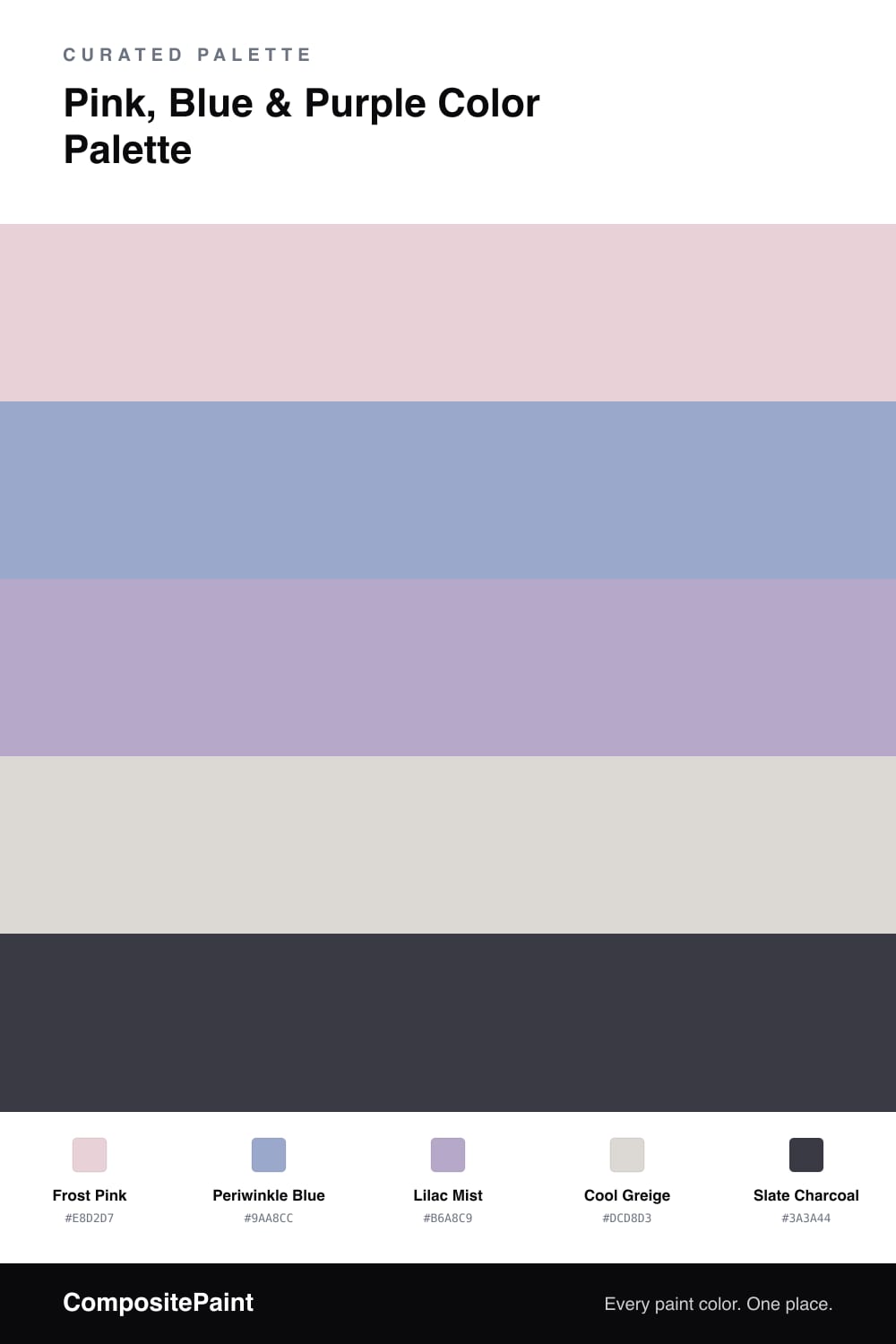
Pink, Blue & Purple Color Palette — Frosted Glass
A cool, contemporary four-color scheme blending soft frost pink, icy periwinkle blue, and muted lilac purple with a clean greige base — every color matched to real paint you can buy.
By David Chen · Formulation Lead & Resident Chemist
Think of this scheme like light passing through frosted glass — everything is softened, cooled, and a little hazy. Frost Pink leads as the dominant tone, but it is a dusty, grey-tinted pink rather than anything sugary, which is what keeps it feeling current for 2026.
Periwinkle Blue is the cool counterweight, and Lilac Mist sits between the two as the natural bridge, since purple is simply pink and blue combined. That middle step is the trick that makes the trio read as one family instead of three separate ideas competing for attention.
To ground all that softness, Cool Greige spreads quietly across the largest surfaces as a neutral base, and a deep Slate Charcoal steps in for contrast on small details like trim, hardware, or a single piece of furniture. Lead with the pink, support with the blue, and let the lilac and charcoal do their work in smaller doses.
Buy These Colors
Each color matched to the closest real paint in every brand, by ΔE2000. Tap a swatch for its full guide or + to save it — take any SKU to the store, they mix on demand.
Questions
Purple is literally pink and blue mixed, so a lilac in the middle acts as a bridge that ties the two ends together. Keeping all three soft and slightly grey-cooled stops them from reading as a nursery and lets them feel grown-up instead.
Let the pink lead on the big surfaces, use the blue on about a third of the room, and treat the lilac as a small accent. The greige and charcoal then keep everything calm and anchored.
Similar Palettes
Closest schemes by color — not by label.