PROFESSIONAL-GRADE PAINT
ONE COAT COVERAGE
MADE FOR REAL RESULTS
CompositePaint

Lavender Living Room Palette — Soft Lavender & Deep Purple

A calm, airy 4-color scheme for a living room: soft lavender walls, clean white trim, a grounding greige, and a deep purple accent for depth. Every color matched to real paint you can buy.

By Jessica Williams · Color Stylist & Interior Editor

Soft Lavender
Walls
Kompozit Lilac Luster · 1280
#D3CDDC
LRV 63
Clean White
Trim & Ceiling
Kompozit Sugar Dust · 0011
#F8F6ED
LRV 92
Warm Greige
Wood & Floors
Kompozit Delicate Honeysweet · 0189
#BCAB99
LRV 42
Deep Purple
Accent
Kompozit Purple Shadow · 1215
#493843
LRV 5
View palette in

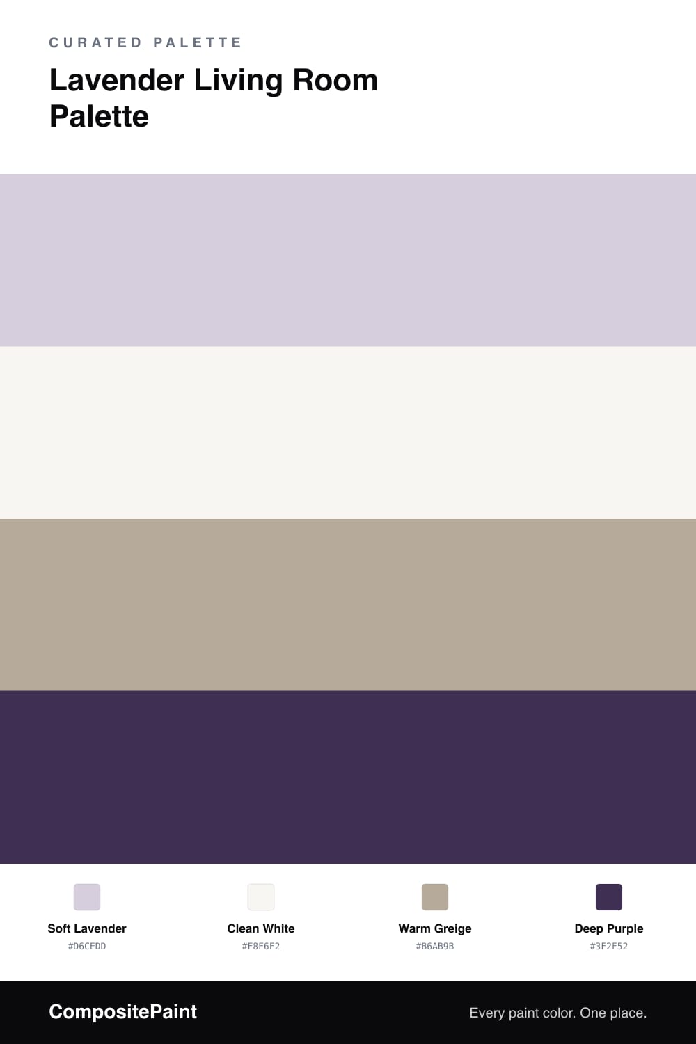
A lavender living room can feel like a deep breath — soft, airy, and quietly calming. This scheme starts with a soft lavender on the walls, a pale purple with just enough gray to stay grown-up and serene instead of sugary.

A clean white on the trim and ceiling keeps everything fresh and lets the lavender feel like light rather than color. Warm greige grounds the room through floors, a rug, or wood furniture, and its warmth balances the cool of the lavender so the space never feels chilly.

Then a deep purple accent adds quiet depth — pillows, a throw, an accent chair, or the back of a bookcase. In small doses it anchors the pale walls and pulls out their purple side. Lavender sets the calm, white keeps it bright, greige warms it, and deep purple gives it a little gravity.

Buy These Colors

Each color matched to the closest real paint in every brand, by ΔE2000. Kompozit first; take any SKU to the store — these mix on demand.

Soft Lavender
#D6CEDD · LRV 64 · Walls
Kompozit Lilac Luster · 1280 ΔE 0.9
Backdrop Real Real · BD-RR ΔE 16.07
Behr Dusty Lilac · N110-1 ΔE 1.54
Benjamin Moore Beach Plum · 2072-60 ΔE 1.98
Clare Wink · PNT100-LT-31 ΔE 7.91
Dunn-Edwards Hailstorm · DE5925 ΔE 3.99
Farrow & Ball Worsted · No. 284 ΔE 8.52
Magnolia Home In Bloom · JG-98 ΔE 5.44
PPG / Glidden Lavender Haze · 1175-3 ΔE 2.41
Sherwin-Williams Potentially Purple · SW 6821 ΔE 2.18
Valspar Purpling Dawn · 1001-6B ΔE 0.72
Clean White
#F8F6F2 · LRV 92 · Trim & Ceiling
Kompozit Sugar Dust · 0011 ΔE 2.38
Backdrop Tabula Rasa · BD-TR ΔE 3.41
Behr Luster White · W-B-600 ΔE 1.22
Benjamin Moore Chantilly Lace · 2121-70 ΔE 2.16
Clare Timeless · PNT100-LT-04 ΔE 2.14
Dunn-Edwards Milk Glass · DEW358 ΔE 1.41
Farrow & Ball All White · No. 2005 ΔE 0.67
Magnolia Home True White · JG-21 ΔE 1.69
PPG / Glidden Delicate White · 1001-1 ΔE 1.78
Sherwin-Williams High Reflective White · SW 7757 ΔE 1.58
Valspar New Ream · V148 ΔE 1.24
Warm Greige
#B6AB9B · LRV 41 · Wood & Floors
Kompozit Delicate Honeysweet · 0189 ΔE 2.68
Backdrop Le Freak · BD-LF ΔE 9.67
Behr Perfect Taupe · PPU18-13 ΔE 2.13
Benjamin Moore Baja Dunes · 997 ΔE 1.02
Clare Money Moves · PNT100-MD-48 ΔE 8.4
Dunn-Edwards Shaggy Barked · DEC771 ΔE 2.36
Farrow & Ball Hardwick White · No. 5 ΔE 2.6
Magnolia Home Drawing Room · JG-157 ΔE 1.97
PPG / Glidden Desert Dune · 1023-4 ΔE 0.52
Sherwin-Williams Gateway Gray · SW 7644 ΔE 2.59
Valspar Ivory Brown · 6006-1C ΔE 1.43
Deep Purple
#3F2F52 · LRV 4 · Accent
Kompozit Purple Shadow · 1215 ΔE 9.85
Backdrop Last Call · BD-LC ΔE 11.61
Behr Baritone · 680F-7 ΔE 1.75
Benjamin Moore Majestic Violet · 2068-10 ΔE 4.19
Clare Blackish · PNT100-DP-54 ΔE 19.86
Dunn-Edwards Magic Night · DEA191 ΔE 6.63
Farrow & Ball Pitch Black · No. 256 ΔE 17.79
Magnolia Home Plum Suede · JG-102 ΔE 9.36
PPG / Glidden Victory Blue · 1165-7 ΔE 9.82
Sherwin-Williams Concord Grape · SW 6559 ΔE 2.68
Valspar Patrician Purple · M224 ΔE 6.43

Questions

will soft lavender feel too cool?

This lavender has a touch of gray that keeps it gentle rather than icy, and the warm greige floors and furniture balance the cool wall. Together they read calm and airy, not cold.

where does the deep purple go in a living room?

Save it for the smallest surfaces — pillows, a throw, an accent chair, or the backs of bookshelves. Used sparingly it gives the soft lavender something to lean on without darkening the whole room.

Similar Palettes

Closest schemes by color — not by label.