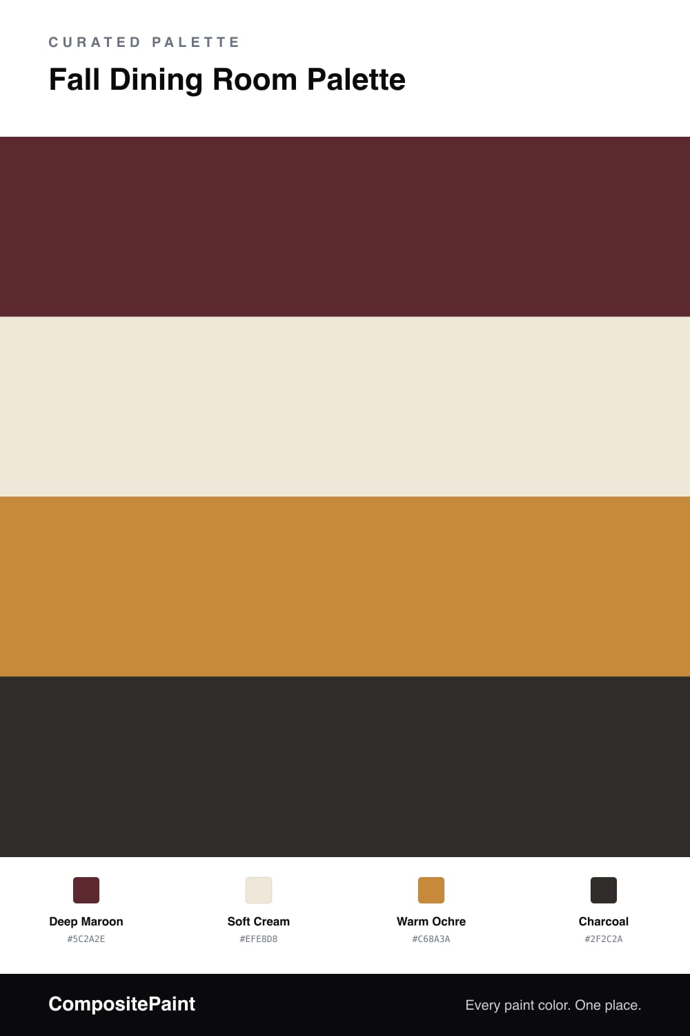
Fall Dining Room Palette — Deep Maroon & Ochre
A moody 4-color fall scheme for dining rooms: deep maroon walls, soft cream trim, a warm ochre accent, and a charcoal anchor for evening dinners. Every color matched to real paint you can buy.
By Jessica Williams · Color Stylist & Interior Editor
A fall dining room is built for evenings — long dinners, candles, the good plates out. This palette leans into that with a deep maroon on the walls, a color that reads almost brown in daylight and glows like wine after dark. It is the kind of room you only fully meet at night.
A soft cream on the trim and ceiling keeps the dark walls from feeling like a cave, and the warm undertone stops the contrast from going cold. A warm ochre accent — a runner, ceramics, the frames around art — lifts the maroon and adds a little golden movement.
A bit of charcoal on chair legs or a light fixture grounds the scheme. Let the maroon carry the room, keep the cream generous on the edges, and use ochre and charcoal in small, deliberate doses.
Buy These Colors
Each color matched to the closest real paint in every brand, by ΔE2000. Tap a swatch for its full guide or + to save it — take any SKU to the store, they mix on demand.
Questions
Dining rooms are one of the few spaces where a deep color works beautifully, because you mostly use them at night under warm light. The maroon turns rich and candlelit after dark, which is exactly when you want the room to shine.
Reach for a soft cream rather than a stark bright white. Against the maroon, a cool white looks blue and clinical. The warm cream keeps the contrast gentle and makes the whole room feel intentional and aged.
Similar Palettes
Closest schemes by color — not by label.