Charcoal Color Palette — Charcoal Ember
A moody five-color scheme led by deep charcoal, warmed by a single ember-orange spark and softened by warm greys — every color matched to real paint you can buy.
By Jessica Williams · Color Stylist & Interior Editor
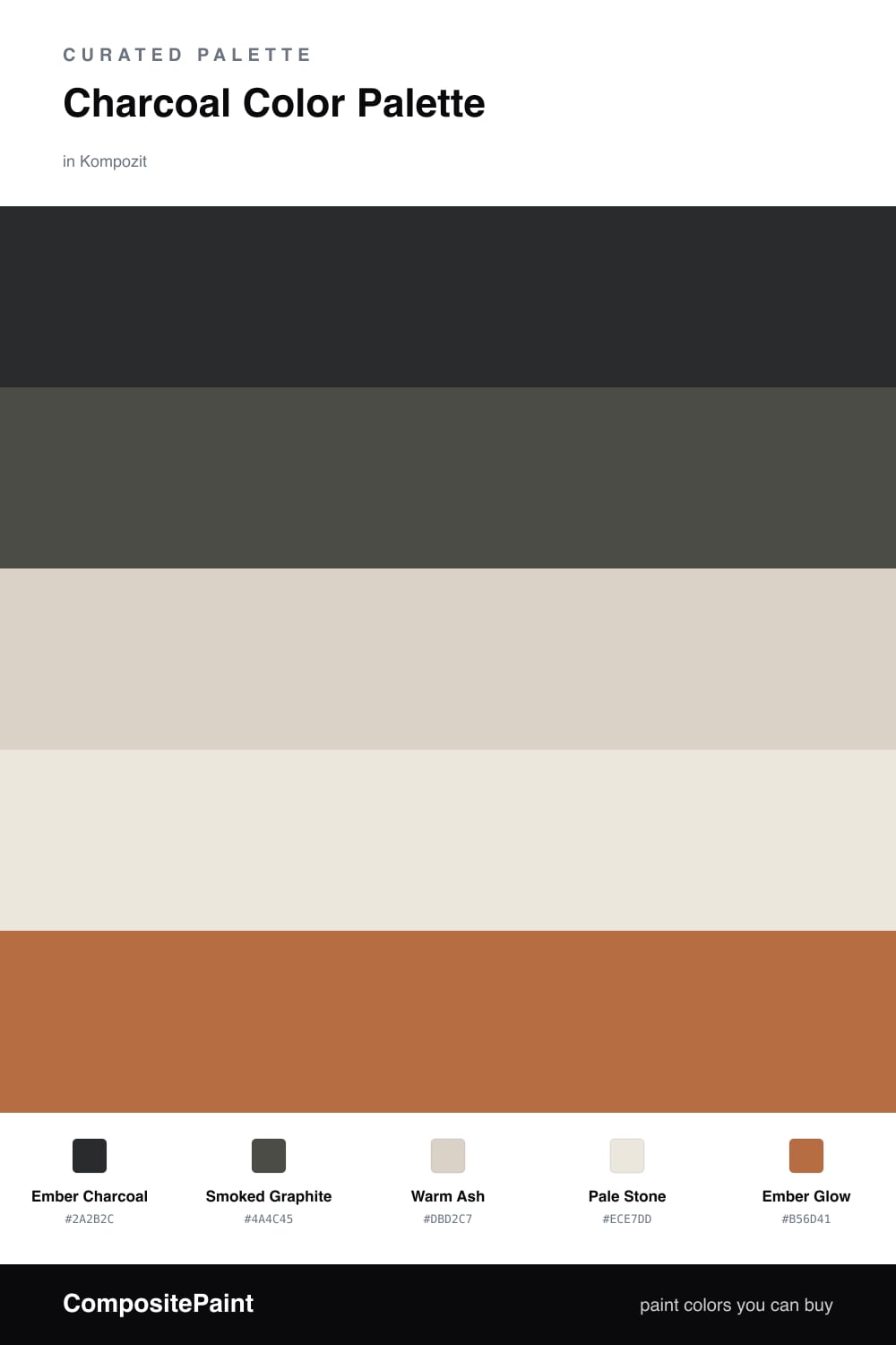
There is a quiet drama in charcoal that I keep coming back to. Ember Charcoal leads this scheme as a deep, slightly warm near-black that feels more like cooled coal than cold stone, with Smoked Graphite stepping in a shade lighter so the dark planes have movement instead of one flat wall.
The warm greys are what keep it from going gloomy. Warm Ash and Pale Stone carry a faint sandy undertone, so they soften the charcoal and bounce a little daylight back into the room rather than swallowing it.
Then comes the spark. Ember Glow is a burnt terracotta that does exactly one job here — it warms the whole palette in the smallest dose. Use it the way you would a low flame, just a touch, and the charcoal around it starts to feel cozy and very much of this moment.
Buy These Colors
Each color matched to the closest real paint in every brand, by ΔE2000. Kompozit first; take any SKU to the store — these mix on demand.
Questions
Charcoal on its own can read cold and flat, almost like wet slate. A single warm spark — here the ember orange — gives the eye somewhere to land and makes the whole room feel lit from within rather than shadowed.
Let charcoal hold the largest planes, roughly two-thirds of what you see, then break it with the warm greys so it never feels heavy. Keep the ember tiny, a cushion or a vase, so it stays a glow and not a shout.
Similar Palettes
Closest schemes by color — not by label.