CP

Burgundy Color Palette — Velvet Bloom

A burgundy-led five-color scheme that pairs deep wine with soft warm neutrals and a dusty rose accent, every color matched to real paint you can buy.

By Maya Patel · Reviews Editor & Product Tester

Velvet Burgundy
Dominant
Kompozit Purple Shadow · 1215
#493843
LRV 5
Aged Bordeaux
Secondary
Kompozit Cordova Burgundy · 0116
#7C3744
LRV 7
Warm Oat
Base
Kompozit White Lightning · 0187
#EEE2D3
LRV 77
Soft Greige
Support
Kompozit Moth Wing · 0183
#CCBCA9
LRV 52
Dusty Rose
Accent
Kompozit Prophetess · 0079
#BE8B8F
LRV 31
View palette in

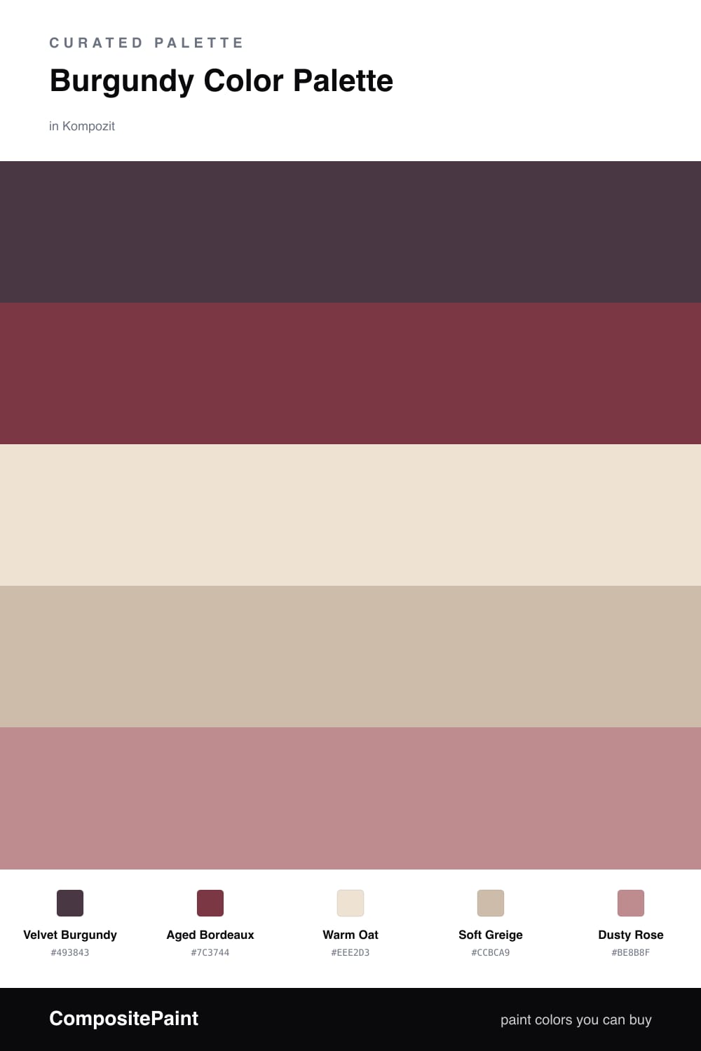
Burgundy is having a real moment in 2026, and this scheme shows why it earns the lead. Velvet Burgundy is the anchor — deep, slightly cool, and confident enough to carry a whole wall. Aged Bordeaux sits just beside it as a softer, dustier wine you can use on trim or millwork to add depth without competing.

The neutrals do the quiet work. Warm Oat keeps ceilings and trim light and modern, while Soft Greige bridges the wine tones and the cream so nothing feels abrupt. This is the combination that stops burgundy from reading old-fashioned.

For the spark, Dusty Rose picks up the pink already living inside the burgundy and brings it forward in small doses. Use it on a single accent — a velvet chair, a throw, a piece of art — and let the burgundy stay dominant. That two-thirds wine, one-third soft balance is what makes the room feel intentional rather than dim.

Buy These Colors

Each color matched to the closest real paint in every brand, by ΔE2000. Kompozit first; take any SKU to the store — these mix on demand.

Velvet Burgundy
#5A1F2B · LRV 3 · Dominant
Kompozit Purple Shadow · 1215 ΔE 13.55
Backdrop Stage Beauty · BD-SB ΔE 10.9
Behr Cimarron · BXC-69 ΔE 2.71
Benjamin Moore Classic Burgundy · HC-182 ΔE 8.36
Clare Blackish · PNT100-DP-54 ΔE 22.67
Dunn-Edwards Mulberry · DEA194 ΔE 12.22
Farrow & Ball Brinjal · No. 222 ΔE 9
Magnolia Home By The Fireplace · JG-29 ΔE 6.19
PPG / Glidden Gooseberry · 1048-7 ΔE 10.48
Sherwin-Williams Rookwood Dark Red · SW 2801 ΔE 7.07
Valspar Royal Garnet · 1011-5 ΔE 3.05
Aged Bordeaux
#7A3540 · LRV 7 · Secondary
Kompozit Cordova Burgundy · 0116 ΔE 1.11
Backdrop Stage Beauty · BD-SB ΔE 7.69
Behr Cranberry · UL100-4 ΔE 1.63
Benjamin Moore Raisin Torte · 2083-10 ΔE 2.09
Clare Vintage · PNT100-DP-67 ΔE 7.85
Dunn-Edwards Garnet Evening · DEA147 ΔE 2.17
Farrow & Ball Preference Red · No. 297 ΔE 5.99
Magnolia Home Create · JG-28 ΔE 3.27
PPG / Glidden Merlot · 13-04 ΔE 3.98
Sherwin-Williams Wild Currant · SW 7583 ΔE 2.47
Valspar Fire Agate · T503 ΔE 1.83
Warm Oat
#EDE3D3 · LRV 78 · Base
Kompozit White Lightning · 0187 ΔE 1.22
Backdrop Don't Eat the Yellow Snow · BD-DS ΔE 3.78
Behr Artist's Canvas · UL150-8 ΔE 0.77
Benjamin Moore Puppy Paws · 1156 ΔE 1.9
Clare Like Buttah · PNT100-LT-62 ΔE 1.01
Dunn-Edwards Siamese Kitten · DE6121 ΔE 1.94
Farrow & Ball Dimity · No. 2008 ΔE 0.48
Magnolia Home Carter Crème · JG-16 ΔE 2.05
PPG / Glidden Glazed Pears · 1095-2 ΔE 0.87
Sherwin-Williams Alluring White · SW 6343 ΔE 2.14
Valspar Honey Moon · 8003-22A ΔE 0.97
Soft Greige
#C9BBA8 · LRV 51 · Support
Kompozit Moth Wing · 0183 ΔE 1.02
Backdrop Boy Meets Girl · BD-BG ΔE 11.2
Behr Celery Powder · PPU8-18 ΔE 3.38
Benjamin Moore Brick House Tan · CW-145 ΔE 1.53
Clare Greige · PNT100-LT-13 ΔE 5.69
Dunn-Edwards Rustic Taupe · DE6129 ΔE 2.52
Farrow & Ball Drop Cloth · No. 283 ΔE 1.6
Magnolia Home Solid Wood · JG-109 ΔE 1.99
PPG / Glidden Stonington · 15-25 ΔE 1
Sherwin-Williams Dhurrie Beige · SW 7524 ΔE 1.22
Valspar Dust Bunny · 2005-10B ΔE 4.31
Dusty Rose
#C98A86 · LRV 32 · Accent
Kompozit Prophetess · 0079 ΔE 4.34
Backdrop Anita · BD-AN ΔE 17.49
Behr Foxen · 200F-4 ΔE 3.67
Benjamin Moore Antique Rose · 2173-40 ΔE 3.38
Clare Pink Sky · PNT100-MD-28 ΔE 0.73
Dunn-Edwards Revival Rose · DEC701 ΔE 5.02
Farrow & Ball Red Earth · No. 64 ΔE 7.71
Magnolia Home Homebody · JG-136 ΔE 15.7
PPG / Glidden Sunstone · 1058-5 ΔE 2.13
Sherwin-Williams Rosedust · SW 25 ΔE 2.13
Valspar Twice Shy · V079-4 ΔE 3.39

Questions

Why does burgundy work so well as the lead color?

Burgundy reads rich and grounded without going fully dark, so it anchors a room the way navy or charcoal would but with more warmth. Surrounding it with oat and greige keeps it from feeling heavy.

How much burgundy is too much?

Let it carry roughly two-thirds of the space — walls or a feature wall — and keep the neutrals as breathing room. Save the dusty rose for small moments like a chair or pillow so the wine stays the star.

Similar Palettes

Closest schemes by color — not by label.