Autumn Color Palette — Sable & Ember
A warm five-color autumn scheme layering burnt orange and maple red over deep sable brown, ochre, and olive — every color matched to real paint you can buy.
By David Chen · Formulation Lead & Resident Chemist
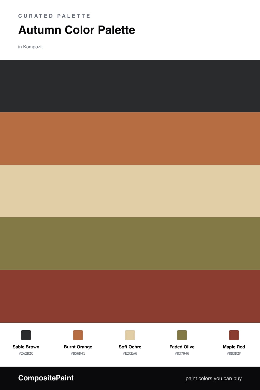
Think of this palette as a walk through dry leaves at the end of October. Sable Brown is the soil underfoot, the deep anchor that lets every warmer shade glow against it. I like it as the dominant tone because dark browns are having a real moment in 2026 interiors, replacing the cooler greiges we leaned on for years.
On top of that base, Burnt Orange and Maple Red do the heavy lifting for warmth. They are close cousins on the color wheel, so they hum together instead of clashing. Soft Ochre is your breathing room — a pale, sandy neutral that keeps the scheme from feeling closed in.
The quiet hero here is Faded Olive. A touch of muted green is what makes the whole thing feel like nature rather than a costume. Use it sparingly on a support piece or trim, and the warm tones around it will read even richer.
Buy These Colors
Each color matched to the closest real paint in every brand, by ΔE2000. Kompozit first; take any SKU to the store — these mix on demand.
Questions
They share the same warm, earthy undertone, so they read like one family pulled from a single fall landscape. The deep sable anchors everything while the orange and red bring heat, and the olive cools things just enough to keep it grounded.
Let the sable brown or the soft ochre carry the most surface, then use burnt orange in medium doses and save the maple red for the smallest hits. A rough 60/30/10 split keeps it cozy instead of heavy.
Similar Palettes
Closest schemes by color — not by label.