CP

Autumn Color Palette — Maple Tide

A warm five-color autumn scheme built on burnt orange and maple red, softened with ochre and grounded in deep brown and olive — every color matched to real paint you can buy.

By Jessica Williams · Color Stylist & Interior Editor

Burnt Orange
Dominant
Kompozit Pretty Parasol · 1039
#AC5D3E
LRV 17
Maple Red
Secondary
Kompozit April Love · 1061
#8B3D2F
LRV 9
Warm Ochre
Base
Kompozit Cat's Eye Marble · 0906
#D6A75D
LRV 43
Soft Olive
Support
Kompozit Tropical Twist · 0403
#837946
LRV 19
Deep Walnut
Accent
Kompozit Silent Sea · 0515
#2A2B2C
LRV 2
View palette in

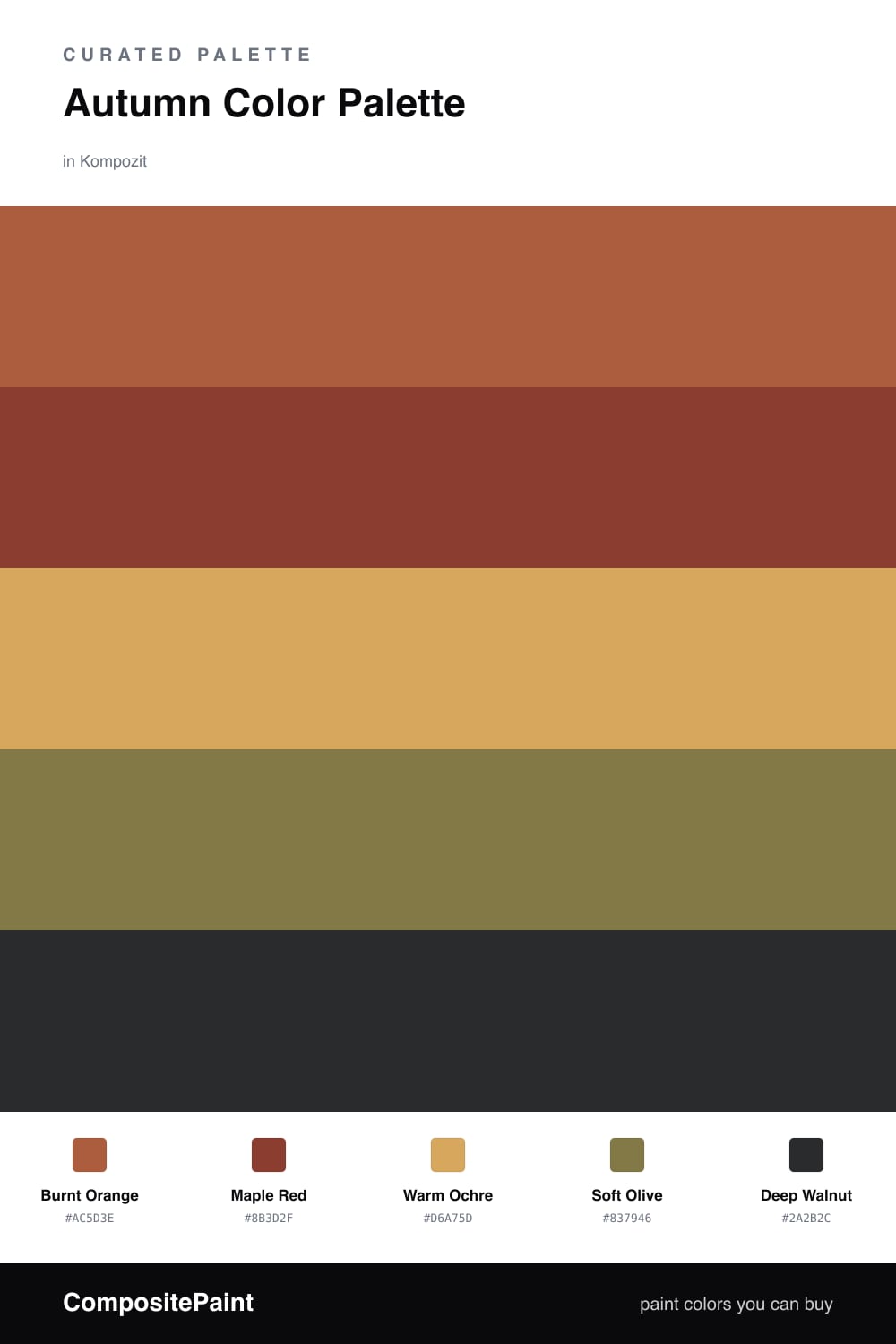
Autumn is less a color than a feeling — that first cool morning when the light turns golden and everything outside seems to glow. This palette chases that warmth. Burnt Orange leads the way, sun-baked and grounded, while Maple Red deepens it with the kind of red you see in a turning tree.

Warm Ochre is your breathing room here, a soft honey neutral that keeps the deeper tones from feeling heavy. I love it on broad walls where the afternoon light can move across it. A muted Soft Olive slips in as a quiet, slightly contemporary counterpoint, the way a green sweater looks right against fallen leaves.

Anchor it all with Deep Walnut on trim, a door, or a single piece of furniture. In a 2026 room I would keep the orange and red as accents and let the ochre and olive do most of the work, so the space feels warm and lived-in rather than loud.

Buy These Colors

Each color matched to the closest real paint in every brand, by ΔE2000. Kompozit first; take any SKU to the store — these mix on demand.

Burnt Orange
#B85C2E · LRV 18 · Dominant
Kompozit Pretty Parasol · 1039 ΔE 4.36
Backdrop Bahaus · BD-BH ΔE 16.5
Behr Jack O Lantern · M220-7 ΔE 2.88
Benjamin Moore Gold Rush · 2166-10 ΔE 3.65
Clare Sriracha · PNT100-DP-29 ΔE 12.03
Dunn-Edwards Georgia Clay · DE5181 ΔE 4.82
Farrow & Ball Blazer · No. 212 ΔE 12.12
Magnolia Home Work Worn Wood · JG-35 ΔE 6.33
PPG / Glidden Tabasco · 1192-7 ΔE 4.7
Sherwin-Williams Husky Orange · SW 6636 ΔE 3.4
Valspar Storybook Sundown · V010-3 ΔE 3.59
Maple Red
#8C3B2A · LRV 9 · Secondary
Kompozit April Love · 1061 ΔE 1.33
Backdrop Stage Beauty · BD-SB ΔE 5.77
Behr Cinnamon Brandy · 230D-7 ΔE 4.24
Benjamin Moore Tea · 2091-10 ΔE 2.64
Clare Vintage · PNT100-DP-67 ΔE 10.62
Dunn-Edwards Deep Crimson · DEA152 ΔE 5.27
Farrow & Ball Eating Room Red · No. 43 ΔE 9.11
Magnolia Home Create · JG-28 ΔE 9.49
PPG / Glidden Brick Dust · 1056-7 ΔE 6.09
Sherwin-Williams Cajun Red · SW 8 ΔE 1.93
Valspar Decadent Red · 2002-5A ΔE 1.87
Warm Ochre
#D9A45B · LRV 42 · Base
Kompozit Cat's Eye Marble · 0906 ΔE 1.88
Backdrop Rosita · BD-RO ΔE 19.4
Behr Cake Spice · M250-4 ΔE 2.18
Benjamin Moore Bryant Gold · HC-7 ΔE 1.61
Clare Good as Gold · PNT100-DP-59 ΔE 5.71
Dunn-Edwards Butterscotch Syrup · DE5298 ΔE 2.56
Farrow & Ball India Yellow · No. 66 ΔE 3
Magnolia Home Bright Days · JG-45 ΔE 7.65
PPG / Glidden Wright Gold · FLLW568 ΔE 3.64
Sherwin-Williams Ceremonial Gold · SW 6382 ΔE 2.06
Valspar Safari Sun · 3004-5B ΔE 1.91
Soft Olive
#7A7A4E · LRV 19 · Support
Kompozit Tropical Twist · 0403 ΔE 4.19
Backdrop Old Soul · BD-OS ΔE 3.75
Behr Lagoon Moss · N330-6 ΔE 2.23
Benjamin Moore Oak Grove · 489 ΔE 3.01
Clare Daily Greens · PNT100-DP-61 ΔE 7.69
Dunn-Edwards Bonsai · DE5538 ΔE 1.87
Farrow & Ball Calke Green · No. 34 ΔE 8.74
Magnolia Home Celery Seeds · JG-58 ΔE 3.63
PPG / Glidden Autumn Fern · 1114-7 ΔE 2.81
Sherwin-Williams Edamame · SW 7729 ΔE 4.12
Valspar Candied Lime · 6002-4C ΔE 1.51
Deep Walnut
#3A2A20 · LRV 3 · Accent
Kompozit Silent Sea · 0515 ΔE 10.84
Backdrop Hocus Pocus · BD-HP ΔE 12.7
Behr Bitter Chocolate · 790B-7 ΔE 7.4
Benjamin Moore Wenge · AF-180 ΔE 4.86
Clare Blackish · PNT100-DP-54 ΔE 12.42
Dunn-Edwards Black · DEA187 ΔE 10.32
Farrow & Ball Pitch Black · No. 256 ΔE 9.52
Magnolia Home Moments · JG-150 ΔE 5.8
PPG / Glidden Black Magic · 1001-7 ΔE 11.26
Sherwin-Williams Polished Mahogany · SW 2838 ΔE 6.79
Valspar Noblesse Oblige · 8004-2G ΔE 6.77

Questions

Why do these autumn colors work together?

They all share a warm, earthy undertone, so they read like one season rather than five separate shades. The ochre keeps things light, the olive adds a quiet contrast, and the walnut grounds the whole thing.

How do I balance them in a room?

Let the burnt orange lead and use the maple red as your spark, roughly a 70/30 warm split. Keep the ochre as your broad calm field and save the deep walnut for trim and small grounding moments.

Similar Palettes

Closest schemes by color — not by label.