CP

Autumn Color Palette — Harvest Horizon

A warm five-color autumn scheme built from burnt orange, maple red, golden ochre, soft olive, and deep brown — every color matched to real paint you can buy.

By David Chen · Formulation Lead & Resident Chemist

Burnt Orange
Dominant
Kompozit Casa De Oro · 1026
#CF6837
LRV 23
Maple Red
Secondary
Kompozit April Love · 1061
#8B3D2F
LRV 9
Golden Ochre
Base
Kompozit Angel Food Cake · 0913
#D7A14F
LRV 41
Soft Olive
Support
Kompozit Tropical Twist · 0403
#837946
LRV 19
Deep Brown
Accent
Kompozit Silent Sea · 0515
#2A2B2C
LRV 2
View palette in

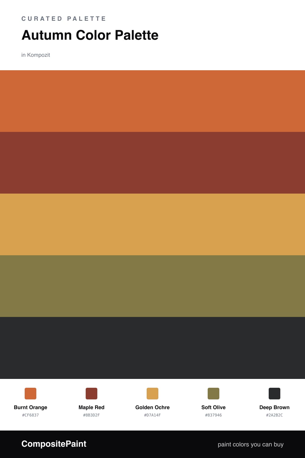
Think of this palette as one walk through the woods in late October. Burnt Orange leads the way, the color of a sugar maple at its peak, and Maple Red deepens it like the leaves that have already turned. These two carry the heat of the scheme.

Underneath, Golden Ochre acts as the quiet base, a warm wash that ties everything together the way afternoon light does. Soft Olive is the steadying note, the mossy green that keeps all that warmth from feeling like a single flat tone, and Deep Brown sits at the bottom like wet earth and tree bark.

For a 2026 read, keep the ochre broad and matte on the big surfaces, then let the burnt orange and maple red show up in smaller, confident doses. The olive and brown do the grounding, so the whole thing lands warm and lived-in rather than loud.

Buy These Colors

Each color matched to the closest real paint in every brand, by ΔE2000. Kompozit first; take any SKU to the store — these mix on demand.

Burnt Orange
#C56A36 · LRV 22 · Dominant
Kompozit Casa De Oro · 1026 ΔE 2.65
Backdrop Old Soul · BD-OS ΔE 25.37
Behr Rumba Orange · M230-7 ΔE 2.04
Benjamin Moore Burnt Caramel · 2167-10 ΔE 0.73
Clare Fire Sign · PNT100-DP-74 ΔE 5.75
Dunn-Edwards Desert Spice · DE5202 ΔE 1.63
Farrow & Ball Charlotte's Locks · No. 268 ΔE 7.24
Magnolia Home Work Worn Wood · JG-35 ΔE 5.88
PPG / Glidden Sesame Crunch · 1198-7 ΔE 0.81
Sherwin-Williams Determined Orange · SW 6635 ΔE 2.29
Valspar Hot Wings · V046-5 ΔE 1.88
Maple Red
#943C2A · LRV 10 · Secondary
Kompozit April Love · 1061 ΔE 2.47
Backdrop Punk Rock · BD-PR ΔE 6.52
Behr Ground Nutmeg · S-H-230 ΔE 2.2
Benjamin Moore Red Oxide · 2088-10 ΔE 2.1
Clare Vintage · PNT100-DP-67 ΔE 11.45
Dunn-Edwards Deep Crimson · DEA152 ΔE 5.61
Farrow & Ball Incarnadine · No. 248 ΔE 7.67
Magnolia Home Brave And Bold · JG-32 ΔE 5.27
PPG / Glidden Autumn Ridge · 1058-7 ΔE 6.03
Sherwin-Williams Brick Paver · SW 7599 ΔE 1.19
Valspar Russet Red · 2011-7 ΔE 0.91
Golden Ochre
#D9A24A · LRV 41 · Base
Kompozit Angel Food Cake · 0913 ΔE 0.99
Backdrop Rosita · BD-RO ΔE 21.84
Behr Solar Fusion · UL150-3 ΔE 2.18
Benjamin Moore Buttercup · 2154-30 ΔE 0.88
Clare Good as Gold · PNT100-DP-59 ΔE 7.1
Dunn-Edwards Copper Cove · DE5320 ΔE 2.12
Farrow & Ball India Yellow · No. 66 ΔE 3.84
Magnolia Home Bright Days · JG-45 ΔE 8.17
PPG / Glidden Curry Sauce · 1210-7 ΔE 3.98
Sherwin-Williams Ceremonial Gold · SW 6382 ΔE 3.83
Valspar Golden Tiger · V052-4 ΔE 2.29
Soft Olive
#7C7A4E · LRV 19 · Support
Kompozit Tropical Twist · 0403 ΔE 3.5
Backdrop Old Soul · BD-OS ΔE 3.6
Behr Lagoon Moss · N330-6 ΔE 2.53
Benjamin Moore Oak Grove · 489 ΔE 3.66
Clare Daily Greens · PNT100-DP-61 ΔE 8.27
Dunn-Edwards Bonsai · DE5538 ΔE 2.44
Farrow & Ball Calke Green · No. 34 ΔE 9.26
Magnolia Home Celery Seeds · JG-58 ΔE 4.3
PPG / Glidden Green Briar · 1113-6 ΔE 2.88
Sherwin-Williams Edamame · SW 7729 ΔE 3.61
Valspar Candied Lime · 6002-4C ΔE 1.18
Deep Brown
#3A2A20 · LRV 3 · Accent
Kompozit Silent Sea · 0515 ΔE 10.84
Backdrop Hocus Pocus · BD-HP ΔE 12.7
Behr Bitter Chocolate · 790B-7 ΔE 7.4
Benjamin Moore Wenge · AF-180 ΔE 4.86
Clare Blackish · PNT100-DP-54 ΔE 12.42
Dunn-Edwards Black · DEA187 ΔE 10.32
Farrow & Ball Pitch Black · No. 256 ΔE 9.52
Magnolia Home Moments · JG-150 ΔE 5.8
PPG / Glidden Black Magic · 1001-7 ΔE 11.26
Sherwin-Williams Polished Mahogany · SW 2838 ΔE 6.79
Valspar Noblesse Oblige · 8004-2G ΔE 6.77

Questions

Why do these autumn colors work together?

They all share the same warm, earthy undertone, the way leaves, bark, and late sun all carry a touch of gold. Because they sit close on the warm side of the wheel, they feel calm together while the deep brown gives the group a clear edge.

How do I use this palette without it feeling heavy?

Let the soft golden ochre carry the most surface area and keep the maple red and deep brown for smaller moments. That roughly 60/30/10 spread keeps the room warm rather than dark.

Similar Palettes

Closest schemes by color — not by label.