CP

Autumn Color Palette — Autumn Pearl

A warm five-color autumn scheme built on burnt orange, maple red, and golden ochre, grounded by olive and deep brown — every color matched to real paint you can buy.

By Jessica Williams · Color Stylist & Interior Editor

Burnt Orange
Dominant
Kompozit Casa De Oro · 1026
#CF6837
LRV 23
Maple Red
Secondary
Kompozit Romantic Night · 1138
#96353A
LRV 9
Golden Ochre
Base
Kompozit Angel Food Cake · 0913
#D7A14F
LRV 41
Soft Olive
Support
Kompozit Tropical Twist · 0403
#837946
LRV 19
Deep Walnut
Accent
Kompozit Silent Sea · 0515
#2A2B2C
LRV 2
View palette in

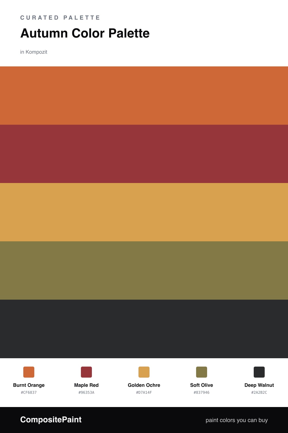
There is a moment in early fall when the light turns golden and everything outside seems to glow from within. That is the feeling I chased here. Burnt Orange leads the way, warm and a little dusty, the kind of shade that reads sophisticated rather than loud in 2026 interiors.

Maple Red deepens the mood like the first turning leaves, while Golden Ochre spreads underneath as a soft, sunlit base. I love these three together because they never compete — they simply ripen.

To keep things grounded, Soft Olive brings a quiet, mossy calm, and Deep Walnut anchors the whole scheme like bare branches against the sky. Use the walnut sparingly on trim or a single piece, and let the warmer tones do the glowing.

Buy These Colors

Each color matched to the closest real paint in every brand, by ΔE2000. Kompozit first; take any SKU to the store — these mix on demand.

Burnt Orange
#C56A33 · LRV 22 · Dominant
Kompozit Casa De Oro · 1026 ΔE 3.13
Backdrop Old Soul · BD-OS ΔE 25.28
Behr Rumba Orange · M230-7 ΔE 1.53
Benjamin Moore Burnt Caramel · 2167-10 ΔE 0.85
Clare Fire Sign · PNT100-DP-74 ΔE 6.42
Dunn-Edwards Desert Spice · DE5202 ΔE 0.95
Farrow & Ball Charlotte's Locks · No. 268 ΔE 7.85
Magnolia Home Work Worn Wood · JG-35 ΔE 6.42
PPG / Glidden Sesame Crunch · 1198-7 ΔE 0.67
Sherwin-Williams Determined Orange · SW 6635 ΔE 2.93
Valspar Hot Wings · V046-5 ΔE 1.53
Maple Red
#9B3A2E · LRV 10 · Secondary
Kompozit Romantic Night · 1138 ΔE 5.91
Backdrop Punk Rock · BD-PR ΔE 4.36
Behr Ground Nutmeg · S-H-230 ΔE 3.84
Benjamin Moore Merlot Red · 2006-10 ΔE 1.4
Clare Vintage · PNT100-DP-67 ΔE 11.45
Dunn-Edwards Scarlet Past · DEA150 ΔE 4.96
Farrow & Ball Incarnadine · No. 248 ΔE 5.87
Magnolia Home Brave And Bold · JG-32 ΔE 3.28
PPG / Glidden Blaze · 13-16 ΔE 5.05
Sherwin-Williams Chinese Red · SW 57 ΔE 1.29
Valspar Rambutan · P044 ΔE 2.48
Golden Ochre
#D9A441 · LRV 42 · Base
Kompozit Angel Food Cake · 0913 ΔE 2.92
Backdrop Eames · BD-EA ΔE 10.2
Behr Plantain Chips · M290-6 ΔE 2.5
Benjamin Moore Mayan Gold · 175 ΔE 2.93
Clare Good as Gold · PNT100-DP-59 ΔE 8.13
Dunn-Edwards Fortune Cookie · DE5355 ΔE 1.33
Farrow & Ball India Yellow · No. 66 ΔE 5.12
Magnolia Home Bright Days · JG-45 ΔE 7.94
PPG / Glidden Curry Sauce · 1210-7 ΔE 2.05
Sherwin-Williams Kingdom Gold · SW 6698 ΔE 3.08
Valspar Golden Tiger · V052-4 ΔE 3.57
Soft Olive
#7A7A4E · LRV 19 · Support
Kompozit Tropical Twist · 0403 ΔE 4.19
Backdrop Old Soul · BD-OS ΔE 3.75
Behr Lagoon Moss · N330-6 ΔE 2.23
Benjamin Moore Oak Grove · 489 ΔE 3.01
Clare Daily Greens · PNT100-DP-61 ΔE 7.69
Dunn-Edwards Bonsai · DE5538 ΔE 1.87
Farrow & Ball Calke Green · No. 34 ΔE 8.74
Magnolia Home Celery Seeds · JG-58 ΔE 3.63
PPG / Glidden Autumn Fern · 1114-7 ΔE 2.81
Sherwin-Williams Edamame · SW 7729 ΔE 4.12
Valspar Candied Lime · 6002-4C ΔE 1.51
Deep Walnut
#3A2A22 · LRV 3 · Accent
Kompozit Silent Sea · 0515 ΔE 10.46
Backdrop Hocus Pocus · BD-HP ΔE 12.13
Behr Bitter Chocolate · 790B-7 ΔE 6.98
Benjamin Moore Wenge · AF-180 ΔE 3.73
Clare Blackish · PNT100-DP-54 ΔE 12.21
Dunn-Edwards Black · DEA187 ΔE 9.93
Farrow & Ball Pitch Black · No. 256 ΔE 9.17
Magnolia Home Moments · JG-150 ΔE 5.38
PPG / Glidden Black Magic · 1001-7 ΔE 10.9
Sherwin-Williams Raisin · SW 7630 ΔE 6.03
Valspar Noblesse Oblige · 8004-2G ΔE 5.65

Questions

Why do these autumn colors work together?

They all share a warm, earthy undertone, so they feel like one family pulled straight from a fall landscape. The deep walnut and olive keep the brighter orange and red from feeling too sweet.

How do I use this palette in a room?

Let the burnt orange lead and use the maple red in smaller doses, with ochre as your soft middle ground. Save the deep walnut for trim or a single grounding piece so the whole space stays cozy rather than heavy.

Similar Palettes

Closest schemes by color — not by label.