Autumn Color Palette — Autumn Dune
A warm five-color autumn scheme built on burnt orange and maple red, softened by ochre, olive, and deep brown — every color matched to real paint you can buy.
By Jessica Williams · Color Stylist & Interior Editor
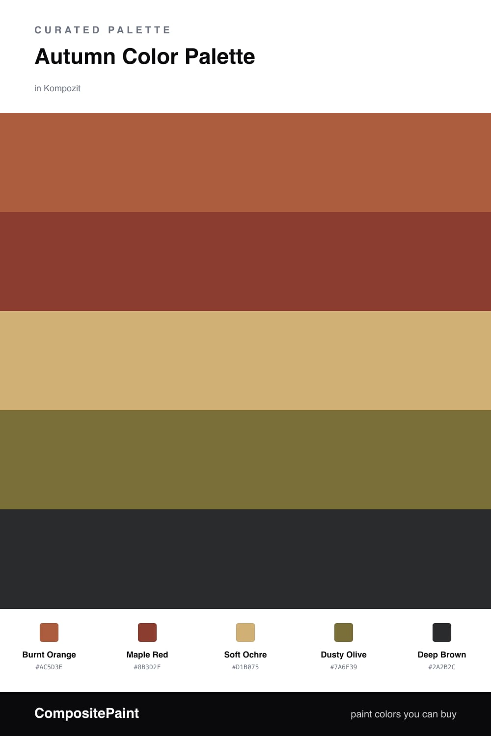
There is a moment in early fall when the light turns golden and everything outside looks dipped in warmth. Burnt Orange captures that feeling, and it leads this palette as a glowing, lived-in anchor that never tips into garish.
Next to it, Maple Red adds a deeper, slightly smoky note, while Soft Ochre spreads the warmth out and keeps the whole thing breathing. I love ochre as a base right now — it reads as a modern neutral in 2026, softer than beige and far more interesting.
To ground it all, Dusty Olive brings a quiet, organic balance, and Deep Brown lands like the last word in a sentence. Keep the ochre and orange in charge, and let the red, olive, and brown show up in the small, intentional places.
Buy These Colors
Each color matched to the closest real paint in every brand, by ΔE2000. Kompozit first; take any SKU to the store — these mix on demand.
Questions
They all share a warm, earthy undertone, so they feel like one family rather than five separate picks. The ochre acts as a soft middle ground that lets the orange and red glow without clashing.
Lead with the soft ochre on your largest surfaces and let burnt orange be the main color, then use the maple red and deep brown only in small doses for depth.
Similar Palettes
Closest schemes by color — not by label.