Autumn Color Palette — Maple & Slate
A warm five-color autumn scheme pairing burnt orange and maple red with ochre, olive, and deep brown — every color matched to real paint you can buy.
By Emily Roberts · DIY Editor & First-Timer's Guide
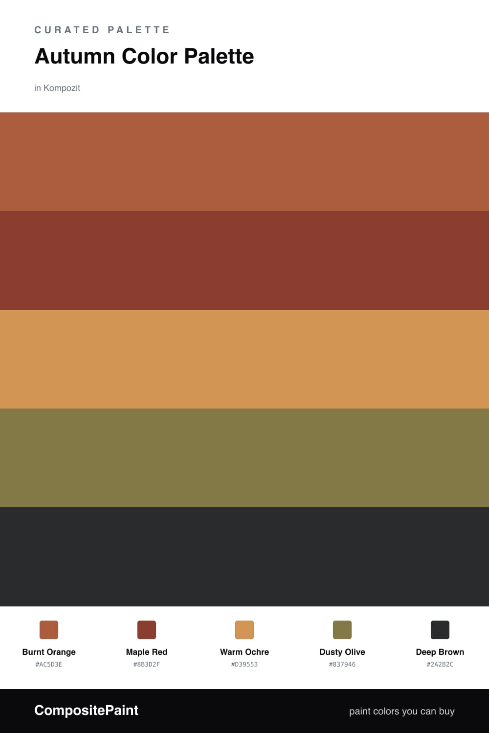
This is the palette I reach for when I want a room to feel like a crisp October afternoon. Burnt Orange does the heavy lifting, that toasty pumpkin-spice tone that reads warm without going neon. Maple Red sits right beside it like a deeper, darker leaf, so the two never compete.
To keep it from feeling too cozy-cabin, I lean on Warm Ochre as the quiet base, a soft golden tan that lets your eyes rest. Dusty Olive is the modern twist here, a muted green-brown that feels very 2026 and stops the whole thing from looking like a Thanksgiving tablecloth.
Finish with Deep Brown in small spots, think a front door, a shelf, or trim. A little goes a long way, and it makes every warm color above look richer by comparison.
Buy These Colors
Each color matched to the closest real paint in every brand, by ΔE2000. Kompozit first; take any SKU to the store — these mix on demand.
Questions
They all sit in the warm, earthy part of the color wheel, the same family you see in fall leaves, so they feel related instead of random. The olive cools things just enough to keep it from looking too orange.
Let the burnt orange lead and keep the maple red and olive as smaller moments, with the ochre as your calm in-between. The deep brown is best in tiny doses, like a door or trim, to ground everything.
Similar Palettes
Closest schemes by color — not by label.