Providence Blue
The slate blue-green nobody's chasing on Pinterest, reviewed honestly: where it reads confidently blue-gray, the light that turns it murky, and what to pick instead.

Jessica has spec'd whites and neutrals for more than 300 rooms and keeps a sample wall of painted drawdowns in her studio. Every color review is checked against real reader rooms in the comments and re-tested when a formula changes. About the testing process →
- 1Salamander6
- 2Hidden Gem14
- 3Providence Blue19
- 4Van Courtland Blue31
- 5Wythe Blue48
The Fast Verdict
Providence Blue is Benjamin Moore's quiet answer to "I want blue, but not a color that screams anything." It's a mid-deep slate with real gray weight and just enough green to keep it out of navy territory — close enough to teal that some rooms will read it that way, close enough to true blue-gray that others won't. It has sat in the Classics collection for years without a Color of the Year moment or a viral kitchen photo, and that's the honest selling point: it works, quietly, room after room, without asking to be the story.
Kitchen islands and cabinetry · dens, libraries, and powder rooms that read best lamplit · front doors and shutters · anyone who wants blue-green depth without committing to a full teal or a full navy
You want a color with one clean, unambiguous name (true teal or true navy, not both) · your room is north-facing, dim, and lamp-free · you're painting over a dark existing color and don't want the extra coat · you need something that reads identical under every bulb in the house
- A genuine blue-green blend — reads as both teal and slate blue depending on the room
- LRV 19 gives it real depth and backbone without going full navy-dark
- Excellent on kitchen islands and cabinetry against white perimeters
- A quiet, un-hyped classic — low risk of dating itself the way trend teals do
- Handles full sun on an exterior door confidently
- Goes flat, murky, near-black in a dim north room with no lamps
- Neither a committed navy nor a committed teal — frustrating if you wanted one clean identity
- Older warm incandescent bulbs can push it swampy-green at night
- Needs two full coats minimum, three over dark or saturated existing paint
What Color Is Providence Blue, Really?
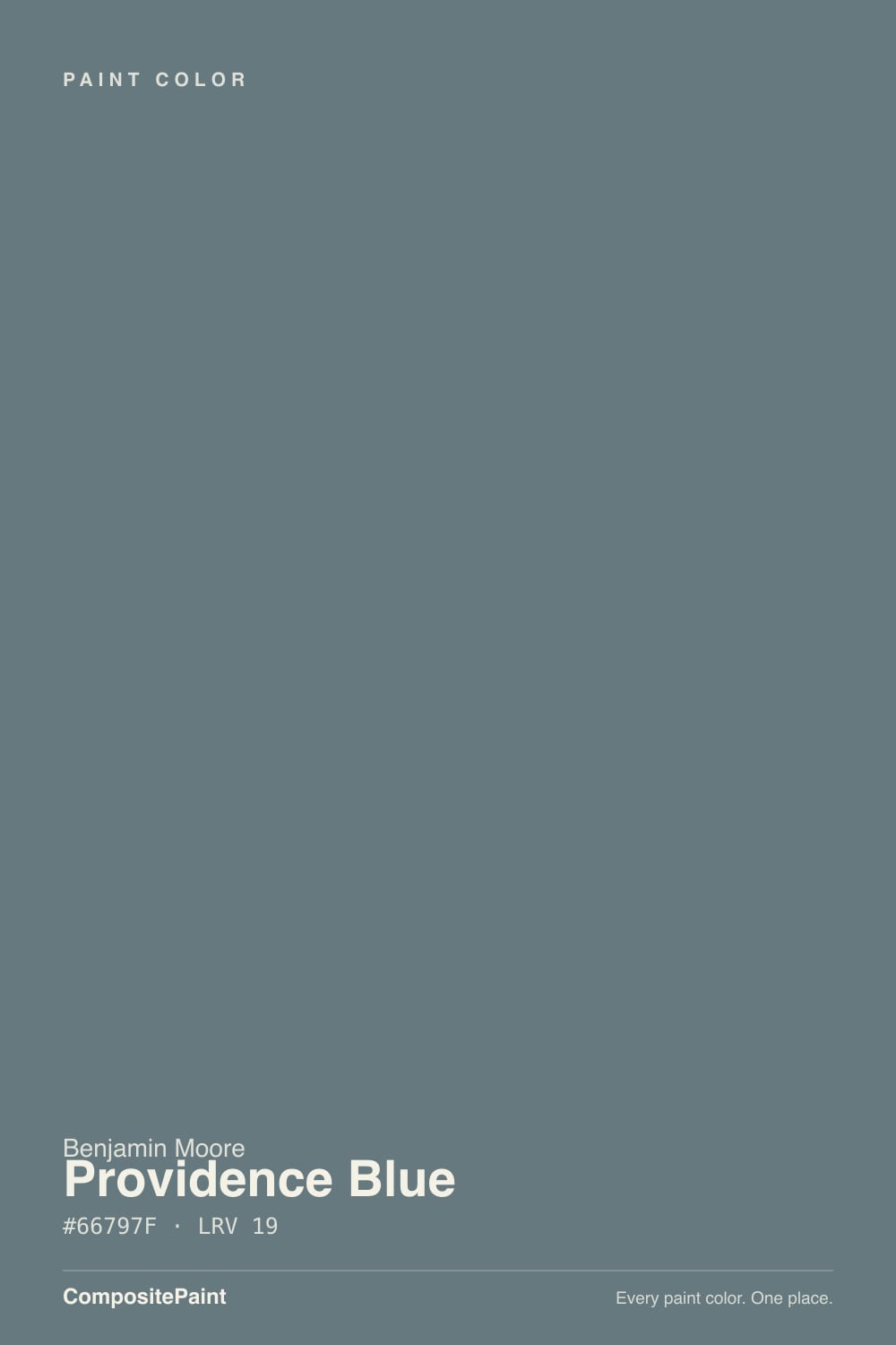
Benjamin Moore's own file calls it a cool-toned slate blue with dark gray undertones, and that's accurate as far as it goes — but the hex tells a fuller story: the green and blue channels sit almost neck and neck, which is why so many people who live with it end up calling it teal instead of blue. It isn't hedging or unstable; it's a genuinely blended color, and whichever name you reach for first says more about your light than about the paint.
At LRV 19 it's a real mid-to-deep color, not a pastel spa blue. That depth is what gives it its backbone — it reads as a committed, grown-up color rather than a timid coastal accent — but it also means it behaves like every color in this LRV range: it needs real light to show its blue-green nuance, and in a dim room it can collapse toward a flat, near-black slate. Plan on two full coats minimum, three over anything dark or saturated.
Undertone in one line: blue-gray with a genuine green lean, never warm, never purple. If it looks distinctly teal on your wall, that's honest — the color is built that close to the line, not misbehaving.
Where It Shines
Give it a room with real daylight and it settles into a confident, sophisticated slate that reads expensive rather than trendy — which is exactly why designers reach for it on kitchen islands and cabinetry more than on open living-room walls. It's also a strong small-room and small-surface color: a powder room, a home office, a single door, a front entry, all take the depth well without the commitment of four full walls. Pair it with warm wood, brass, and a soft white trim and it looks like it's always been there.
Where It Fails
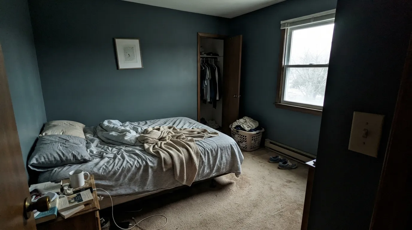
Almost every disappointed story about Providence Blue comes down to one of three predictable situations, and none of them are the paint being unstable — they're the paint being honest about light and expectations that weren't honest with it first.
Cool, weak daylight strips out the color's nuance and leaves a flat, murky, near-black slate that reads more like a shadow than a paint color. This is the most common regret, and it's entirely fixable: add warm lamps, or pick a lighter color if the room genuinely gets no sun.
Providence Blue sits deliberately between the two, and that's the whole point of the color, but buyers who searched for "navy" or "teal" and landed here sometimes feel like they got neither. If you need one clean identity, go BM Van Deusen Blue for committed navy or BM Palladian Blue for committed teal-green; this color is for people who want both at once.
Under older 2700K incandescent bulbs the green comes forward hard, and a few readers describe the evening color as swampy or olive rather than blue. Modern warm-white LED at a similar color temperature is more flattering — test your actual bulb, not just the Kelvin number on the box.
Room by Room
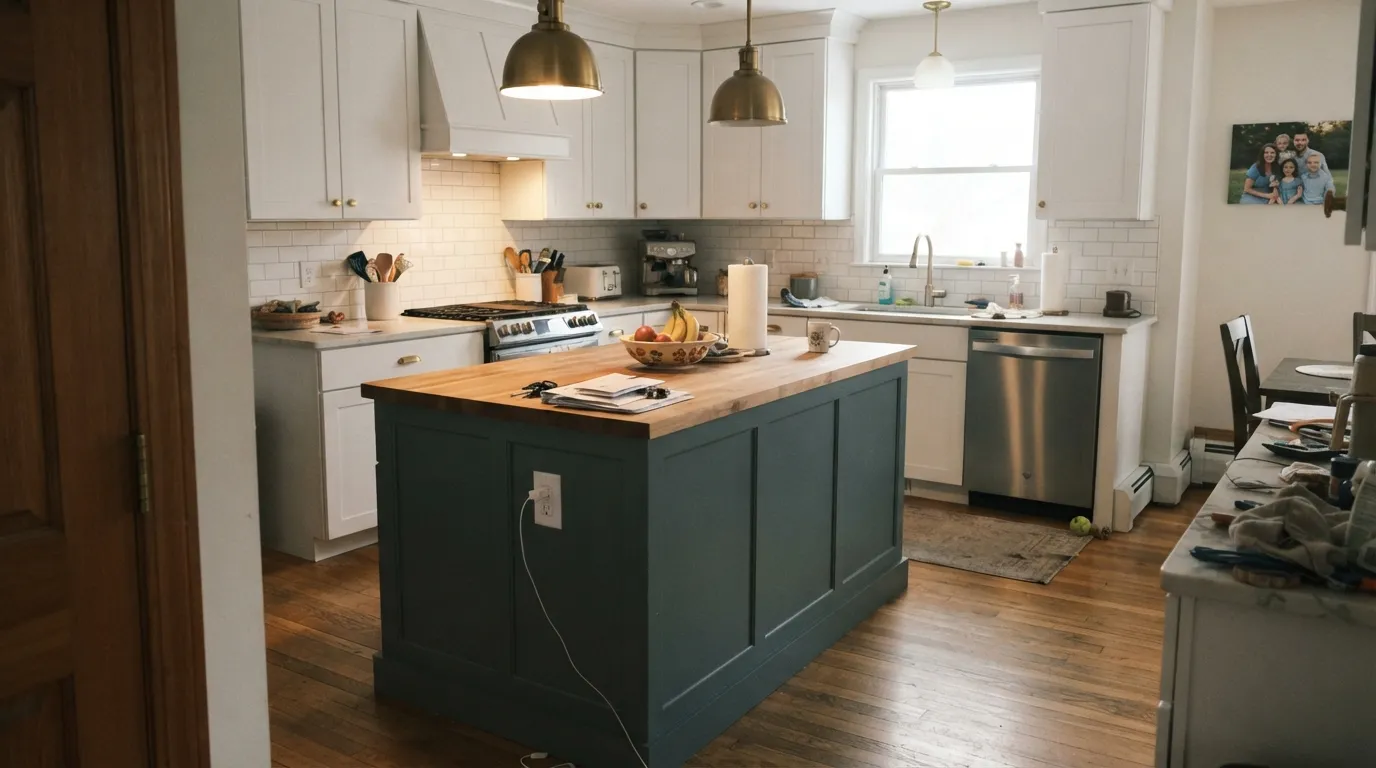
On an island or full run of lower cabinets, against white perimeter cabinets or countertops, this is where the color earns its keep. Satin or semi-gloss cabinet enamel; brass or unlacquered hardware is its best match.
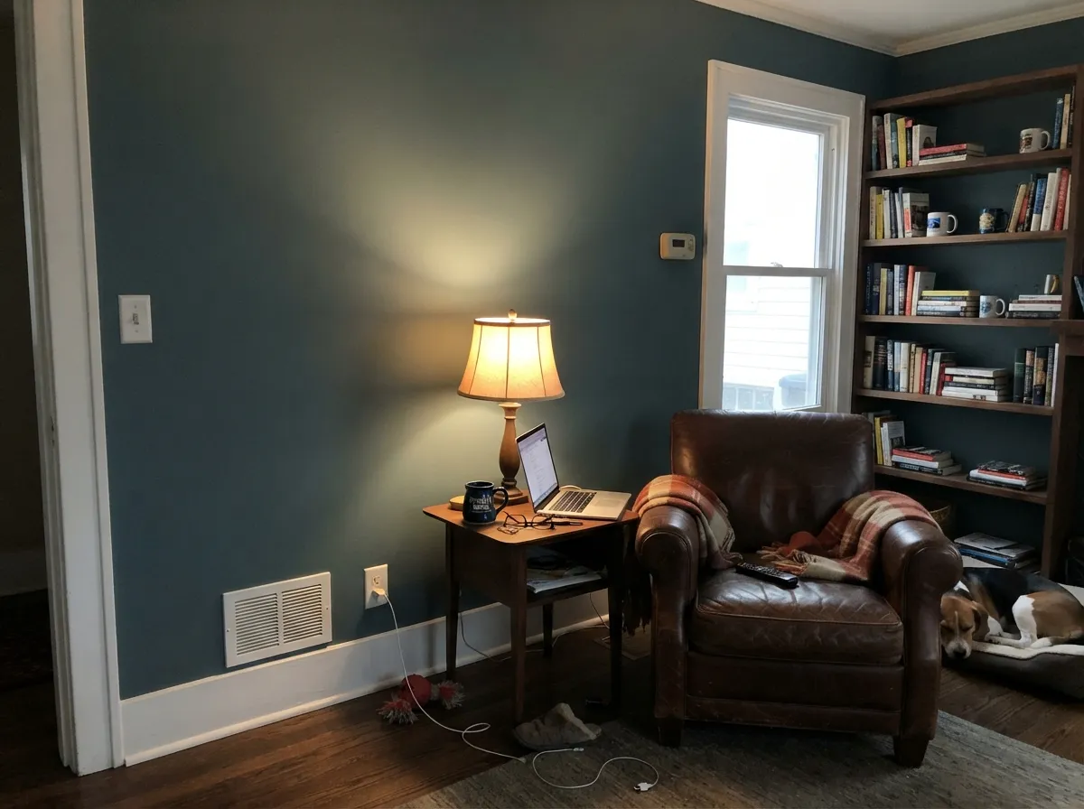
Low, lamp-lit rooms flatter the depth instead of fighting it. Walnut shelving, leather, and a warm reading lamp turn it genuinely cozy rather than dark.
Four walls of it in a small windowless bath reads intentional and rich rather than cave-like, because there's no big open daylight swing to expose the murkier side. Eggshell or a wipeable matte.
South or east light: genuinely handsome, confident blue-gray. North-facing and dim: this is the room where the fails section above happens. Sample a full sheet before committing to four open walls.
Restful and grounding at night under warm LED lamps. Skip it if the room is north-facing and you refuse to add lamp light — it will read flat by 5pm in winter.
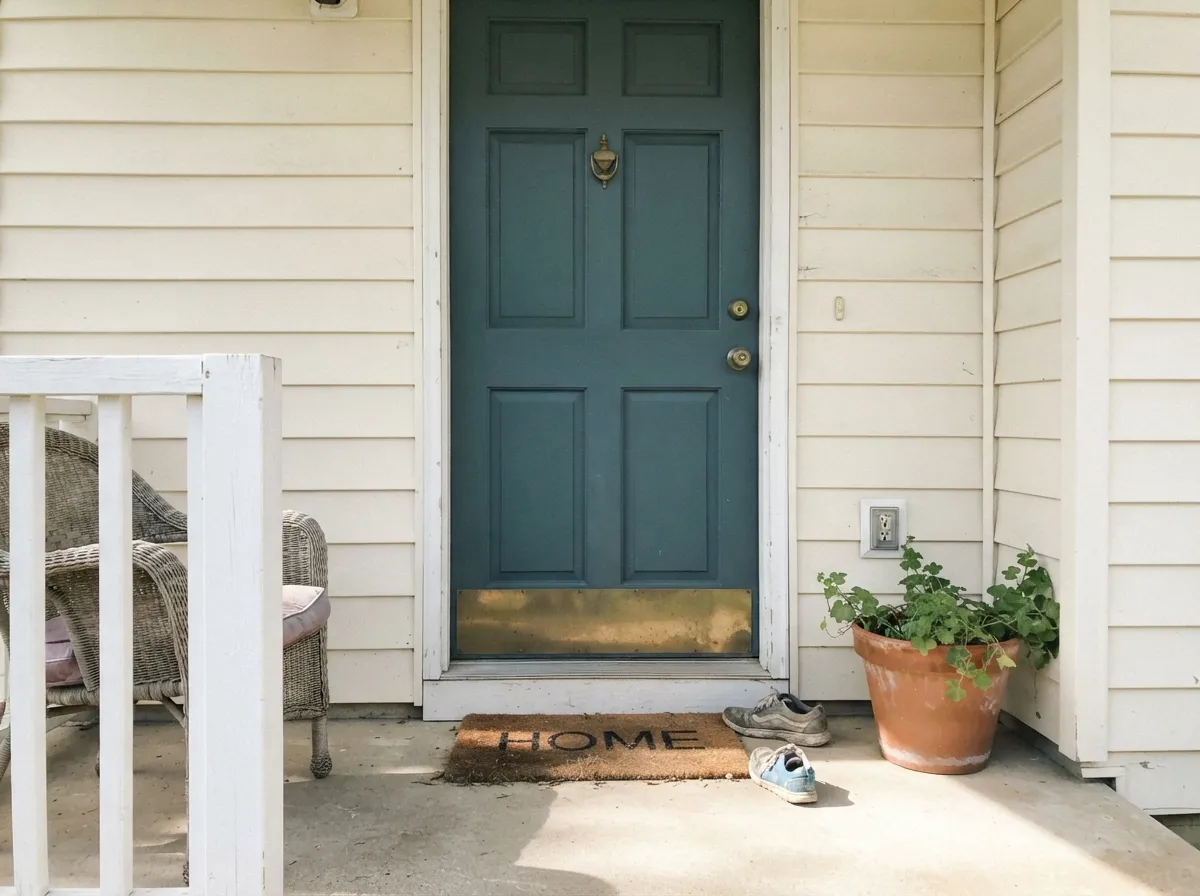
Full sun reads it brighter and clearly blue rather than the murkier indoor read. Against a pale or white body color it's a confident, non-navy statement door that still reads timeless rather than trendy.
Your Light Is the Risk
Blue comes forward, gray backs off — this is the color at its most confidently blue-gray, not murky.
Weak cool daylight flattens the nuance into a near-black slate. The single most common source of disappointment with this color.
Fresh and lively in morning east light, warmer and cozier as west sun drops in the afternoon. It moves noticeably through the day.
Warm 2700–3000K LED keeps it a settled blue-gray. Older incandescent can push it green; cool white LED flattens it colder and closer to true gray-teal.
Most complaints about Providence Blue are a light mismatch. Upload a photo of your actual room and see it on your walls — then ask for the same wall in north light or evening lamps before you buy a single sample.
Need It From Another Brand?
Any paint counter can custom-tint Benjamin Moore 1636 directly. If you would rather stay in one brand's own deck, these are the closest stock matches, measured as ΔE2000. Under 2 is a difference you will not see on the wall.
| Brand | Closest color | ΔE | LRV | |
|---|---|---|---|---|
| Sherwin-Williams | LabradoriteSW 7619 · Sherwin-Williams | 1.3 | 19 | Color page → |
| Behr | Country LakeECC-54-2 · Behr | 3.2 | 18 | Color page → |
| Valspar | Blue Thunder8004-37F · Valspar | 1.4 | 18 | Color page → |
| PPG / Glidden | Night RendezvousPPG1037-5 · PPG / Glidden | 0.8 | 18 | Color page → |
| Glidden | Night RendezvousPPG1037-5 · Glidden | 0.5 | 18 | Color page → |
| Dutch Boy | Aged Denim431-4DB · Dutch Boy | 1.3 | 19 | Color page → |
Similar Benjamin Moore Colors
The nearest shades to Providence Blue within Benjamin Moore's own range, ranked by perceptual color distance — useful when you want the same look a touch lighter, darker, or warmer.
WCAG 2.1: AA is 4.5 : 1 for normal text, 3 : 1 for large text, AAA is 7 : 1.
Providence Blue vs the Colors You're Also Considering
Every Providence Blue sample board has the same rivals on it. The numbers show the real lightness gap — then it comes down to which risk you would rather live with.
Pick this for the more dependable, easier-to-place version of the same blue-green depth.
Behr N430-6A · LRV 14Hidden GemPick this if you want it darker and more committed to green-teal, and you're ready for its own two lighting traps.
Pick this when you want more color, more presence — Smoky Blue plays it safer than Providence Blue does.
Sherwin-Williams SW 7604 · LRV 15Smoky BluePick this if you want the same slate mood with less green and less commitment — it truly never overcommits.
The closest Benjamin Moore neighbors are Stillwater 1650 and Philipsburg Blue HC-159, both at LRV 19 and #627885. They carry the same lightness but sit slightly further toward blue-violet, so Providence Blue looks a little greener beside them. Hamilton Blue HC-191 at LRV 18 is almost the same color, while the PM-6 version of Hamilton Blue at LRV 16 is a step darker.
Across brands the field is crowded. Glidden Night Rendezvous PPG1037-5 at deltaE 0.49 is effectively the same paint. Sherwin-Williams Labradorite SW 7619 at deltaE 1.3, Dutch Boy Aged Denim 431-4DB at deltaE 1.3, Valspar Blue Thunder 8004-37F at deltaE 1.43, Farrow and Ball Barrow Blue No. G8 at deltaE 1.83, Behr Iron Mountain N520-5 at deltaE 1.87, and Dunn-Edwards Blue Monday DET568 at deltaE 1.9 are all visually identical in normal room light. Rodda Blue Jay CA202 at deltaE 2.3 and C2 Bluegrass C2-728 at deltaE 2.94 are very close, so sample first.
Providence Blue Coordinating Colors
The rule for coordinating with Providence Blue is simple: keep whites soft and warm rather than icy, and let one near-black or warm greige do the grounding work. It pairs naturally with its own lighter blue-green cousins, with warm neutrals, and with a single dark anchor — these are the partners that keep showing up in rooms that work:
The Quiet Classic Nobody's Chasing
Providence Blue has never had a Color of the Year moment and it isn't the color behind any viral kitchen photo — it has simply sat in Benjamin Moore's Classics collection, quietly getting specified by people who need a blue-green that doesn't need to be the whole story of the room. That's not a knock. Trend teals and trend navies date themselves the moment the trend moves on; a color that never had a moment doesn't have one to lose.
The honest trade-off is the flip side of that same quietness: it won't show up in a curated 'best paint colors of the year' roundup, and if you want a color with instant name recognition to reassure a resale buyer, this isn't it. What it offers instead is a genuinely well-balanced blue-green that behaves consistently once you understand its one real condition — give it light, or give it lamps.
Providence Blue With Wood Tones and Floors
Warm woods are its best company: walnut, white oak, and butcher block all sit comfortably against the green-gray undertone, and brass or unlacquered hardware picks up the warmth without fighting the blue. Cool gray-washed floors work too, in a more restrained, modern-coastal way — the two cool tones settle into each other rather than compete.
The one combination worth sampling first is honey-orange builder oak. It isn't a hard clash the way it is with a true purple, but the warm-orange floor and the cool blue-green wall are pulling in different temperature directions, and in a dim room that mismatch reads more noticeably. A runner rug or a warmer trim white usually settles it.
Three Ready Palettes Built on Providence Blue
A color is never alone on the wall. These are complete combinations in the 60-30-10 pattern, with the reason each one holds together. Every one opens in the visualizer.
Simply White perimeter cabinets keep the kitchen bright while the island carries the color; Beach Glass echoes the same blue-green family a shade lighter in an adjacent powder room, so the palette feels connected room to room.
Try this palette in your roomWhite Dove trim keeps the room from reading too dark overall, and Wrought Iron on the built-ins gives the eye a near-black anchor so the blue-green reads deliberate and grounded, not simply dim.
Try this palette in your roomA quiet, no-opinion white siding lets the door do the talking without a stark black-and-white contrast; Kendall Charcoal on shutters is dark enough to ground the house without arguing with the blue-green undertone the way true black can.
Try this palette in your roomProvidence Blue FAQ
Is Providence Blue a blue or a teal?
Both, honestly. Benjamin Moore files it as a slate blue, but the blue and green channels sit close enough together that many rooms read it as teal instead. Whichever you see first usually says more about your light than about the paint — it's built right on that line, not misbehaving.
How dark is it, and will it make a room feel small?
At LRV 19 it's a genuine mid-to-deep color, not a light accent. In a room with real daylight it reads rich rather than cramped; in a dim, north-facing room with no lamps it can feel closing-in — add warm light or pick a lighter color if that's your room.
Does it work on kitchen cabinets or an island?
Yes — it's arguably the color's best use. Against white perimeter cabinets and brass hardware it reads sophisticated rather than dark, and satin or semi-gloss cabinet enamel wipes clean easily.
What trim white goes with Providence Blue?
A soft warm white like White Dove or Simply White in semi-gloss. It doesn't need a stark, ice-cold trim white — that combination tends to make the blue-green edge feel harsher than it needs to.
Is it a good front door or exterior color?
Yes, and it's underused for this. Full outdoor sun reads it clearly blue-gray rather than the murkier indoor read some north-facing rooms get, and against a pale or white body it makes a confident statement door without going full navy.
Does it look different under LED versus warm bulbs?
Noticeably. Warm 2700–3000K LED keeps it a settled blue-gray at night. Older incandescent bulbs can push it toward swampy green, and stark cool-white LED flattens it colder and closer to a plain gray-teal — test your actual bulbs before deciding you don't like the color.
Have you painted with Providence Blue?
Rate it — one tap helps the next reader decide.
Ask a Question