Hamilton Blue
The stony blue-gray from Benjamin Moore's Historical Collection, reviewed honestly: where it earns its keep, the light that flattens it, and what to pick instead.

Jessica has spec'd whites and neutrals for more than 300 rooms and keeps a sample wall of painted drawdowns in her studio. Every color review is checked against real reader rooms in the comments and re-tested when a formula changes. About the testing process →
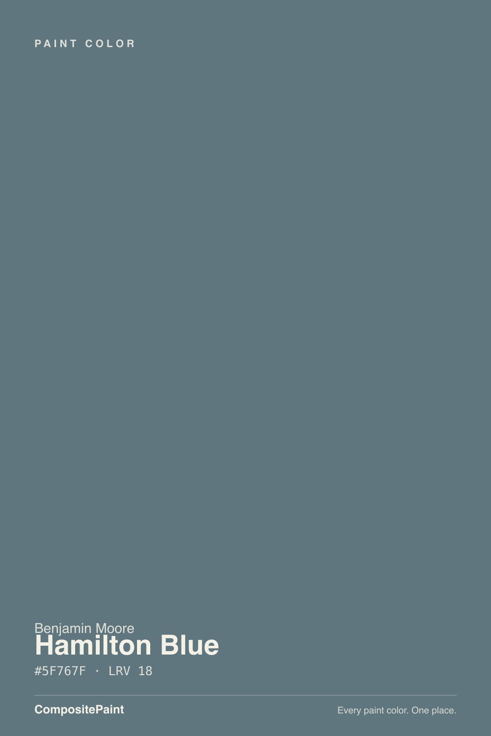
- 1Salamander6
- 2Newburg Green11
- 3Hamilton Blue18
- 4Van Courtland Blue31
- 5Wythe Blue48
The Fast Verdict
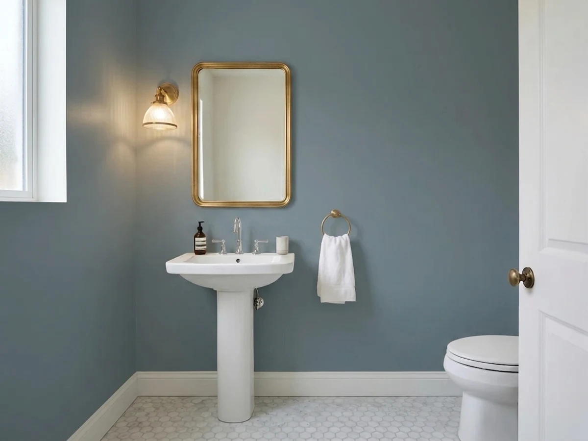
Hamilton Blue is what happens when a paint company builds a blue around a gray masstone instead of a pigment. It is dark enough (LRV 18) to read as a real color choice, not a tint, but the grey underneath keeps it from ever going loud — no cornflower, no coastal cliché, just a stony slate-blue that behaves like a neutral until the light reminds you it isn't. It has almost no internet chatter, which is not a red flag here; it is a quiet Historical Collection color doing quiet work.
Kitchen islands and cabinets · front doors and shutters (it doubles as a Woodluxe exterior stain color) · dens and studies with warm lamps · anyone who wants "blue" without a bright blue
You pictured a cheerful, saturated blue · your only window faces north and stays dim · your trim and floors are honey oak · you need one gallon to cover a whole small, low-light room
- A real, dependable blue-gray with a grey base that keeps it from ever going loud
- Dark enough (LRV 18) to anchor a kitchen island or front door without going near-black
- One of the few colors sold as both a wall paint and a matching exterior wood stain
- Plays well with warm wood, brass and white cabinetry — it never fights for attention
- Genuinely historic pedigree (BM Historical Collection), not a repackaged trend color
- Reads more gray than blue at full strength — disappointing if you wanted a cheerful blue
- Goes flat and cave-like in a dim, north-facing room with no daylight backup
- Clashes with honey oak and golden-beige warm trim
- Almost no owner reviews or real-room photos online to check before committing
What Color Is Hamilton Blue, Really?
A dark, stony blue with a grey backbone. Benjamin Moore's own description calls it a shade "steeped in history," and the SKU tells the same story: HC-191 sits in the Historical Collection, the line built around colors documented on historic American buildings rather than trend palettes. That pedigree shows in the mix — this is not a saturated designer blue, it is a muted, weathered one, closer in spirit to old painted shutters than to a paint-chip sky.
At LRV 18 it sits in the medium-dark range, close to colors like Chelsea Gray and well past anything that reads pastel. Push the color to full strength and the masstone leans surprisingly close to a flat grey — the blue is real, but it never overwhelms the grey it is built on. That is the whole personality of this color: enough blue to name it, enough grey to keep it from shouting.
Undertone in one line: cool blue-grey with a whisper of green underneath, never violet, never true navy. In flat or north light the green-grey comes forward and it can read as a plain stony grey; in direct sun the blue steps out and it looks unmistakably like a blue. Both readings are honest — this is a color that changes its mind with the room.
Where It Shines
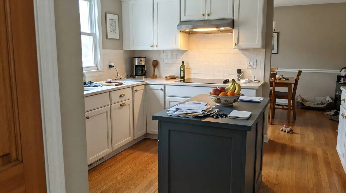
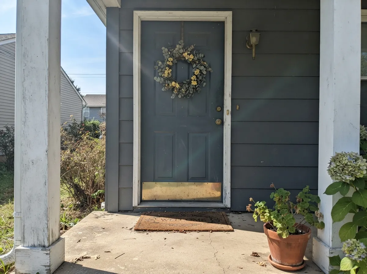
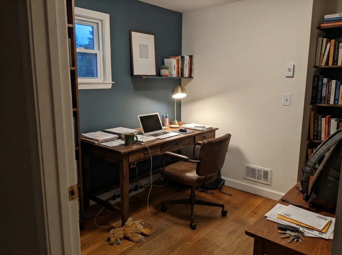
Give it a job with some daylight and warm materials nearby and it is a dependable, grown-up blue-gray. Kitchen islands are its natural home — set against white perimeter cabinets and a warm wood floor, the grey base keeps it from fighting brass or butcher block the way a brighter blue would. It is also one of the few interior colors that has a matching exterior life: Benjamin Moore sells Hamilton Blue as a Woodluxe stain for siding, decks and fences, so a front door or shutters can match a study wall exactly, gallon for gallon.
Where It Fails
Almost every disappointed story with a color like this comes from one of three predictable mismatches. None of them are the paint's fault — but if your room matches one, this is not your blue.
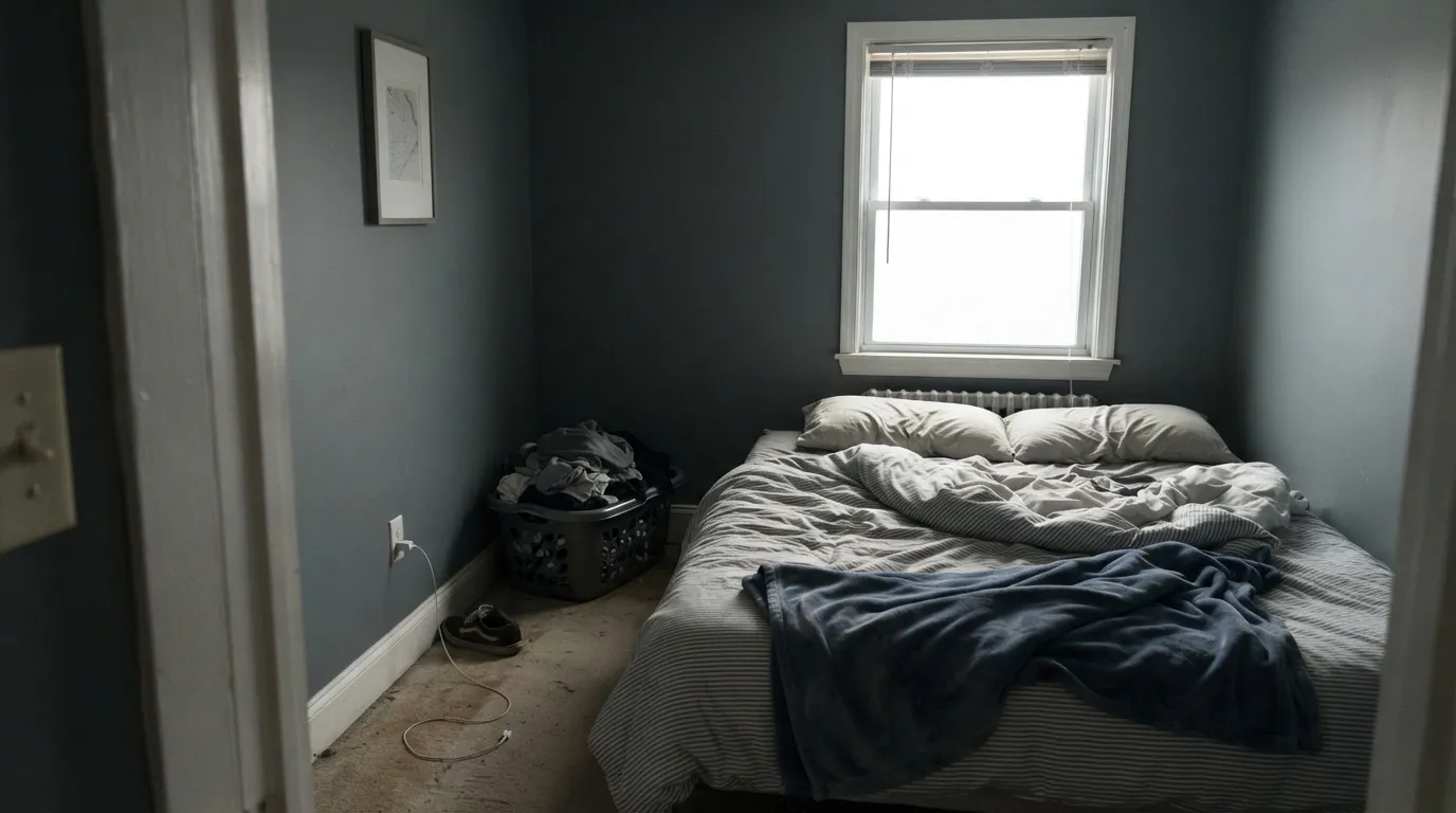
LRV 18 already absorbs most of the light that hits it; take away a strong window and the grey base takes over completely, leaving a flat, cave-like slate with almost no blue left to see. Reserve it for rooms that get real daylight or plan on real lamps.
The name promises more color than the can delivers. This is a grayed-down historical blue, not a coastal or nursery blue — anyone picturing a cheerful sky tone will open the can and see gray first. If that is the goal, look at a lighter, more saturated blue instead, not this one.
Hamilton Blue is a cool color built on grey and green; honey oak and golden-beige trim are warm and orange-leaning. Next to each other, the oak looks more orange and the paint looks flatter and greyer than it is on its own. Walnut, white oak or painted trim are far better neighbors.
Room by Room
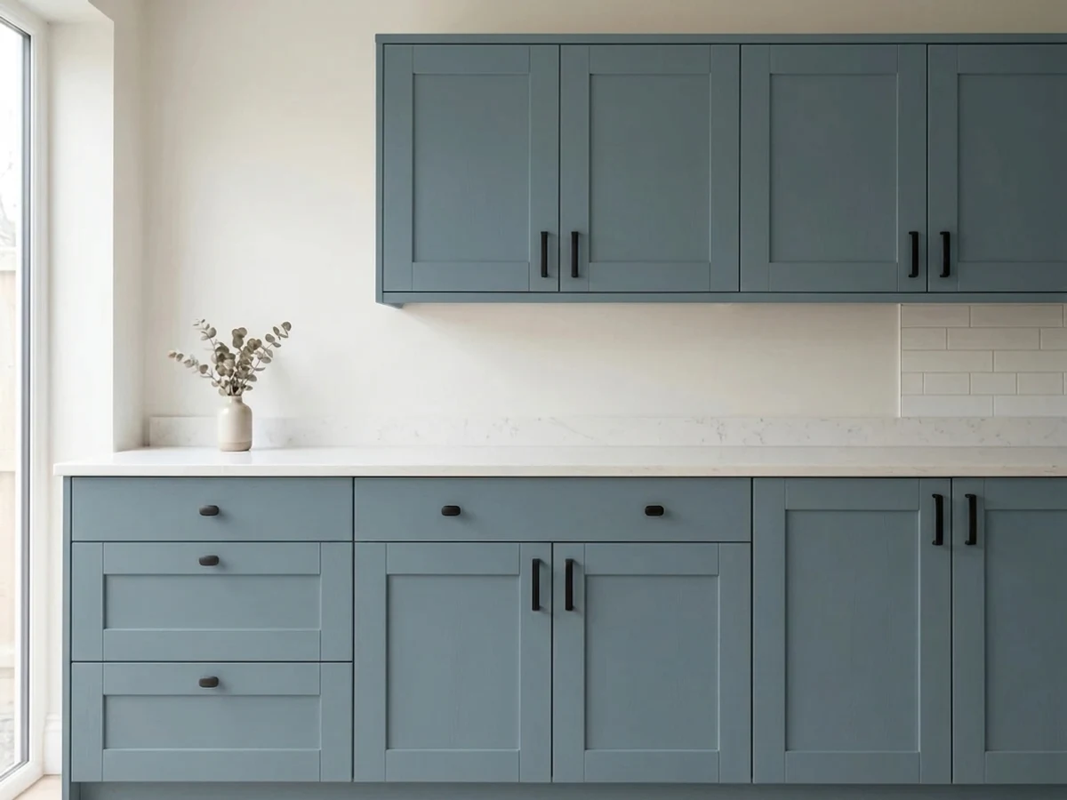
On an island against white perimeter cabinets and a warm wood floor, it reads as a deliberate, historic color choice rather than a trend. Satin urethane-fortified cabinet enamel; brass or matte black hardware both work.
One of the few colors that ships as both a wall paint and a Woodluxe exterior stain, so door, shutters and any wood trim can match precisely. Reads richer and more blue in direct sun than it does indoors.
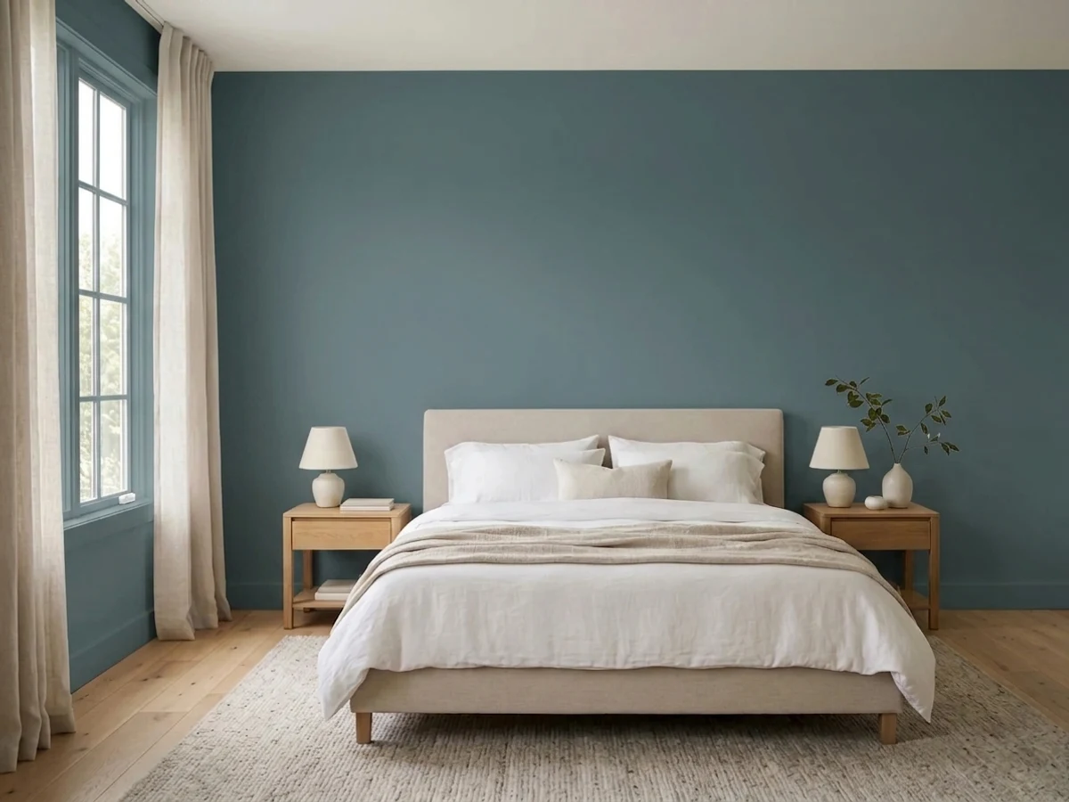
Under 2700K bulbs it settles into a calm, cocoon-like blue-grey. In a north-facing bedroom with no lamp plan, budget for warmth or expect it to read closer to plain grey after dark.
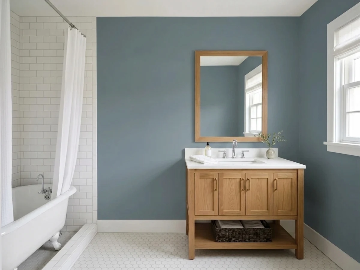
A satin Hamilton Blue vanity under a white or light marble top and brass fixtures is a small, contained way to use the color without betting a whole room on it.
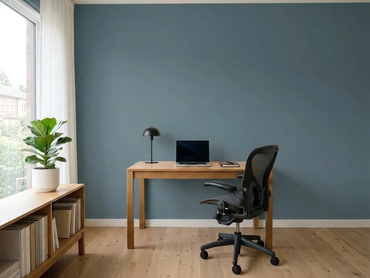
Handsome with leather, walnut and brass lamp light in a closed room that is not fighting for daylight with an open-plan kitchen. In a bright, airy open plan, a lighter cousin like Van Courtland Blue is the safer call.
LRV 18 is workable on shutters, a door, or trim, but it is dark for full siding on anything but a large, sun-drenched house — expect it to read closer to charcoal than blue from the street on a shaded elevation.
Your Light Is the Risk
Low warm sun pulls the blue forward and the grey recedes — the richest, most obviously "blue" this color ever looks.
Cool, indirect daylight drains the blue and leaves a subdued, slightly muddy grey. Sample here first if this is your only real light.
Bright and welcoming at sunrise, it cools and quiets as the day goes on — expect two different moods from the same wall.
2700K lamps deepen it toward denim-blue and cozy. Cool white LEDs pull the green-grey forward and flatten it — swap the bulbs before you blame the paint.
Most complaints about Hamilton Blue are a light mismatch. Upload a photo of your actual room and see it on your walls — then ask for the same wall in north light or evening lamps before you buy a single sample.
Need It From Another Brand?
Any paint counter can custom-tint Benjamin Moore HC-191 directly. If you would rather stay in one brand's own deck, these are the closest stock matches, measured as ΔE2000. Under 2 is a difference you will not see on the wall.
| Brand | Closest color | ΔE | LRV | |
|---|---|---|---|---|
| Sherwin-Williams | StargazerSW 9635 · Sherwin-Williams | 2.0 | 17 | Color page → |
| Behr | Silver Hill750F-5 · Behr | 1.8 | 17 | Color page → |
| Valspar | Risk-RewardT692 · Valspar | 1.1 | 17.3 | Color page → |
| PPG / Glidden | Freedom FoundPPG1040-6 · PPG / Glidden | 3.0 | 18 | Color page → |
| Glidden | Village Blue70BG 17/116 · Glidden | 2.5 | 17 | Color page → |
| Dutch Boy | Aged Denim431-4DB · Dutch Boy | 2.1 | 19 | Color page → |
Similar Benjamin Moore Colors
The nearest shades to Hamilton Blue within Benjamin Moore's own range, ranked by perceptual color distance — useful when you want the same look a touch lighter, darker, or warmer.
WCAG 2.1: AA is 4.5 : 1 for normal text, 3 : 1 for large text, AAA is 7 : 1.
Hamilton Blue vs the Colors You're Also Considering
Every Hamilton Blue sample board has the same rivals on it. The numbers show the real lightness gap — then it comes down to which risk you would rather live with.
Pick this for the Benjamin Moore version with a documented historical pedigree and a matching exterior stain option.
Sherwin-Williams SW 7604 · LRV 15Smoky BluePick this if your painter works in Sherwin-Williams — a near-twin slate blue-gray, a touch darker and just as gray-hearted.
Pick this when you want the color to commit and hold its depth instead of drifting toward gray at midday.
Benjamin Moore HC-145 · LRV 31Van Courtland BluePick this for the same slate-blue idea a full step lighter — trustworthy in a room with only one modest window.
Hamilton Blue also exists as PM-6 with the same hex, #5F767F, listed at LRV 16, so if you see both codes they are the same color in different collections. Stillwater 1650 and Philipsburg Blue HC-159, both LRV 19 and both #627885, are the lighter and slightly softer alternative when 18 feels too dark. Britannia Blue 1623 at LRV 18 keeps the depth but drops most of the green.
Across brands, Valspar Risk-Reward T692 at LRV 17.3, Hirshfield's Winter Harbor H0051 at LRV 16, and Behr Silver Hill 750F-5 at LRV 17 are visually identical in normal room light, with deltaE values of 1.11, 1.46, and 1.75. Sherwin-Williams Stargazer SW 9635 at LRV 17 and Farrow & Ball Sloe Blue No. 87 at LRV 18 are very close but worth sampling first, at 1.97 and 2.10. Dunn-Edwards Wharf View DEC799, LRV 16, is close but visibly different side by side.
Hamilton Blue Coordinating Colors
The rule for coordinating with Hamilton Blue: keep whites clean and warm-leaning, keep neighboring neutrals grey rather than beige, and save true dark contrast for hardware and accents rather than a second big color. These are the partners that keep showing up alongside it:
A Historical Collection Color, Not a Trend Color
Hamilton Blue's SKU gives away its origin: the HC prefix marks Benjamin Moore's Historical Collection, a line built around colors documented on historic American buildings and landmarks rather than invented for a seasonal palette. Benjamin Moore's own copy describes it as a shade "steeped in history" — and unlike a Color of the Year pick, it has almost no viral moment, no famous room, no wave of before-and-after posts to point to. That is not a strike against it; it is simply a quiet, dependable color that has sat in the deck doing unglamorous work — shutters, doors, cabinetry — for years.
The practical upside of that obscurity: there is very little hype to live up to and very little bandwagon risk. Buy it because the grey-blue balance suits your room, not because it is trending, and it should still look right in ten years the way most Historical Collection colors do.
Hamilton Blue With Wood Tones and Floors
This is a cool color, so it wants cool-to-neutral wood partners. Walnut, white oak, weathered gray wood and painted millwork all sit comfortably next to it — the depth of the blue-gray reads as intentional rather than accidental. Butcher block and lighter maple work too, as long as the room has enough daylight to keep the pairing from going murky.
The one wood tone to sample carefully first is honey or golden oak. Because Hamilton Blue leans cool and grey, it sits almost opposite warm orange-toned oak on the color wheel — the floor reads more orange next to it, and the wall reads flatter and greyer next to the floor. If the honey oak is staying, a large area rug between the two, or a lighter comparison color like Boothbay Gray, is the safer move.
Three Ready Palettes Built on Hamilton Blue
A color is never alone on the wall. These are complete combinations in the 60-30-10 pattern, with the reason each one holds together. Every one opens in the visualizer.
White Dove and Stonington Gray keep the room bright and neutral, so the island can carry all the color without the kitchen feeling heavy. Warm wood floors and brass pulls bridge the cool blue and the warm white.
Try this palette in your roomLight grey siding and crisp white trim give the door and shutters room to be the one saturated note on the house. Because Hamilton Blue also exists as a matching Woodluxe stain, wood shutters and a painted door can be an exact color match, not a close guess.
Try this palette in your roomA full room of Hamilton Blue needs a genuine dark note to look intentional rather than dim — Wrought Iron built-ins supply it, while White Dove trim keeps the room from reading like a single flat block of color.
Try this palette in your roomHamilton Blue FAQ
Is Hamilton Blue more blue or more gray?
Both, depending on the light. Push it to full strength and the masstone leans close to a plain grey; in direct sun or under warm lamps, the blue steps forward and it reads unmistakably as a blue-gray. In flat north light, expect people to call it grey.
Is it good for kitchen cabinets or an island?
Yes — it is arguably its best use. Against white perimeter cabinets, warm wood floors and brass hardware it reads as a deliberate, historical color choice rather than a trend pick. Use a satin urethane-fortified cabinet enamel.
What trim color goes with Hamilton Blue?
A clean, warm-leaning white like Chantilly Lace or White Dove in semi-gloss. Both keep enough contrast to read as trim without competing with the blue-gray for attention.
Can I use it outside on a front door or shutters?
Yes, and it is one of the more literal exterior matches in the BM deck — Hamilton Blue is also sold as a Woodluxe exterior wood stain, so a painted door and stained wood shutters can be the same color, not an approximation.
How does it look in a north-facing room?
Cooler and flatter than in any other light — the blue mostly disappears and it reads as a subdued grey. If your only real light is north-facing, sample a large board before committing to a full room.
What is the difference between Hamilton Blue and Van Deusen Blue?
Van Deusen Blue (HC-156, LRV 11) is darker and more saturated — more clearly a navy. Hamilton Blue (LRV 18) is lighter and built on a stronger grey base, so it reads calmer and more neutral, and pairs more easily with warm wood without any risk of going near-black.
Have you painted with Hamilton Blue?
Rate it — one tap helps the next reader decide.
Ask a Question