Bella Blue
An old-number Benjamin Moore blue-teal nobody talks about, reviewed honestly: the light where it turns genuinely blue-green, the light where it goes flat, and the rooms it actually belongs in.

Jessica has spec'd whites and neutrals for more than 300 rooms and keeps a sample wall of painted drawdowns in her studio. Every color review is checked against real reader rooms in the comments and re-tested when a formula changes. About the testing process →
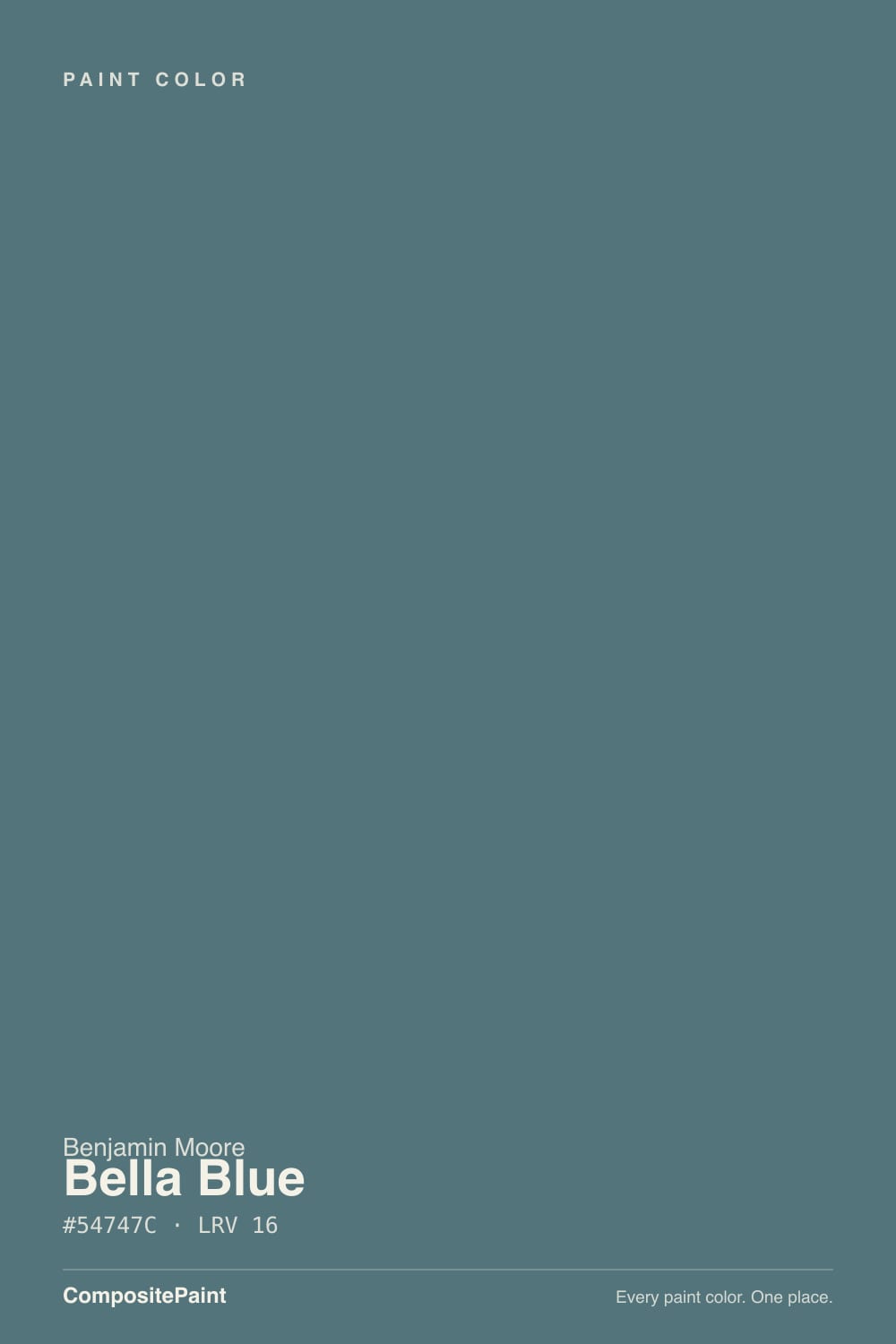
- 1Salamander6
- 2Newburg Green11
- 3Bella Blue16
- 4Adirondack Blue22
- 5Van Courtland Blue31
The Fast Verdict
Bella Blue is a deep, grayed-down blue-green that Benjamin Moore has carried under a plain three-digit number for years — no Color of the Year campaign, no viral design-blog moment, just a genuinely useful mid-depth teal-blue that shows up more on front doors and kitchen islands than it does online. At LRV 16 it reads as a real color commitment in any light, and it sits neatly between the pale spa-blues and the true black-navies without ever tipping into either.
Front doors and shutters · dens, studies, and powder rooms that want depth without going black · kitchen islands under a light perimeter · anyone who wants a moody blue-green that isn't navy and isn't turquoise
You want a true, crisp navy · your room stays dim all day with no lamp plan · your floors are honey oak with no wood or rug buffer · you want a color other people will recognize by name
- Genuinely deep blue-green that never tips into bright turquoise or navy-black
- Desaturated enough to survive next to warm wood better than a true teal would
- A classic, forgiving choice for front doors and shutters
- Small-room deep color that reads custom on a vanity or island
- Quiet and unfussy — no trend baggage, no risk of a dated "moment" color
- Goes flat, charcoal-gray in a dim room with no warm light
- Not a substitute for a true navy — buyers expecting Hale Navy-style blue-black are sometimes disappointed
- Complements, and fights, honey oak and orange-leaning wood
- Not a color people know by name — harder to preview via other people's photos
What Color Is Bella Blue, Really?
Bella Blue sits almost exactly on the line between blue and green — the hex works out to a hue right around 192°, the blue side of teal, with the saturation turned down to about a fifth of a true teal's intensity. That gray is the whole point: it is what keeps a blue-green this deep from reading like a novelty paint-chip color and lets it sit on a front door or a kitchen island without shouting for attention.
LRV 16 puts it in genuinely dark territory — deeper than the pale spa-blues (Palladian Blue sits at LRV 53) and the chameleon blue-grays (Beach Glass at LRV 41, Boothbay Gray at LRV 36), closer to the depth of a true navy like Van Deusen Blue (LRV 11) or Hale Navy (LRV 6). That depth is why walls, a door, or cabinetry in Bella Blue read as a real decision rather than a soft accent.
Undertone in one line: blue-leaning teal with the saturation dialed way down — never purple, never a clean navy-black. In low light it can look almost charcoal; that is the depth talking, not a different undertone underneath.
Where It Shines
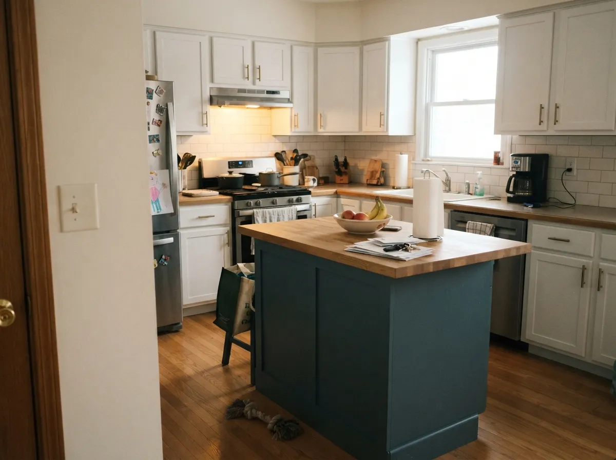
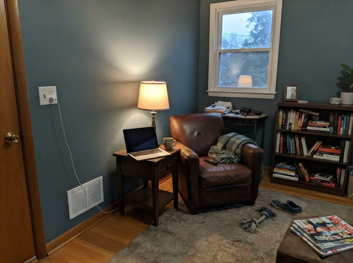
Give it a door, a den, or an island and real light — daylight or a warm lamp — and it holds a genuinely believable blue-green that neither a stark navy nor a pale spa-blue can match. It is at its best in contained doses: a front door against a light-colored house, cabinetry against a white perimeter, an accent wall behind dark wood furniture. In those settings the depth reads as intentional and the color never has to compete with a whole room's worth of light.
Where It Fails
Bella Blue does not collect many bad reviews, mostly because not many people are talking about it at all — but the complaints that do exist follow three predictable patterns, and none of them are the paint's fault.
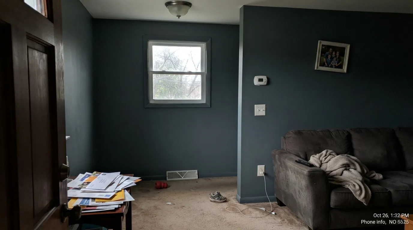
At LRV 16 it is already a genuinely dark color; take away daylight and warm lamps and it sinks toward a flat, characterless charcoal-gray with almost none of the blue-green left to see. Cool LEDs make it worse, not better. If the room stays dim all day, this needs a lamp plan before it needs a second coat.
The hue sits closer to teal than to blue-black — there is visible green in it next to a real navy like Hale Navy or SW Naval. Buyers who sample it hoping for crisp, nautical navy sometimes call it "muddy" or "off." It isn't off — it's teal. If pure blue-black is the goal, this is the wrong can.
Orange and blue-green sit opposite each other on the color wheel, so warm honey oak floors or orange-stained trim next to Bella Blue push each other in opposite directions — the wood reads more orange, the wall reads flatter and grayer. It survives contact better than a saturated teal would, since it's already desaturated, but a rug or a walnut piece still helps.
Room by Room
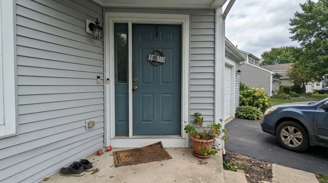
A single blue-teal door against a white or light-gray house is the classic use for a color exactly this depth: dark enough to read as a real color choice from the street, grayed-down enough that it never looks like a craft-store teal. Semi-gloss holds up to weather and fingerprints.
Under white or cream perimeter cabinets it carries all the color the kitchen needs without a full commitment. Satin cabinet enamel wipes clean; unlacquered brass or aged-brass pulls warm it up instead of leaning nautical.
Low daylight flatters it the same way it flatters any dark color — walnut shelves, leather, and one warm lamp turn it genuinely handsome. Eggshell holds up where a desk chair scuffs the wall.
Deep enough to feel calm rather than busy, but it needs 2700K bulbs in the mix or it goes flat by evening. Pair with a warm white trim (White Dove, not a stark cool white) and it reads restful, not cold.
Small rooms take a color this deep well, and a Bella Blue vanity under white walls is a weekend project that reads custom. Brass hardware and a marble or quartz top keep it from feeling like a beach-house theme.
Works best as one wall or a built-in, not four walls in a bright, high-traffic room. At this depth a whole living room needs real daylight and a genuine plan for lamps after dark, or it risks reading like a forgotten, dim color instead of a deliberate one.
Your Light Is the Risk
Real daylight or a 2700K bulb pulls the blue-green forward and the depth reads intentional, not muddy. This is the light it was built for.
Cool, low daylight strips the color out and leaves a flat charcoal-gray with almost none of the teal left. Test with the lamps on, not just at noon.
A touch bluer and cooler in the morning, a touch greener and warmer by late afternoon. The shift is gentle — most people don't notice unless they're looking for it.
2700K bulbs keep the blue-green alive after dark; cool white LEDs push it toward gray-black. Swap the bulbs before you second-guess the paint.
Most complaints about Bella Blue are a light mismatch. Upload a photo of your actual room and see it on your walls — then ask for the same wall in north light or evening lamps before you buy a single sample.
Need It From Another Brand?
Any paint counter can custom-tint Benjamin Moore 720 directly. If you would rather stay in one brand's own deck, these are the closest stock matches, measured as ΔE2000. Under 2 is a difference you will not see on the wall.
| Brand | Closest color | ΔE | LRV | |
|---|---|---|---|---|
| Sherwin-Williams | RiverwaySW 6222 · Sherwin-Williams | 3.6 | 16 | Color page → |
| Behr | Blue SageHDC-FL15-03 · Behr | 1.0 | 16 | Color page → |
| Valspar | Ol' Blue EyesV105-5 · Valspar | 2.4 | 14.7 | Color page → |
| PPG / Glidden | Vining IvyPPG1148-6 · PPG / Glidden | 3.7 | 15 | Color page → |
| Glidden | Totally Teal30BG 16/133 · Glidden | 0.9 | 16 | Color page → |
| Dutch Boy | Shadowed Blue428-6DB · Dutch Boy | 3.6 | 16 | Color page → |
Similar Benjamin Moore Colors
The nearest shades to Bella Blue within Benjamin Moore's own range, ranked by perceptual color distance — useful when you want the same look a touch lighter, darker, or warmer.
WCAG 2.1: AA is 4.5 : 1 for normal text, 3 : 1 for large text, AAA is 7 : 1.
Bella Blue vs the Colors You're Also Considering
Every Bella Blue sample board has the same rivals on it. The numbers show the real lightness gap — then it comes down to which risk you would rather live with.
Pick this for the bluer, cleaner slate-teal — Hidden Gem leans greener and can edge toward swampy in the wrong light.
Behr N430-6A · LRV 14Hidden GemPick this if you want more green in the mix and less blue — Behr's version of the same mood, at almost the same depth.
Pick this for the teal lean — Bella Blue carries visible green that Van Deusen Blue doesn't, and reads softer, less nautical.
Benjamin Moore HC-156 · LRV 11Van Deusen BluePick this for a truer navy with almost no green in it — one step darker and one step closer to black-blue.
Pick this for the commitment — Palladian Blue is a whisper of color, Bella Blue is a genuine statement.
Benjamin Moore HC-144 · LRV 53Palladian BluePick this for the same blue-green family at spa-light depth — walls that stay pale and airy instead of moody.
Pick this for consistency — Beach Glass drifts between blue, green and gray depending on the room; Bella Blue holds its slate-teal color.
Benjamin Moore 1564 · LRV 41Beach GlassPick this for a lighter, greener, more chameleon color that shifts with the light instead of holding steady.
Georgian Bay CC-782 shares the same LRV of 16 but its hex is #537284, which carries more blue and less green, so it reads closer to a dusty navy. Thousand Oceans 1645 at LRV 18 and hex #5E7480 is lighter and grayer, a safer pick for a room short on daylight. Schooner AF-520 at LRV 18 and hex #527687 is the brightest and most clearly blue of the neighbors.
Across brands, Glidden Totally Teal 30BG 16/133 at a deltaE of 0.9 and Behr Blue Sage HDC-FL15-03 at 1.03 are effectively the same color, with Blue Sage visually identical in normal room light. Valspar Ol' Blue Eyes V105-5 at 2.37 and Magnolia Home Blue Skies JG-85 at 2.77 are very close and worth sampling first.
Farther out, Farrow and Ball Sloe Blue No. 87 at 2.87 sits close, while Sherwin-Williams Riverway SW 6222 at 3.65 and PPG and Glidden Vining Ivy PPG1148-6 at 3.7 are close but visibly different side by side, Riverway grayer and Vining Ivy greener.
Bella Blue Coordinating Colors
The pairing rule for Bella Blue is simple: warm whites and warm neutrals soften it, cool whites and honey wood fight it. It sits comfortably next to true navies for tonal layering, and against a near-black it reads as color rather than competing with it. These are the partners that keep showing up in rooms that work:
Bella Blue on Exteriors
Outside is arguably where a color this depth earns its keep. On a front door it reads as a deliberate, grown-up alternative to the two exterior-blue extremes — brighter coastal blues that can look thin, and true navy that can look severe against a light house. Full sun brings out more blue than the color shows indoors, and it holds its color through the day rather than washing out.
Pair it with a white or light-gray body and either a warm neutral trim or a true near-black like Kendall Charcoal or Wrought Iron for the shutters. Avoid pairing it with a warm, honey-toned wood porch or door surround without a buffer — the orange-versus-blue-green clash that shows up indoors on floors shows up outside on stained wood too.
Bella Blue With Wood Tones and Metals
Walnut, espresso, and weathered gray wood are Bella Blue's best company — the darker or grayer the wood, the more the blue-green reads as sophisticated rather than nautical. White oak and driftwood-toned floors are safe too, especially in coastal or transitional rooms.
Honey oak and orange-stained trim are the one real friction point: blue-green and orange sit opposite each other on the wheel, so each pushes the other toward its extreme — the wood looks more orange, the wall looks flatter and grayer. It's not a hard no, but sample it against the actual floor first, or bridge the two with a rug and a piece of walnut furniture.
On hardware, unlacquered brass and aged brass are the classic match and keep the color from feeling cold; matte black and oil-rubbed bronze both work for a more grounded, less nautical look. Polished chrome and stainless steel are the only real miss — they push the whole pairing colder than the wall already is.
Three Ready Palettes Built on Bella Blue
A color is never alone on the wall. These are complete combinations in the 60-30-10 pattern, with the reason each one holds together. Every one opens in the visualizer.
A warm white body keeps the house light, the charcoal shutters ground it, and the blue-teal door supplies the one color note without turning the whole facade into a paint chip.
Try this palette in your roomTwo darks in one room sounds risky, but Wrought Iron reads nearly black while Bella Blue is clearly blue-green, so the pairing reads as intentional depth rather than competing statements. White Dove trim keeps the room from feeling like a cave.
Try this palette in your roomA crisp white perimeter lets the island carry all the color the kitchen needs; Edgecomb Gray's warm greige on an adjacent wall keeps the room from feeling cold next to the teal, and brass hardware reads expensive rather than nautical against either.
Try this palette in your roomBella Blue FAQ
Is Bella Blue more blue or more green?
More blue than green, but genuinely in between — the hue sits right around teal-blue. Next to a true navy like Hale Navy it looks visibly greener; next to a true spa-teal like Palladian Blue it looks visibly bluer and darker. That in-between quality is the whole appeal.
Is it too dark for a small room?
Not necessarily. Small rooms — powder rooms, vanities — often carry a color this deep better than a large open room does, because there's less wall for the eye to read as "dim" instead of "colored." Just plan for a warm light source; a small windowless room with no lamp will read the color as nearly black.
What trim goes with Bella Blue?
A warm white — White Dove is the safe default — keeps the contrast soft. A stark, cool white trim can make the blue-green look colder and grayer than it actually is.
Does it work for a front door?
Yes — it's a genuinely classic use for a color this depth. Semi-gloss holds up outdoors, and it reads well against a white, light-gray, or beige house. Full sun brightens it slightly and brings out more blue than it shows indoors.
Does it need warm lamps at night?
It benefits from them the way any deep color does. 2700K bulbs keep the teal alive after dark; cool LEDs flatten it toward gray. It's not unusable without warm bulbs, just less interesting.
Is Bella Blue a popular or well-known color?
Honestly, no — it doesn't have a Color of the Year moment or a big design-blog following the way Hale Navy or Palladian Blue does. That's not a knock on the paint; Benjamin Moore's plain-numbered colors are often older, quieter workhorses that never got a marketing push. It's a genuinely good blue-teal that's easy to overlook because nobody's talking about it.
Have you painted with Bella Blue?
Rate it — one tap helps the next reader decide.
Ask a Question