No More Drama
Behr's own quietly confident wine-red, reviewed honestly: the light where it reads true red, the light where it turns brown, and the rooms where it actually belongs.

Jessica has spec'd whites and neutrals for more than 300 rooms and keeps a sample wall of painted drawdowns in her studio. Every color review is checked against real reader rooms in the comments and re-tested when a formula changes. About the testing process →
- 1Redwood0
- 2Bewitched6
- 3No More Drama12
- 4Cinnamon Slate19
- 5Rejuvenate30
The Fast Verdict
No More Drama is Behr's own pick for a serious red — not the loud fire-engine kind, but a deep wine-crimson with a brown undertone that keeps it from feeling like a toy. In direct daylight it reads confidently red; drop the light and it slides toward a moody plum-brown. Behr backs it across doors, cabinets, and exterior lines, but almost nobody is talking about it online — you are testing largely on the brand's word, not a crowd of homeowner photos.
Front doors and shutters · kitchen islands and cabinets in doses · powder rooms and small accent walls · dining rooms with warm evening light and brass
You want a whole room painted this color · your only light is cool LED or flat north daylight · you want a true fire-engine red, not a wine · you need a color with an established crowd track record before you commit
- Genuine wine-red depth with a warm, believable brown undertone
- Reads confident and custom on a front door or kitchen island
- Pairs beautifully with brass and gold hardware
- Sold across interior, exterior, and cabinet-rated Behr lines for real durability options
- Small-dose use (door, island, one wall) is nearly foolproof
- Turns muddy, brownish or plum-like without real daylight or warm bulbs
- Too heavy and enclosing for a full room at LRV 8
- Reads more wine than true red — a mismatch if you pictured fire-engine or barn red
- Very little real-world homeowner documentation to check your expectations against
What Color Is No More Drama, Really?
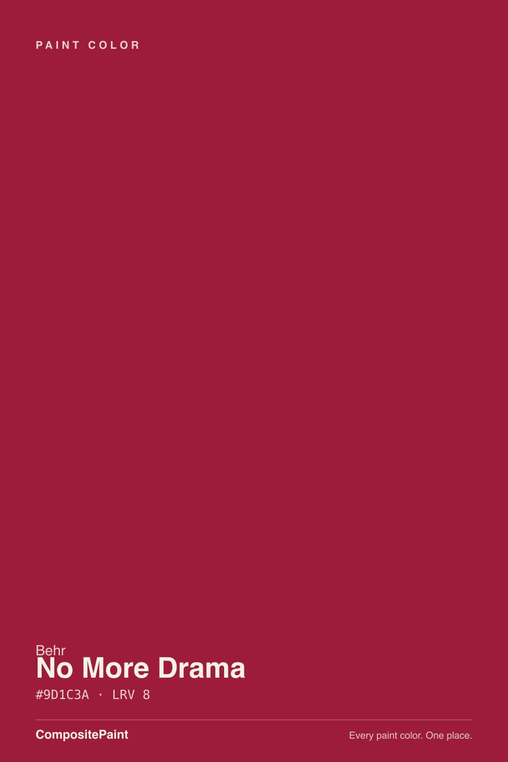
A deep red built on a warm base with an earthy brown undertone running underneath — the brown is what keeps it from reading candy-apple or cartoonish. Behr lists it among its own expertly picked reds rather than as a headline color, which tracks: it behaves like a considered, slightly restrained wine-red rather than a color designed to shout from a paint chip wall.
At LRV 8 it is genuinely dark — close to the depth of a near-black rather than a mid-tone red. That matters for two reasons: it needs real light to unlock any brightness at all, and it holds its color at a small dose (a door, an island, one wall) far better than it will across four walls of a room, where the depth can feel heavy rather than rich.
Undertone in one line: warm red first, earthy brown-wine second — never orange, never pink. If your sample looks brownish or almost plum, that is dim or artificial light doing exactly what this color does under those conditions, not a bad batch.
Where It Shines
Give it a door, an island, or one accent wall and real daylight or warm lamplight, and it earns the "drama" in its name without tipping theatrical. Brass and gold hardware are its best company — the warm metal picks up the same warmth in the undertone and the whole pairing reads deliberate rather than loud. At night, under a warm bulb, it settles into the kind of deep, confident red that photographs well and looks like a choice, not a compromise.
Where It Fails
The regret stories that are easy to predict for a color like this all trace back to one of three mismatches, and none of them are a defect in the paint — they are a mismatch between what the color actually is and what the buyer expected walking in.
At LRV 8, four walls of No More Drama is a heavy, enclosing room, not the confident accent it is on a single door or island. Behr sells it across cabinet, trim and exterior lines for a reason — it is built for a dose, not a backdrop. If you want the color on every wall, sample a full sheet first and live with it for a week before committing to the whole room.
Drop this color into a north-facing hallway under cool white LEDs and the red recedes; the brown-wine undertone takes over and it can look closer to a bruised plum than a red. It is not a flaw specific to this color — every deep warm red does this — but it is more pronounced here because the brown undertone is already doing real work. Warm 2700K bulbs and any daylight fix it; cool bulbs alone will not.
This is not a fire-engine or barn red. Its hex sits closer to a magenta-leaning wine than a true red-orange like Behr's own Red Pepper or Benjamin Moore's Caliente. If you are picturing a classic bright red front door, sample it next to a true red before you buy — the gap between the two is bigger on the wall than it looks on the chip.
Room by Room
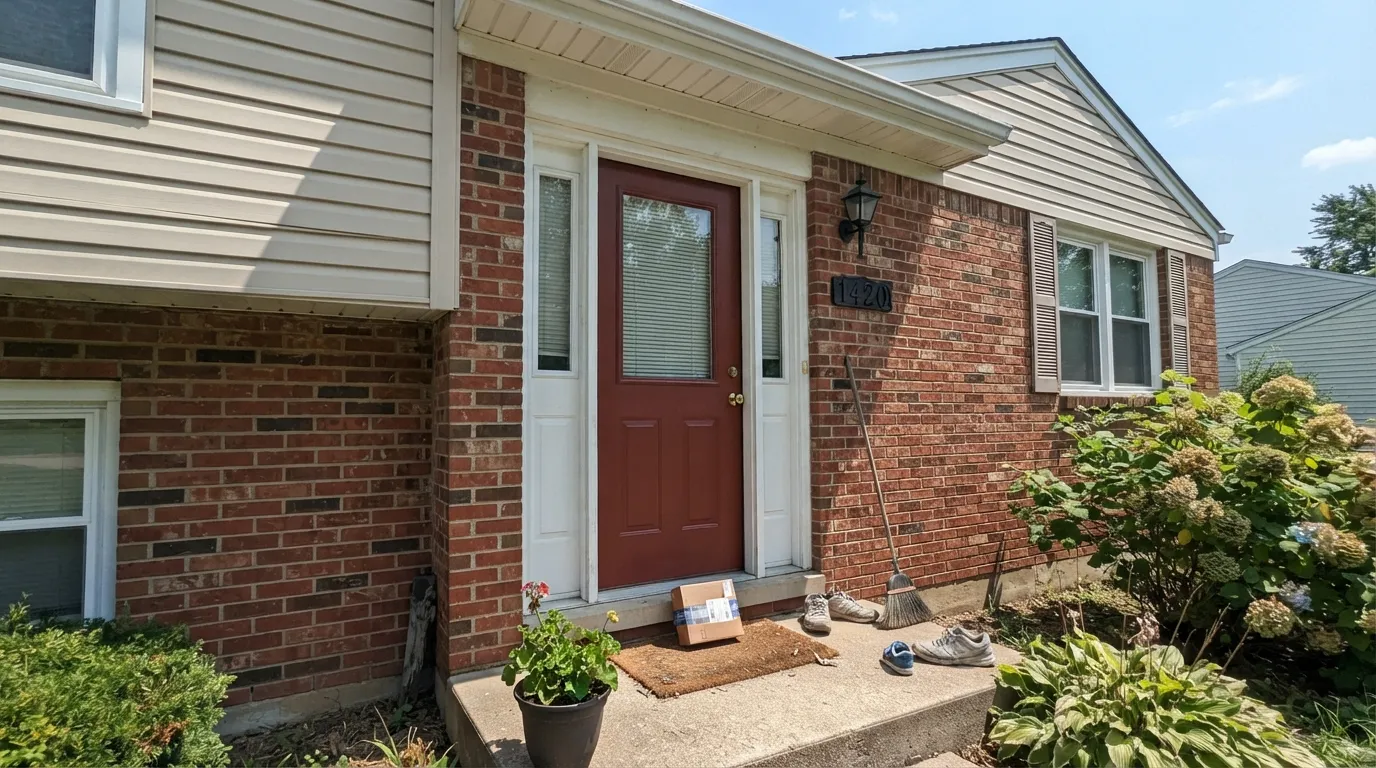
The single most reliable use for this color. In real exterior daylight it reads as a deliberate, grown-up statement red, and Behr sells it in exterior-rated Marquee flat as well as interior lines. Semi-gloss for durability and shine.
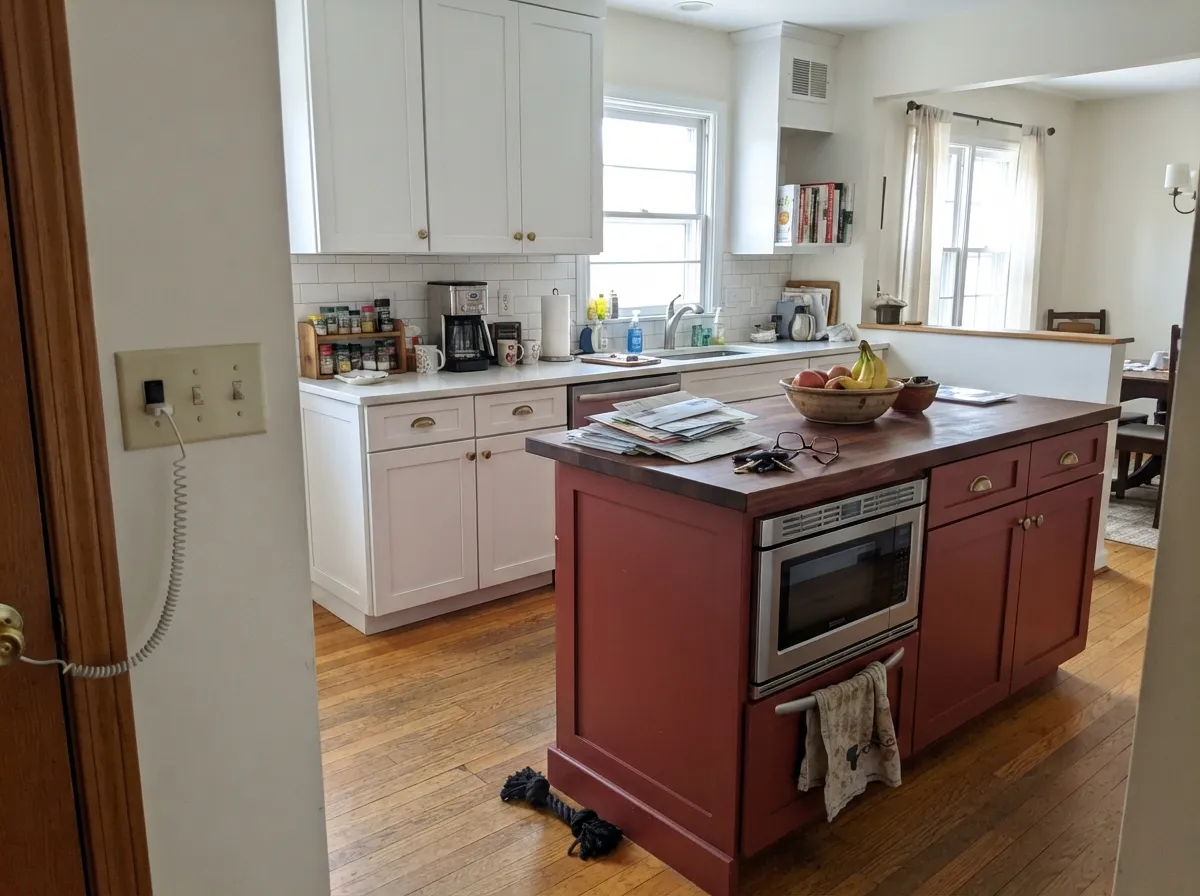
On an island under white or warm-white perimeter cabinets, with brass pulls, it reads custom and confident. A full kitchen of this color over honey-toned wood floors is a bigger, riskier commitment; keep the surrounding cabinetry lighter.
One wall, warm dimmable bulbs, brass or gold light fixtures: this is close to the ideal setting for the color. All four walls in a room that only gets north light is the version that disappoints.
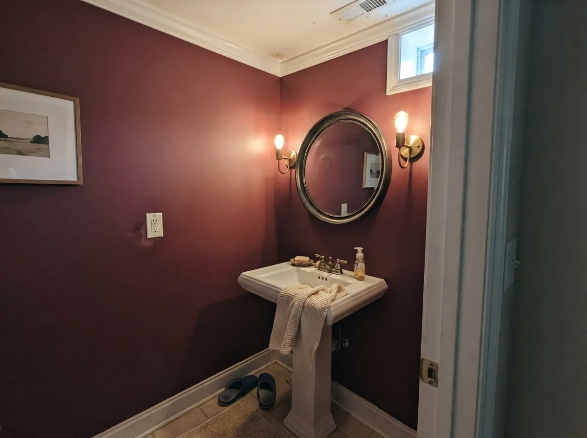
Small rooms take deep saturated color well because there is less wall to feel heavy. A powder room with white or cream trim and warm lighting lets it read jewel-box rather than cave.
As a single accent wall behind a sofa or fireplace it can work beautifully with walnut and brass. As the color for an entire open-plan living space it fights the room's natural light and reads heavier than intended.
Behr's exterior lines carry this color, and it works well in the same small-dose role outdoors as indoors: shutters, a door, trim details. Full siding in this color is an unusual and heavy choice most houses will not want to live with long-term.
Your Light Is the Risk
Full sun or bright indirect daylight is where the red comes forward and the brown undertone recedes — the color at its most confidently red.
Dim rooms and overcast north light let the earthy brown-wine undertone dominate; the color can read closer to plum or near-black than red.
Cooler morning light keeps it more wine and restrained; warm afternoon sun pushes it toward a fuller, brighter red for a few hours.
2700K warm bulbs keep the red alive after dark and flatter brass hardware. Cool white LEDs flatten it toward a dull brown-plum — swap bulbs before you second-guess the paint.
Most complaints about No More Drama are a light mismatch. Upload a photo of your actual room and see it on your walls — then ask for the same wall in north light or evening lamps before you buy a single sample.
Need It From Another Brand?
Any paint counter can custom-tint Behr P140-7 directly. If you would rather stay in one brand's own deck, these are the closest stock matches, measured as ΔE2000. Under 2 is a difference you will not see on the wall.
| Brand | Closest color | ΔE | LRV | |
|---|---|---|---|---|
| Sherwin-Williams | Antique RedSW 7587 · Sherwin-Williams | 1.4 | 12 | Color page → |
| Benjamin Moore | Currant Red1323 · Benjamin Moore | 1.3 | 12 | Color page → |
| Valspar | Red Ochre2011-4 · Valspar | 3.0 | 13.1 | Color page → |
| PPG / Glidden | GranadaPPG17-12 · PPG / Glidden | 0.3 | 12 | Color page → |
| Glidden | GranadaPPG17-12 · Glidden | 0.3 | 12 | Color page → |
| Dutch Boy | Rubyshire Red204-6DB · Dutch Boy | 3.9 | 13 | Color page → |
Similar Behr Colors
The nearest shades to No More Drama within Behr's own range, ranked by perceptual color distance — useful when you want the same look a touch lighter, darker, or warmer.
WCAG 2.1: AA is 4.5 : 1 for normal text, 3 : 1 for large text, AAA is 7 : 1.
No More Drama vs the Colors You're Also Considering
Every No More Drama sample board has the same rivals on it. The numbers show the real lightness gap — then it comes down to which risk you would rather live with.
Pick this for more wine depth and a color that turns richer, not brighter, after dark.
Benjamin Moore AF-290 · LRV 8CalientePick this if you want a true red-orange that commits to "red" in any light, without the wine lean.
Pick this for the deeper, more sophisticated wine version of the same front-door statement.
Sherwin-Williams SW 6866 · LRV 7HeartthrobPick this for a brighter, more universally "red" front door with less burgundy in it.
Pick this for more visible red in ordinary daylight; Dark Crimson needs stronger light to read as anything but near-black.
Behr M140-7 · LRV 5Dark CrimsonPick this if you want it darker and more purple-wine still — Dark Crimson reads near-black without strong direct light.
No More Drama Coordinating Colors
The rule for coordinating with No More Drama is simple: warm whites and creams for trim, one near-black for grounding, and brass or gold metal over chrome or nickel. Because the color already carries a brown undertone, it plays more easily with warm neutrals than with cool grays.
No More Drama's Own Story
Unlike a color like Caliente or Heartthrob, this one has no Color of the Year moment, no viral room, and almost no homeowner photo trail online. Behr keeps it in its own "expertly picked" red shortlist rather than pushing it as a headline color, and it shows up quietly across Behr's cabinet, interior, and exterior product lines rather than in marketing campaigns.
That is worth knowing going in: this is a color you are choosing largely on the brand's confidence and your own sample, not on a wall of other people's finished rooms. It is not a red risk in the color-theory sense — the undertone is well-behaved and predictable — it is a documentation risk. Sample generously and live with it in your actual light before committing to more than a door or an island.
No More Drama With Metals and Wood
Brass, unlacquered gold, and warm bronze hardware are this color's best company — the warmth in the metal matches the warmth in the undertone, and together they read expensive rather than themed. Polished chrome and cool nickel sit at the opposite temperature and can make the red look slightly flat by comparison.
For wood, walnut and other deep, cool-leaning browns let the red stay the star; very golden, orange-leaning honey oak competes with the brown undertone already in the paint and can pull the whole pairing muddy. Pale white oak or painted trim sidesteps the issue entirely.
Three Ready Palettes Built on No More Drama
A color is never alone on the wall. These are complete combinations in the 60-30-10 pattern, with the reason each one holds together. Every one opens in the visualizer.
A same-brand door-and-trim pairing keeps the color decision simple, and the black shutters ground the wine-red so it reads deliberate red from the street rather than pink or brown at a distance.
Try this palette in your roomA soft warm-white perimeter lets the island carry all the color; Iron Ore on the pantry door gives one more dark note so the wine-red island doesn't stand alone as the only saturated color in the room. Brass pulls tie all three together.
Try this palette in your roomA small room takes the deep wine-red well; White Dove trim keeps the space from feeling like a cave, and one near-black frame note stops the scheme from reading like a single flat block of color.
Try this palette in your roomNo More Drama FAQ
Is No More Drama a true red or more of a wine/burgundy?
Closer to wine. The base is a warm red, but the earthy brown undertone pulls it toward burgundy rather than a bright fire-engine or barn red. If you want a true red, compare it side by side with Benjamin Moore Caliente or Behr's own Red Pepper before you decide.
Is it good for a front door?
Yes — this is its strongest, most predictable use. Behr sells it in exterior-rated lines as well as interior, and in real daylight it reads as a deliberate, grown-up statement color rather than something loud.
What trim white goes with it?
A warm white like Benjamin Moore White Dove keeps the pairing soft; a brighter white like Behr Polar Bear gives more contrast and crispness on an exterior door-and-trim combo. Either avoids the muddy look a dingy off-white can create against a saturated color.
Can I use it on kitchen cabinets or an island?
Yes, and it is one of its best interior jobs — but in doses. An island or a run of cabinets under a lighter perimeter reads custom and intentional; a full kitchen in this color over golden wood floors is a much bigger, riskier commitment.
How many coats does it need?
Behr rates one-coat hide when it is tinted into its Dynasty or Marquee interior lines; for most other lines and a typical DIY job, plan on a tinted gray primer first and two finish coats — standard practice for any saturated dark color.
Does it look different at night than during the day?
Yes, more than most colors. Direct daylight or warm 2700K bulbs keep the red forward; dim rooms or cool white LEDs let the brown undertone take over and the color can slide toward a dull plum. Bulb choice matters as much as wall placement here.
Have you painted with No More Drama?
Rate it — one tap helps the next reader decide.
Ask a Question