Dark Crimson
Behr's brick-crimson reviewed honestly: the doors, islands and small rooms where it glows, the whole walls where it goes muddy, and what to pair it with.

Jessica has spec'd whites and neutrals for more than 300 rooms and keeps a sample wall of painted drawdowns in her studio. Every color review is checked against real reader rooms in the comments and re-tested when a formula changes. About the testing process →
- 1Rookwood Dark Red3
- 2Dark Crimson9
- 3Cinnamon Slate19
- 4Rejuvenate30
The Fast Verdict
Dark Crimson is a genuine brick-red with a brown foundation under it — not a candy red, not a wine-purple, just a deep, grounded crimson that reads like aged brick more than like a fire engine. At LRV 9 it sits close to the near-black end of the deck, which is exactly why it works so well in small doses: a front door, a kitchen island, a lamplit dining room. Ask it to cover four walls of a bright, ordinary room and it stops being crimson and starts being a very dark brown box.
Front doors and entryways · shutters · kitchen islands and cabinetry · a small dining room or powder room under warm lamplight
You want a true bright fire-engine red · your room runs on cool LEDs with little daylight · you're painting more than one wall · you're not willing to prime before you paint
- A genuine brick-crimson, not another purple-leaning wine red
- Reads confident and grounded instead of loud, even at full saturation
- One of Behr's most dependable front-door and exterior reds
- Flatters walnut, aged brass, and dark bronze hardware
- Small rooms and cabinets look custom, not trend-chasing
- Needs a tinted primer or expect three to four coats over white
- Cool LEDs and dim rooms drain it to flat, muddy brown-black
- Too dark and saturated for more than one wall in most rooms
- Reads nearly black in photos and from across a room
What Color Is Dark Crimson, Really?
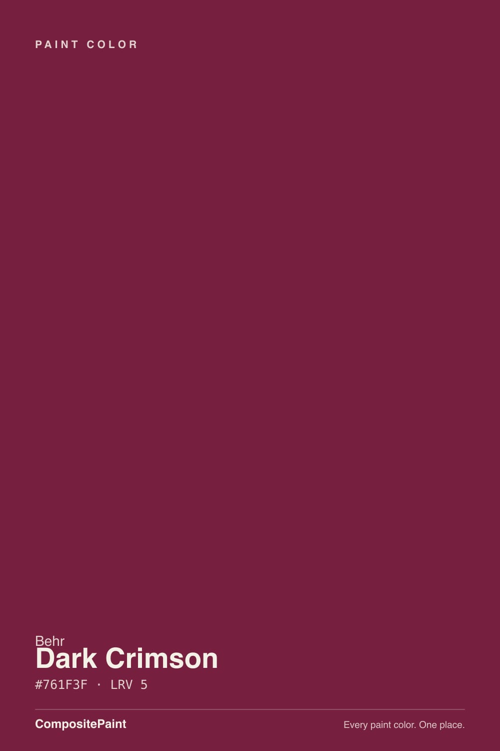
A deep brick-crimson with brown and burgundy sitting underneath it, not a straight red and not a purple-leaning wine. The brown is what keeps it from reading candy-red or Christmas-red — it grounds the color, the way old brick or aged leather is red without ever being bright. Behr markets it for doors, cabinets, shutters and trim, and that framing is honest: this is a color built to do a focused job, not to carry an entire room.
At LRV 9 it is genuinely dark — closer on the reflectance scale to a near-black than to a mid-tone red. That depth is the whole personality. In direct light it announces itself as red, unmistakably. Step back, dim the light, or view it from across a room, and it reads almost black-brown until something — sun through a window, a warm bulb, a camera flash — catches it and pulls the red back out. That flicker between near-black and crimson is what people either love or find frustrating, depending on whether they expected it.
Undertone in one line: brick first, brown second — never purple, never true wine. If your sample looks flat blackish-brown, that is ordinary room light doing its job, not a bad batch; give it a direct light source before judging it.
Where It Shines
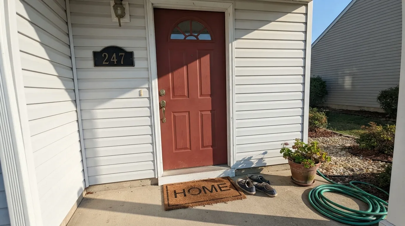
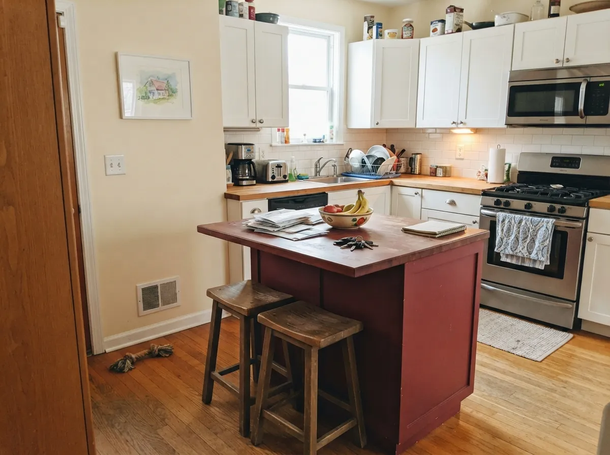
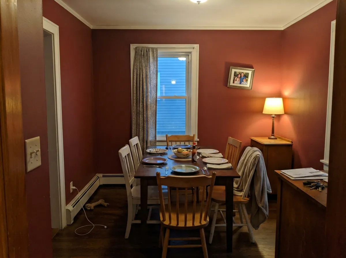
Give it a door, a cabinet, or a small room with a warm lamp nearby and it is one of the best deep reds in the Behr lineup. On an entry door with white or cream siding it reads confident and expensive rather than loud. On a kitchen island under white perimeter cabinets it is the kind of small, bold decision that photographs like a design choice, not an accident. In a dining room or powder room that gets evening lamplight, it turns the whole space intimate — closer to a wine bar than a kids' playroom.
Where It Fails
Almost every disappointed review of Dark Crimson comes from one of three situations, and all three are predictable before the first coat goes on. None of them are the paint's fault — but if your plan matches one, this is not the color for it.
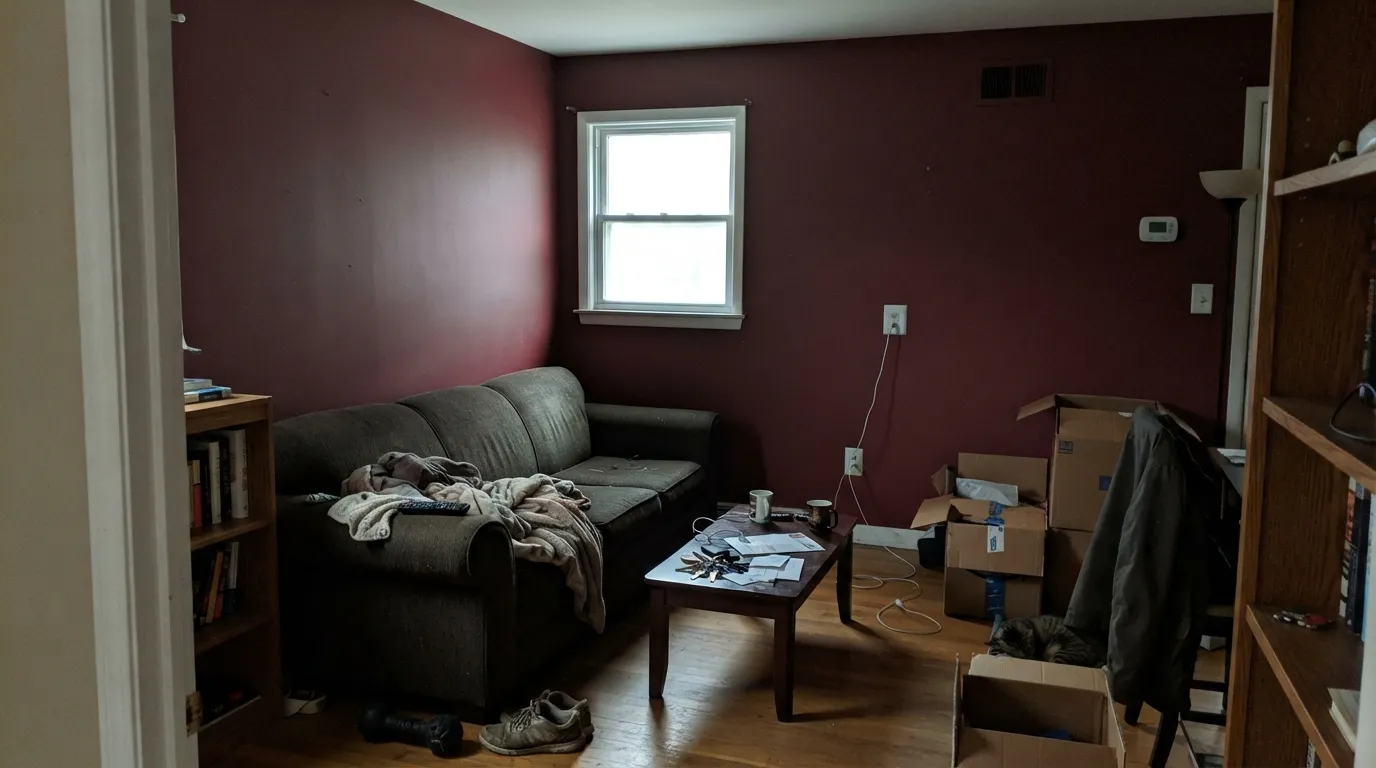
At LRV 9, four walls of Dark Crimson in a room with normal daylight stop reading as "rich red" and start reading as a dark, closed-in brown box — the exact opposite of the cozy library look people picture. It was built for a door, a cabinet, or one accent wall, not a whole-room commitment. If you love the color and want more of it, use it as a single feature and keep the rest of the room light.
Cool white LEDs and dim north daylight strip the red out and leave the brown and near-black underneath fully exposed. That is where the "my red door looks brown" and "it just looks black" complaints come from. Warm 2700K bulbs are not optional for this color after dark — they are part of the paint job.
Deep saturated reds are famous for poor coverage over anything light, and Dark Crimson is no exception — painters report three to four coats going straight over a white door before it stops looking streaky and pink-ish at the edges. A gray-tinted primer, or a red-base primer if your store stocks one, cuts that down to two finish coats.
Room by Room
This is the job Dark Crimson was built for. Full sun reads it as true brick-crimson; shade pulls it toward near-black, and both look intentional. Semi-gloss exterior enamel, and prime over any lighter existing door color first.
One island, one pantry door, or a hutch in Dark Crimson under white or cream perimeter cabinets is a confident, controlled statement. A whole kitchen of it is a much bigger bet and rarely the right one — satin cabinet enamel either way.
A single accent wall or a small, closed dining room lit by warm sconces and a chandelier is where this color earns "cozy" instead of "cave." Skip it if the room is open to a bright kitchen with cool overheads.
Small windowless rooms take deep saturated color well, and Dark Crimson on all four walls of a powder room reads custom rather than heavy, especially with brass fixtures and a warm sconce doing the lighting.
One wall behind a leather chair or a fireplace, with everything else light, works. All four walls in a room people actually spend daylight hours in is the most common regret with this color.
This is a focused color by design. Spread across every room it reads heavy and dated fast; save it for the one or two places where depth is the point.
Your Light Is the Risk
Full sun on an exterior door or a south-facing wall is where it earns the name — unmistakably crimson, brick-deep, not muddy.
Cool light with no direct sun strips the red and leaves a flat blackish-brown. If the room stays dim all day, this color will too.
Bright, clearly red at the sun hours; settles into a quiet near-black brown the rest of the day. Expect the shift, not a single fixed color.
Warm 2700K bulbs bring the crimson back after dark and give it a wine-bar glow. Cool white LEDs flatten it to plain dark brown.
Most complaints about Dark Crimson are a light mismatch. Upload a photo of your actual room and see it on your walls — then ask for the same wall in north light or evening lamps before you buy a single sample.
Need It From Another Brand?
Any paint counter can custom-tint Behr M140-7 directly. If you would rather stay in one brand's own deck, these are the closest stock matches, measured as ΔE2000. Under 2 is a difference you will not see on the wall.
| Brand | Closest color | ΔE | LRV | |
|---|---|---|---|---|
| Sherwin-Williams | Luxurious RedSW 6314 · Sherwin-Williams | 1.1 | 9 | Color page → |
| Benjamin Moore | Pottery Red2085-20 · Benjamin Moore | 0.9 | 9 | Color page → |
| Valspar | Rushing RedV042-6 · Valspar | 2.8 | 7.2 | Color page → |
| PPG / Glidden | Ruby LipsPPG1052-7 · PPG / Glidden | 1.8 | 8 | Color page → |
| Glidden | Oriental Berry96RR 08/311 · Glidden | 0.3 | 8 | Color page → |
| Dutch Boy | Mulberry Tree202-7DB · Dutch Boy | 1.2 | 8 | Color page → |
Similar Behr Colors
The nearest shades to Dark Crimson within Behr's own range, ranked by perceptual color distance — useful when you want the same look a touch lighter, darker, or warmer.
WCAG 2.1: AA is 4.5 : 1 for normal text, 3 : 1 for large text, AAA is 7 : 1.
Dark Crimson vs the Colors You're Also Considering
Every Dark Crimson sample board has the same rivals on it. The numbers show the real lightness gap — then it comes down to which risk you would rather live with.
Pick this for the deeper, closer-to-black version of the same brick-crimson mood.
Benjamin Moore 2092-30 · LRV 12Boston BrickPick this if you want the same brick-red idea from Benjamin Moore's deck, a shade lighter and easier to read as red at a glance.
Pick this when you want the red to still read as red, not just a dark brown.
Behr PPU2-02 · LRV 8Red PepperPick this if you're already committed to Behr and want an even browner, quieter door red.
Red Red Wine S-H-130 shares LRV 5 and sits at hex #74203B against Dark Crimson's #761F3F, a difference small enough that no one would call them apart on a door. Antique Ruby S-H-120 at LRV 5 with hex #791A46 carries more purple, which shows under warm light. Luscious S-G-130 at LRV 5 goes further the same way.
Going the other direction, Cherry Cobbler S-G-140 at LRV 6 with hex #7F1A39 is a cleaner, slightly brighter red with less magenta, and it is the choice if you want the color to read red rather than wine. Red Brick S-H-170 at LRV 6 with hex #742838 trades the magenta for brown and reads earthier and more muted.
Across brands, Sherwin-Williams Elderberry SW 2902 at LRV 6 and hex #7C243D is the one recorded equivalent, at deltaE 2.76. That is very close, but sample first, since Elderberry is marginally lighter and slightly less magenta.
Dark Crimson Coordinating Colors
The rule for coordinating with Dark Crimson is simple: let it be the one bold move, and keep everything around it either a warm white or a true near-black. It pairs cleanly with cream and off-white siding or walls, loves black and charcoal hardware, and sits well next to a lighter tonal brick-red when you want two related notes instead of one. These are the partners that keep showing up in rooms that work:
Dark Crimson on Exterior Doors and Trim
This is where Dark Crimson does its most reliable work. Full sun on a front door reads as true, confident brick-crimson rather than the near-black it can slip into indoors, and the shaded side of the same door will read a full step darker — walk around with a sample before committing if your entry gets mixed sun through the day.
Coverage is the practical issue to plan for, not the color itself: over a lighter existing door color, expect to prime first with a gray-tinted or red-base primer, then two finish coats of exterior satin or semi-gloss enamel. Skipping the primer is the single most common regret in owner reports — three or four coats and a still-uneven, slightly pink-at-the-edges finish.
Dark Crimson With Wood Tones and Metals
Walnut, aged leather, and dark stained wood are the natural company for this color — the brown foundation in the paint meets the brown in the wood, and the whole pairing reads warm and deliberate rather than clashing. Honey oak is less of a fight than it is with cooler reds, since Dark Crimson already leans brown, but it still works best as a small accent rather than a full room next to a lot of golden wood.
Metals are the easy decision: aged or unlacquered brass, oil-rubbed bronze, and matte black hardware all sit comfortably against it. Polished chrome or nickel is the one finish that reads slightly cold and clinical next to this particular red.
Three Ready Palettes Built on Dark Crimson
A color is never alone on the wall. These are complete combinations in the 60-30-10 pattern, with the reason each one holds together. Every one opens in the visualizer.
A neutral white body lets the door carry all the color; charcoal shutters add contrast without competing for attention. This is the combination Dark Crimson was built to headline.
Try this palette in your roomOne bold island against warm cream walls and crisp white perimeter cabinets keeps the crimson looking like a deliberate design choice instead of an accident that took over the room.
Try this palette in your roomA small, closed dining room takes deep color well. The white trim keeps the room from feeling like a cave, the near-black sideboard grounds the scheme, and the whole effect depends on warm lamps doing their job after dark.
Try this palette in your roomDark Crimson FAQ
Is Dark Crimson a true red or more of a brown?
Both, depending on the light. It is built on a brown-burgundy foundation, so in dim or cool light it reads as a dark brown near-black; in direct sun or under a warm lamp, the red comes forward and it reads as a genuine brick-crimson. It is never a bright, candy true-red.
Is it a good front door color?
Yes — this is the job it does best. Behr sells it specifically for doors, cabinets, shutters and trim, and full sun on an exterior door shows off the crimson without the muddiness a dim interior room can bring out.
How many coats does it take?
Plan on more than a standard color. Deep saturated reds are notorious for weak coverage, and painters commonly need three to four coats over a light existing color without a tinted primer. Use a gray-tinted or red-base primer first and you can usually finish in two coats.
Can I use it on kitchen cabinets?
Yes, especially as a single island, pantry door, or hutch rather than the whole kitchen. Pair it with white or cream perimeter cabinets so the color reads as a deliberate accent. Use a satin urethane-fortified cabinet enamel.
Will it look black in low light?
Close to it. At LRV 9 this color sits near the deck's near-black colors, and in a dim room with cool bulbs it will read as a flat dark brown-black rather than red. That is expected behavior, not a bad can of paint — give it direct light or warm 2700K bulbs to bring the red back.
What trim or siding color goes with Dark Crimson?
Behr's own pairing is a warm white — Behr White or Ultra Pure White — for trim and siding, which lets the crimson carry all the color on a door or accent. A near-black like Iron Ore works well as a shutter color for extra contrast.
Have you painted with Dark Crimson?
Rate it — one tap helps the next reader decide.
Ask a Question