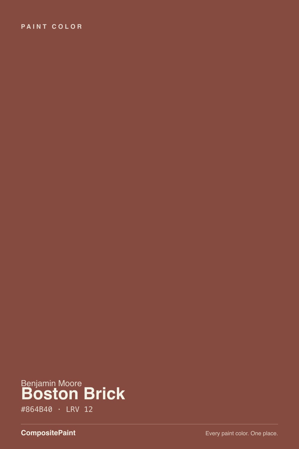
Boston Brick
Benjamin Moore's classic front-door brick red, reviewed honestly: the light where it glows, the real-brick mismatch nobody warns you about, and what to pick instead.

Jessica has spec'd whites and neutrals for more than 300 rooms and keeps a sample wall of painted drawdowns in her studio. Every color review is checked against real reader rooms in the comments and re-tested when a formula changes. About the testing process →
- 1Mahogany0
- 2Turkish Coffee5
- 3Boston Brick12
- 4Cavern Clay20
- 5Redend Point30
The Fast Verdict
Boston Brick is Benjamin Moore's answer to "paint my door the color of old brick" — a deep, saturated red built on a warm, brown-leaning base that refuses to go purple or icy the way thinner reds do. It has sat on BM's own bestseller lists for years without a single Color of the Year push, because its job has always been narrow: the front door, the shutters, a library or dining room that wants real depth. Buy it for that job and it delivers. Buy it hoping it will vanish into your actual brick, and you may be surprised.
Front doors and shutters on cream or white houses · dining rooms and libraries that want real depth · kitchen islands with brass and warm wood · anyone restoring a historic New England exterior
You want it to color-match your actual brick exactly · you want a true fire-engine or cherry red · the room is small, north-facing, and lamp-free · you're skipping the gray-tinted primer
- A genuinely saturated brick red with a warm, brown-based undertone that never flashes purple or cold
- The classic, dependable front-door color for cream and white historic houses
- Turns rich and glowing under real daylight and warm lamp light
- Dark enough (LRV 12) to hold its saturation in strong sun without washing out
- A safe, easy partner for warm wood, brass, and cream trim
- Buyers expect it to vanish into their real brick — it rarely matches actual masonry exactly
- Needs a gray-tinted primer and two full coats, or coverage goes patchy
- Goes flat and muddy-brown in a dim, north-facing room with no lamps
- Four walls of a small, dark room can read heavy rather than rich
What Color Is Boston Brick, Really?
Boston Brick is a decades-old Benjamin Moore color that has quietly outlasted most of the trend reds that came after it, and it did that by staying in its lane: it is one of the brand's most-bought reds specifically for front doors, shutters, and historic exteriors, not a color anyone reaches for as a whole-house wall paint. The name promises the color of aged brick, and it delivers an idealized, uniform version of it — smoother, more saturated, and more consistent than any real brick wall ever is.
The undertone is what makes it work as hard as it does: a deeply saturated red built on a warm, brown-leaning base rather than a cool or pink one, which is why it resists the icy, purplish flash that trips up thinner reds in weak light. At LRV 12 it is a genuinely dark, near-full-strength color — even a single door reads richly saturated in daylight — and because there is no cool base underneath to go muddy-purple, it holds its character in more lighting situations than most saturated reds manage. Coverage is the real catch: a white primer fights this depth and leaves patchy, uneven color, so a gray-tinted primer and at least two full topcoats are not optional.
Undertone in one line: warm red with a brown backbone — never a cool cherry, never pink. If it looks orange on your door, that is strong afternoon sun; if it looks almost black-brown at dusk, that is low light doing exactly what a dark, saturated color does, not a defect in the paint.
Where It Shines
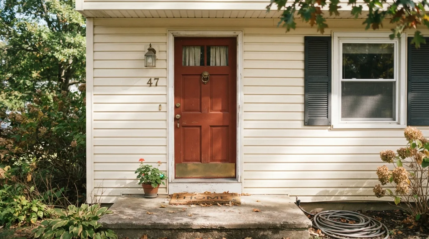
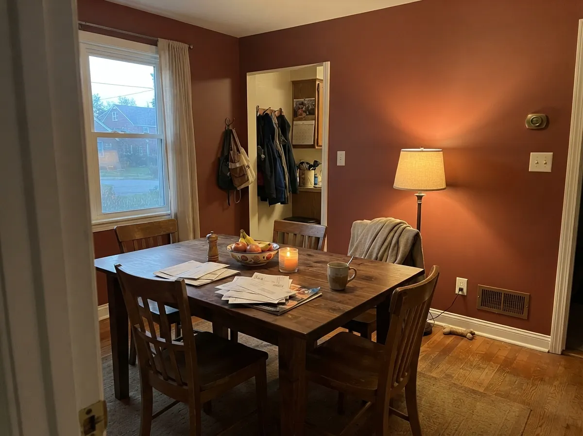
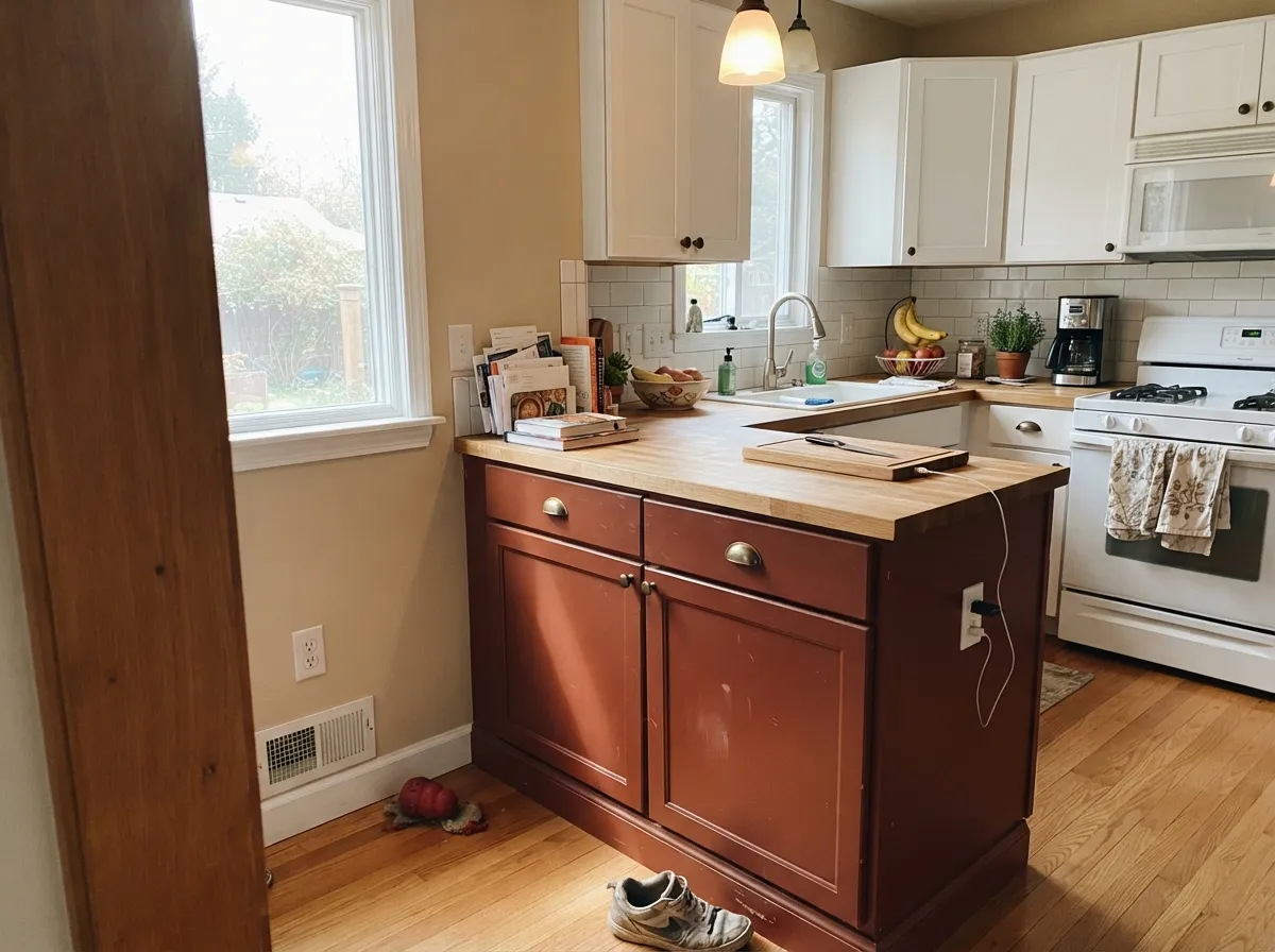
This color earns its keep in small, deliberate doses. On a front door against cream or white siding it is the classic New England statement — brass hardware and a black lantern finish the look. Indoors it is built for rooms that want real depth: a dining room or library drenched wall-to-wall reads rich and architectural rather than loud, and on a kitchen island under white perimeter cabinets it behaves like a piece of furniture, not a wall color. Give it warm wood, brass, and either real daylight or committed lamp light, and it looks expensive rather than heavy.
Where It Fails
Almost every disappointed story about Boston Brick comes from one of three mismatched expectations, and all three are predictable before the first coat goes on. None of them are the paint failing — they are the paint being asked to do a job it was never built for.
Boston Brick is an idealized, uniform brick-red, not a color-match tool. Real masonry runs from salmon-pink to burnt-orange to deep brown depending on the clay and the kiln, so a door or trim painted Boston Brick next to your actual brick will often read noticeably smoother and browner than the wall beside it. Sample a large card directly against your own brick before committing — do not trust the chip alone.
Without a cool base to fall back on, Boston Brick still needs light to read as red rather than as flat, muddy brown. In a dim north room with no warm lamps, readers describe it going heavy and cave-like rather than rich. Test a large sample in the actual room before drenching all four walls.
A standard white primer fights this depth and shows through as patchy, uneven color even after a second coat. Use a gray-tinted primer and plan on two full topcoats — treating it like a light color you can cover in one coat is the most common regret with this paint.
Room by Room
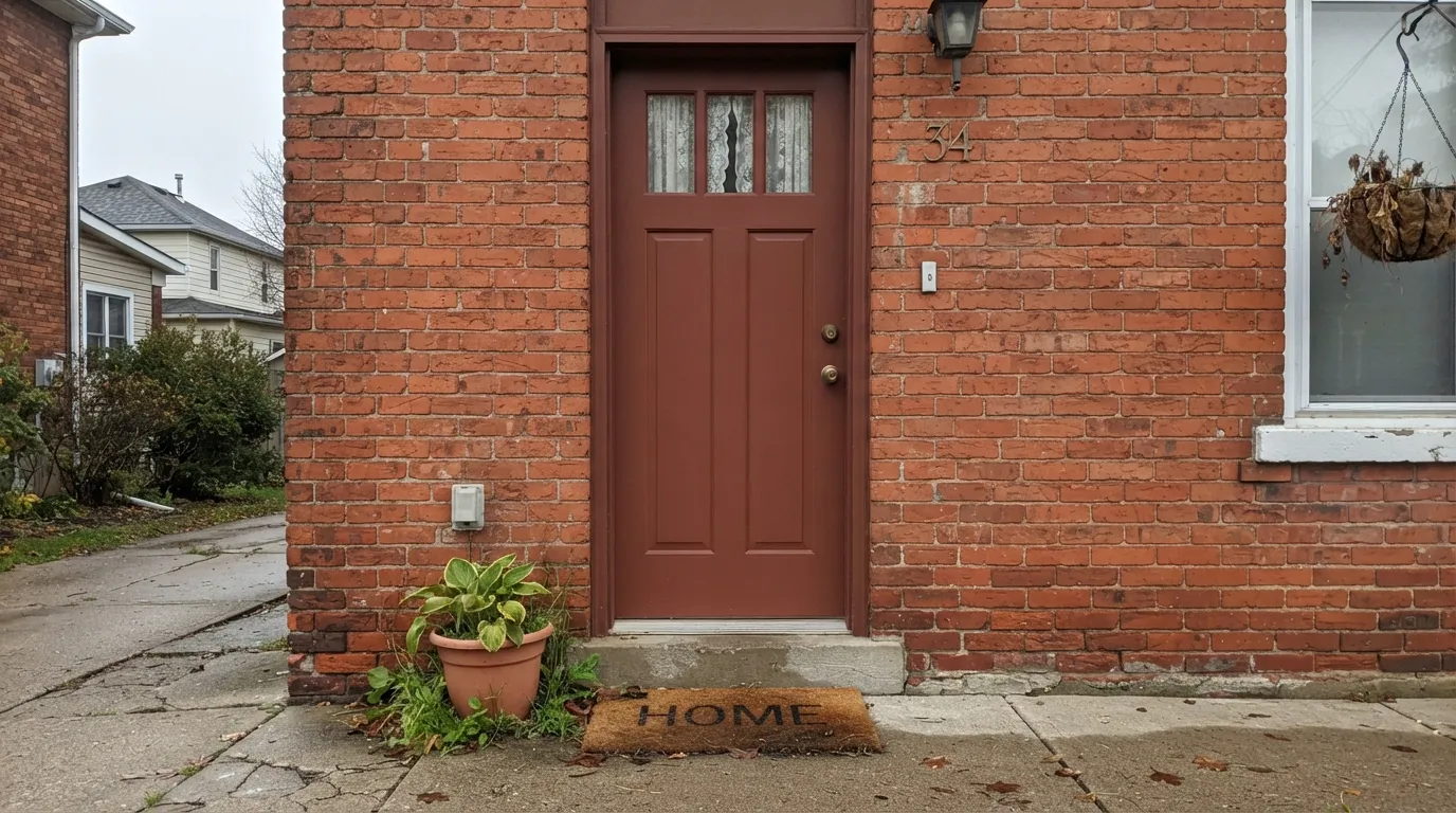
On cream, white, or pale-gray siding this is Boston Brick's best-known role, and the one it was really built for. Semi-gloss, brass hardware, a black or bronze lantern nearby — it reads heritage, not trend.
Works beautifully as shutters or trim against a light-colored house. Against your own existing red brick, sample first — the two reds rarely match exactly, and the intent should be a deliberate contrast, not a seamless blend.
Drenched on walls with white or cream trim and a walnut table, it is genuinely one of the deck's best dining-room colors. Eggshell for durability, warm bulbs after dark.
Low, warm light flatters it the same way it flatters a den. Leather, walnut shelving, and brass reading-lamp light are its natural company; it turns a small room into a deliberately cozy one rather than a dark one.
Semi-gloss on an island under white perimeter cabinets is a classic, controlled way to use this color; brass hardware and warm wood open shelving finish it well. A full kitchen of Boston Brick cabinets is a much bigger bet, and needs real daylight to avoid feeling heavy.
One wall behind a sofa or a fireplace surround can carry it well in a room with good daylight. Four walls in a smaller, dimmer living room is where the "too heavy" complaints come from — test big before committing to the whole room.
Your Light Is the Risk
The brick warmth glows richly and the undertone reads clearly red-brown, never muddy. The light this color was built for.
Without warmth to work with, it goes flat and heavy — closer to dried brown than brick. Add warm lamps or reconsider a smaller dose.
Its brown-leaning base resists the icy, purplish flash that trips up cooler reds in the morning — it reads as grounded, historic brick rather than anything berry or cold.
2700K bulbs deepen it toward firelight — the richest version of the color. Cool white LEDs flatten it toward plain brown; swap the bulbs before you second-guess the paint.
Most complaints about Boston Brick are a light mismatch. Upload a photo of your actual room and see it on your walls — then ask for the same wall in north light or evening lamps before you buy a single sample.
Need It From Another Brand?
Any paint counter can custom-tint Benjamin Moore 2092-30 directly. If you would rather stay in one brand's own deck, these are the closest stock matches, measured as ΔE2000. Under 2 is a difference you will not see on the wall.
| Brand | Closest color | ΔE | LRV | |
|---|---|---|---|---|
| Sherwin-Williams | Flower PotSW 6334 · Sherwin-Williams | 3.4 | 10 | Color page → |
| Behr | Spiced RedQE-14 · Behr | 0.6 | 10 | Color page → |
| Valspar | WatusiM152 · Valspar | 2.1 | 9.8 | Color page → |
| PPG / Glidden | Red ClayPPG16-32 · PPG / Glidden | 1.5 | 10 | Color page → |
| Glidden | Red ClayPPG16-32 · Glidden | 1.4 | 10 | Color page → |
| Dutch Boy | Red Mesa408-6DB · Dutch Boy | 5.0 | 11 | Color page → |
Similar Benjamin Moore Colors
The nearest shades to Boston Brick within Benjamin Moore's own range, ranked by perceptual color distance — useful when you want the same look a touch lighter, darker, or warmer.
WCAG 2.1: AA is 4.5 : 1 for normal text, 3 : 1 for large text, AAA is 7 : 1.
Boston Brick vs the Colors You're Also Considering
Every Boston Brick sample board has the same rivals on it. The numbers show the real lightness gap — then it comes down to which risk you would rather live with.
Pick this for unmistakable brick-red saturation, not a muted mauve.
Benjamin Moore 2113-40 · LRV 19Cinnamon SlatePick this for a lighter, dustier red-brown with a mauve edge — 2025's Color of the Year, softer than a true brick.
Pick this for the deeper, browner brick that holds its color even in weaker light.
Sherwin-Williams SW 7701 · LRV 24Cavern ClayPick this for a lighter, more orange terracotta that needs real sun to glow.
Boston Brick Coordinating Colors
The rule for coordinating with Boston Brick is simple: warm creams, near-blacks, and one confident cool note. It sits happily next to warm whites and charcoal trim, and a single deep navy or forest green nearby keeps an all-brick-red scheme from feeling one-note. These are the partners that keep showing up in rooms and exteriors that work:
Boston Brick's Own Story: A Front-Door Classic
Boston Brick has stayed on Benjamin Moore's own bestseller lists for years without ever chasing a Color of the Year moment. Its job has always been narrow and specific: the front door and shutters on a cream, white, or pale-gray New England house, where a saturated brick-red reads as heritage rather than trend. That narrow lane is also why it has lasted — it was never asked to be a whole-house color, so it never had to compromise to become one.
The name promises more than the paint delivers on real masonry. Boston Brick is an idealized, uniform version of aged brick — smooth, saturated, and consistent in a way no actual brick wall ever is. Buyers who expect it to vanish seamlessly into their home's real brick are usually surprised; buyers who use it as a deliberate accent against brick, or against a painted cream or white exterior, get exactly what the name promises.
Boston Brick With Wood Tones and Floors
Warm wood is this color's best company. Walnut, cherry, and warm oak floors or furniture sit comfortably next to Boston Brick because both live on the same warm side of the color wheel — nothing fights.
Brass and aged bronze hardware read as intentional and expensive against it; polished chrome and cool stainless are the one metal finish that argues with the warmth. Gray-washed or cool-toned floors are the other pairing to sample carefully — they can make the red look slightly more brown and less alive than it does over warm wood.
Three Ready Palettes Built on Boston Brick
A color is never alone on the wall. These are complete combinations in the 60-30-10 pattern, with the reason each one holds together. Every one opens in the visualizer.
Cream siding lets the door read as the one saturated note on the elevation; near-black shutters add a second dark accent so the brick door doesn't stand alone as the only deep color on the house.
Try this palette in your roomWarm white trim keeps a fully drenched brick-red room from reading like a cave; navy built-ins add one cool, deep note so the room doesn't run entirely warm.
Try this palette in your roomPale Oak keeps the walls quiet and warm so the island carries all the color; white perimeter cabinets with brass hardware are the classic frame for a red-brown island.
Try this palette in your roomBoston Brick FAQ
Is Boston Brick warm or cool?
Warm, unmistakably. It's built on a brown-leaning base rather than a cool or pink one, which is why it resists the icy, purplish flash that trips up thinner reds in weak light — it reads as grounded brick in almost any light, not a cold cherry.
Will it match my real brick exterior?
Not automatically. Boston Brick is an idealized, uniform brick-red — real masonry runs from pink to orange to deep brown depending on the clay. Sample a large card directly against your actual brick before committing to a door or trim color.
What primer does it need?
A gray-tinted primer, followed by at least two full topcoats. A standard white primer fights this color's depth and leaves patchy, uneven coverage even after a second coat.
Is it good for kitchen cabinets or an island?
Yes, especially as an island or a hutch rather than a whole kitchen. Semi-gloss, brass hardware, and warm wood open shelving are its best company; use a urethane-fortified cabinet enamel for durability.
Can I use it on all four walls of a room?
Only with real daylight or committed warm lamp light. In a small, dim room it can read heavy rather than rich — start with a door, an island, or one accent wall before drenching a whole room.
What trim color goes with Boston Brick?
A warm white like White Dove or Swiss Coffee softens it; a near-black like Wrought Iron or Kendall Charcoal gives the classic historic contrast. Avoid a stark, cool white, which can make the red look dull by comparison.
Have you painted with Boston Brick?
Rate it — one tap helps the next reader decide.
Ask a Question