Cherry Cola
A near-black wine reviewed honestly: the light where it glows deep red, the light where it disappears into black, and what to pick if the name misled you.

Jessica has spec'd whites and neutrals for more than 300 rooms and keeps a sample wall of painted drawdowns in her studio. Every color review is checked against real reader rooms in the comments and re-tested when a formula changes. About the testing process →
- 1Rookwood Dark Red3
- 2Cherry Cola8
- 3Million Dollar Red13
- 4Cinnamon Slate19
The Fast Verdict
Cherry Cola is not the brown soda-red the name suggests — it is a deep, near-black wine with a distinct plum-violet lean, sitting at LRV 8, as dark as Behr's own Cracked Pepper. In warm evening light or full sun it glows a genuine oxblood red. In anything dimmer or cooler it reads almost black. This is a small-dose color: a front door, a powder room, a cabinet run, never a whole sunlit living room.
Front doors and interior doors · powder rooms and small dens · kitchen islands and lower cabinets · accent walls lit by warm lamps
You want it to read clearly red in daylight · your only light source is cool LEDs · you are painting more than one wall · you pictured a warm cola-brown, not a wine-purple
- A genuinely distinctive wine-plum, not another brick-red or barn-red
- Reads as rich oxblood red in warm light, not just a dark neutral
- Excellent on doors, cabinets, and small enclosed rooms
- Pairs beautifully with brass and black hardware
- Even coverage reported in one coat over a primed surface
- Reads near-black rather than red in daylight-only or north-facing rooms
- The name oversells a brown that isn't really there — it's a purple-leaning wine
- Too dark and too saturated for a whole sunlit room
- Thin public track record — few real-room photos exist to check your room against
What Color Is Cherry Cola, Really?
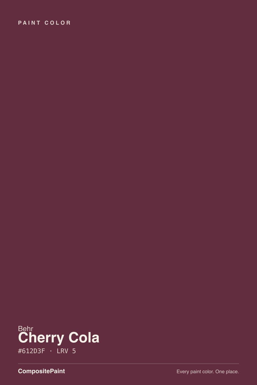
The name promises a brown, cola-adjacent red, and the paint does not deliver that. Cherry Cola's actual hex leans distinctly toward plum: the blue channel sits much closer to the red channel than it does in a true brick or rust red, which is what pulls the color toward wine and oxblood instead of toward a warm cola-brown. It sits in the same family as a deep burgundy or aubergine more than it does the caramel-brown the name implies — the first surprise almost every buyer reports.
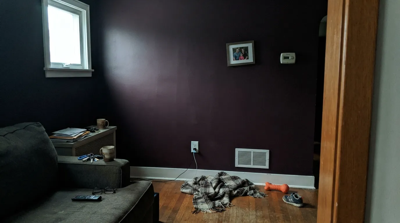
At LRV 8 it is one of the darkest colors Behr sells, tied with the brand's own Cracked Pepper and matching the depth of Pratt & Lambert's true brick-oxide red. That is dramatically darker than Benjamin Moore's Million Dollar Red (LRV 8) or Raspberry Truffle (LRV 9) — colors already known for needing lamplight to read as red rather than black. Cherry Cola needs even more help. In anything short of direct sun or a warm bulb close to the wall, the red drains out and what is left reads as a near-black plum, not a color at all from across the room.
Undertone in one line: wine-violet first, brown-red a distant second — never orange, never true brick. If your sample looks flat black-purple, that is the color being honest about low light, not a bad can.
Where It Shines
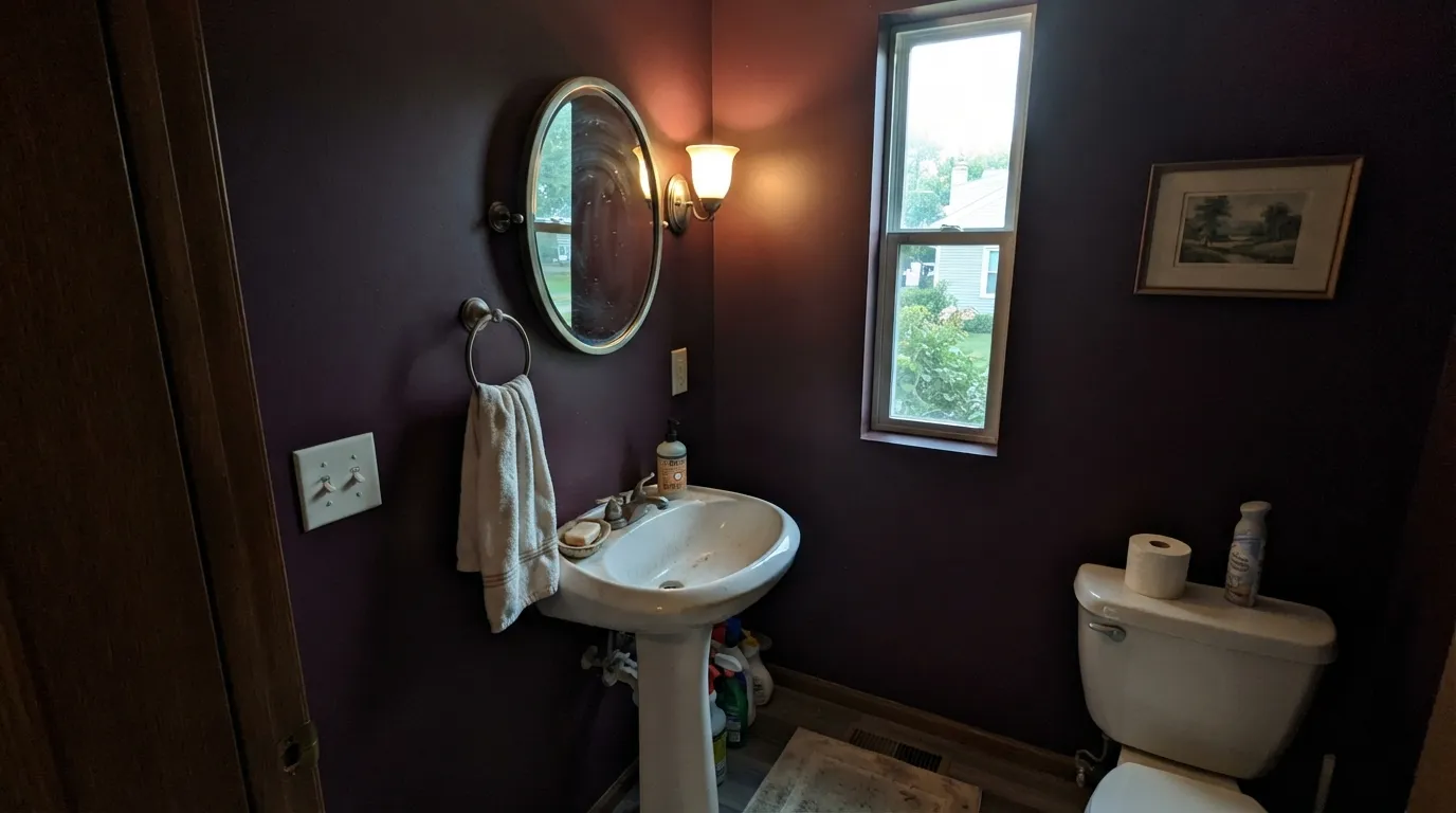
This is a color for small, controlled light: a front door catching afternoon sun, a powder room with one warm sconce, a kitchen island under pendant lights. In that kind of light the plum drains away and a genuine deep red-wine comes forward — rich, saturated, and clearly a color choice rather than an accident. Early buyers on the sample-size listing report it covering evenly in one coat with no brush marks, which matters here: a deep saturated color like this shows every roller stroke if the coat is thin.
Where It Fails
Almost every disappointed report with a color this dark and this saturated follows one of three scripts, and all three are visible in the number before you ever open the can.
"Cherry Cola" reads as a warm brown-red in most people's heads. The actual paint is a plum-leaning wine with barely any brown in it. If you wanted a cola-brown red, this is the wrong can — look at a true brick-oxide instead.
At LRV 8 a full wall of Cherry Cola in ordinary daylight reads as a heavy, near-black block, not a red room. It needs warm supplemental light to earn its name. Use it as a door, an accent wall with a lamp nearby, or a small room — not the only light source in a big open space.
Cool white light pushes the color further toward flat black-purple and drains the last of the visible red. If the room runs on daylight LEDs, swap the bulbs near this color to 2700K before you decide you don't like it — the paint is rarely the actual problem.
Room by Room
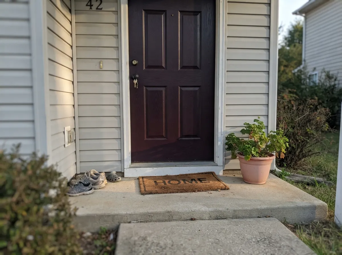
In full or afternoon sun a Cherry Cola door reads as a rich, confident wine-red against nearly any house color, and exterior light gives it exactly the brightness it needs to show its color instead of going black. Semi-gloss, and expect it to look a shade darker on a shaded north-facing entry.
Small, enclosed, and usually lit by one warm fixture — the exact conditions this color wants. Matte or eggshell on all four walls with a brushed-brass mirror and White Dove or Swiss Coffee trim is the classic move, and the room is small enough that the depth reads as intentional, not oppressive.
One wall, not the run of the hallway. Pair it with a paler neutral on the rest of the walls so the color has somewhere to breathe, and add a warm sconce if the hallway doesn't already have good light.
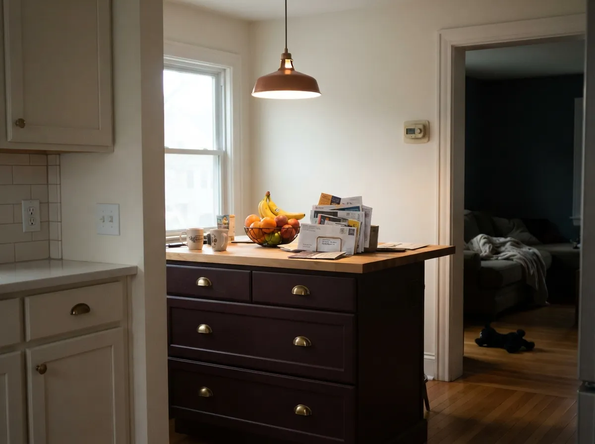
Under pendant lighting a Cherry Cola island is a strong, well-lit focal point with brass or black hardware. Satin cabinet enamel, and keep the perimeter cabinets a light neutral — the whole kitchen in this color, with only overhead daylight, will read muddy by mid-afternoon.
Beautiful for dinner-hour lighting: candles and warm bulbs bring the wine forward. During the day, without lamps on, expect it to sit closer to black-brown than red. A dimmable warm fixture is doing half the design work here.
Four walls of an LRV 8 color in a room people actually read a book in during the day is a hard sell — it will feel like a cave outside of lamp hours. If you love the color, take it to a single accent wall behind the headboard or the sofa, not the whole room.
Your Light Is the Risk
2700K bulbs close to the wall or door bring the wine-red forward and the plum recedes. This is the light the color needs to look like its name.
Cool, flat daylight with nothing warm to counter it leaves Cherry Cola reading as near-black. Sample it in the actual room before committing a whole wall.
Direct or late-day sun is the one daylight condition strong enough to show the red clearly — a south-facing door or west-lit dining wall is the easiest place to get this color right without lamps.
Daylight-spectrum LEDs do to this color at night what north light does during the day: flatten it toward black-purple. Warm bulbs are close to mandatory, not optional, with this one.
Most complaints about Cherry Cola are a light mismatch. Upload a photo of your actual room and see it on your walls — then ask for the same wall in north light or evening lamps before you buy a single sample.
Need It From Another Brand?
Any paint counter can custom-tint Behr S130-7 directly. If you would rather stay in one brand's own deck, these are the closest stock matches, measured as ΔE2000. Under 2 is a difference you will not see on the wall.
| Brand | Closest color | ΔE | LRV | |
|---|---|---|---|---|
| Sherwin-Williams | Carriage DoorSW 7594 · Sherwin-Williams | 1.8 | 8 | Color page → |
| Benjamin Moore | Barn RedES-22 · Benjamin Moore | 2.0 | 0 | Color page → |
| Valspar | Red Henna1008-7A · Valspar | 3.0 | 8.5 | Color page → |
| PPG / Glidden | BordeauxPPG1055-7 · PPG / Glidden | 2.2 | 8 | Color page → |
| Glidden | Old Redwood30YR 08/236 · Glidden | 3.2 | 8 | Color page → |
| Dutch Boy | Holiday Berry303-7DB · Dutch Boy | 2.7 | 8 | Color page → |
Similar Behr Colors
The nearest shades to Cherry Cola within Behr's own range, ranked by perceptual color distance — useful when you want the same look a touch lighter, darker, or warmer.
WCAG 2.1: AA is 4.5 : 1 for normal text, 3 : 1 for large text, AAA is 7 : 1.
Cherry Cola vs the Colors You're Also Considering
Every Cherry Cola sample board has the same rivals on it. The numbers show the real lightness gap — then it comes down to which risk you would rather live with.
Pick this for more depth and a wine character no true red can give you.
Benjamin Moore 2003-10 · LRV 8Million Dollar RedPick this if you want a true lacquer red rather than a purple-leaning wine — still lamplight-dependent, but unmistakably red, not plum.
Pick this when you want the darkest, most dramatic version of this family.
Benjamin Moore 2080-10 · LRV 9Raspberry TrufflePick this for a noticeably lighter, easier berry-red that still needs lamplight but shows color more of the day.
Pick this for full-strength saturation Sleepy Hollow was never built to give you.
Benjamin Moore 1454 · LRV 28Sleepy HollowPick this if the wine-plum mood is the point but you need it to work on four walls in daylight — Sleepy Hollow is the same family at a livable LRV 28.
Pick this when you specifically want that depth to read as red, not black, in the right light.
Behr PPU18-01 · LRV 5Cracked PepperPick this if you want the same near-black depth without betting on a color showing up at all — Cracked Pepper is a warm black, honest about being neutral.
Within Behr, Burnt Tile 150F-7 at #662B40 and LRV 5 is the nearest sibling and reads a touch brighter and more red. Poisonberry BXC-18 at #612939 and LRV 4 is darker and more berry, while Hawaiian Cinder S-G-710 at #5B2D36 and LRV 4 leans brown enough to lose the wine feel.
Across brands, Valspar Power Tie P041 at #5F2D3A and LRV 4.7 has a deltaE of 1.9, which makes it visually identical in normal room light. Sherwin-Williams Burgundy SW 6300 at #63333E and LRV 5 sits at deltaE 2.83 and Benjamin Moore Grape Juice 2074-10 at #62334A and LRV 5 at deltaE 3.25, both very close but worth sampling first, with Grape Juice the more purple of the two.
C2 Paint Heirloom Tomato BD63 at deltaE 3.69 and Kompozit Noble Honor 1166 at deltaE 4.17 are close but visibly different side by side, Noble Honor clearly more plum.
Cherry Cola Coordinating Colors
The rule for coordinating with Cherry Cola: warm whites to soften it, one near-black to echo its depth, and a mid-tone greige for the room next door. It leans purple, not orange, so it sits better with brass and black metals than with true browns or rust tones.
These are the partners that keep the color legible instead of letting it disappear:
The Name vs. The Paint
"Cherry Cola" is a soda name, and soda names promise a warm, brown-edged red — think caramel, think rootbeer's cousin. The paint does not deliver that. Cherry Cola's undertone sits distinctly toward violet: this is a wine or oxblood, not a cola-brown, and the gap between the name and the wall is the single most common surprise reported by buyers who pick it from the name alone.
This is worth knowing before you sample it, because it changes what to compare it against. If you actually want the brown-red the name implies, a true brick-oxide or barn red is the closer match. If you want the deep plum-wine the paint actually is, Cherry Cola is a genuinely good, distinctive option in a color family Behr doesn't offer much of — most of its dark reds lean brown or brick, not violet.
Cherry Cola on Doors and Cabinets
This is where the color does its best work, because both surfaces get more direct light than a wall usually does and both are small enough that LRV 8 reads as intentional rather than oppressive. On an exterior door, semi-gloss and full sun bring the wine forward clearly; on cabinets, satin urethane-fortified enamel under kitchen task lighting does the same job indoors.
Hardware matters more with this color than with most: brass and unlacquered bronze warm it further and flatter the plum, matte black keeps it moody and modern, and polished chrome or nickel is the one metal that fights it — the cool glare reads oddly against a warm-lit wine.
Three Ready Palettes Built on Cherry Cola
A color is never alone on the wall. These are complete combinations in the 60-30-10 pattern, with the reason each one holds together. Every one opens in the visualizer.
A small room takes the full-strength color well, White Dove trim keeps the edges soft instead of stark, and Wrought Iron on the mirror and fixtures gives one near-black note without competing with the wine on the walls.
Try this palette in your roomA quiet greige body lets the door carry all the color, and full exterior sun gives Cherry Cola exactly the light it needs to read as wine-red instead of black. Charcoal shutters echo the depth without fighting the door for attention.
Try this palette in your roomPale Oak walls give the room enough daylight to stay livable while the buffet carries the drama, and a dimmable fixture over the table brings the wine forward at dinner hour. Revere Pewter next door keeps the handoff to the rest of the house calm.
Try this palette in your roomCherry Cola FAQ
Is Cherry Cola red, brown, or purple?
Purple-leaning wine, despite the brown-sounding name. It has real red in it, but the undertone sits closer to plum and oxblood than to a cola-brown or a brick-red. In warm light it reads red; in cool or dim light it reads closer to black-purple.
Can I paint a whole room in it?
Not recommended without serious lamp light. At LRV 8 it is one of the darkest colors in the Behr deck, and a full room lit only by daylight will read as a heavy near-black block rather than a red room. It works best as a door, a small enclosed room, or a single accent wall with warm lighting nearby.
What trim color goes with Cherry Cola?
A warm white keeps the pairing soft — White Dove or Swiss Coffee. A brighter, cooler white like Chantilly Lace will sharpen the contrast if that's the look you want, but expect the wine to read a touch darker and more purple next to it.
Is it a good front door color?
Yes, one of its best uses. Exterior sun gives it the brightness it needs to look like wine-red instead of near-black, and it reads as confident and unusual against nearly any house body color — pale greige and white houses both work.
Will it look black in my room?
If the room is dim, north-facing, or lit only by cool LEDs — largely yes, and that is the paint being honest, not a defect. Test a sample under your actual evening lighting before committing, and add a warm 2700K bulb near the wall if you want the red to stay visible after dark.
Does it work on kitchen cabinets?
Very well on an island or a run of lower cabinets under pendant lighting, in satin. A full kitchen of Cherry Cola cabinets with only overhead daylight is a harder bet — keep the perimeter cabinets a light neutral so the room doesn't go dark by afternoon.
Have you painted with Cherry Cola?
Rate it — one tap helps the next reader decide.
Ask a Question