CP

Sage Color Palette — Sage Wren

A calm five-color scheme led by soft sage and grounded by warm neutrals with a single deep accent, every color matched to real paint you can buy.

By Maya Patel · Reviews Editor & Product Tester

Wren Sage
Dominant
Kompozit Historic Shade · 0372
#ADA791
LRV 39
Muted Olive
Secondary
Kompozit Pendula Garden · 0429
#7B8267
LRV 21
Soft Linen
Base
Kompozit Hint of Vanilla · 0001
#EEE8DC
LRV 81
Warm Greige
Support
Kompozit Moth Wing · 0183
#CCBCA9
LRV 52
Deep Pine
Accent
Kompozit Atlantic Waves · 0473
#264243
LRV 5
View palette in

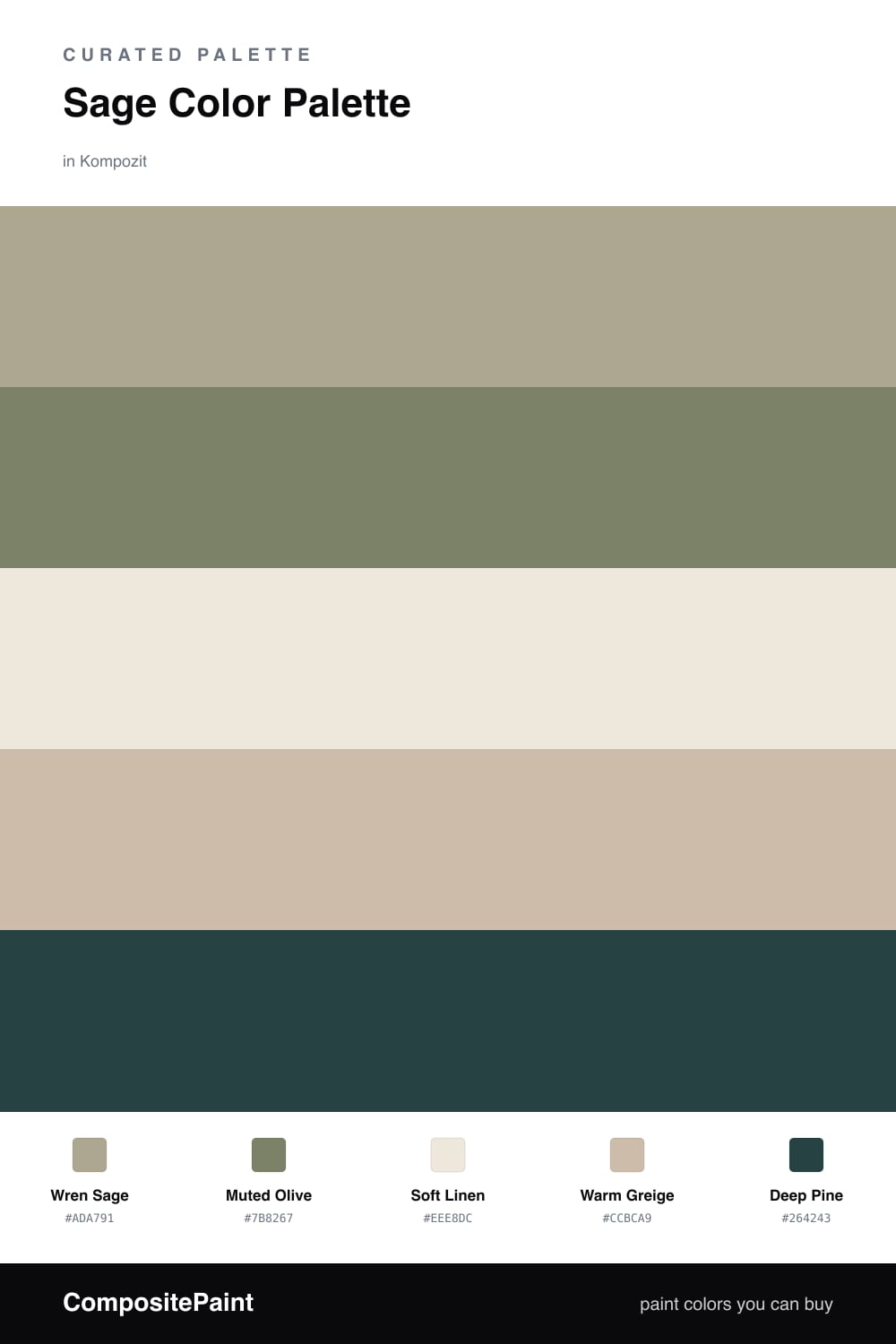
This is the kind of sage I keep reaching for in 2026 — quiet, a little gray, and easy to live with. Wren Sage leads the whole scheme, soft enough to coat the biggest surfaces without feeling like a statement.

Muted Olive deepens the same green family for a second layer, while Soft Linen and Warm Greige sit underneath as calm, warm neutrals. They keep the sage from going cold and give your eye somewhere to rest.

The winner here is restraint. Deep Pine is the only sharp note, and it earns its place precisely because there’s so little of it. Use it on one small surface and the rest of the palette snaps into focus.

Buy These Colors

Each color matched to the closest real paint in every brand, by ΔE2000. Kompozit first; take any SKU to the store — these mix on demand.

Wren Sage
#A6AE96 · LRV 41 · Dominant
Kompozit Historic Shade · 0372 ΔE 6.56
Backdrop Le Freak · BD-LF ΔE 1.12
Behr Garden Wall · 730D-4 ΔE 1.37
Benjamin Moore Estate Sale · CSP-795 ΔE 2.76
Clare Make Waves · PNT100-MD-43 ΔE 8.95
Dunn-Edwards Shaggy Barked · DEC771 ΔE 7.95
Farrow & Ball French Gray · No. 18 ΔE 5.57
Magnolia Home Seasonal · JG-51 ΔE 2.86
PPG / Glidden Olive Sprig · 1125-4 ΔE 2.2
Sherwin-Williams Clary Sage · SW 6178 ΔE 3.12
Valspar Stormy Day · V097-3 ΔE 1.81
Muted Olive
#7E8467 · LRV 22 · Secondary
Kompozit Pendula Garden · 0429 ΔE 1.11
Backdrop Old Soul · BD-OS ΔE 4.4
Behr Mocha Accent · 720D-5 ΔE 2.58
Benjamin Moore Springfield Sage · 510 ΔE 3.59
Clare Dirty Chai · PNT100-DP-52 ΔE 11.09
Dunn-Edwards Green Scene · DE6251 ΔE 3.52
Farrow & Ball Calke Green · No. 34 ΔE 4.08
Magnolia Home Olive Grove · JG-09 ΔE 3.6
PPG / Glidden Wilderness · 11-26 ΔE 2.48
Sherwin-Williams Artichoke · SW 6179 ΔE 1.41
Valspar Northern Glen · 5007-4B ΔE 2.12
Soft Linen
#EFE9DC · LRV 82 · Base
Kompozit Hint of Vanilla · 0001 ΔE 0.48
Backdrop Jane · BD-JA ΔE 2.14
Behr Ivory Palace · PPU10-14 ΔE 0.54
Benjamin Moore Stoneware · CSP-245 ΔE 1.12
Clare Like Buttah · PNT100-LT-62 ΔE 2.59
Dunn-Edwards Abstract White · DE6232 ΔE 0.94
Farrow & Ball James White · No. 2010 ΔE 2.17
Magnolia Home Antique Rose · JG-23 ΔE 0.22
PPG / Glidden Cream Puff · 1078-1 ΔE 0.5
Sherwin-Williams Creamy · SW 7012 ΔE 0.52
Valspar Shell White · 7007-12 ΔE 0.85
Warm Greige
#C8BCA8 · LRV 51 · Support
Kompozit Moth Wing · 0183 ΔE 2.17
Backdrop Boy Meets Girl · BD-BG ΔE 12.42
Behr Celery Powder · PPU8-18 ΔE 2.18
Benjamin Moore Brick House Tan · CW-145 ΔE 0.4
Clare Greige · PNT100-LT-13 ΔE 6.28
Dunn-Edwards Birchwood · DEC752 ΔE 1.68
Farrow & Ball Drop Cloth · No. 283 ΔE 0.7
Magnolia Home Solid Wood · JG-109 ΔE 1.95
PPG / Glidden Stonington · 15-25 ΔE 1.26
Sherwin-Williams Shiitake · SW 9173 ΔE 1.26
Valspar Dust Bunny · 2005-10B ΔE 5.49
Deep Pine
#34423A · LRV 5 · Accent
Kompozit Atlantic Waves · 0473 ΔE 6.27
Backdrop After Hours · BD-AH ΔE 5.18
Behr Black Swan · 710F-7 ΔE 0.66
Benjamin Moore Hunter Green · 2041-10 ΔE 4.54
Clare Blackish · PNT100-DP-54 ΔE 9.54
Dunn-Edwards Refined Green · DEA181 ΔE 3.73
Farrow & Ball Pitch Black · No. 256 ΔE 10.46
Magnolia Home Arches · JG-97 ΔE 9.91
PPG / Glidden Black Magic · 1001-7 ΔE 10.09
Sherwin-Williams Roycroft Bottle Green · SW 2847 ΔE 0.66
Valspar Black Evergreen · 5009-1 ΔE 4.28

Questions

Why does sage work as the lead color here?

Sage is a soft, low-saturation green that reads as a neutral, so it carries a whole room without tiring the eye. Pairing it with linen and greige keeps it grounded, while the deep pine adds just enough contrast to feel intentional.

How much of the accent should I use?

Keep the deep pine to roughly one-fifth of the space — a door, a shelf, or trim. Let the sage dominate, the neutrals fill in, and the accent do the punctuating.

Similar Palettes

Closest schemes by color — not by label.