CP

Beige Color Palette — Beige Smoke

A soft five-color scheme led by warm beige with smoky gray-taupe neutrals and a deep espresso accent, every color matched to real paint you can buy.

By Maya Patel · Reviews Editor & Product Tester

Smoked Beige
Dominant
Kompozit Sandstone Palette · 0273
#D9CCB6
LRV 61
Warm Greige
Secondary
Kompozit Delicate Honeysweet · 0189
#BCAB99
LRV 42
Soft Linen
Base
Kompozit Hint of Vanilla · 0001
#EEE8DC
LRV 81
Smoke Taupe
Support
Kompozit Greystoke · 0575
#88857D
LRV 23
Espresso Brown
Accent
Kompozit Black Licorice · 0529
#3A3B3B
LRV 4
View palette in

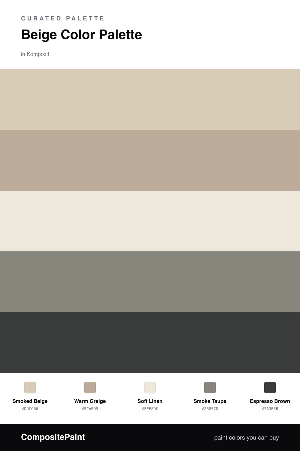
Beige is having a quiet comeback, and this is the version I would actually live with. Smoked Beige leads the whole scheme, a warm mid-tone that feels grounded rather than builder-grade. It carries enough gray in its undertone to look current in 2026, not dated.

Around it, Warm Greige and Smoke Taupe add weight, while Soft Linen keeps everything breathing and light. The trick with a tonal palette like this is contrast in depth, so the lightest and darkest neutrals do real work instead of all the colors hovering in the same lane.

The Espresso Brown is the move that makes it. Drop it in small, deliberate places and suddenly the soft beiges look intentional and warm rather than washed out. Lead with the smoked beige, layer the greige and taupe, and let the espresso ground the room.

Buy These Colors

Each color matched to the closest real paint in every brand, by ΔE2000. Kompozit first; take any SKU to the store — these mix on demand.

Smoked Beige
#D8CBB4 · LRV 61 · Dominant
Kompozit Sandstone Palette · 0273 ΔE 0.47
Backdrop Real Real · BD-RR ΔE 3.09
Behr Estate Limestone · QE-27 ΔE 1.3
Benjamin Moore Natural Linen · 966 ΔE 1.39
Clare Flatiron · PNT100-LT-17 ΔE 4.64
Dunn-Edwards Cochise · DEC761 ΔE 1.48
Farrow & Ball String · No. 8 ΔE 2.65
Magnolia Home Plaster · JG-156 ΔE 1.99
PPG / Glidden Summer Wheat · 14-10 ΔE 0.83
Sherwin-Williams Softer Tan · SW 6141 ΔE 1.3
Valspar Rattan Basket · 3007-10C ΔE 1.13
Warm Greige
#BCAD96 · LRV 43 · Secondary
Kompozit Delicate Honeysweet · 0189 ΔE 2.7
Backdrop Le Freak · BD-LF ΔE 10.59
Behr Nile Sand · UL170-19 ΔE 0.82
Benjamin Moore Embassy Green · 1523 ΔE 2.84
Clare Money Moves · PNT100-MD-48 ΔE 9.26
Dunn-Edwards Egyptian Sand · DE6207 ΔE 1.81
Farrow & Ball French Gray · No. 18 ΔE 5.47
Magnolia Home Embossed Letter · JG-106 ΔE 0.95
PPG / Glidden True Khaki · 14-27 ΔE 2.34
Sherwin-Williams Portico · SW 7548 ΔE 0.9
Valspar Ivory Brown · 6006-1C ΔE 1.92
Soft Linen
#EFE8DA · LRV 81 · Base
Kompozit Hint of Vanilla · 0001 ΔE 0.83
Backdrop Don't Eat the Yellow Snow · BD-DS ΔE 3.75
Behr Chenille Spread · HDC-NT-03 ΔE 0.91
Benjamin Moore Stoneware · CSP-245 ΔE 1.23
Clare Like Buttah · PNT100-LT-62 ΔE 2.04
Dunn-Edwards Ball of String · DE6190 ΔE 0.52
Farrow & Ball James White · No. 2010 ΔE 2.19
Magnolia Home Antique Rose · JG-23 ΔE 0.53
PPG / Glidden Angel Food · 1088-1 ΔE 0.52
Sherwin-Williams Creamy · SW 7012 ΔE 0.43
Valspar Dover White · 7007-1 ΔE 0.22
Smoke Taupe
#8E867A · LRV 24 · Support
Kompozit Greystoke · 0575 ΔE 2.87
Backdrop Hartford · BD-HF ΔE 8.57
Behr Art District · MQ2-57 ΔE 1.37
Benjamin Moore Stardust · 2108-40 ΔE 1.99
Clare Dirty Chai · PNT100-DP-52 ΔE 0.85
Dunn-Edwards Fallen Rock · DE6389 ΔE 5.65
Farrow & Ball Mole's Breath · No. 276 ΔE 2.9
Magnolia Home Reclaimed Wood · JG-124 ΔE 1.83
PPG / Glidden Roller Coaster · 1008-5 ΔE 0.97
Sherwin-Williams Mountain Road · SW 7743 ΔE 4.14
Valspar Artichoke · 6003-2A ΔE 0.86
Espresso Brown
#3A322A · LRV 3 · Accent
Kompozit Black Licorice · 0529 ΔE 7
Backdrop After Hours · BD-AH ΔE 9.2
Behr Bitter Chocolate · 790B-7 ΔE 3.75
Benjamin Moore Onyx · 2133-10 ΔE 5.77
Clare Blackish · PNT100-DP-54 ΔE 8.2
Dunn-Edwards Black · DEA187 ΔE 6.18
Farrow & Ball Pitch Black · No. 256 ΔE 5.33
Magnolia Home Moments · JG-150 ΔE 3.13
PPG / Glidden Black Magic · 1001-7 ΔE 7.14
Sherwin-Williams Black Bean · SW 6006 ΔE 4.94
Valspar Fired Earth · 6011-1 ΔE 2.35

Questions

Why do these colors work together?

They all share the same warm, slightly gray undertone, so they read as one calm family. The deep espresso at the end gives the soft beiges an edge they would lack on their own.

How do I keep an all-beige scheme from feeling flat?

Vary the depth, not the hue. Let the lightest linen open up the walls, layer the greige and taupe in textiles and trim, and use the espresso in small grounding doses like a frame or a chair.

Similar Palettes

Closest schemes by color — not by label.