CP

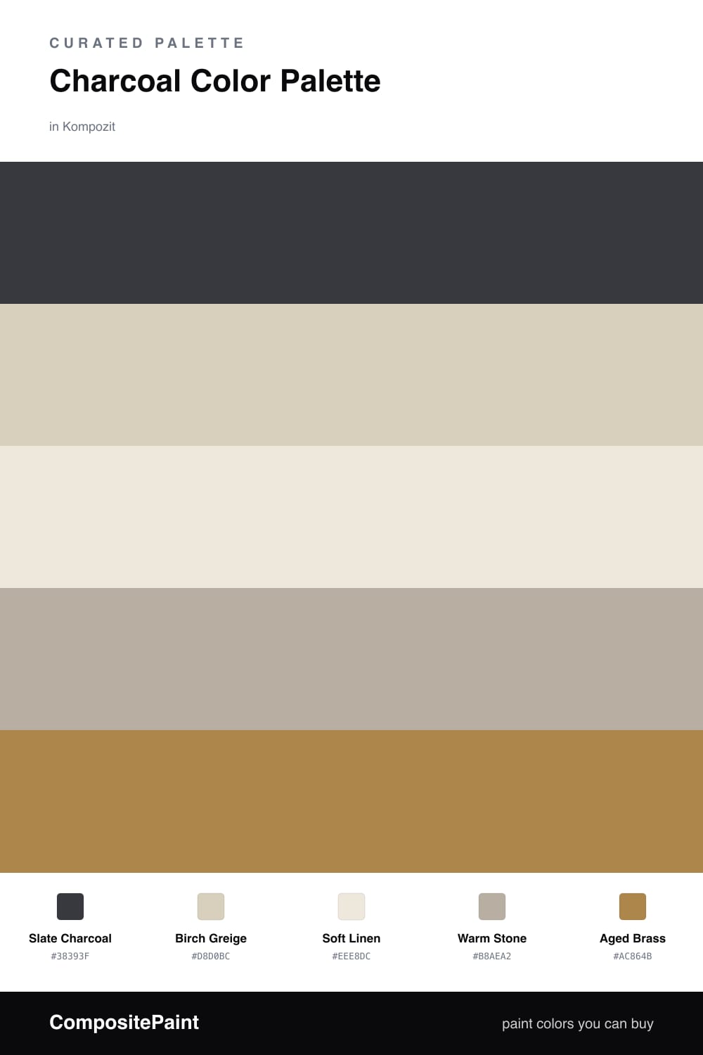
Charcoal Color Palette — Charcoal & Birch

A grounded charcoal-led scheme softened by warm birch neutrals and a quiet brass accent, with every color matched to real paint you can buy.

By Emily Roberts · DIY Editor & First-Timer's Guide

Slate Charcoal
Dominant
Kompozit Octavius · 0522
#38393F
LRV 4
Birch Greige
Secondary
Kompozit Pebblebrook · 0224
#D8D0BC
LRV 63
Soft Linen
Base
Kompozit Hint of Vanilla · 0001
#EEE8DC
LRV 81
Warm Stone
Support
Kompozit Marshy Habitat · 0204
#B8AEA2
LRV 43
Aged Brass
Accent
Kompozit Golden Cadillac · 0879
#AC864B
LRV 26
View palette in

Charcoal is having a real moment right now, and it is easy to see why. Slate Charcoal gives you almost all the drama of black, but it stays soft and warm enough to live with every day. Let it lead the room as your anchor color.

To keep things from feeling heavy, lean on the warm neutrals. Birch Greige and Warm Stone sit close to wood tones, while Soft Linen keeps the whole palette light and breathable. Together they wrap the charcoal in something gentle and lived-in.

The little spark here is Aged Brass. A touch of it — in hardware, a lamp, a frame — picks up the warmth in the birch and makes the charcoal look intentional rather than gloomy. A small dose goes a long way.

Buy These Colors

Each color matched to the closest real paint in every brand, by ΔE2000. Kompozit first; take any SKU to the store — these mix on demand.

Slate Charcoal
#36383B · LRV 4 · Dominant
Kompozit Octavius · 0522 ΔE 2.25
Backdrop After Hours · BD-AH ΔE 6.08
Behr Black Garnet · N110-7 ΔE 4
Benjamin Moore Mopboard Black · CW-680 ΔE 1.31
Clare Blackish · PNT100-DP-54 ΔE 6.09
Dunn-Edwards Black · DEA187 ΔE 2.51
Farrow & Ball Pitch Black · No. 256 ΔE 3.22
Magnolia Home Blackboard · JG-05 ΔE 2.26
PPG / Glidden Black Magic · 1001-7 ΔE 3.63
Sherwin-Williams Greenblack · SW 6994 ΔE 2.37
Valspar Forest Canopy · 5010-1 ΔE 5.36
Birch Greige
#D8CFBF · LRV 63 · Secondary
Kompozit Pebblebrook · 0224 ΔE 1.87
Backdrop Real Real · BD-RR ΔE 1.22
Behr Aged Beige · PPU7-09 ΔE 0.81
Benjamin Moore Cedar Key · 982 ΔE 0.48
Clare Flatiron · PNT100-LT-17 ΔE 2.4
Dunn-Edwards Fine Grain · DE6213 ΔE 0.87
Farrow & Ball Shaded White · No. 201 ΔE 1.35
Magnolia Home Stoneware Pieces · JG-55 ΔE 4.3
PPG / Glidden Crushed Silk · 1024-3 ΔE 0.42
Sherwin-Williams Grecian Ivory · SW 7541 ΔE 0.42
Valspar Gentle Shadows · 8005-5A ΔE 1.24
Soft Linen
#EFE9DD · LRV 82 · Base
Kompozit Hint of Vanilla · 0001 ΔE 0.22
Backdrop Jane · BD-JA ΔE 2.03
Behr Ivory Palace · PPU10-14 ΔE 0.5
Benjamin Moore Stoneware · CSP-245 ΔE 1.52
Clare Like Buttah · PNT100-LT-62 ΔE 2.82
Dunn-Edwards Abstract White · DE6232 ΔE 1
Farrow & Ball James White · No. 2010 ΔE 2.57
Magnolia Home Antique Rose · JG-23 ΔE 0.5
PPG / Glidden Cream Puff · 1078-1 ΔE 0.77
Sherwin-Williams Downy · SW 7002 ΔE 0.8
Valspar Shell White · 7007-12 ΔE 0.54
Warm Stone
#BCB1A0 · LRV 45 · Support
Kompozit Marshy Habitat · 0204 ΔE 2.25
Backdrop Le Freak · BD-LF ΔE 9.77
Behr Saturn Gray · UL190-7 ΔE 1.58
Benjamin Moore Pashmina · AF-100 ΔE 1.03
Clare Money Moves · PNT100-MD-48 ΔE 7.76
Dunn-Edwards Flintstone · DE6221 ΔE 1.58
Farrow & Ball Hardwick White · No. 5 ΔE 2.51
Magnolia Home Embossed Letter · JG-106 ΔE 2.17
PPG / Glidden Discover · 1021-3 ΔE 1.26
Sherwin-Williams Silver Gray · SW 49 ΔE 2.44
Valspar Patrick's Eyes · T690 ΔE 2.61
Aged Brass
#A8884F · LRV 26 · Accent
Kompozit Golden Cadillac · 0879 ΔE 1.89
Backdrop Anita · BD-AN ΔE 12.33
Behr Brown Rabbit · 300F-5 ΔE 2.38
Benjamin Moore Seville Tan · 251 ΔE 2.06
Clare Dirty Chai · PNT100-DP-52 ΔE 14.74
Dunn-Edwards Fall Harvest · DE6160 ΔE 1.97
Farrow & Ball Mouse's Back · No. 40 ΔE 10.99
Magnolia Home Vintage Crown · JG-152 ΔE 4.61
PPG / Glidden Graceful Gazelle · 1105-7 ΔE 1.2
Sherwin-Williams Chamois · SW 6131 ΔE 3.79
Valspar Rustic Wicker · T508 ΔE 3.63

Questions

Why does charcoal work as a main color?

Charcoal reads almost like a soft black but with a little warmth in it, so it grounds a room without feeling harsh. Pairing it with birch and linen keeps it cozy instead of cold.

How much charcoal is too much?

Let it lead but not take over — think one big anchor like a wall or cabinets, then balance it with the lighter birch and linen so the space still feels open and bright.

Similar Palettes

Closest schemes by color — not by label.