CP

Moody Dining Room Palette — Charcoal-Green & Brass

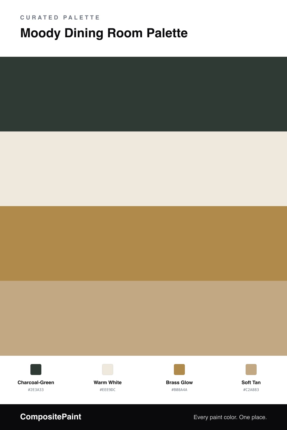
A dramatic 4-color scheme for dining rooms: deep charcoal-green walls, warm white trim, a glowing brass accent, and a tan grounding tone for evening dinners. Every color matched to real paint you can buy.

By Jessica Williams · Color Stylist & Interior Editor

A moody dining room is meant for evenings — low light, full table, conversation that runs long. This palette commits to that mood with a charcoal-green on the walls, a color so deep it reads nearly black until the light hits it and the green comes through.

A warm white on the trim and ceiling keeps the dark from swallowing the room whole, drawing crisp lines around the moody walls. The star is a brass accent — a light fixture, picture frames, candlesticks — that catches every flicker and warms the green from the inside.

Soft tan grounds the scheme through a wood table or floor, adding a natural note so the room feels collected rather than severe. Let the green dominate, keep the white framing tight, and use brass and tan to bring back the glow. After dark, this room comes alive.

View palette in
Charcoal-Green
Walls
Dutch Boy Rugged Green · 424-7DB
#343B36
LRV 4
Warm White
Trim & Ceiling
Glidden Cream Puff · PPG1078-1
#EEE9DC
LRV 82
Brass Glow
Accent
Glidden Butterscotch Ripple · PPG1106-7
#B08843
LRV 27
Soft Tan
Wood & Floors
Diamond Vogel Season Finale · 0267
#C1A780
LRV 40

Buy These Colors

Each color matched to the closest real paint in every brand, by ΔE2000. Tap a swatch for its full guide or + to save it — take any SKU to the store, they mix on demand.

Charcoal-Green
#2E3A33 · LRV 4 · Walls
Sherwin-Williams · SW 2809 · ΔE 3.12
Behr · S-H-780 · ΔE 3.4
Benjamin Moore · CW-510 · ΔE 4.03
Valspar · 6011-5 · ΔE 3.09
PPG / Glidden · PPG0995-7 · ΔE 8.1
Glidden · 00NN 05/000 · ΔE 9.62
Dutch Boy · 424-7DB · ΔE 2.91
HGTV Home by Sherwin-Williams · HGSW 3291 · ΔE 2.91
Dunn-Edwards · DEA002 · ΔE 9.23
Magnolia Home · JG-05 · ΔE 10.51
Farrow & Ball · NO. G18 · ΔE 8.57
Diamond Vogel · H101 · ΔE 8.49
Hirshfield's · H0101 · ΔE 8.94
Rodda · CA210 · ΔE 12.61
C2 Paint · C2-981 · ΔE 8.52
Clare · PNT100-DP-54 · ΔE 9.76
Portola Paints · NEWTON'S INDIGO · ΔE 10.96
Annie Sloan · AUBUSSON BLUE · ΔE 9.85
Backdrop · BD-AH · ΔE 5.24
Rust-Oleum · 285144 · ΔE 8.02
Kompozit · 0529 · ΔE 7.98
Warm White
#EEE9DC · LRV 82 · Trim & Ceiling
Sherwin-Williams · SW 7012 · ΔE 1
Behr · PPU10-14 · ΔE 0.43
Benjamin Moore · CSP-245 · ΔE 0.86
Valspar · 7007-12 · ΔE 0.88
PPG / Glidden · PPG1086-1 · ΔE 0.99
Glidden · PPG1078-1 · ΔE 0
Dutch Boy · 018W · ΔE 1
HGTV Home by Sherwin-Williams · HGSW 4033 · ΔE 1
Dunn-Edwards · DE6232 · ΔE 0.54
Magnolia Home · JG-23 · ΔE 0.52
Farrow & Ball · NO. W1 · ΔE 1.18
Diamond Vogel · 0001 · ΔE 0.88
Hirshfield's · 0001 · ΔE 0.78
Rodda · CA008 · ΔE 0
C2 Paint · C2-580 · ΔE 0.47
Clare · PNT100-LT-62 · ΔE 2.93
Portola Paints · KASHMIR · ΔE 2.36
Annie Sloan · OLD OCHRE · ΔE 10.75
Backdrop · BD-JA · ΔE 1.83
Rust-Oleum · 329598 · ΔE 4.33
Kompozit · 0001 · ΔE 0.78
Brass Glow
#B08A4A · LRV 28 · Accent
Sherwin-Williams · SW 6131 · ΔE 3.88
Behr · MQ4-9 · ΔE 2.92
Benjamin Moore · 196 · ΔE 1.41
Valspar · 3007-5A · ΔE 2.46
PPG / Glidden · PPG1106-7 · ΔE 1.18
Glidden · PPG1106-7 · ΔE 1.15
Dutch Boy · 318-7DB · ΔE 1.86
HGTV Home by Sherwin-Williams · HGSW 2172 · ΔE 3.88
Dunn-Edwards · DE5370 · ΔE 2.08
Magnolia Home · JG-152 · ΔE 5.72
Farrow & Ball · NO. 46 · ΔE 7.03
Diamond Vogel · 0900 · ΔE 1.53
Hirshfield's · 0879 · ΔE 1.7
Rodda · R053 · ΔE 3.47
C2 Paint · BD36 · ΔE 6.54
Clare · PNT100-DP-59 · ΔE 6.8
Portola Paints · BANDELIER · ΔE 8.13
Annie Sloan · CHATEAU GREY · ΔE 11.77
Backdrop · BD-AN · ΔE 13.41
Rust-Oleum · 398640 · ΔE 11.36
Kompozit · 0879 · ΔE 1.7
Soft Tan
#C2A883 · LRV 41 · Wood & Floors
Sherwin-Williams · SW 6122 · ΔE 0.73
Behr · T16-16 · ΔE 1.2
Benjamin Moore · 1061 · ΔE 0.84
Valspar · T578 · ΔE 0.93
PPG / Glidden · PPG1093-5 · ΔE 1.97
Glidden · 30YY 39/225 · ΔE 2.28
Dutch Boy · 217-4DB · ΔE 1.39
HGTV Home by Sherwin-Williams · HGSW 2185 · ΔE 0.73
Dunn-Edwards · DE6200 · ΔE 1.58
Magnolia Home · JG-166 · ΔE 6.51
Farrow & Ball · NO. 38 · ΔE 2.06
Diamond Vogel · 0267 · ΔE 0.7
Hirshfield's · H0122 · ΔE 2.48
Rodda · CA108 · ΔE 2.86
C2 Paint · BD29 · ΔE 4.1
Clare · PNT100-DP-59 · ΔE 5.29
Portola Paints · CODA · ΔE 5.58
Annie Sloan · VERSAILLES · ΔE 5.93
Backdrop · BD-LF · ΔE 14.29
Rust-Oleum · 371674 · ΔE 12.16
Kompozit · 0281 · ΔE 2.74

Questions

Won't charcoal-green walls make the room feel small?

A dark dining room actually feels intimate rather than cramped, because you mostly use it at night. The deep green wraps the table in shadow and pushes all the attention onto the people and the meal, which is the whole point.

Why brass instead of chrome or black hardware?

Brass picks up candlelight and lamp glow, so it warms a dark green room from within. Cooler metals would disappear against the moody walls, while brass adds that gold flicker that makes the whole scheme feel rich.

KEEP EXPLORING

Similar Palettes

Closest schemes by color — not by label.