CP

Plum Color Palette — Plum Ember

A moody five-color scheme led by deep plum, warmed with smoky neutrals and lit by a single ember accent — every color matched to real paint you can buy.

By Jessica Williams · Color Stylist & Interior Editor

Deep Plum
Dominant
Kompozit Purple Shadow · 1215
#493843
LRV 5
Dusty Mauve
Secondary
Kompozit Charming Violet · 1221
#8C7281
LRV 19
Warm Greige
Base
Kompozit Coconut Macaroon · 0138
#DACAC0
LRV 61
Smoke Taupe
Support
Kompozit Young Colt · 0198
#A79B8C
LRV 34
Ember Rust
Accent
Kompozit Pretty Parasol · 1039
#AC5D3E
LRV 17
View palette in

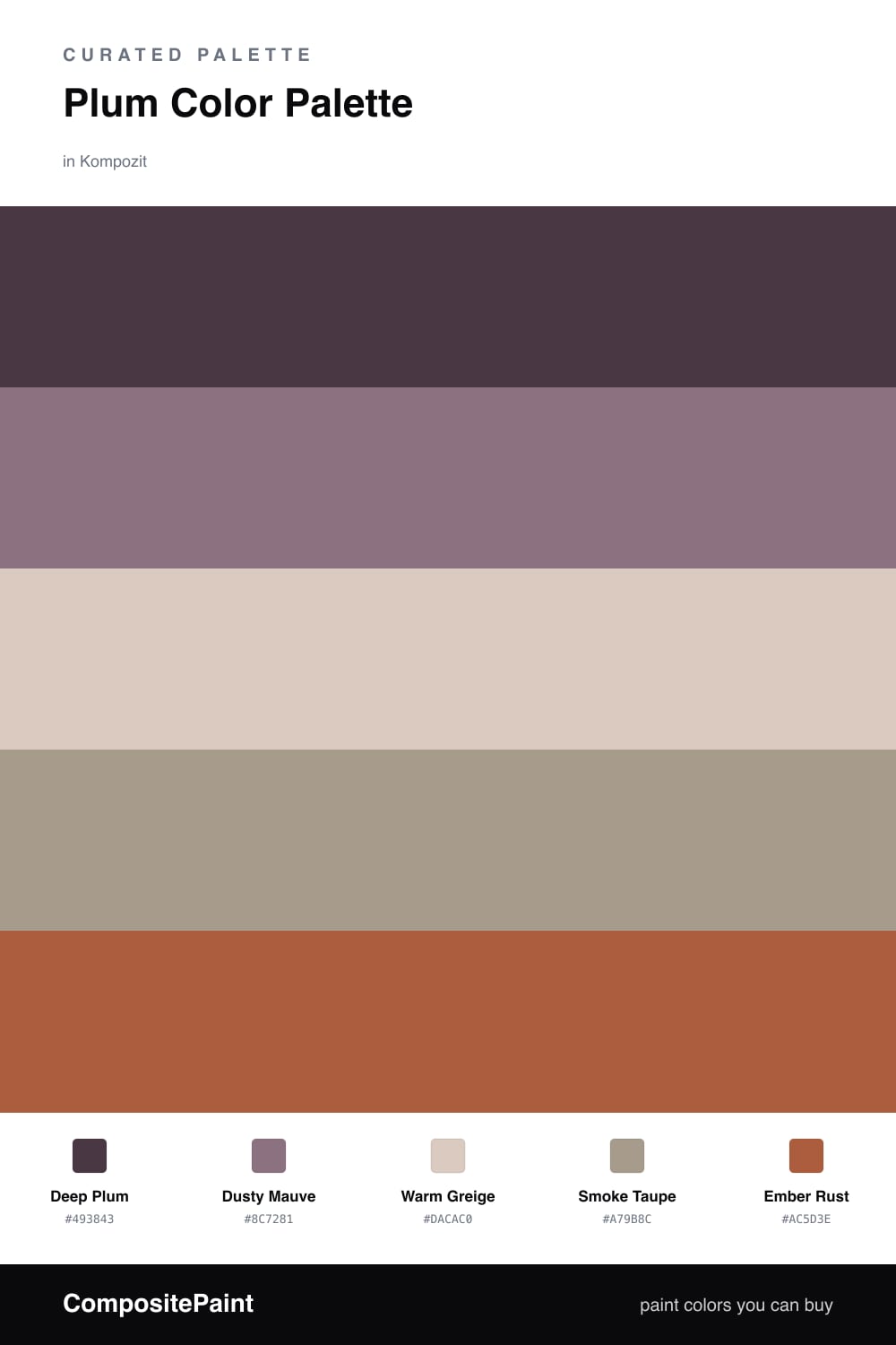
There is something about deep plum that feels lit from within, like the last glow of a fire. Deep Plum leads this scheme as a soft, enveloping anchor — it has enough red in it to stay warm, so a whole wall of it wraps a room rather than chilling it.

Around that anchor, Dusty Mauve carries the plum into softer territory, while Warm Greige and Smoke Taupe keep everything grounded and quiet. These two neutrals are the breathing room — they let the plum stay the star without the space turning heavy.

Then comes the spark. Ember Rust is the single warm flicker that gives the palette its name, and a little goes a long way in 2026 interiors that favor restraint. Use it on one piece you want your eye to land on, and let the plum do the rest.

Buy These Colors

Each color matched to the closest real paint in every brand, by ΔE2000. Kompozit first; take any SKU to the store — these mix on demand.

Deep Plum
#4A2C46 · LRV 4 · Dominant
Kompozit Purple Shadow · 1215 ΔE 7.62
Backdrop Last Call · BD-LC ΔE 15.22
Behr Deep Garnet · 110F-7 ΔE 2.05
Benjamin Moore Exotic Purple · 2071-10 ΔE 4.91
Clare Blackish · PNT100-DP-54 ΔE 19.58
Dunn-Edwards Preserve · DEA193 ΔE 6.94
Farrow & Ball Pitch Black · No. 256 ΔE 17.44
Magnolia Home Plum Suede · JG-102 ΔE 7.99
PPG / Glidden Victory Blue · 1165-7 ΔE 14.39
Sherwin-Williams Merlot · SW 2704 ΔE 7.19
Valspar Virtuoso · M215 ΔE 6.84
Dusty Mauve
#8A6A7C · LRV 17 · Secondary
Kompozit Charming Violet · 1221 ΔE 3.31
Backdrop Mom Jeans · BD-MJ ΔE 23.69
Behr Hickory Stick · 120F-5 ΔE 2.28
Benjamin Moore Lazy Afternoon · 1378 ΔE 3.28
Clare Prince · PNT100-DP-33 ΔE 8.23
Dunn-Edwards Amazing Amethyst · DE6013 ΔE 6.9
Farrow & Ball London Clay · No. 244 ΔE 13.27
Magnolia Home Elemental · JG-129 ΔE 15.59
PPG / Glidden Velvet Slipper · 1046-6 ΔE 3.96
Sherwin-Williams Plum Dandy · SW 6284 ΔE 1.38
Valspar Tragic Juliet · T512 ΔE 1.65
Warm Greige
#D8CDC2 · LRV 62 · Base
Kompozit Coconut Macaroon · 0138 ΔE 2.58
Backdrop Real Real · BD-RR ΔE 3.92
Behr Aged Beige · PPU7-09 ΔE 2.42
Benjamin Moore Charmeuse · AF-265 ΔE 2.1
Clare Flatiron · PNT100-LT-17 ΔE 1.14
Dunn-Edwards Fine Grain · DE6213 ΔE 2.03
Farrow & Ball Cornforth White · No. 228 ΔE 2.41
Magnolia Home Stoneware Pieces · JG-55 ΔE 5.74
PPG / Glidden River Rock · 18-02 ΔE 0.98
Sherwin-Williams Reticence · SW 6064 ΔE 0.81
Valspar Rabbit's Foot · 8004-9B ΔE 0.95
Smoke Taupe
#A89A8E · LRV 33 · Support
Kompozit Young Colt · 0198 ΔE 2.08
Backdrop Anita · BD-AN ΔE 2.62
Behr Rustic Taupe · N200-4 ΔE 1.69
Benjamin Moore Creekbed · 1006 ΔE 0.52
Clare Set In Stone · PNT100-LT-15 ΔE 11.45
Dunn-Edwards Twilight Taupe · DE6060 ΔE 3.65
Farrow & Ball Pigeon · No. 25 ΔE 7.13
Magnolia Home Antiquing · JG-128 ΔE 4.93
PPG / Glidden Diversion · 1021-4 ΔE 2.19
Sherwin-Williams Pewter Tankard · SW 23 ΔE 2.88
Valspar Chocolate Oatmeal · T575 ΔE 2.93
Ember Rust
#B5532E · LRV 16 · Accent
Kompozit Pretty Parasol · 1039 ΔE 3.66
Backdrop Bahaus · BD-BH ΔE 12.89
Behr Thanksgiving · M210-7 ΔE 2.37
Benjamin Moore Fiery Opal · 077 ΔE 3.95
Clare Sriracha · PNT100-DP-29 ΔE 10.33
Dunn-Edwards Red River · DE5125 ΔE 5.91
Farrow & Ball Blazer · No. 212 ΔE 9.26
Magnolia Home On Bosque · JG-36 ΔE 3.9
PPG / Glidden Orange Vermillion · 1194-7 ΔE 3.64
Sherwin-Williams Jalapeño · SW 6629 ΔE 4.09
Valspar Ripe Peach · P045 ΔE 4.18

Questions

Why does plum feel so rich in a room?

Plum sits between red and blue, so it carries the warmth of one and the depth of the other. That balance is what makes it read as both cozy and grown-up, especially in low evening light.

How much of the bright accent should I use?

Keep it small — think one-fifth of the space at most. The ember tone is there to spark the plum, not compete with it, so save it for a chair, a throw, or a single painted door.

Similar Palettes

Closest schemes by color — not by label.