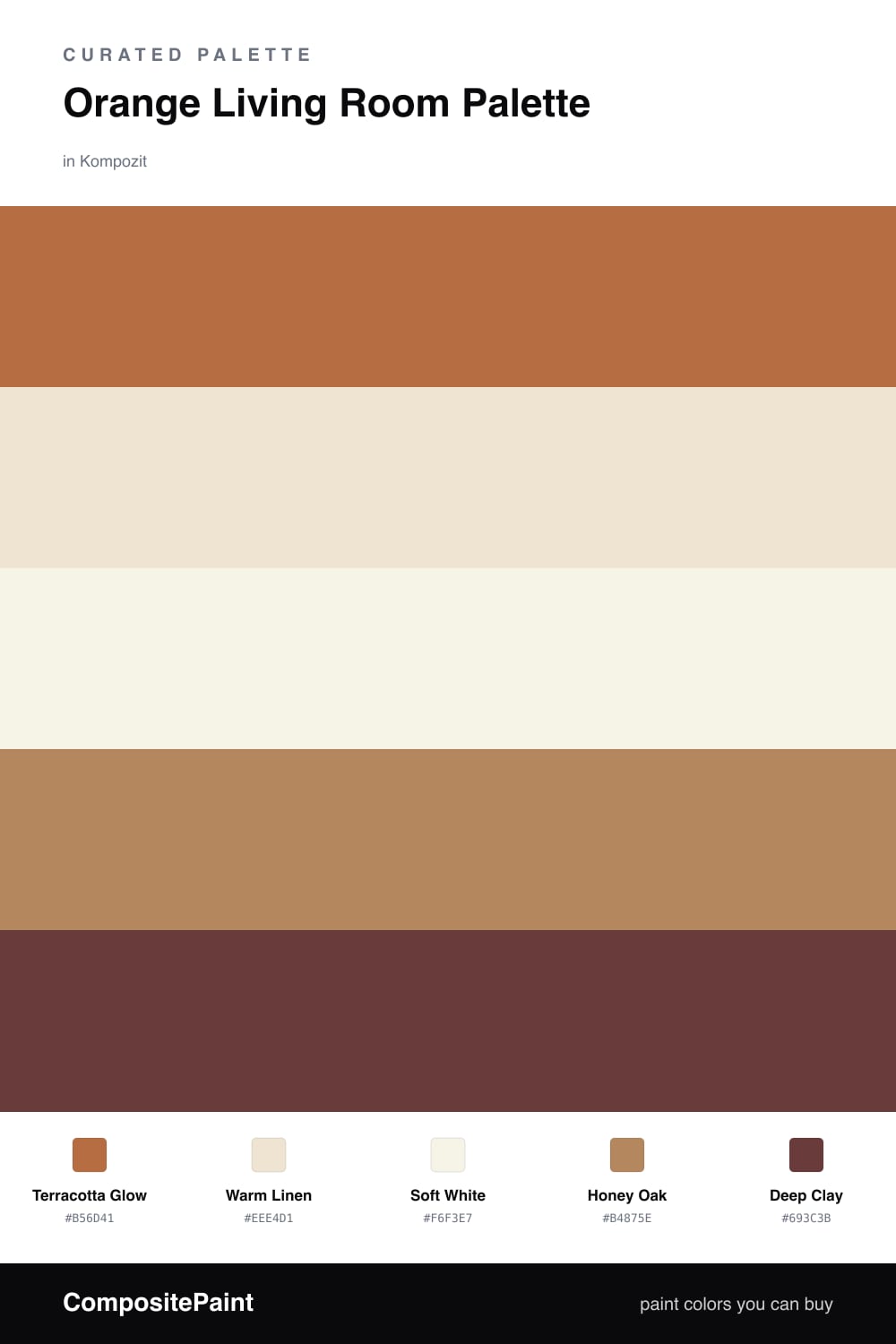
Orange Living Room Palette — Terracotta Glow & Warm Linen
A warm five-color living room scheme led by terracotta orange, balanced with soft linen, crisp white, oak, and a deep clay accent — every color matched to real paint you can buy.
By Emily Roberts · DIY Editor & First-Timer's Guide
If you have ever wanted a living room that feels like late-afternoon sun, this is your palette. Terracotta Glow leads on the main walls — an earthy, sunbaked orange that feels cozy and current without shouting. It is the kind of warm tone showing up everywhere in 2026, soft enough to live with every day.
To keep it grounded, Warm Linen handles the trim and ceiling, and Soft White brightens any built-ins or cabinets so the orange has room to breathe. Honey Oak ties in your floors and wood furniture, echoing the warmth instead of fighting it.
Finally, Deep Clay is your accent — think a velvet pillow, a painted shelf, or a single dark frame. Just a little of it makes the whole room feel intentional and pulled-together. Lead with the orange, lean on the neutrals, and add the clay in small doses.
Buy These Colors
Each color matched to the closest real paint in every brand, by ΔE2000. Kompozit first; take any SKU to the store — these mix on demand.
Questions
Not when you pick a soft, earthy orange like this one. Terracotta reads warm and cozy rather than loud, and surrounding it with linen and white keeps the room feeling calm and grown-up.
Let the orange lead on the main walls and let the neutrals do the rest. A rough 60/40 split — orange walls against warm whites and oak — keeps it inviting instead of overwhelming.
Similar Palettes
Closest schemes by color — not by label.