CP

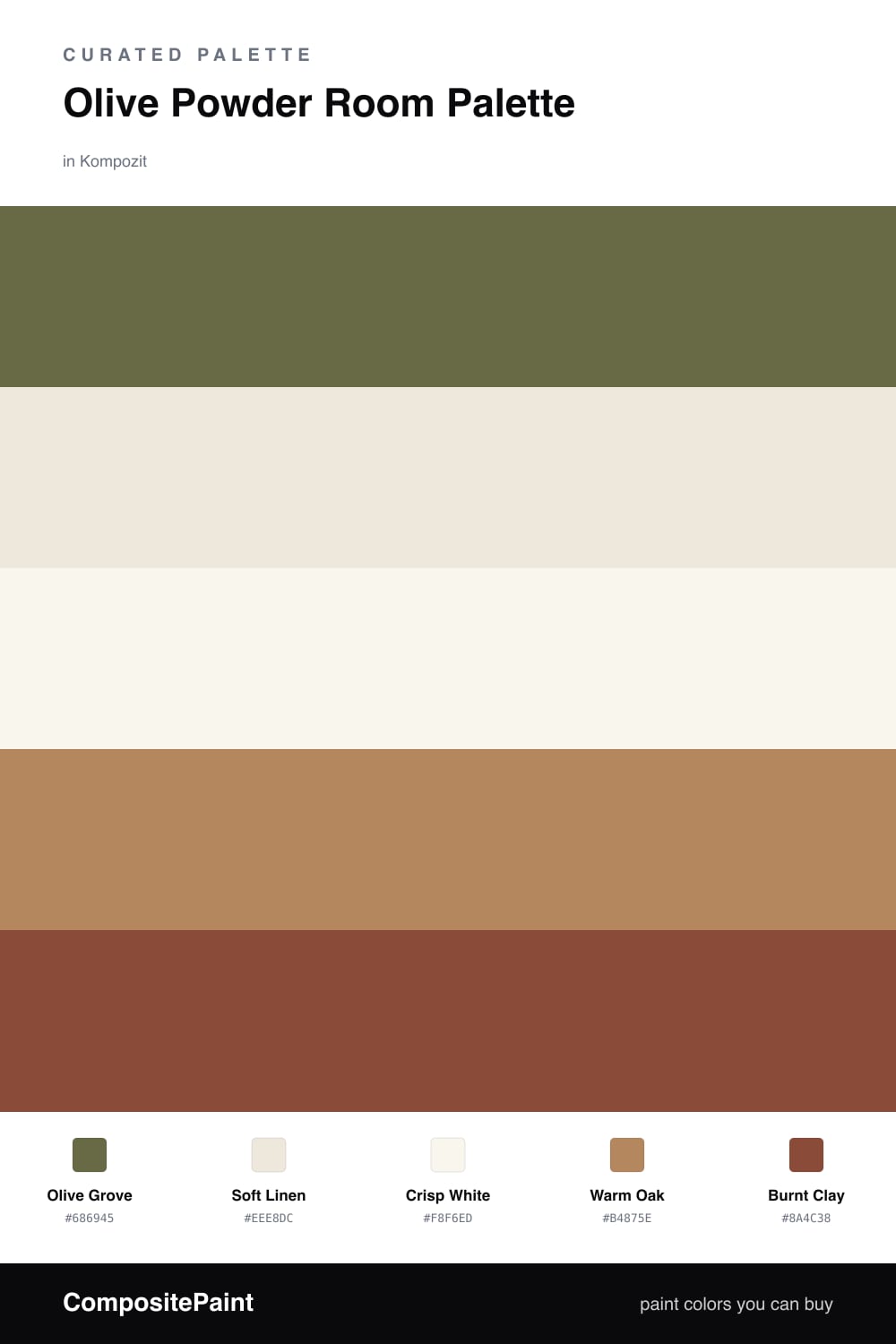
Olive Powder Room Palette — Olive Grove & Soft Linen

A warm, grounded 5-color scheme for a powder room: olive walls, soft linen backdrop, crisp trim, warm oak, and a deep clay accent, with every color matched to real paint you can buy.

By Maya Patel · Reviews Editor & Product Tester

Olive Grove
Walls
Kompozit Old School · 0410
#686945
LRV 13
Soft Linen
Vanity & Backdrop
Kompozit Hint of Vanilla · 0001
#EEE8DC
LRV 81
Crisp White
Trim & Ceiling
Kompozit Sugar Dust · 0011
#F8F6ED
LRV 92
Warm Oak
Wood & Floors
Kompozit Safari Sun · 0248
#B4875E
LRV 28
Burnt Clay
Mirror Frame Accent
Kompozit Remaining Embers · 0053
#8A4C38
LRV 11
View palette in

A powder room is small, windowless, and forgiving, which makes it the best room in the house to commit to a real color. This palette puts a muted, slightly gray Olive Grove on every wall, the kind of green that goes earthy and grounded under warm bulbs instead of bright or minty.

To keep it from feeling heavy, the vanity and backdrop wear a Soft Linen and the trim and ceiling stay Crisp White, so the olive has a clean edge to lean on. Warm Oak on the floor and a floating shelf brings in the wood tone that olive always wants beside it.

For the one bit of drama, a Burnt Clay mirror frame gives the eye a warm, reddish anchor against all that green. Use that deepest color on the smallest surface only, one frame or one sconce, and let the olive carry the room.

Buy These Colors

Each color matched to the closest real paint in every brand, by ΔE2000. Kompozit first; take any SKU to the store — these mix on demand.

Olive Grove
#6B6B47 · LRV 14 · Walls
Kompozit Old School · 0410 ΔE 0.94
Backdrop Buenos Aires · BD-BA ΔE 15.74
Behr Portsmouth Olive · HDC-CL-20 ΔE 1.05
Benjamin Moore Sterling Forest · 518 ΔE 4.19
Clare Daily Greens · PNT100-DP-61 ΔE 7.9
Dunn-Edwards Spruce Woods · DE6238 ΔE 4.82
Farrow & Ball Bancha · No. 298 ΔE 1.05
Magnolia Home Landscape · JG-49 ΔE 2.87
PPG / Glidden Rustling Leaves · 1123-7 ΔE 1.94
Sherwin-Williams Oakmoss · SW 6180 ΔE 3.08
Valspar Vineyard View · 8003-27F ΔE 3.24
Soft Linen
#EDE8DA · LRV 81 · Vanity & Backdrop
Kompozit Hint of Vanilla · 0001 ΔE 1.13
Backdrop Don't Eat the Yellow Snow · BD-DS ΔE 3.66
Behr Ivory Palace · PPU10-14 ΔE 0.89
Benjamin Moore Seashell · 926 ΔE 1.75
Clare Like Buttah · PNT100-LT-62 ΔE 2.79
Dunn-Edwards Abstract White · DE6232 ΔE 0.87
Farrow & Ball James White · No. 2010 ΔE 1.44
Magnolia Home Antique Rose · JG-23 ΔE 0.76
PPG / Glidden Edelweiss · 14-23 ΔE 0.53
Sherwin-Williams Creamy · SW 7012 ΔE 1.21
Valspar Canterbury Cream · V163 ΔE 0.54
Crisp White
#FAF8F4 · LRV 94 · Trim & Ceiling
Kompozit Sugar Dust · 0011 ΔE 2.43
Backdrop Tabula Rasa · BD-TR ΔE 3.54
Behr Ultra Pure White · PPU18-06 ΔE 1.01
Benjamin Moore Snowfall White · 2144-70 ΔE 3.11
Clare Whipped · PNT100-LT-02 ΔE 1.23
Dunn-Edwards Milk Glass · DEW358 ΔE 1.41
Farrow & Ball All White · No. 2005 ΔE 0.5
Magnolia Home True White · JG-21 ΔE 1.78
PPG / Glidden Delicate White · 1001-1 ΔE 2.02
Sherwin-Williams High Reflective White · SW 7757 ΔE 1.61
Valspar Ultra White · 7006-24 ΔE 1.23
Warm Oak
#B08A5E · LRV 28 · Wood & Floors
Kompozit Safari Sun · 0248 ΔE 2.74
Backdrop Anita · BD-AN ΔE 10.11
Behr Almond Roca · S260-5 ΔE 1.27
Benjamin Moore Bryan Ochre · CW-390 ΔE 1.27
Clare Good as Gold · PNT100-DP-59 ΔE 7.09
Dunn-Edwards Dark Sepia · DE6138 ΔE 1.71
Farrow & Ball Mouse's Back · No. 40 ΔE 9.39
Magnolia Home Vintage Crown · JG-152 ΔE 2.08
PPG / Glidden Caramel Kiss · 1083-6 ΔE 0.88
Sherwin-Williams Peristyle Brass · SW 43 ΔE 3.87
Valspar Char Latte · M128 ΔE 2.23
Burnt Clay
#8B4A36 · LRV 11 · Mirror Frame Accent
Kompozit Remaining Embers · 0053 ΔE 0.75
Backdrop Buenos Aires · BD-BA ΔE 11.55
Behr Spiced Red · QE-14 ΔE 3.19
Benjamin Moore California Rustic · ES-24 ΔE 1.45
Clare Vintage · PNT100-DP-67 ΔE 9
Dunn-Edwards Cherry Cola · DEA156 ΔE 1.41
Farrow & Ball Eating Room Red · No. 43 ΔE 7.92
Magnolia Home Home At Last · JG-30 ΔE 5.16
PPG / Glidden Burled Redwood · 1067-7 ΔE 1.33
Sherwin-Williams Flower Pot · SW 6334 ΔE 3.65
Valspar Rusted Earth · 2002-7A ΔE 1.29

Questions

Is olive too dark for a small powder room?

No, and a powder room is the one place to be brave. There is no natural light to fight and you are only in there a minute, so a saturated olive feels intimate rather than gloomy. Keep the ceiling and trim in the crisp white so the walls do not close in.

What metal finish looks best with olive walls?

Warm metals win here. Brushed brass or aged bronze on the faucet, mirror, and sconces pull the gold out of the olive and tie it to the warm oak. Chrome reads cold against this palette and flattens the green.

Similar Palettes

Closest schemes by color — not by label.