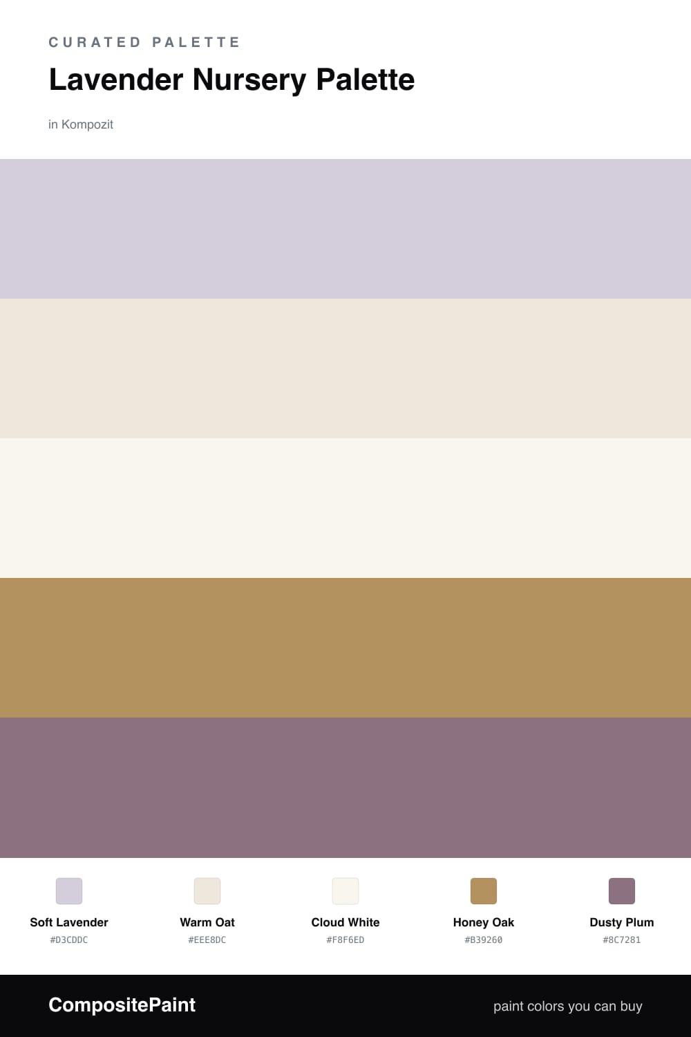
Lavender Nursery Palette — Soft Lavender & Warm Oat
A gentle, restful 5-color scheme for nurseries: soft lavender walls, warm oat backdrop, crisp trim, grounding wood, and a dusty plum accent, every color matched to real paint you can buy.
By David Chen · Formulation Lead & Resident Chemist
A nursery should feel like the room is holding its breath for you — quiet, soft, and easy on a tired eye at three in the morning. The lead here is Soft Lavender, but notice how gray it is. Pure purple bounces a lot of cool light around; this version has been muted down so it behaves more like a warm-leaning neutral that simply happens to be lavender. That is the trick to making the color soothing instead of sugary.
Around it I have set Warm Oat as a backdrop, the kind of soft beige that keeps the lavender from feeling cold, with Cloud White on the trim and ceiling so the edges of the room stay clean and bright. Honey Oak does the grounding work — a crib, a dresser, the floor — and adds the warm wood tone that every 2026 room wants underfoot.
For the one deeper note, reach for Dusty Plum. Think of it as lavender with the lights turned low: same family, more depth. Use it small — a single shelf, a pair of curtains, the frames over the crib — and it gives the eye somewhere to rest without ever shouting.
Buy These Colors
Each color matched to the closest real paint in every brand, by ΔE2000. Kompozit first; take any SKU to the store — these mix on demand.
Questions
Keep the soft lavender on the main walls and let everything else stay warm and neutral. Lavender is a cool color, so if it shows up on the walls, the trim, and the furniture all at once the room starts to feel chilly. One big surface is plenty.
Yes, because this lavender is muted and grayed rather than bright purple. A soft, dusty lavender reads as a calm neutral, so it carries from a newborn room into a toddler room without looking babyish or needing a repaint.
Similar Palettes
Closest schemes by color — not by label.