Coastal Kitchen Palette — Soft Sea Glass & Warm Cream
A calm, sunlit 5-color scheme for coastal kitchens: sea-glass green cabinets, warm cream walls, crisp trim, and a deep navy anchor. Every color matched to real paint you can buy.
By Jessica Williams · Color Stylist & Interior Editor
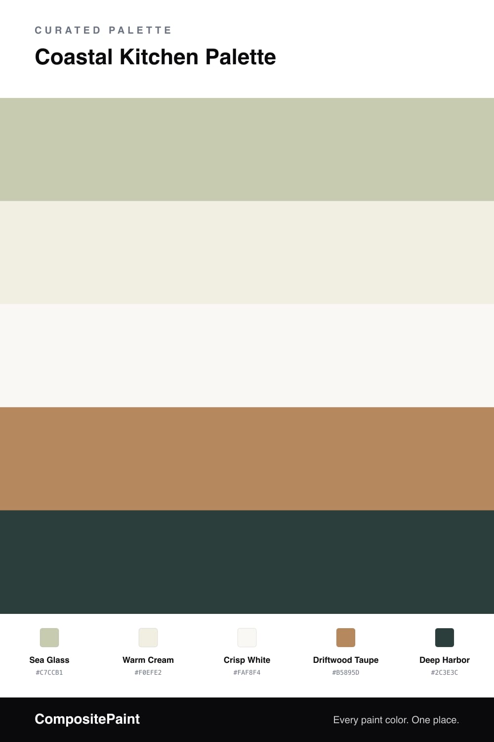
A coastal kitchen should feel like morning light off the water — soft, warm, never stark. This palette leans on a muted sea-glass green for the cabinets, the kind of color that reads gray on a cloudy day and green when the sun comes in. It never tips into mint.
Around it sits a warm cream on the walls and a slightly cleaner white on the trim and ceiling, so the green has room to breathe. Driftwood taupe grounds the scheme through wood floors, open shelving, or a butcher-block counter. And a single deep harbor anchor — on an island or a run of lower cabinets — gives the eye somewhere to land.
Use the deepest color sparingly: one surface, no more. The whole scheme is built so the green leads, the neutrals support, and the navy punctuates.
Buy These Colors
Each color matched to the closest real paint in every brand, by ΔE2000. Tap a swatch for its full guide or + to save it — take any SKU to the store, they mix on demand.
Questions
Keep the darkest color for the smallest surface — an island, a single base cabinet run, or interior shelving. Used on more than about a fifth of the room it stops reading as an accent and starts to close the space in.
Not against the warm cream and driftwood here. The green is muted and slightly gray, so it stays soft rather than minty, and the warm neutrals around it keep the whole room sunlit.
Similar Palettes
Closest schemes by color — not by label.