Burnt Orange Living Room Palette — Warm Spice & Taupe
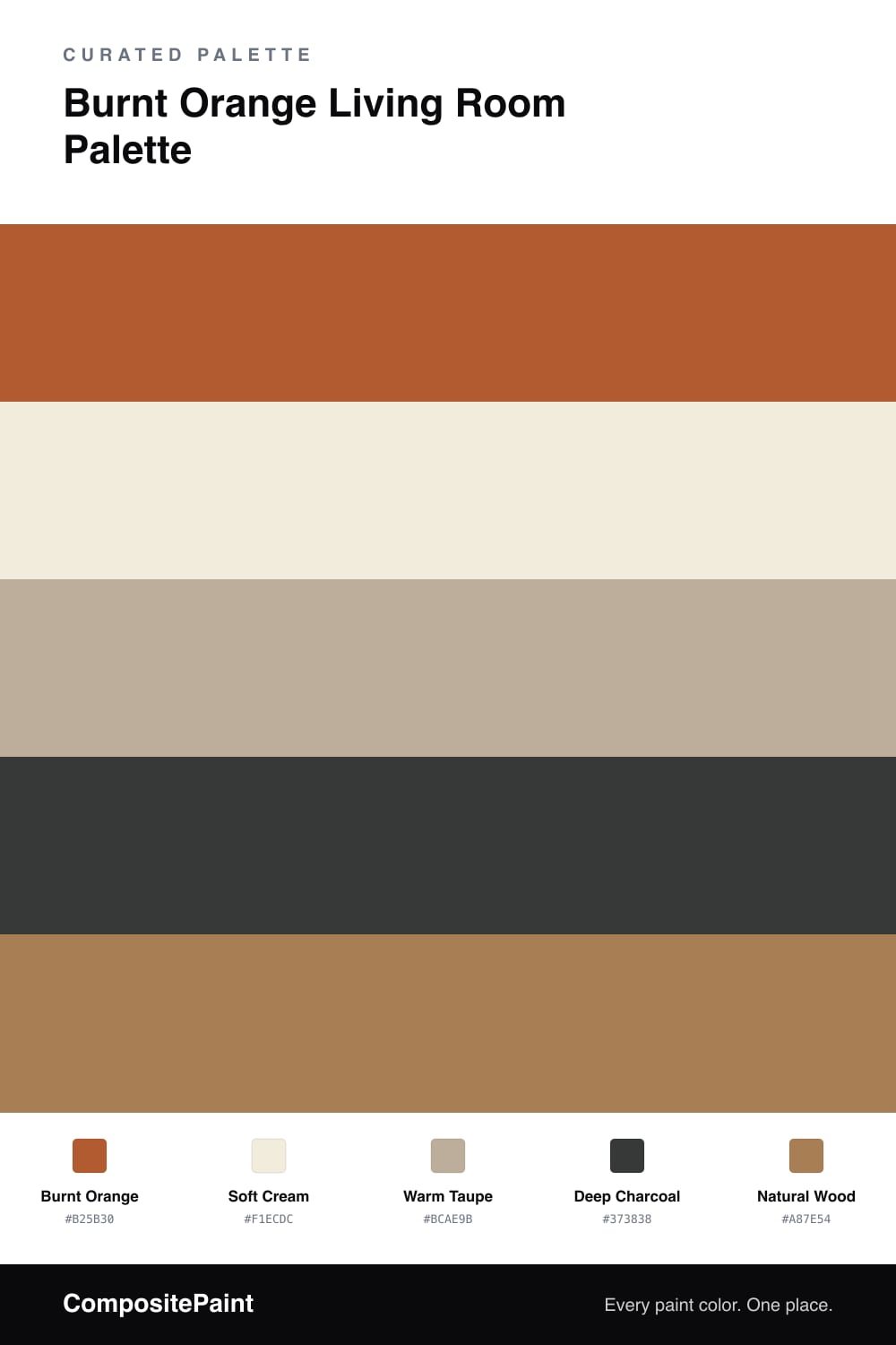
A warm, vintage 5-color scheme for living rooms: a burnt orange accent, soft cream, calm taupe, charcoal grounding, and natural wood. Every color matched to real paint you can buy.
By Jessica Williams · Color Stylist & Interior Editor
A burnt orange living room nods to the seventies in the best way — warm, earthy, and full of character. This palette keeps the burnt orange to a single accent wall, where its spice-and-clay tone feels rich and inviting rather than overpowering.
The rest of the walls stay in a soft cream, with warm taupe carrying through on a secondary wall or built-in. Both share the orange’s warm undertone, so they calm it down without dulling it. Natural wood in floors, a coffee table, or shelving deepens the vintage feel and ties everything together.
A few touches of deep charcoal — a frame, a lamp base, a cushion — add the contrast that keeps the scheme crisp. Let the orange lead on one wall, keep the neutrals soft and warm, and the room feels cozy and confident rather than dated.
Buy These Colors
Each color matched to the closest real paint in every brand, by ΔE2000. Tap a swatch for its full guide or + to save it — take any SKU to the store, they mix on demand.
Questions
Keep it to one accent wall, an alcove, or the back of a bookcase. It is a rich, saturated color, so on a single surface it feels warm and retro, while on every wall it can quickly feel overwhelming.
Cream and warm taupe are the easiest partners. They share the same warm undertone as the orange, so they soften it without fighting it. A little charcoal then adds the contrast that keeps the scheme from feeling washed out.
Similar Palettes
Closest schemes by color — not by label.