CP

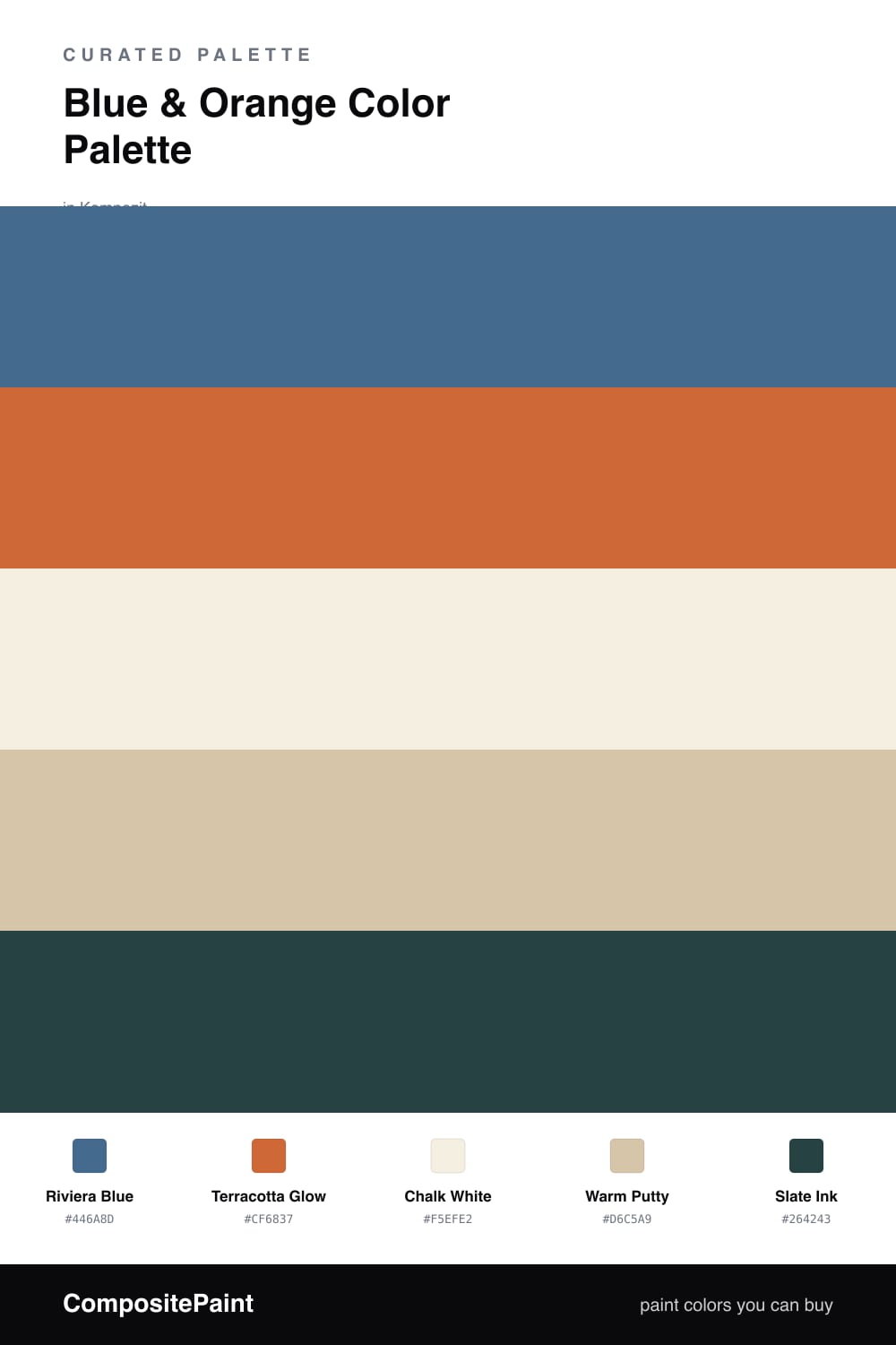
Blue & Orange Color Palette — Riviera Drift

A laid-back five-color scheme pairing a clear riviera blue with a sun-warmed terracotta orange, softened by chalk white and warm putty, with every color matched to real paint you can buy.

By David Chen · Formulation Lead & Resident Chemist

Riviera Blue
Dominant
Kompozit Honky Tonk Blue · 0619
#446A8D
LRV 13
Terracotta Glow
Secondary
Kompozit Casa De Oro · 1026
#CF6837
LRV 23
Chalk White
Base
Kompozit Bunny Cake · 0012
#F5EFE2
LRV 87
Warm Putty
Support
Kompozit Garden Country · 0279
#D6C5A9
LRV 57
Slate Ink
Accent
Kompozit Atlantic Waves · 0473
#264243
LRV 5
View palette in

This is blue and orange dialed back to something you can live in. Riviera Blue leads as a soft, slightly grayed coastal blue, and Terracotta Glow answers it with the warmth of a sun-baked clay pot. Because both are muted rather than primary, the contrast still reads but it feels lived-in, not loud.

Chalk White is the base that keeps everything breathing, and Warm Putty bridges the blue and the orange so they shade into each other instead of facing off. A little Slate Ink on the smallest details, a frame or a fixture, gives your eye somewhere to rest.

For 2026 the move is restraint, so let the blue cover the big surfaces, drop the terracotta in small warm doses, and keep the neutrals doing the quiet work in between.

Buy These Colors

Each color matched to the closest real paint in every brand, by ΔE2000. Kompozit first; take any SKU to the store — these mix on demand.

Riviera Blue
#3F6E8C · LRV 14 · Dominant
Kompozit Honky Tonk Blue · 0619 ΔE 3.55
Backdrop Mom Jeans · BD-MJ ΔE 6.31
Behr Regatta Bay · 550F-6 ΔE 3.44
Benjamin Moore Santa Monica Blue · 776 ΔE 0.94
Clare Hyperlink · PNT100-MD-41 ΔE 2.28
Dunn-Edwards Rainy Lake · DE5852 ΔE 2.16
Farrow & Ball Pitch Blue · No. 220 ΔE 11.56
Magnolia Home Blue Skies · JG-85 ΔE 6.22
PPG / Glidden Blue Oasis · 1158-6 ΔE 2.7
Sherwin-Williams Down Pour · SW 6516 ΔE 1.86
Valspar Cottage by the Sea · V069-5 ΔE 3.29
Terracotta Glow
#C9683C · LRV 23 · Secondary
Kompozit Casa De Oro · 1026 ΔE 1.5
Backdrop Anita · BD-AN ΔE 21.03
Behr Rumba Orange · M230-7 ΔE 4.09
Benjamin Moore Fall Harvest · 2168-10 ΔE 0.77
Clare Fire Sign · PNT100-DP-74 ΔE 3.56
Dunn-Edwards Clay Pot · DE5174 ΔE 1.73
Farrow & Ball Charlotte's Locks · No. 268 ΔE 4.69
Magnolia Home Work Worn Wood · JG-35 ΔE 5.2
PPG / Glidden Sesame Crunch · 1198-7 ΔE 3.31
Sherwin-Williams Determined Orange · SW 6635 ΔE 1.09
Valspar Hot Wings · V046-5 ΔE 3.83
Chalk White
#F3EEE3 · LRV 86 · Base
Kompozit Bunny Cake · 0012 ΔE 0.87
Backdrop Jane · BD-JA ΔE 1.45
Behr Snowy Pine · PPU10-13 ΔE 1.49
Benjamin Moore Steam · AF-15 ΔE 1.92
Clare Wing It · PNT100-LT-24 ΔE 2.87
Dunn-Edwards Trite White · DE6204 ΔE 1.18
Farrow & Ball Pointing · No. 2003 ΔE 1.37
Magnolia Home Silos White · JG-107 ΔE 1.98
PPG / Glidden Atrium White · 1020-1 ΔE 0.95
Sherwin-Williams Westhighland White · SW 7566 ΔE 0
Valspar Wings of an Angel · V153 ΔE 0.44
Warm Putty
#D8C7AC · LRV 58 · Support
Kompozit Garden Country · 0279 ΔE 0.63
Backdrop August · BD-AU ΔE 7.98
Behr Parachute Silk · UL160-16 ΔE 1.38
Benjamin Moore Cocoa Sand · 1122 ΔE 2.26
Clare Meet Cute · PNT100-LT-60 ΔE 8.92
Dunn-Edwards Pale Beach · DE6199 ΔE 0.63
Farrow & Ball Savage Ground · No. 213 ΔE 1.37
Magnolia Home Plaster · JG-156 ΔE 3.68
PPG / Glidden Armadillo · 14-17 ΔE 1.4
Sherwin-Williams Tres Naturale · SW 9101 ΔE 2
Valspar Café Au Lait · M118 ΔE 1.6
Slate Ink
#33403F · LRV 5 · Accent
Kompozit Atlantic Waves · 0473 ΔE 4.96
Backdrop After Hours · BD-AH ΔE 4.11
Behr Astronomical · N450-7 ΔE 1.25
Benjamin Moore Regent Green · 2136-20 ΔE 2.7
Clare Blackish · PNT100-DP-54 ΔE 8.02
Dunn-Edwards Dark Engine · DE6350 ΔE 7.06
Farrow & Ball Pitch Black · No. 256 ΔE 8.37
Magnolia Home Arches · JG-97 ΔE 6.45
PPG / Glidden Black Magic · 1001-7 ΔE 7.85
Sherwin-Williams Roycroft Bottle Green · SW 2847 ΔE 4.16
Valspar Black Evergreen · 5009-1 ΔE 0.59

Questions

is riviera blue too cool to feel relaxed?

No, because it is mixed with a touch of gray rather than pure pigment, so it reads soft and weathered instead of icy. Paired with the warm terracotta and putty, the blue settles down and feels coastal rather than clinical.

where should the terracotta orange go?

Keep it to about one-fifth of what you see. Use it on one feature wall, a door, or in textiles and ceramics, and let the blue carry the larger surfaces so the orange always lands as a warm highlight.

Similar Palettes

Closest schemes by color — not by label.