CP

Blue & Orange Color Palette — Marina Morning

A breezy five-color scheme pairing a clear marina blue with a soft terracotta orange, settled by oatmeal and driftwood neutrals — every color matched to real paint you can buy.

By Jessica Williams · Color Stylist & Interior Editor

Marina Blue
Dominant
Kompozit Honky Tonk Blue · 0619
#446A8D
LRV 13
Terracotta Glow
Secondary
Kompozit Jack-O-Lantern · 1038
#D37A51
LRV 28
Oatmeal Linen
Base
Kompozit Hint of Vanilla · 0001
#EEE8DC
LRV 81
Driftwood Greige
Support
Kompozit Cantera · 0343
#CEC5AF
LRV 56
Slate Ink
Accent
Kompozit Octavius · 0522
#38393F
LRV 4
View palette in

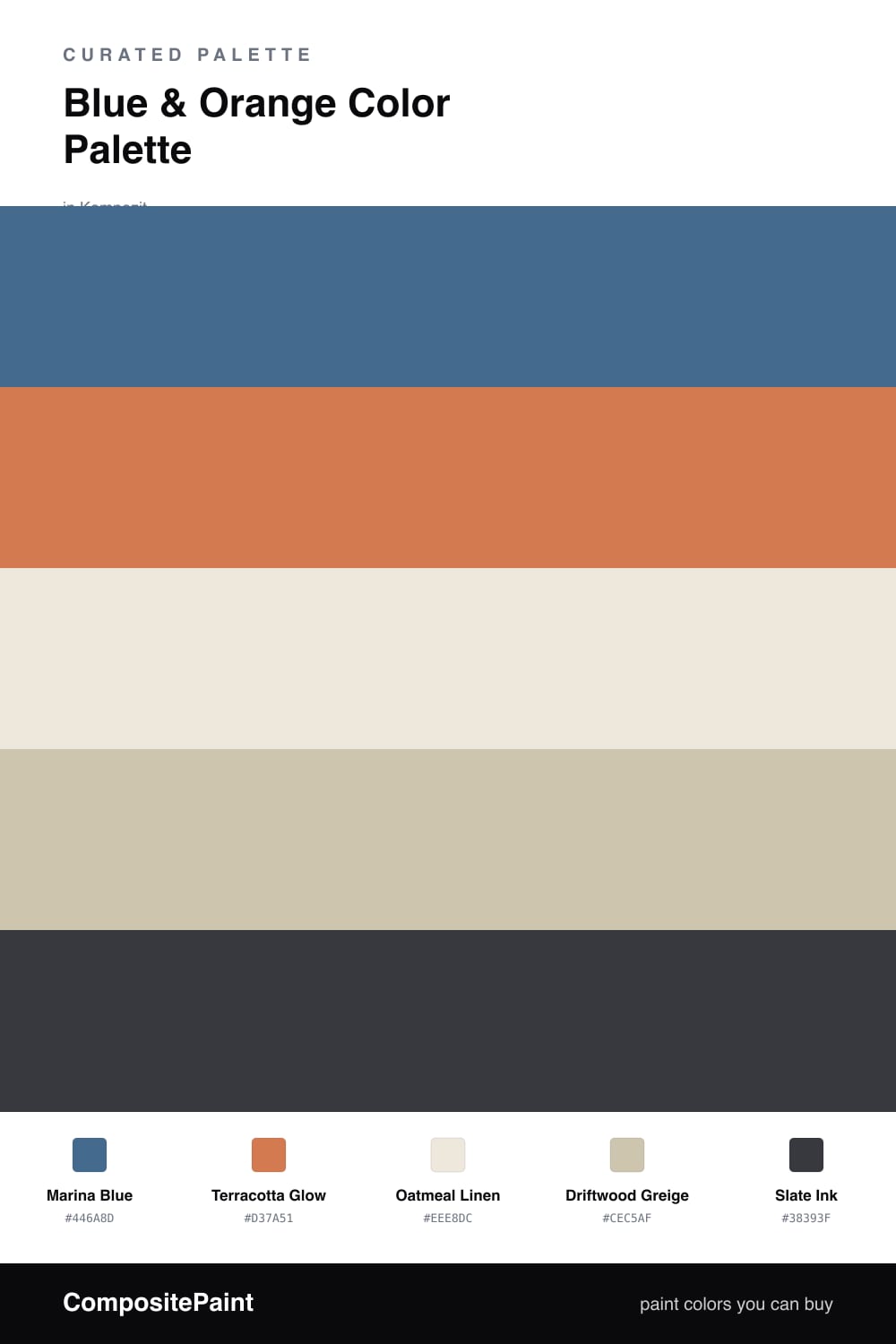
Blue and orange are natural opposites, which is exactly why they flatter each other instead of fighting. This scheme softens that classic contrast into something easier to live with: a clear, sea-glass Marina Blue as the anchor and a sun-warmed Terracotta Glow as the spark.

Oatmeal Linen and Driftwood Greige sit in the middle as a quiet, sandy base, giving the two brights plenty of room to breathe. They keep the pairing feeling current and calm rather than nautical or loud, which is where blue-and-orange schemes usually go wrong.

A thread of Slate Ink grounds the whole thing — think a black-bronze handle or a slim frame. Use the blue generously, the orange in smaller warm doses, and let the neutrals carry the rest.

Buy These Colors

Each color matched to the closest real paint in every brand, by ΔE2000. Kompozit first; take any SKU to the store — these mix on demand.

Marina Blue
#3A6E8F · LRV 14 · Dominant
Kompozit Honky Tonk Blue · 0619 ΔE 3.54
Backdrop Mom Jeans · BD-MJ ΔE 7.14
Behr Regatta Bay · 550F-6 ΔE 3.68
Benjamin Moore Santa Monica Blue · 776 ΔE 1.12
Clare Hyperlink · PNT100-MD-41 ΔE 2.33
Dunn-Edwards Rainy Lake · DE5852 ΔE 1.93
Farrow & Ball Pitch Blue · No. 220 ΔE 11.93
Magnolia Home Blue Skies · JG-85 ΔE 7.04
PPG / Glidden Blue Oasis · 1158-6 ΔE 1.89
Sherwin-Williams Down Pour · SW 6516 ΔE 2.52
Valspar Cottage by the Sea · V069-5 ΔE 3.43
Terracotta Glow
#CC7A4D · LRV 27 · Secondary
Kompozit Jack-O-Lantern · 1038 ΔE 2.22
Backdrop Anita · BD-AN ΔE 17.54
Behr Grounded · 240D-5 ΔE 2.6
Benjamin Moore Bryce Canyon · 098 ΔE 1.39
Clare Fire Sign · PNT100-DP-74 ΔE 5.32
Dunn-Edwards Spanish Peanut · DE5180 ΔE 4.39
Farrow & Ball Red Earth · No. 64 ΔE 7.68
Magnolia Home Work Worn Wood · JG-35 ΔE 6.67
PPG / Glidden Cazuela · 17-23 ΔE 1.28
Sherwin-Williams Rhumba Orange · SW 6642 ΔE 2.61
Valspar Clove Bud · 2004-5B ΔE 2.42
Oatmeal Linen
#EFE7D7 · LRV 80 · Base
Kompozit Hint of Vanilla · 0001 ΔE 1.65
Backdrop Don't Eat the Yellow Snow · BD-DS ΔE 3.1
Behr Rye Flour · HDC-FL13-5 ΔE 1.36
Benjamin Moore Navajo White · 947 ΔE 1.09
Clare Like Buttah · PNT100-LT-62 ΔE 1.36
Dunn-Edwards Ball of String · DE6190 ΔE 0.48
Farrow & Ball James White · No. 2010 ΔE 2.13
Magnolia Home Carter Crème · JG-16 ΔE 1.09
PPG / Glidden Edelweiss · 14-23 ΔE 0.93
Sherwin-Williams Restful White · SW 7563 ΔE 1.19
Valspar Double Scoop · V176 ΔE 0.52
Driftwood Greige
#CDC2AE · LRV 55 · Support
Kompozit Cantera · 0343 ΔE 1.59
Backdrop Boy Meets Girl · BD-BG ΔE 12.73
Behr Washed Khaki · UL170-8 ΔE 1.27
Benjamin Moore Royal Flax · CSP-315 ΔE 2
Clare Motor City · PNT100-LT-09 ΔE 8.41
Dunn-Edwards Birchwood · DEC752 ΔE 2.14
Farrow & Ball Stony Ground · No. 211 ΔE 0.99
Magnolia Home Anatolian · JG-127 ΔE 5.43
PPG / Glidden Gotta Have It · 1076-3 ΔE 3.51
Sherwin-Williams Cargo Pants · SW 7738 ΔE 1.51
Valspar Oatbran · 6006-1B ΔE 1.22
Slate Ink
#2B3540 · LRV 3 · Accent
Kompozit Octavius · 0522 ΔE 4.9
Backdrop After Hours · BD-AH ΔE 10.02
Behr Sorcerer · 760F-7 ΔE 2.15
Benjamin Moore Winding Waterway · 2063-10 ΔE 5.83
Clare Blackish · PNT100-DP-54 ΔE 10.56
Dunn-Edwards Old Mill · DEA185 ΔE 5.68
Farrow & Ball Pitch Black · No. 256 ΔE 8.41
Magnolia Home Blackboard · JG-05 ΔE 3.59
PPG / Glidden Black Magic · 1001-7 ΔE 8.44
Sherwin-Williams Anchors Aweigh · SW 9179 ΔE 1.55
Valspar Pitch Cobalt · 5010-2 ΔE 2.81

Questions

how do i keep marina blue and terracotta from looking too coastal-cliche?

Lean on the warm neutrals and skip the rope-and-anchor styling. Oatmeal Linen on the largest surfaces and a few brushed-brass or pale-wood touches read as contemporary 2026, not a beach gift shop. The blue and orange then feel chosen, not themed.

which color should i use the most of?

Let Marina Blue lead as your dominant tone and keep Terracotta Glow as the warm spark, roughly a 70/30 split. Oatmeal Linen and Driftwood Greige fill the calm middle, and Slate Ink shows up only in small grounding doses like a frame or a fixture.

Similar Palettes

Closest schemes by color — not by label.