Navy Color Palette — Amber Harbor
A deep navy-led five-color scheme warmed by a glowing amber accent and grounded in soft neutrals, with every color matched to real paint you can buy.
By Emily Roberts · DIY Editor & First-Timer's Guide
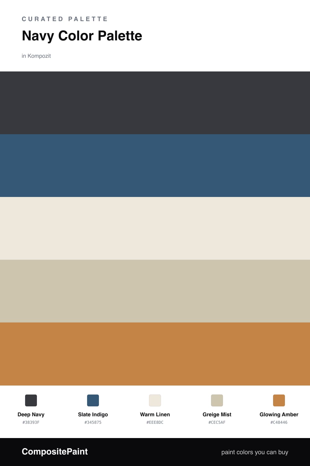
Navy is having a real moment in 2026, and this scheme shows why it has staying power. Deep Navy leads, calm and confident, with Slate Indigo a step lighter to keep big walls from feeling flat. Think of the indigo as navy with the lights turned up a notch.
The soft middle is where the room breathes. Warm Linen and Greige Mist are quiet, sandy neutrals that stop all that blue from feeling heavy or cold — they are the pause between the deep tones and the bright one.
Then comes the fun part. Glowing Amber is your accent, the warm flicker that makes everyone in the room feel cozy. Use it sparingly and let the navy stay in charge, and you get a look that feels both timeless and very now.
Buy These Colors
Each color matched to the closest real paint in every brand, by ΔE2000. Kompozit first; take any SKU to the store — these mix on demand.
Questions
Navy is cool and deep, so it needs something warm to come alive — amber is that spark. The two sit on opposite sides of the color wheel, which is why the navy looks richer and the amber looks brighter when they share a room.
Keep it small. Navy and the soft neutrals do most of the work, and amber shows up in little doses — a pillow, a lampshade, a single chair — roughly a one-fifth share of the whole space.
Similar Palettes
Closest schemes by color — not by label.