Navy & Brass Bedroom Palette — Classic Blue & Warm Ochre
A timeless 5-color scheme for navy bedrooms: classic navy walls, warm white trim, soft dove gray for balance, and a warm brass-ochre accent that glows. Every color matched to real paint you can buy.
By Jessica Williams · Color Stylist & Interior Editor
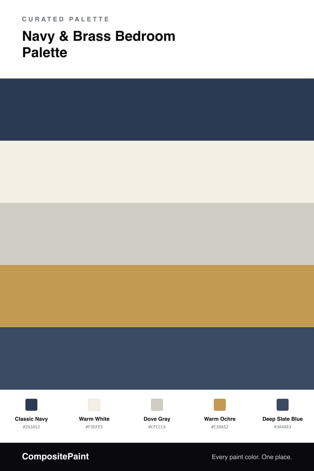
This is the dressed-up cousin of a moody bedroom — still rich and dark, but with a crisp, classic polish. The classic navy covers the main walls, a deep blue that has been a designer favorite for decades because it acts almost like a neutral. Warm white on the trim and ceiling keeps the whole room sharp and bright where it counts, framing the navy cleanly. Dove gray softens the middle ground; use it on furniture or built-ins so the room has a calm resting tone between the dark walls and bright trim. The headboard wall gets a deep slate blue, just a shade lighter and grayer, to add quiet dimension. The real magic is the warm ochre — think aged brass — on lamps, pulls, picture frames, and small accents. That glow of warm metal against cool navy is what makes this palette feel finished and timeless.
Buy These Colors
Each color matched to the closest real paint in every brand, by ΔE2000. Tap a swatch for its full guide or + to save it — take any SKU to the store, they mix on demand.
Questions
Navy is about as timeless as a saturated color gets, which is exactly why it feels safe. Unlike trendy shades, a true classic navy reads almost like a neutral once it is on the wall, and it flatters nearly every wood tone and metal finish. Paired with warm white and a little brass, it has staying power that bright colors rarely match.
The classic navy is your main, deeper wall color, while the deep slate blue is a slightly lighter, grayer cousin used on the headboard wall. Putting them side by side gives subtle dimension so the room is not one flat block of dark blue. If you prefer simplicity, you can skip the slate and use navy throughout.
Similar Palettes
Closest schemes by color — not by label.