Navy Color Palette — Navy Tide
A navy-led five-color scheme pairing deep tidewater navy with soft greige, warm white, and a brass accent — every color matched to real paint you can buy.
By Emily Roberts · DIY Editor & First-Timer's Guide
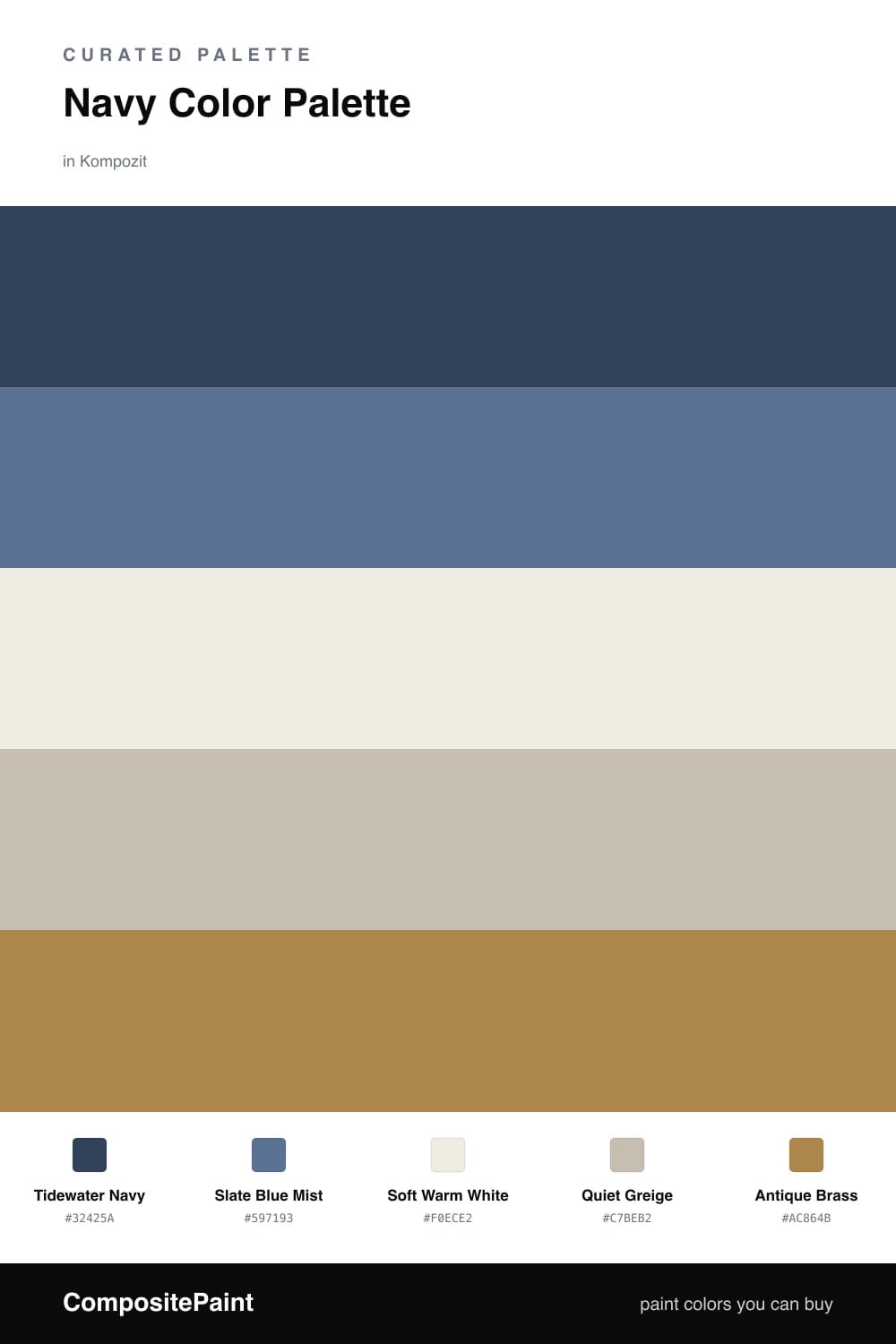
Navy is one of those colors that feels both safe and a little bit grown-up at the same time. Tidewater Navy leads here as a deep, slightly grey-blue anchor — the kind of shade that looks great on a wall, a kitchen island, or a front door without ever feeling too dark.
To keep it breathing, Slate Blue Mist steps in as a softer second blue, and Soft Warm White and Quiet Greige do the calm, quiet work in between. That mix is what makes the navy feel current rather than nautical or stuffy.
The little spark is Antique Brass — use it in tiny doses, like cabinet pulls, a light fixture, or a picture frame. A warm metal next to all that cool navy is the 2026 move, and it is the easiest way to make the whole scheme feel finished.
Buy These Colors
Each color matched to the closest real paint in every brand, by ΔE2000. Kompozit first; take any SKU to the store — these mix on demand.
Questions
Navy reads almost like a neutral but with more depth, so it can carry a whole room without feeling heavy. Pairing it with a warm white and a soft greige keeps it from going cold, and the brass accent adds just enough warmth to feel inviting.
Let the navy lead — think roughly two-thirds of the space on walls or a big piece of furniture. Keep the warm white and greige as the calm middle ground, and save the brass for small touches like hardware or a lamp.
Similar Palettes
Closest schemes by color — not by label.