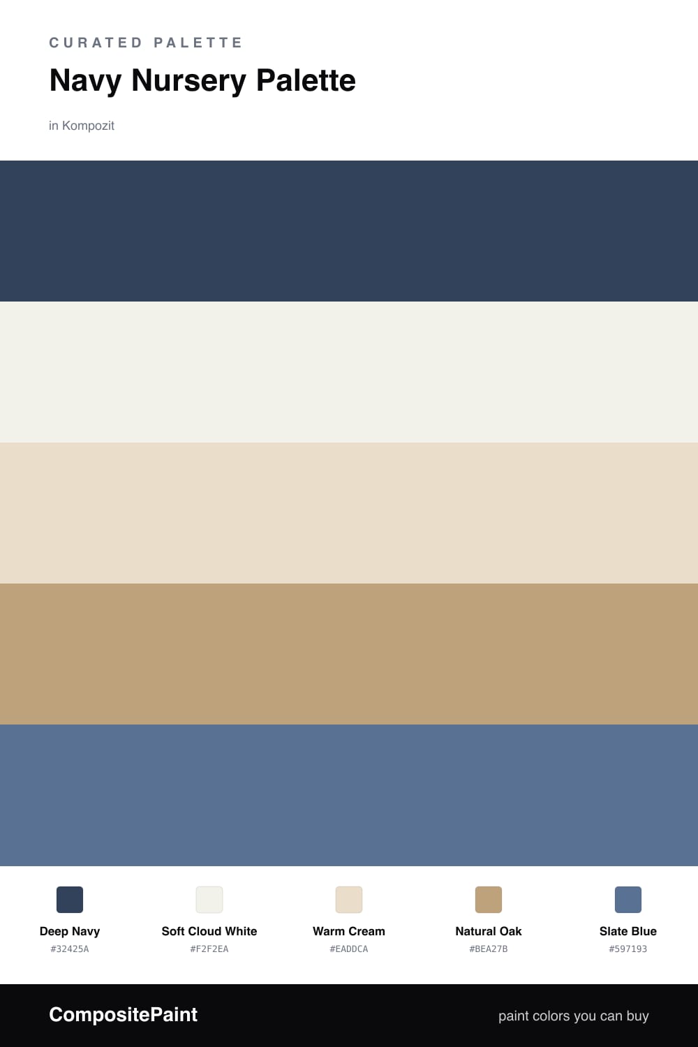
Navy Nursery Palette — Deep Navy & Soft Cloud
A calming five-color nursery scheme led by deep navy, softened with warm cream, crisp white, natural oak, and a slate-blue accent — every color matched to real paint you can buy.
By David Chen · Formulation Lead & Resident Chemist
Navy is having a quiet moment in nurseries right now, and I understand why. A Deep Navy wall reads like a clear night sky — restful, a little dreamy, and far more soothing than the bright primary blues we used to default to. Used on one wall or the lower band of the room, it gives a baby’s eyes something deep and calm to settle on.
The trick is balance. Soft Cloud White on the trim and ceiling keeps the room breathing and reflects daylight back down, while Warm Cream on cabinets and built-ins softens every edge. Think of the cream as the buffer that keeps the navy from going severe.
Then come the warm notes. Natural Oak floors and furniture add a honeyed undertone that takes the chill off all that blue, and a Slate Blue accent — on a chair, a frame, or a knit throw — links the warm and cool halves together. Lead with the navy, keep the whites doing the quiet work, and let oak and slate be the gentle surprises.
Buy These Colors
Each color matched to the closest real paint in every brand, by ΔE2000. Kompozit first; take any SKU to the store — these mix on demand.
Questions
Not when you handle it the way a chemist handles a strong reagent — a little goes a long way. Keep navy to one feature wall or the lower two-thirds of the room, and let the soft white ceiling and warm cream bounce light back so the space still feels open and gentle.
Warmth is the counterweight to all that cool blue. The natural oak tone and warm cream do that job, adding a honeyed undertone that softens the navy, while the slate-blue accent bridges the two so nothing feels abrupt.
Similar Palettes
Closest schemes by color — not by label.