CP

Blue & Orange Color Palette — Cobalt Flame

A bold five-color scheme pairing vivid cobalt blue with a warm flame orange, balanced by soft cream and a smoky charcoal — every color matched to real paint you can buy.

By Emily Roberts · DIY Editor & First-Timer's Guide

Cobalt Flame
Dominant
Kompozit Dancing Sea · 0641
#1C4D8F
LRV 8
Ember Orange
Secondary
Kompozit Casa De Oro · 1026
#CF6837
LRV 23
Linen Cream
Base
Kompozit Kiara · 0005
#F5ECDC
LRV 85
Toasted Sand
Support
Kompozit Golden Buff · 0288
#DEC8A3
LRV 59
Smoke Charcoal
Accent
Kompozit Silent Sea · 0515
#2A2B2C
LRV 2
View palette in

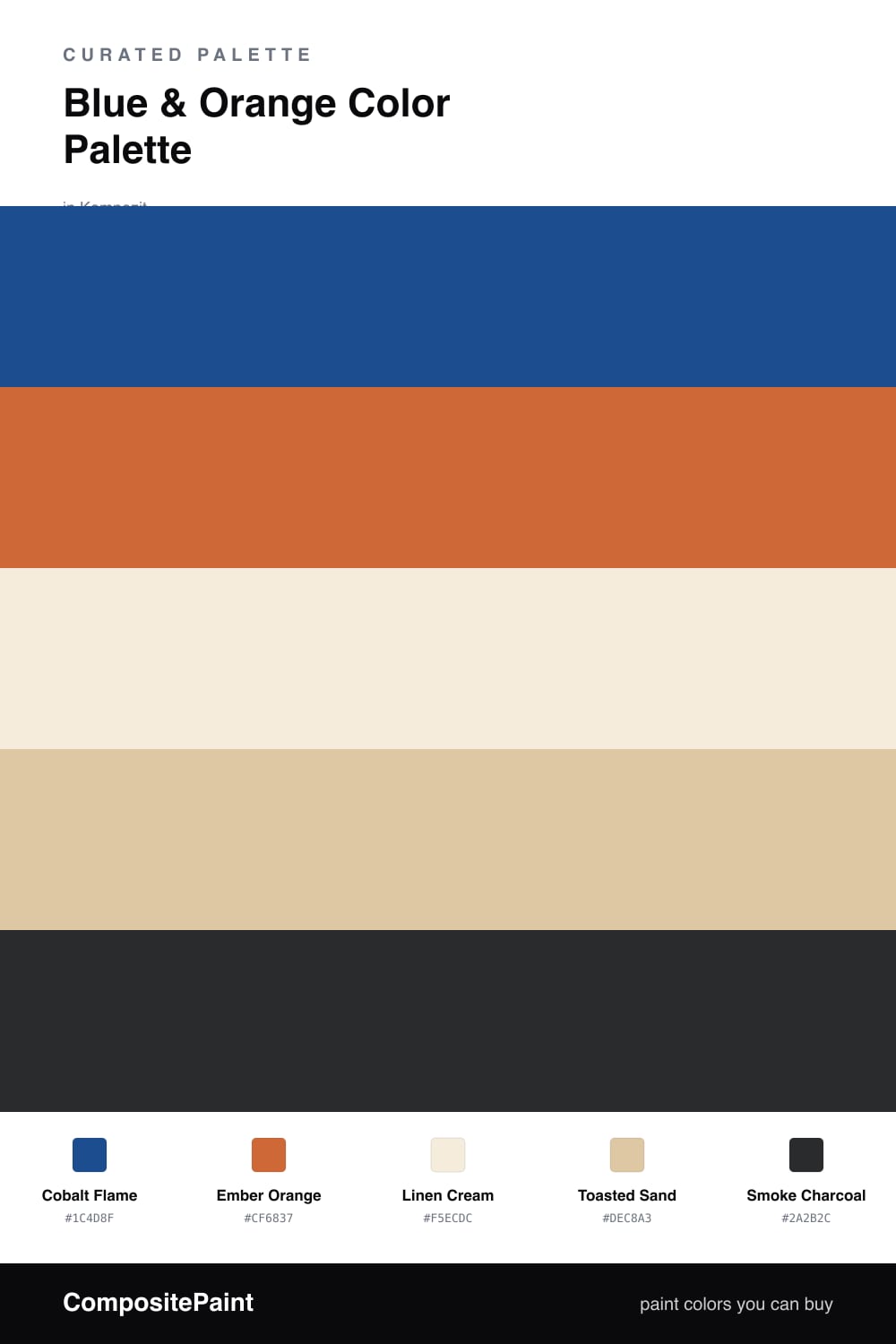
Blue and orange are true opposites on the color wheel, which is exactly why they make each other glow instead of clash. This scheme leans on a vivid Cobalt Flame as the anchor and a warm Ember Orange as the spark that brings it to life.

In between, Linen Cream and Toasted Sand do the quiet work, giving both brights room to breathe so the room feels collected rather than busy. A whisper of Smoke Charcoal grounds the whole thing and keeps the cobalt from floating away.

If you are new to color, here is the easy version: paint most of the space in the blue, save the orange for the pieces you want people to notice, and let the cream and sand carry everything else. That simple split is what keeps this 2026-fresh pairing feeling confident, not chaotic.

Buy These Colors

Each color matched to the closest real paint in every brand, by ΔE2000. Kompozit first; take any SKU to the store — these mix on demand.

Cobalt Flame
#27518C · LRV 8 · Dominant
Kompozit Dancing Sea · 0641 ΔE 1.47
Backdrop We Three Kings · BD-WK ΔE 7.37
Behr Express Blue · M500-6 ΔE 1.61
Benjamin Moore Blueberry Hill · 812 ΔE 2.13
Clare Deep Dive · PNT100-MD-40 ΔE 17.89
Dunn-Edwards Deep Sapphire · DEA137 ΔE 1.21
Farrow & Ball Stiffkey Blue · No. 281 ΔE 11.29
Magnolia Home Silos District · JG-92 ΔE 7.39
PPG / Glidden Brilliant Blue · 1161-7 ΔE 1.21
Sherwin-Williams Frank Blue · SW 6967 ΔE 1.4
Valspar Strong Will · 8001-44G ΔE 1.27
Ember Orange
#D96A2B · LRV 25 · Secondary
Kompozit Casa De Oro · 1026 ΔE 3.2
Backdrop Anita · BD-AN ΔE 22.12
Behr Maple Leaf · 250D-6 ΔE 1.76
Benjamin Moore Pumpkin Cream · 2168-20 ΔE 3.68
Clare Fire Sign · PNT100-DP-74 ΔE 6.98
Dunn-Edwards Desert Spice · DE5202 ΔE 3.93
Farrow & Ball Charlotte's Locks · No. 268 ΔE 7.41
Magnolia Home Work Worn Wood · JG-35 ΔE 9.31
PPG / Glidden Field Poppy · 1195-7 ΔE 2.57
Sherwin-Williams Knockout Orange · SW 6885 ΔE 3.84
Valspar Sandy Peppers · 8001-17G ΔE 2.35
Linen Cream
#F2ECDD · LRV 84 · Base
Kompozit Kiara · 0005 ΔE 1.37
Backdrop Jane · BD-JA ΔE 2.43
Behr Parchment Paper · 710C-1 ΔE 0.74
Benjamin Moore Arbor White · ES-01 ΔE 0.56
Clare Like Buttah · PNT100-LT-62 ΔE 2.54
Dunn-Edwards Bone China · DEW339 ΔE 0.21
Farrow & Ball White Tie · No. 2002 ΔE 1.74
Magnolia Home Pearly Cotton · JG-33 ΔE 1.21
PPG / Glidden Spun Cotton · 1203-1 ΔE 0.52
Sherwin-Williams Classic Light Buff · SW 50 ΔE 0.58
Valspar Statuesque · 7002-5 ΔE 0.53
Toasted Sand
#DCC6A6 · LRV 58 · Support
Kompozit Golden Buff · 0288 ΔE 1.67
Backdrop August · BD-AU ΔE 7.84
Behr Louvre · N280-3 ΔE 0.48
Benjamin Moore Richmond Bisque · HC-177 ΔE 1.28
Clare Meet Cute · PNT100-LT-60 ΔE 9.21
Dunn-Edwards Cliff's View · DEC720 ΔE 2.32
Farrow & Ball Savage Ground · No. 213 ΔE 1.37
Magnolia Home Tapestry Thread · JG-105 ΔE 6.12
PPG / Glidden My Love · 1081-3 ΔE 2.46
Sherwin-Williams Toasted Pine Nut · SW 7696 ΔE 0
Valspar Café Au Lait · M118 ΔE 0.63
Smoke Charcoal
#2C2A29 · LRV 2 · Accent
Kompozit Silent Sea · 0515 ΔE 2.17
Backdrop Hocus Pocus · BD-HP ΔE 5.3
Behr Beluga · 770F-7 ΔE 6.52
Benjamin Moore Black · PM-9 ΔE 2.22
Clare Blackish · PNT100-DP-54 ΔE 9.39
Dunn-Edwards Black · DEA187 ΔE 5.16
Farrow & Ball Pitch Black · No. 256 ΔE 4.81
Magnolia Home Blackboard · JG-05 ΔE 5.72
PPG / Glidden Black Magic · 1001-7 ΔE 7.11
Sherwin-Williams Tricorn Black · SW 6258 ΔE 2.27
Valspar Dark Kettle Black · 4011-2 ΔE 3.01

Questions

Which color should I use the most of?

Let the cobalt blue lead. Aim for roughly two-thirds blue and one-third orange, and let the cream and sand fill the quiet space in between so the two brights never shout over each other.

Will this still feel current and not like a sports logo?

Yes, the trick is the temperature. The blue here is a softened cobalt and the orange is a toasted ember rather than a traffic-cone orange, so they read warm and grown-up instead of loud.

Similar Palettes

Closest schemes by color — not by label.