CP

Blue & Orange Color Palette — Harbor Sunset

A bold five-color scheme pairing deep harbor blue with warm sunset orange, balanced by cream and charcoal — every color matched to real paint you can buy.

By Jessica Williams · Color Stylist & Interior Editor

Harbor Blue
Dominant
Kompozit Quiet Peace · 0592
#3A4A64
LRV 7
Sunset Orange
Secondary
Kompozit Jack-O-Lantern · 1038
#D37A51
LRV 28
Warm Cream
Base
Kompozit Pale Quartz · 0362
#EFEADA
LRV 82
Soft Sand
Support
Kompozit Muslin Tint · 0287
#E0CDB1
LRV 63
Deep Charcoal
Accent
Kompozit Silent Sea · 0515
#2A2B2C
LRV 2
View palette in

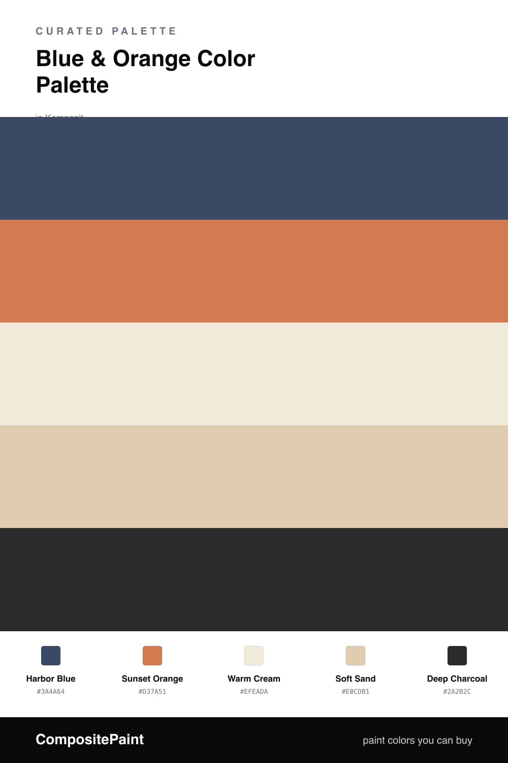
Blue and orange is the steadiest contrast pairing there is — true opposites that flatter each other instead of clashing. This scheme leans on a deep, weathered Harbor Blue as the anchor, the kind of blue that reads almost like ink in low light and softens to slate by a window. Against it, a warm Sunset Orange glows like late afternoon, terracotta-leaning rather than neon, which is what keeps the whole thing feeling 2026-grown-up instead of graphic.

In between, Warm Cream and Soft Sand give the two brights somewhere to breathe. They are the calm middle that stops the contrast from snapping too hard, and they pick up the warmth of the orange so it never feels stranded. A quiet Deep Charcoal sits underneath it all, grounding the palette the way a dark frame settles a bright photograph.

Use the blue as your dominant tone, save the orange for smaller doses where it can spark, and let the cream and sand carry the rest. Done this way, the pairing feels less like a sports logo and more like a harbor at dusk — deep water, warm light, soft stone.

Buy These Colors

Each color matched to the closest real paint in every brand, by ΔE2000. Kompozit first; take any SKU to the store — these mix on demand.

Harbor Blue
#2A4A6B · LRV 6 · Dominant
Kompozit Quiet Peace · 0592 ΔE 4.21
Backdrop Last Call · BD-LC ΔE 8.72
Behr Twilight Chimes · 560F-7 ΔE 1.31
Benjamin Moore Cefalú Beach · 2061-20 ΔE 2.3
Clare Blackish · PNT100-DP-54 ΔE 16.75
Dunn-Edwards Deep Ocean · DEA135 ΔE 5.85
Farrow & Ball Hague Blue · No. 30 ΔE 9.88
Magnolia Home Signature · JG-91 ΔE 5.5
PPG / Glidden Blue Tang · 10-32 ΔE 0.62
Sherwin-Williams Indigo · SW 6531 ΔE 1.27
Valspar Indigo Cloth · 4009-7 ΔE 4.28
Sunset Orange
#D9743F · LRV 28 · Secondary
Kompozit Jack-O-Lantern · 1038 ΔE 3.2
Backdrop Anita · BD-AN ΔE 20.15
Behr Amber Wave · 260D-5 ΔE 2.62
Benjamin Moore Pumpkin Pie · 2167-20 ΔE 2.23
Clare Fire Sign · PNT100-DP-74 ΔE 5.68
Dunn-Edwards Sweet Potato · DE5201 ΔE 4.09
Farrow & Ball Charlotte's Locks · No. 268 ΔE 7.48
Magnolia Home Work Worn Wood · JG-35 ΔE 8.55
PPG / Glidden Field Poppy · 1195-7 ΔE 1.5
Sherwin-Williams Knockout Orange · SW 6885 ΔE 2.63
Valspar Sandy Peppers · 8001-17G ΔE 2.37
Warm Cream
#F0E9DA · LRV 82 · Base
Kompozit Pale Quartz · 0362 ΔE 1.18
Backdrop Don't Eat the Yellow Snow · BD-DS ΔE 3.33
Behr Coastal Beige · PPU7-13 ΔE 0.76
Benjamin Moore Stoneware · CSP-245 ΔE 0.99
Clare Like Buttah · PNT100-LT-62 ΔE 1.93
Dunn-Edwards Ball of String · DE6190 ΔE 0.52
Farrow & Ball James White · No. 2010 ΔE 1.89
Magnolia Home Antique Rose · JG-23 ΔE 0.85
PPG / Glidden Purity · 14-20 ΔE 0.49
Sherwin-Williams Classic Light Buff · SW 50 ΔE 0.56
Valspar Grow · 8003-25A ΔE 1.03
Soft Sand
#E0CDB2 · LRV 63 · Support
Kompozit Muslin Tint · 0287 ΔE 0.37
Backdrop August · BD-AU ΔE 7.15
Behr Concord Buff · HDC-AC-09 ΔE 0.52
Benjamin Moore Moccasin · 1059 ΔE 0.91
Clare Turbinado · PNT100-LT-21 ΔE 4.02
Dunn-Edwards Cochise · DEC761 ΔE 1.24
Farrow & Ball String · No. 8 ΔE 2.33
Magnolia Home Tapestry Thread · JG-105 ΔE 5.95
PPG / Glidden Sand Fossil · 1098-3 ΔE 2.01
Sherwin-Williams Sundew · SW 7688 ΔE 1.29
Valspar Peasant Bread · 8003-22B ΔE 0.24
Deep Charcoal
#2E2C2A · LRV 3 · Accent
Kompozit Silent Sea · 0515 ΔE 2.57
Backdrop Hocus Pocus · BD-HP ΔE 6.19
Behr Beluga · 770F-7 ΔE 6.38
Benjamin Moore Black · PM-9 ΔE 2.53
Clare Blackish · PNT100-DP-54 ΔE 8.75
Dunn-Edwards Black · DEA187 ΔE 4.69
Farrow & Ball Pitch Black · No. 256 ΔE 4.26
Magnolia Home Blackboard · JG-05 ΔE 5.94
PPG / Glidden Black Magic · 1001-7 ΔE 6.6
Sherwin-Williams Tricorn Black · SW 6258 ΔE 2.38
Valspar Noir · 4009-2 ΔE 2.87

Questions

Why do blue and orange work so well together?

They sit directly opposite on the color wheel, so each one makes the other look richer. Keeping the blue deep and the orange warm and a little muted, with cream resting in between, keeps the pairing feeling collected instead of loud.

How do I balance the two colors so neither takes over?

Let the blue lead and keep the orange as a spark, roughly a 70/30 split. Harbor Blue carries the largest surfaces, Sunset Orange shows up in smaller moments, and the cream and sand do the quiet connecting work so the two brights never compete.

Similar Palettes

Closest schemes by color — not by label.