Antler Velvet
The warm-cool taupe Sherwin-Williams itself can't decide is beige or gray, reviewed honestly: the light where it glows, the light where it goes muddy, and what it was actually built for.

Jessica has spec'd whites and neutrals for more than 300 rooms and keeps a sample wall of painted drawdowns in her studio. Every color review is checked against real reader rooms in the comments and re-tested when a formula changes. About the testing process →
- 1Anonymous20
- 2Fawn Brindle36
- 3Antler Velvet43
- 4Agreeable Gray60
- 5Pale Oak69
The Fast Verdict
Antler Velvet is a mid-depth taupe that Sherwin-Williams' own system can't quite commit to — it files the color under "Yellow," but on a wall it reads like a grounded, earthy brown-gray, not yellow at all. It landed a real spot in SW's 2023 Colormix Forecast "Biome" palette, built for rooms that want to feel tactile and natural rather than styled. It is not a headline color and nobody names a whole house after it, but in an organic-modern room with real daylight, it is a genuinely good, honestly unglamorous choice.
Organic-modern living rooms and bedrooms · exteriors with stone or cedar siding · open-plan homes that want a grounding neutral without going full gray or full beige · anyone drawn to the earthy "new naturalism" mood over gray-decade greige
You want the wall to read unmistakably gray or unmistakably beige · your room is dim and north-facing · your trim is a cool, blue-leaning white · you're chasing a headline Color-of-the-Year name
- A genuine warm-cool balance most taupes only claim to have
- Grounded, earthy read that fits the organic-modern trend without dating fast
- Real Sherwin-Williams forecast credibility (2023 Colormix Biome palette) — not a marketing invention
- Holds its color on exteriors and beside natural materials
- Coordinates cleanly with Alabaster, Worldly Gray and Natural Linen, all SW's own suggested pairings
- Not famous — thin real-world review history to lean on
- Balanced undertone means it won't commit to reading gray or beige
- Goes flat and muddy in dim, north-facing rooms
- Cool white trim makes it look dingy instead of grounded
What Color Is Antler Velvet, Really?
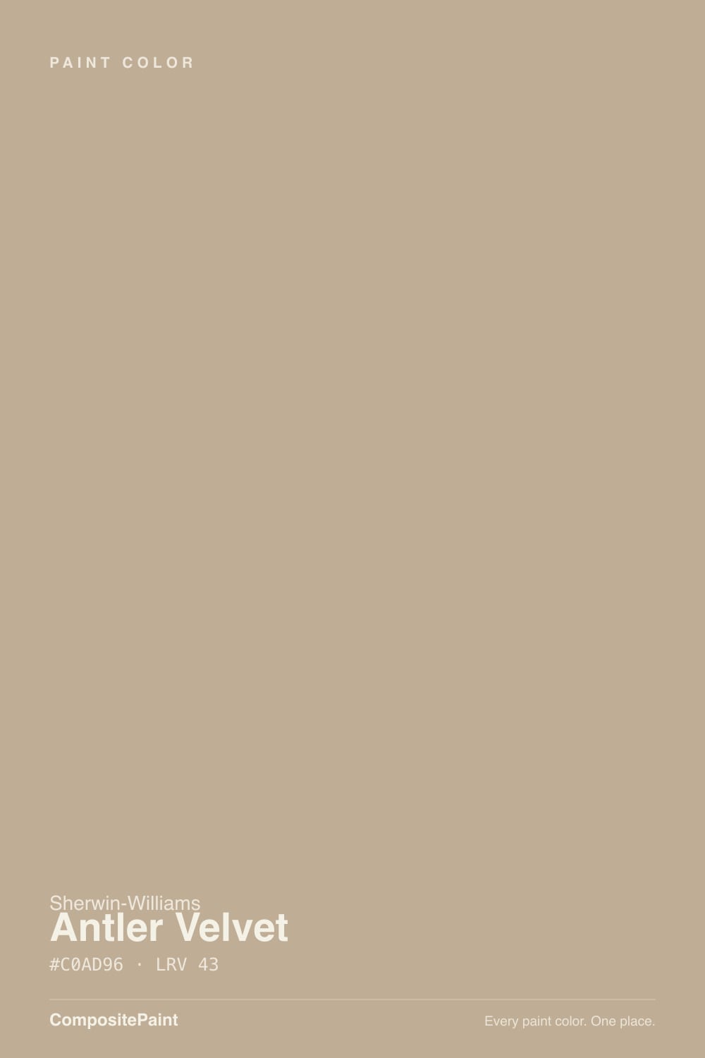
Antler Velvet is a mid-depth taupe built on a genuine warm-and-cool balance — unusual enough that even Sherwin-Williams' own catalog can't fully commit to it, filing the color under its "Yellow" family even though on the wall it behaves like a grounded, earthy taupe-brown, nothing close to yellow. Sherwin-Williams built its 2023 Colormix Forecast around a "Biome" palette and placed Antler Velvet inside the "Nurturer" persona — the design language of exposed wood, linen, unglazed pottery, and rooms meant to feel handled rather than staged. That is the honest lineage: not a Color of the Year, not a viral name, but a real curated forecast pick built for the earthy-neutral, organic-modern moment that followed the gray decade.
At LRV 43 it sits in the same mid-depth band as Pashmina and Dorian Gray — deep enough to hold real color across a big wall, too deep to double as a bounce-light-everywhere whole-house safety pick. That depth is the point: next to a warm wood floor and linen textiles it reads grounded and quietly expensive, the kind of neutral a room reaches for when beige feels boring and gray feels cold.
Undertone in one line: a genuine near-even split between warm and cool, which is rarer than it sounds — most "balanced" taupes still lean one way once you live with them. In warm daylight or lamp light it reads like a honeyed, melodic brown; under cooler, grayer light the warmth recedes and a flatter taupe-gray steps forward. Neither read is wrong — it is the same paint being honest about the light — but it means the color will not settle into being "the gray one" or "the beige one" in your head the way a more decisive greige will.
Where It Shines
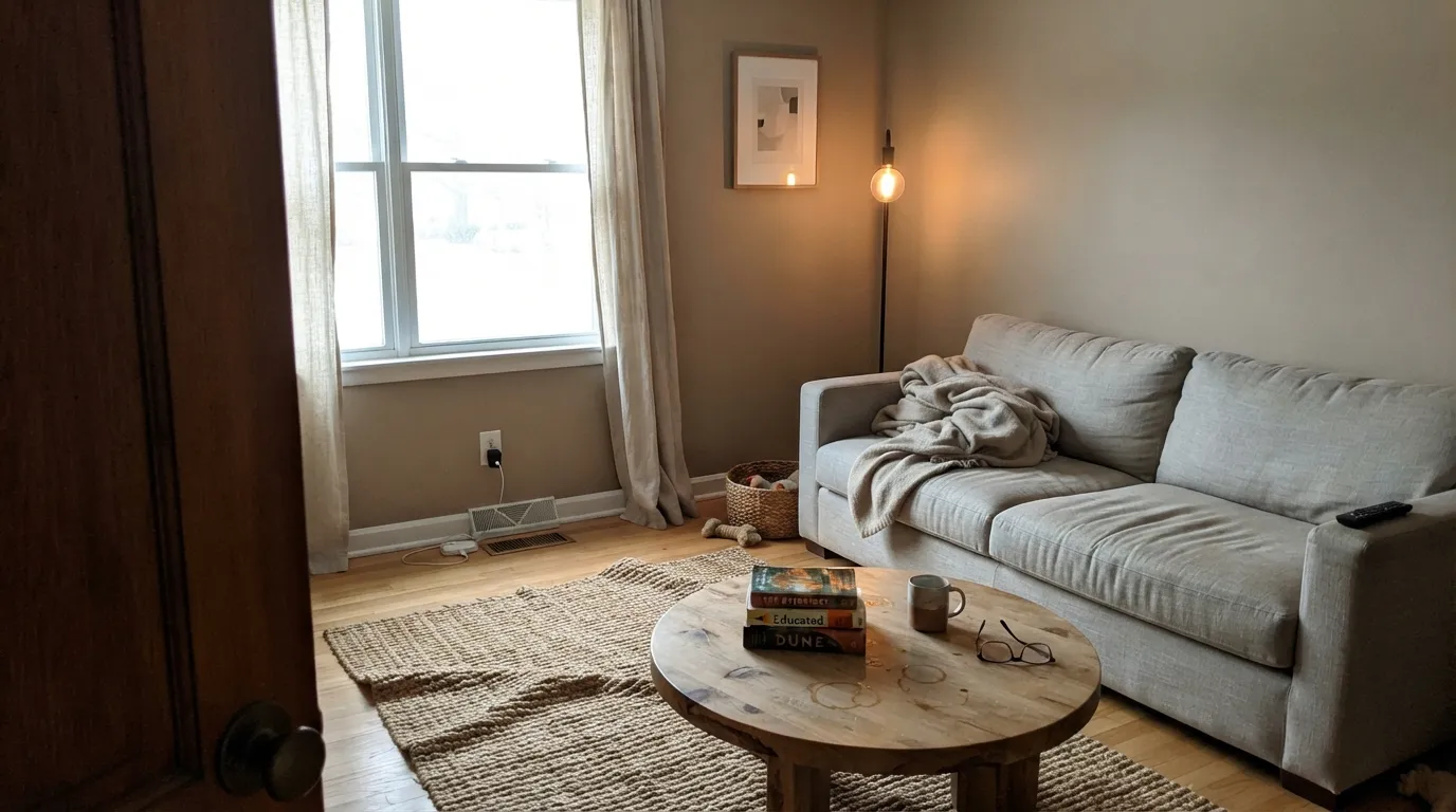
Give it real daylight and natural materials and this is exactly the earthy, tactile neutral Sherwin-Williams built it to be. Linen, raw wood, stone, unlacquered brass — the organic-modern palette that has largely replaced all-gray as the design-forward default — is its natural company. It is a genuinely good, if quiet, choice for a living room or bedroom that wants to feel grounded without tipping into farmhouse-beige or contractor-gray, and on an exterior with stone or cedar siding it holds its earthy read even in strong sun.
Where It Fails
Antler Velvet does not carry the pile of one-star Houzz threads that follow a bestseller like Agreeable Gray — it is simply not a heavily reviewed color. What the color science and Sherwin-Williams' own pairing suggestions do predict are three honest, avoidable mismatches. None of them are the paint's fault.
Like every warm neutral in the LRV 40s, cool north daylight strips out the warmth and leaves a flatter, muddier taupe-gray behind — less melodic brown, more wet concrete. Test a large sample on the actual wall before committing a whole room.
Sherwin-Williams pairs Antler Velvet with Alabaster (SW 7008) for a reason — a warm trim white lets the wall's own warmth read clearly. Swap in a cool blue-white and the wall looks dingy by comparison, the same optical trick that sinks warm whites next to brighter cool ones.
This is a genuinely balanced warm-cool taupe, and buyers hunting for an unambiguous "warm beige" or "true gray" sometimes feel like they got neither. If you want the color to commit, Balanced Beige leans more definitively warm and Worldly Gray leans more definitively cool-gray — Antler Velvet sits between them on purpose.
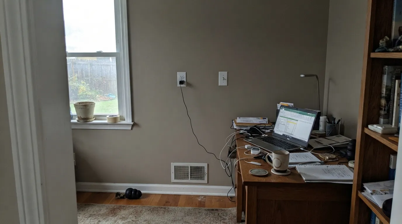
Room by Room
With real daylight and a linen sofa or wood coffee table it is the grounded, tactile neutral the organic-modern trend is built on. Eggshell finish, warm trim.
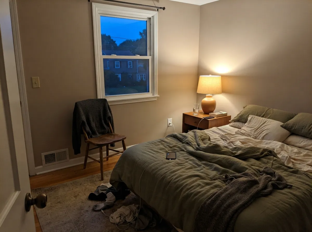
Under evening lamps the color turns honeyed and calm — a genuinely restful backdrop. If the room stays dim all day, expect a flatter, more muted read at noon.
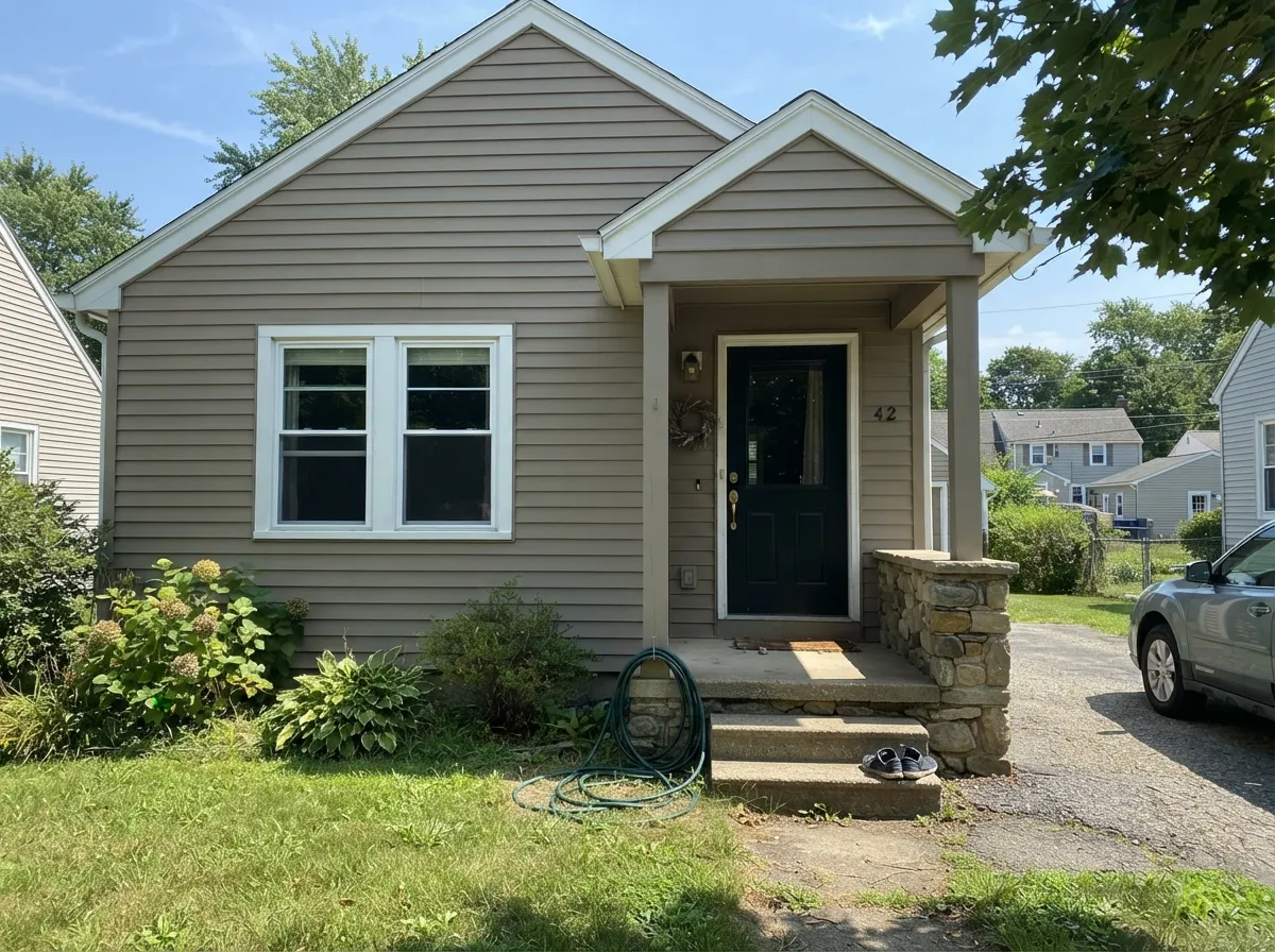
On siding it holds its earthy warmth even in bright sun and sits comfortably beside real stone, cedar, and other natural materials. Pair with a crisp warm white trim and a near-black door or shutters for contrast.
On an island under warm white upper cabinets it is a genuinely handsome, unusual choice. A full kitchen of Antler Velvet cabinets is a bigger commitment and needs strong, consistent daylight to avoid looking muddy by evening.
Because it already leans quiet and grounded, an office or den that runs on lamp light more than daylight actually flatters it — the warm bulbs do the work the sun would otherwise do.
It can carry a whole floor, but because the undertone is genuinely balanced rather than decisively warm or cool, walk the sample through every room it will touch — a north corner and a south corner can read as two different colors.
Your Light Is the Risk
The balance tips warm and the color reads like a honeyed, grounded taupe-brown — the read Sherwin-Williams built it for.
Cool, gray daylight strips the warmth and leaves a flatter, muddier taupe behind. Sample big before committing a whole room.
Genuinely a two-sided color: warmer and browner at the sun hours, cooler and grayer once the direct light passes. Expect the shift, don't fight it.
2700K bulbs tip it warm and melodic; cool white LEDs flatten it toward gray. Bulb temperature matters more for this color than most.
Most complaints about Antler Velvet are a light mismatch. Upload a photo of your actual room and see it on your walls — then ask for the same wall in north light or evening lamps before you buy a single sample.
Need It From Another Brand?
Any paint counter can custom-tint Sherwin-Williams SW 9111 directly. If you would rather stay in one brand's own deck, these are the closest stock matches, measured as ΔE2000. Under 2 is a difference you will not see on the wall.
| Brand | Closest color | ΔE | LRV | |
|---|---|---|---|---|
| Behr | Riviera BeachPPU7-07 · Behr | 0.5 | 44 | Color page → |
| Benjamin Moore | PensiveAF-140 · Benjamin Moore | 1.1 | 42 | Color page → |
| Valspar | Ivory Brown6006-1C · Valspar | 2.4 | 42.2 | Color page → |
| PPG / Glidden | PersuasionPPG1077-3 · PPG / Glidden | 1.8 | 44 | Color page → |
| Glidden | TranscendPPG1079-4 · Glidden | 2.6 | 43 | Color page → |
| Dutch Boy | Natural Twine411-3DB · Dutch Boy | 1.6 | 44 | Color page → |
Similar Sherwin-Williams Colors
The nearest shades to Antler Velvet within Sherwin-Williams's own range, ranked by perceptual color distance — useful when you want the same look a touch lighter, darker, or warmer.
WCAG 2.1: AA is 4.5 : 1 for normal text, 3 : 1 for large text, AAA is 7 : 1.
Antler Velvet vs the Colors You're Also Considering
Every Antler Velvet sample board has the same rivals on it. The numbers show the real lightness gap — then it comes down to which risk you would rather live with.
Pick this for more depth and grounding — Worldly Gray is a full LRV lighter and reads thinner on a big wall.
Sherwin-Williams SW 7043 · LRV 57Worldly GrayPick this for SW's own suggested pairing — lighter, softer, and more willing to commit to gray.
Pick this for more warmth — Pashmina leans cooler and can go flat without strong light.
Benjamin Moore AF-100 · LRV 44PashminaPick this for a moodier, more definitively gray-taupe at nearly the same depth.
Khaki Shade SW 7533 at LRV 44 and hex #C0AF97 is the nearest neighbor in the line, a hair lighter with slightly more green, which makes it read a little less pink. Favorite Tan SW 6157, also LRV 44 at #C1AE91, takes the same value toward yellow, so it looks more golden on a wall.
Avenue Tan SW 7543 at #BCB099 is the cool one of the set, closer to a sage-tinged tan, while Townhall Tan SW 7690 at LRV 42 is clearly deeper and more golden. Portico SW 7548 at LRV 42 is the grayer, more muted option.
Across brands, Valspar Ivory Brown 6006-1C at LRV 42.2 has a deltaE of 2.37 and Dunn-Edwards Egyptian Sand DE6207 at LRV 40 a deltaE of 2.22, both very close but worth sampling first. Farrow & Ball Smoked Trout No. 60 at LRV 41, deltaE 3.01, is also very close and carries noticeably more pink.
Antler Velvet Coordinating Colors
Sherwin-Williams' own pairing suggestions are the right place to start: a warm white to keep the wall's warmth honest, and a lighter or grayer neutral from the same balanced family to extend the palette without a hard color change. These are the partners that keep the earthy, organic-modern mood intact:
The Real Story: Sherwin-Williams' 2023 "Biome" Forecast
Antler Velvet has no Color of the Year headline and no viral design-blog moment — its actual credential is quieter and, honestly, more specific: Sherwin-Williams placed it in the "Biome" story of its 2023 Colormix Forecast, under a design persona the brand called "Nurturer." That collection was built around exposed wood, linen, unglazed clay, and rooms meant to feel handled and lived-in rather than showroom-styled — the design mood that has been steadily replacing the all-gray decade since the early 2020s.
The one genuinely odd detail worth knowing: Sherwin-Williams' own color-family system files Antler Velvet under "Yellow," a classification that will surprise anyone who samples it and sees a taupe-brown on the wall. That mismatch is a real quirk of how SW's internal color engine buckets warm neutrals, not a sign the paint itself is confused — the chip and the can both agree it reads earthy taupe, not yellow.
Antler Velvet With Wood Tones and Floors
This decision gets made at the floor, not the paint store. Mid-tone and dark walnut, espresso, and pale white oak all read as a distinct, complementary tone against Antler Velvet's warmth, which is exactly what a grounding neutral needs from its floor. Cool gray-washed floors are a safer-than-expected pairing too — the contrast in temperature keeps both elements legible instead of blending into one muddy zone.
The one floor that fights it is very orange, high-gloss honey oak. Antler Velvet is already a warm yellow-brown at its core, so stacking it on top of an equally warm-orange floor collapses the room into a single undifferentiated tone instead of a considered pairing. A large jute or wool rug breaks the two apart if the honey oak floor isn't going anywhere.
Three Ready Palettes Built on Antler Velvet
A color is never alone on the wall. These are complete combinations in the 60-30-10 pattern, with the reason each one holds together. Every one opens in the visualizer.
Alabaster is the warm trim white Sherwin-Williams itself pairs with Antler Velvet, so the wall's warmth reads clean instead of muddy. Urbane Bronze adds one deep, warm-dark note that grounds the room without going cold black.
Try this palette in your roomThe warm earthy body holds its color in full sun and reads correctly beside real stone or cedar; a crisp white trim and a near-black door give it the contrast a modern-craftsman exterior needs without pushing the whole house gray.
Try this palette in your roomNatural Linen is Sherwin-Williams' own coordinating pick, and Clary Sage brings back the muted greens the color was paired with in its original 2023 Biome forecast — the same earthy, nature-first mood, sized for a bedroom.
Try this palette in your roomAntler Velvet FAQ
Is Antler Velvet warm or cool?
Both, genuinely — it is one of the few Sherwin-Williams neutrals with a real near-even warm-cool balance rather than a clear lean. Warm light and warm bulbs bring the brown forward; cool daylight pulls it toward a flatter taupe-gray. If you need a color that commits to one side, this is not it on purpose.
Is Antler Velvet gray or beige?
Neither, exactly — Sherwin-Williams files it under its own "Yellow" color family, but most people would call it a taupe on the wall. It sits between the true grays and the true beiges in the deck, which is the whole appeal for rooms that want a grounding neutral without committing to either.
What trim goes with Antler Velvet?
Sherwin-Williams' own pairing suggestion is Alabaster (SW 7008), a warm white, and it is the right call — a cool blue-white trim makes the wall look muddy. Worldly Gray works as a softer, lighter wall partner if you want two shades from the same family instead of a hard trim change.
Is it good for an exterior?
Yes — this is one of its genuine strengths. It holds its earthy warmth in full sun and sits well beside real stone and cedar siding. Pair it with a crisp warm-white trim and a near-black door or shutters for contrast.
Was Antler Velvet a Color of the Year?
No, and it should not be sold as one. Its real credential is a spot in Sherwin-Williams' 2023 Colormix Forecast "Biome" palette, under the "Nurturer" design persona — a legitimate curated pick, just a quieter one than a headline Color of the Year.
Does it work with honey oak floors?
Carefully. Antler Velvet is already a warm yellow-brown at heart, so very orange honey oak can push the pairing toward monotone rather than contrast. It looks better with mid-tone or dark walnut floors, or pale white oak, where the wood and the wall read as two distinct warm tones instead of competing for the same one.
Have you painted with Antler Velvet?
Rate it — one tap helps the next reader decide.
Ask a Question