Iceland
The icy blue-gray hiding in Pratt & Lambert's coastal deck, reviewed honestly: the rooms where it goes watery and calm, the light that turns it teal, and what to pick instead.

Jessica has spec'd whites and neutrals for more than 300 rooms and keeps a sample wall of painted drawdowns in her studio. Every color review is checked against real reader rooms in the comments and re-tested when a formula changes. About the testing process →
- 1Pewter Green12
- 2Retreat21
- 3Iceland41
- 4Upward57
- 5Sea Salt63
The Fast Verdict
Iceland is a mid-tone blue-gray with a cool, slightly watery cast — gray on the chip, clearly blue once it is on four walls. At LRV 41 it has enough body to hold in a bright bath and enough chill to feel coastal without going nautical. If you want gray, keep walking; if you want the color of a north-sea morning, this is one of the quieter ways to get it.
North-facing bathrooms and powder rooms · coastal bedrooms · living rooms with cool daylight and pale wood · anyone who likes Boothbay Gray but shops Pratt & Lambert
You actually want gray · honey oak, cherry, or golden-beige floors · a dim room you will not lamp · whole-house neutrality with no blue in it
- Coastal blue-gray that stays calm instead of nautical
- Holds its color in bright baths — LRV 41 is real mid-tone depth
- North light is a feature, not a bug
- Pairs cleanly with chrome, nickel, pale oak, and white tile
- Quieter and less famous than Stardew or Boothbay Gray, same job
- Not gray — buyers expecting gray see blue by the second wall
- Fights honey oak, cherry, and everything yellow-warm
- Warm 2700K bulbs and dim rooms turn it murky teal
- Obscure P&L color: harder to sample, fewer real-room photos than the SW/BM twins
What Color Is Iceland, Really?
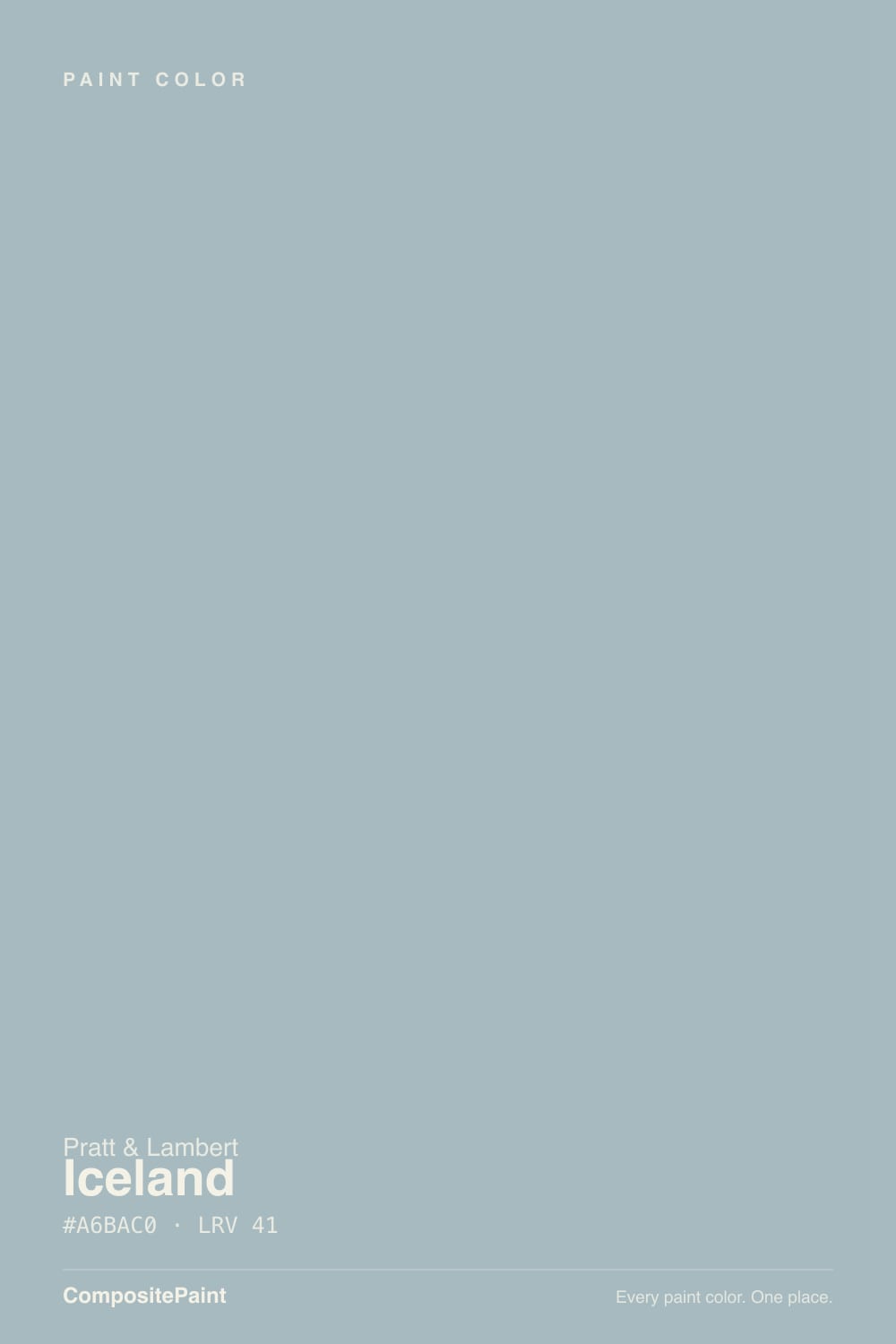
A soft cool blue-gray with a faint aqua in it — enough blue that nobody will call it gray on a wall, not so much that it reads as a blue paint. Pratt & Lambert files Iceland in the gray family, which is how these colors always get sold: the chip looks like a quiet coastal neutral, and the room does not. It keeps showing up in P&L's coastal palettes because that muted, watery cast feels calm and clean without tipping icy-white or navy-nautical. It is not a Color of the Year and it is not a household name. It is a heritage-deck color that does one job well.
At LRV 41 it is a genuine mid-tone, sitting in the same depth band as Sherwin-Williams Stardew (LRV 43) and Benjamin Moore Boothbay Gray (LRV 43). That depth is the useful part. Paler spa colors wash toward mint or baby-blue in a bright bath; Iceland keeps its silvery-blue body in full daylight and then drops a step stormier after dark. Plan for the wall to read deeper and more blue than the chip — every muted blue-gray does this, and it is the number-one surprise when people expected gray.
Undertone in one line: cool blue first, a whisper of green-aqua second — never violet, never beige. If your sample reads flat gray, the light is warm and dim; if it reads teal, that is west sun or 2700K bulbs pulling the green. Both versions are the same paint being honest about the room.
Where It Shines
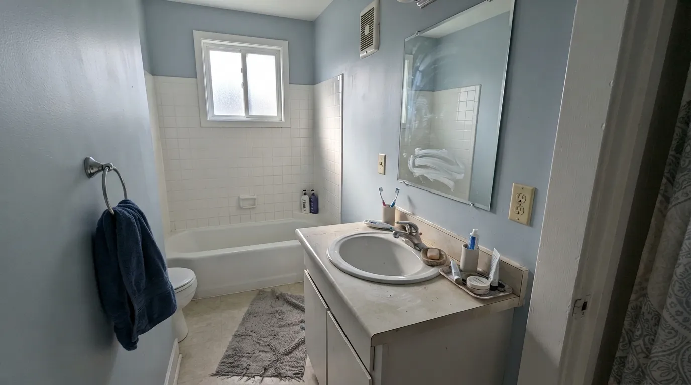
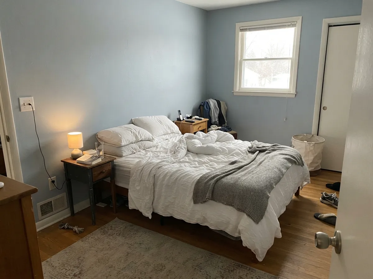
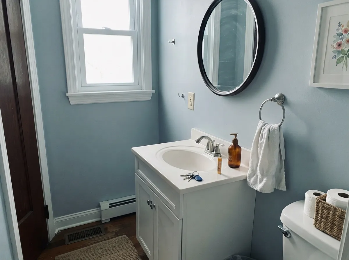
This color is built for cool light and wet rooms. In a north bath with white tile, chrome, and pale stone it reads like clean water — the exact coastal calm the name promises — which makes it one of the better bathroom colors in a brand most people never sample. Its second home is the north or east bedroom: matte or eggshell walls, a crisp white on the trim, linen bedding, and the blue stays restful instead of thematic. Give it white oak, nickel, and a navy towel or throw, and it looks like it was always there.
Where It Fails
Almost every regret story about a color like Iceland follows one of three scripts, and all three are predictable before the first coat. None of them are the paint's fault — but if your room matches one, this is not your color, and sampling bigger will only confirm it.
On the chip it passes for a soft coastal gray. On four walls the blue is unmistakable — depth multiplies undertone. If your goal is gray with a little personality, this is too much personality; look at SW Light French Gray or BM Classic Gray and let Iceland stay in the bath.
Yellow-orange is blue's complement, so golden oak floors, cherry trim, and builder-beige carpet all amplify the blue while the walls push the wood toward orange. Both sides lose. Iceland needs pale white oak, gray-washed floors, maple, or a big rug between it and anything golden.
At LRV 41 this is not a color that glows in a cave. Low light plus 2700K lamps kills the silver and leaves a murky teal-gray that readers of similar blue-grays describe as dirty water. The fix is daylight or cooler lamps; if the room is dim and you refuse to light it, pick a lighter gray.
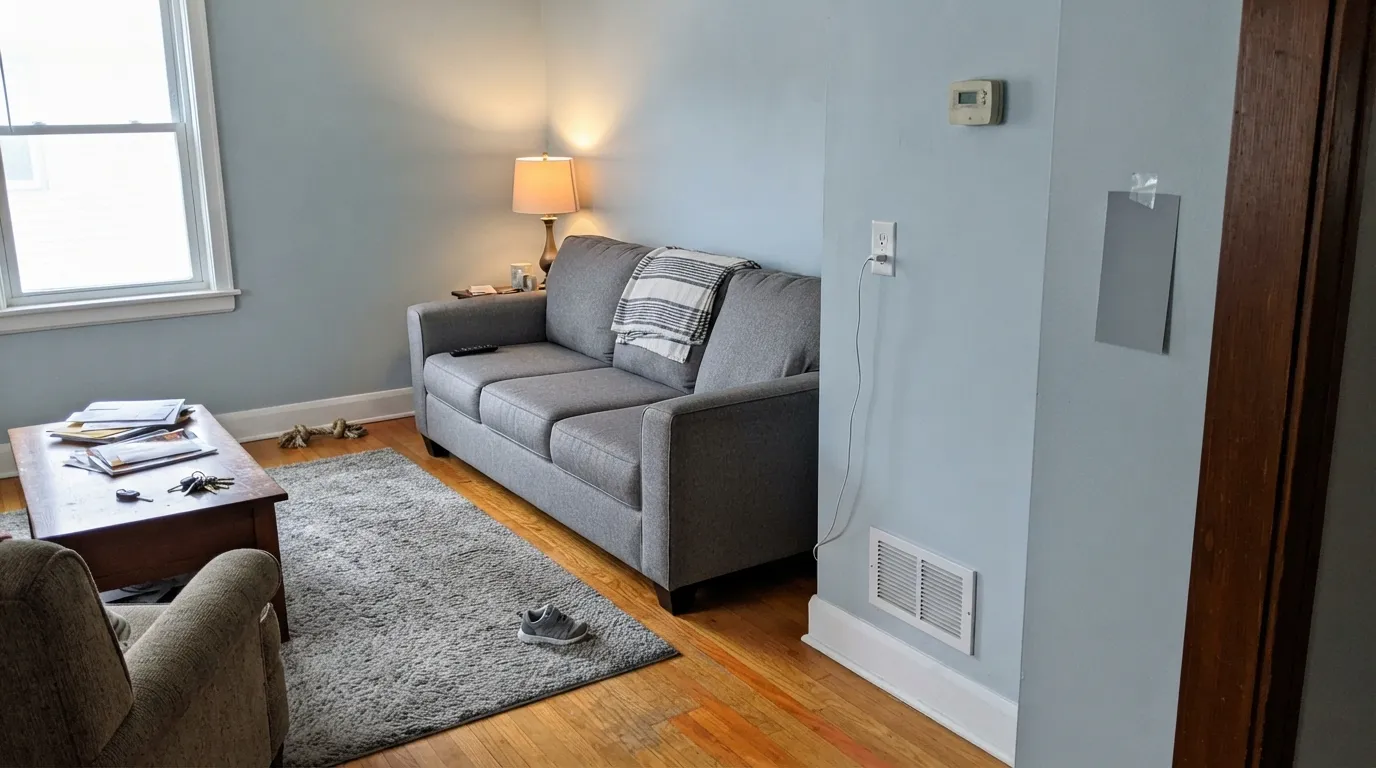
Room by Room
Cool, watery, and clean against white tile and nickel. Satin in the wet zone wipes condensation; eggshell on a powder-dry powder wall is enough. Pair with Chantilly Lace or Horizon on the trim — a creamy trim white will make the walls look dingy-blue by comparison.
North and east bedrooms are where the icy cast reads restful instead of cold. Matte or eggshell; White Dove trim if you want the blue to pop, Horizon if you want it quieter. Skip it in a west bedroom with honey oak floors — that pairing is the cons list in one room.
Small rooms take mid-tone color well. All four walls in Iceland, a crisp white ceiling, chrome or polished nickel, and one navy hand towel is a weekend project that looks considered. Satin on the vanity if you paint that too.
Beautiful in a cool-daylight living room with pale oak and linen. Riskier in open plans that dump into a warm kitchen, where Iceland has to negotiate honey cabinets and beige granite. Keep the adjacent rooms on the cool side — Classic Gray or Horizon next door is the safe handoff.
Satin Iceland on a vanity-height island or a hutch under white walls is quietly coastal. A full kitchen of blue-gray cabinets is a bigger bet, and a losing one over orange oak. If the boxes stay, use a urethane-fortified satin and keep the walls a clean white.
Full outdoor sun washes mid blue-grays toward faded denim, and from the street the aqua can read as chalky discoloration. The exception is a shaded north door or porch ceiling on a white house, where the icy cast looks intentional. For siding, pick something with a longer outdoor track record.
Your Light Is the Risk
Cool gray daylight is what this paint was mixed for. The blue stays silvery and watery instead of icy, and the green stays in the background. This is the coastal-bath read.
LRV 41 does not glow. In a closed, under-lit room the silver drops out and you get a stormy teal-gray that feels heavier than the chip. Add light or pick a higher-LRV gray.
Low warm sun pulls the aqua forward for an hour and the wall can flash green-teal. Most coastal rooms can live with it; if teal is the dealbreaker, test at 6pm before committing.
2700K bulbs muddy it toward green. 3000K–3500K keeps the blue-gray honest. Cool white LEDs push it icier — fine in a bath, a little clinical in a bedroom.
Most complaints about Iceland are a light mismatch. Upload a photo of your actual room and see it on your walls — then ask for the same wall in north light or evening lamps before you buy a single sample.
Need It From Another Brand?
Any paint counter can custom-tint Pratt & Lambert 32-15 directly. If you would rather stay in one brand's own deck, these are the closest stock matches, measured as ΔE2000. Under 2 is a difference you will not see on the wall.
| Brand | Closest color | ΔE | LRV | |
|---|---|---|---|---|
| Sherwin-Williams | Languid BlueSW 6226 · Sherwin-Williams | 0.8 | 46 | Color page → |
| Behr | Half Sea FogN470-3 · Behr | 1.9 | 46 | Color page → |
| Benjamin Moore | Cape Blue1642 · Benjamin Moore | 1.7 | 47 | Color page → |
| Valspar | Soft Shore8004-39C · Valspar | 1.2 | 46 | Color page → |
| PPG / Glidden | Lazy RiverPPG1148-4_1 · PPG / Glidden | 2.9 | 47 | Color page → |
| Glidden | Blue WillowPPG1145-4 · Glidden | 3.5 | 47 | Color page → |
Contrast and Legibility
WCAG 2.1: AA is 4.5 : 1 for normal text, 3 : 1 for large text, AAA is 7 : 1.
Iceland vs the Colors You're Also Considering
Every Iceland sample board has the same rivals on it. The numbers show the real lightness gap — then it comes down to which risk you would rather live with.
Pick this for the slightly cleaner, more silvery twin of the same idea.
Pratt & Lambert 32-8 · LRV 41WedgewoodPick this if you want the in-brand bathroom classic — same depth, a hair duskier, the P&L blue-gray already reviewed for wet rooms.
Pick this when you want the icier, more clearly blue version of that same mid-tone.
Sherwin-Williams SW 9138 · LRV 43StardewPick this if you want the famous analog people keep buying as a gray — a touch less blue, easier to sample.
The closest Pratt & Lambert relative is Wedgewood (32-8), also at LRV 41. The two are nearly the same weight and family; Wedgewood carries a touch more gray-green and slightly less blue, so it looks a hair quieter and less coastal. If you want the softer, more neutral version, choose Wedgewood; for the cleaner cool-blue read, choose Iceland.
Sterling (32-13), at LRV 38, is close in depth but goes the opposite direction in temperature. It is a warm greige, so side by side Sterling looks tan and Iceland looks blue. Pick Sterling for a warm neutral, Iceland when you specifically want cool.
Light Grey (32-12), at LRV 58, is noticeably lighter and more neutral. It is the better pick for a bright, airy backdrop; Iceland gives more color and a deeper, cooler presence on the same wall.
Iceland Coordinating Colors
The rule for coordinating with Iceland: stay on the cool side of the fence. Crisp whites, tonal blue-grays, and a single navy — and keep everything yellow at arm's length. It pairs with chrome and nickel far better than with champagne brass, loves pale oak, and layers with its in-brand twin Wedgewood if you want two depths of the same water. These are the partners that keep showing up in rooms that work:
Why This Color Stays Obscure — and When That Helps
Pratt & Lambert is a Sherwin-Williams heritage line, and Iceland has never had a Color of the Year campaign or a viral living-room moment to drag it onto Pinterest. That is not a defect. Stardew and Boothbay Gray do the same mid-tone blue-gray job with a decade of reader photos; Iceland is the quieter, slightly icier cousin hiding one aisle over, which is useful if you want the coastal mood without the color everyone else sampled last Saturday.
The in-brand context matters more than the fame. Wedgewood (32-8) is the P&L bathroom blue-gray already on this site, same LRV, a hair duskier. Iceland is the silvery twin. If a P&L store is mixing your paint anyway, sample both on the same wall — they are close enough that lighting, not preference-in-the-abstract, should pick the winner.
Iceland With Wood Tones and Floors
This decision gets made at the floor, not the paint store. Pale white oak, gray-washed oak, maple, and painted wood floors are the color's best friends — the cool, dry grain lets the blue read silvery and deliberate. Walnut can work if the rest of the room stays cool; the red-brown depth makes Iceland look more gray. Cream or gray carpet is fine.
The one honest no is golden: honey oak floors, orange-stained trim, yellow-beige carpet, cherry kitchen boxes. Yellow-orange sits opposite blue on the wheel, so each side exaggerates the other — the floor reads more orange, the walls read more blue, and no amount of coats fixes geometry. If the golden floor is staying, put a large rug between it and this paint, or choose a true greige and keep the calm without the fight.
Metals are straightforward: polished nickel, chrome, and matte black all sit naturally against it. Unlacquered brass will work as a warm contrast, but it will also make the walls look cooler — sample the hardware before you commit. Skip champagne and gold-tone builder kits.
Three Ready Palettes Built on Iceland
A color is never alone on the wall. These are complete combinations in the 60-30-10 pattern, with the reason each one holds together. Every one opens in the visualizer.
A crisp white keeps Iceland looking clean instead of dusty, and a navy vanity is the one dark note a spa bath needs. Chantilly Lace matters here — a creamy trim white would make the walls read dingy-blue by comparison.
Try this palette in your roomHorizon is the cool quiet gray that hands off to Iceland without a temperature fight, so the bedroom stays tonal instead of blue-against-cream. Wrought Iron gives one soft near-black so the scheme does not float.
Try this palette in your roomPure White is a default white that stays out of Iceland's way, and Van Deusen Blue is the navy you pick when Hale Navy feels like too much. Together they read coastal without a theme-park anchor.
Try this palette in your roomIceland FAQ
Is Iceland gray or blue?
Blue — quietly, but unmistakably once it is on a wall. In warm or dim light it can pass for a smoky gray-green, and in cool north light it turns silvery and watery, but on four walls nobody will call it gray. If gray is what you actually want, this is the wrong color; that mismatch is behind most bad reviews of colors in this family.
What trim white goes with Iceland?
A clean or cool white. Chantilly Lace is the crisp choice; Horizon is the quiet tonal one; Pure White is the safe default if your painter is in Sherwin-Williams. White Dove will work if you want the blue to pop against a warm edge. Skip creamy whites like Swiss Coffee — they make Iceland look dingy.
Is it good for a bathroom?
It is the best room for it. Cool light, white tile, and nickel are its natural company, and LRV 41 is deep enough to hold color on wet-zone walls without going navy. Use satin in the splash zone. Pair with a crisp white on the trim, not a cream.
Does Iceland work with oak floors?
Depends entirely on the oak. Pale white oak, gray-washed oak, and maple are excellent. Golden honey oak and orange-stained builder oak are the genuine clash: yellow-orange sits opposite blue, so the floor goes more orange and the walls go more blue. A large rug helps; wall-to-wall honey tones need a different color.
How is Iceland different from Stardew or Boothbay Gray?
Same depth band, different temperature. Stardew (LRV 43) is the famous blue-gray people keep buying as a gray — a touch less icy. Boothbay Gray (LRV 43) is the one most buyers still mistake for gray. Iceland is the cleaner, more silvery-blue read of that idea, and it lives in a brand with fewer real-room photos, so sample a big board before you commit.
Will Iceland work in a north-facing room?
Yes — that is its best light. Cool north daylight keeps it silvery and watery instead of teal. The rooms that fail are the dim ones with no daylight and warm bulbs, not the north ones with a real window.
Have you painted with Iceland?
Rate it — one tap helps the next reader decide.
Ask a Question