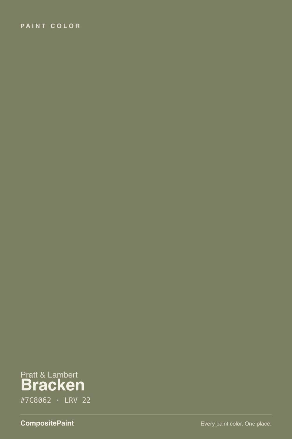
Bracken
The khaki-olive sitting quietly in Pratt & Lambert's Calibrated deck, reviewed honestly: the rooms where it reads like dried fern, the light that turns it army surplus, and what to pick instead.

Jessica has spec'd whites and neutrals for more than 300 rooms and keeps a sample wall of painted drawdowns in her studio. Every color review is checked against real reader rooms in the comments and re-tested when a formula changes. About the testing process →
- 1Essex Green6
- 2Vintage Vogue12
- 3Bracken22
- 4Evergreen Fog30
- 5Clary Sage41
The Fast Verdict
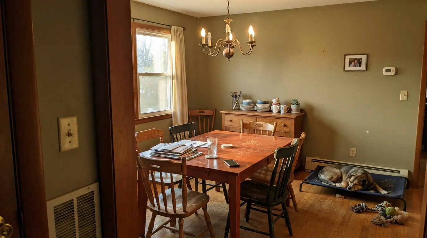
Bracken is olive that has dried in the sun: khaki first, green second, never mint. At LRV 22 it is a true mid-dark — it will make a cherry dining room look inevitable, and it will swallow a north bedroom. Pratt & Lambert has never put a spotlight on this chip, and almost nobody asks for 27-7 by name. That is the point. If the house already has walnut, mahogany, or colonial millwork, this is the green that looks mixed for the wood. If you wanted sage, keep walking.
Dining rooms and libraries with cherry or walnut · kitchen cabinets with brass and butcher block · lamplit bedrooms that should feel like a field at dusk · anyone pairing olive with colonial millwork
The room faces north and runs on cool LEDs · you wanted sage, not khaki · cool gray floors or marble · you need a color that bounces light around a small house
- Khaki-olive that looks mixed for cherry, walnut, and colonial millwork
- Same useful depth as the famous cabinet olives, with a warmer yellow cast
- Quiet enough to drench a dining room without shouting green
- Satin cabinets hide fingerprints better than a light sage
- Obscure on purpose — not a trend chip, not a Color of the Year
- Not sage — buyers expecting gray-green get khaki by the second wall
- LRV 22 eats light; dim north rooms go army surplus
- Fights cool gray floors, blue-white trim, and Carrara-type stone
- Stacks yellow with honey oak and can go swampy
What Color Is Bracken, Really?
An earthy yellow-olive, grayed down until it sits closer to khaki than to leaf. The name is the plant: bracken is a fern that dries brown-green on a hillside, not a spring shoot. Pratt & Lambert files 27-7 in the old Calibrated 27-line, not in the Williamsburg collection — but the color behaves as if it were mixed for that millwork. Saturated hunter greens shout; Bracken recedes into wood, brass, and cream linen and looks like it was always on the wall.
At LRV 22 it reflects about a fifth of the light that hits it, which is the same depth as the cabinet olives people actually search for. Put a chip next to P&L Sage (LRV 35) and Bracken suddenly looks like the shadow of that color — same family, a full step down, much more khaki. On four walls it will read a notch darker and browner than the fan deck. That is normal for muted yellow-greens; plan for it, or the dining room you thought was olive will feel like a closed study.
Undertone in one line: warm yellow-olive — khaki first, green second, never blue. If the sample goes army-surplus gray, your light is cold. If it goes mustard, you are seeing west sun on the yellow. Both versions are the same paint telling the truth about the room.
Where It Shines
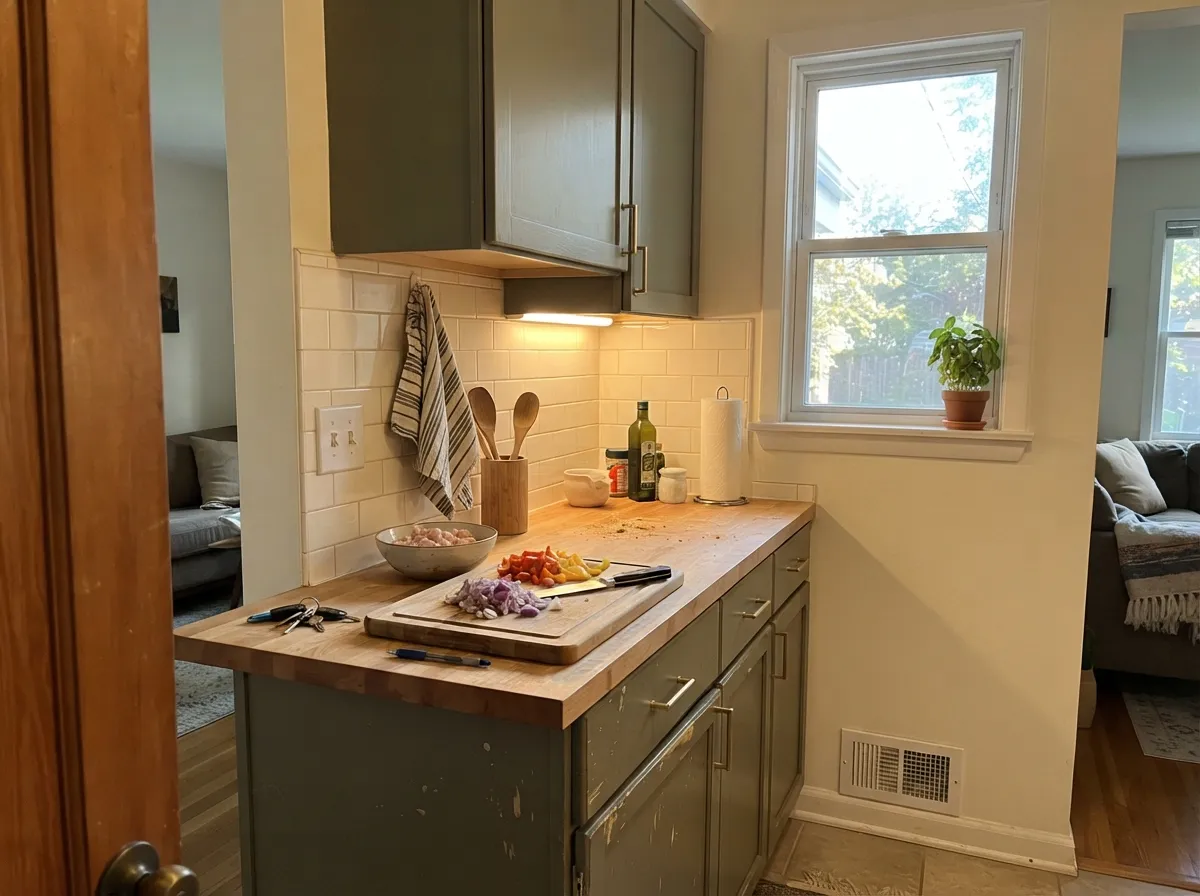
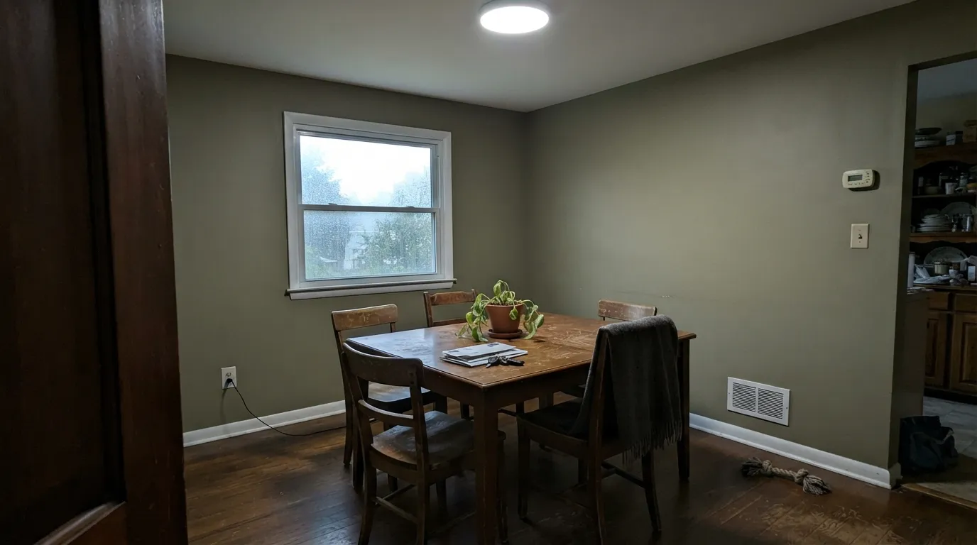
Give it real wood and warm light and Bracken looks older than the house in the best way. Cherry, walnut, mahogany, and the kind of paneled dining room Pratt & Lambert used to sell paint into — that is its home. On kitchen cabinets in satin it does the same job as the famous Sherwin olives, with a yellower, more herbal cast that flatters brass and butcher block. Cream linen, leather, and a slightly warm white on the trim keep it from tipping camouflage.
Where It Fails
Almost every regret with a khaki olive follows one of three scripts, and you can call them before the first coat. None of them are the paint's fault — but if your room matches one, this is not your green, and a bigger sample will only confirm it.
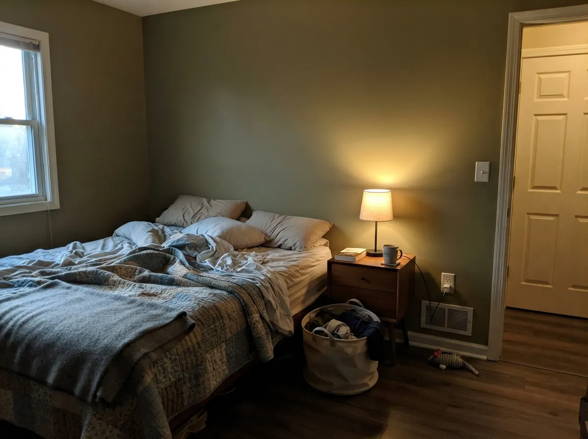
North light strips the yellow and leaves a flat army-surplus khaki that readers of every muted olive describe as muddy or dead. Bracken is LRV 22 — it cannot invent warmth the window did not send. The fix is warm 2700K bulbs and a room that actually gets sun, not another coat.
On the chip it can pass for a deep sage. On four walls the khaki is the whole story — a dried-fern brown-green, not the gray-green people mean by sage. If you want that cooler, livelier read at the same depth, Behr Sage Green sits at the same LRV with less yellow. If you want sage that still leaves the room light, step up to P&L Sage or Clary Sage.
Bracken wants wood, cream, and brass. Cool gray LVP, Carrara-type stone, and a crisp gallery white push it toward dirty mustard and make the walls look like they missed a renovation. A warm spec white is fine for contrast; a blue-white is a fight.
Room by Room
Cherry table, brass chandelier, cream linen, one west window: this is the room the color was mixed for. Eggshell on the walls, a warm white on the trim in semi-gloss, and the wood does the rest. At night under 2700K it goes velvety khaki-olive and the room feels finished, not painted.
Satin Bracken on cabinets is the quiet cousin of the Sherwin cabinet olives: same useful depth, more yellow, less gray. Brass hardware, butcher block, and a cream or Alabaster wall keep it herbal instead of muddy. A full kitchen of olive on honey-oak floors is a harder bet — the two yellows stack.
Walnut shelves, leather, a wool rug, and real daylight make it look like a study that was always this color. Open to a cool gray kitchen it will argue. Eggshell for scuff resistance where chairs hit; keep the lamps warm.
Dusk on the walls is the mood, and Bracken can do it without going hunter. Matte or eggshell, White Dove or Designer White on the trim, 2700K bulbs as part of the paint job. Skip it in a north bedroom with one window and cool LEDs — that is the army-surplus version.
A closed study is a dining room without the china: wood desk, warm lamps, a color that hides video-call clutter. It will make a bright south office feel grounded. It will make a basement office feel like a bunker. Believe the light, not the chip.
Full sun pulls the khaki toward brown-olive, which can look like faded military on a whole elevation. The useful exterior job is shutters or a front door on a cream or warm-white house, in shade or on a north wall, where the fern-green reads intentional. Satin or semi-gloss exterior enamel; sample on the actual siding in afternoon light.
Your Light Is the Risk
South or west sun keeps the yellow-olive alive so it reads fern, not mud. After dark, 2700K bulbs are not optional — they are how the khaki stays warm instead of going dead.
Cool gray daylight strips the yellow and leaves a flat army-khaki. This is the version people hate, and no extra coat will put the warmth back.
The yellow comes forward through the afternoon; for an hour before sunset it can flash mustard-olive. Sample on a west wall at 6pm if that shift is a dealbreaker.
2700K restores the herbal yellow and the walls go velvety. 3500K and up, especially cheap cool LEDs, push it toward surplus green-gray. Treat bulb temperature as part of the spec.
Most complaints about Bracken are a light mismatch. Upload a photo of your actual room and see it on your walls — then ask for the same wall in north light or evening lamps before you buy a single sample.
Need It From Another Brand?
Any paint counter can custom-tint Pratt & Lambert 27-7 directly. If you would rather stay in one brand's own deck, these are the closest stock matches, measured as ΔE2000. Under 2 is a difference you will not see on the wall.
| Brand | Closest color | ΔE | LRV | |
|---|---|---|---|---|
| Sherwin-Williams | ArtichokeSW 6179 · Sherwin-Williams | 1.2 | 21 | Color page → |
| Behr | EcologicalS380-6 · Behr | 1.5 | 22 | Color page → |
| Benjamin Moore | Great Barrington GreenHC-122 · Benjamin Moore | 1.4 | 21 | Color page → |
| Valspar | Native Henna6001-4B · Valspar | 1.8 | 21 | Color page → |
| PPG / Glidden | Pine GarlandPPG1126-6 · PPG / Glidden | 1.8 | 20 | Color page → |
| Glidden | Guild Green10GY 20/179 · Glidden | 2.1 | 20 | Color page → |
Contrast and Legibility
WCAG 2.1: AA is 4.5 : 1 for normal text, 3 : 1 for large text, AAA is 7 : 1.
Bracken vs the Colors You're Also Considering
Every Bracken sample board has the same rivals on it. The numbers show the real lightness gap — then it comes down to which risk you would rather live with.
Pick this when you want the yellower khaki-olive on walls, especially with cherry, walnut, or colonial millwork.
Sherwin-Williams SW 6186 · LRV 21Dried ThymePick this if you want the slightly greener, more searched-for cabinet olive at the same depth — it is the SW version of this idea, with a known lighting trap.
Pick this when the warm yellow lean is the point, not an accident.
Behr ICC-77 · LRV 22Sage GreenPick this if you want the same depth without the khaki — Behr's is the cooler, deeper sage, less fern, more leaf.
Within the Pratt & Lambert deck, Sage (26-5) is the closest lighter relative. At an LRV of 35 it is a softer, grayer green that stays quiet and easy on the eye. Choose Sage when you want the green feeling without the drama; choose Bracken (27-7, LRV 22) when you want depth and enclosure.
Go darker and Forest (27-9), at LRV 7, is a deep near-black green. Forest reads almost as a dark neutral and is better for a front door, a small accent, or a very high-light room, whereas Bracken still holds its olive character across a full wall.
If you are weighing green against a true gray, Granite (32-19) shares Bracken's LRV of 21 but has almost no color in it. Side by side, Granite looks flatly gray while Bracken clearly leans olive and warm. Pick Granite for a neutral backdrop and Bracken when you actually want the room to read green.
Bracken Coordinating Colors
The rule for coordinating with Bracken: warm whites, deeper olives, and real wood — and keep cool gray and blue-white at arm's length. Cream and khaki-olive is the colonial pairing; brass and walnut are the metals and floors it was mixed for. These are the partners that keep showing up in rooms that work:
Not a Williamsburg Chip — Built for That Wood Anyway
Pratt & Lambert once owned the Colonial Williamsburg paint franchise; Benjamin Moore mixes that collection now. Bracken 27-7 is not in it — it sits in the Calibrated 27-line — and it is easy to confuse with Williamsburg names like Bracken Biscuit, which is a cream, not an olive. The pairing still holds. Khaki-olive, cream trim, cherry or walnut, and brass is the millwork language those houses already speak, and Bracken does it without pretending to be a documented historic color.
That obscurity is useful. There is no Pratt & Lambert Color of the Year, and 27-7 has no viral room attached to it. You are not buying a trend olive. You are buying a dried-fern green that looks correct next to old wood, and that is a smaller, more durable bet than a saturated sage that photographs well for one season.
Wood Tones, Floors, and Metals
Bracken is a yellow-olive, so it either sings with warm wood or fights it. Cherry, walnut, mahogany, and stained millwork with a red or brown cast are the easy wins — the khaki reads as a continuation of the furniture. Pale, unstained white oak is also fine; the contrast is quiet, not yellow-on-yellow. Golden honey oak is the clash: both sides get more yellow, and the walls can go swampy. A large rug is a patch, not a cure.
On metal, aged brass, unlacquered brass, and oil-rubbed bronze belong here; chrome and cool nickel make the khaki look dirty. Stone wants cream, travertine, or a warm marble — not a blue-gray slab. If the floors and counters are already cool, pick a greener olive or a true sage and leave Bracken for a house that still has wood in it.
Three Ready Palettes Built on Bracken
A color is never alone on the wall. These are complete combinations in the 60-30-10 pattern, with the reason each one holds together. Every one opens in the visualizer.
Bright spec-white trim against khaki-olive walls is the old colonial contrast: the wood and brass do the warmth, Designer White keeps the edges clean, and a near-black olive on one door stops the scheme from floating. Cherry or walnut furniture is not optional in this palette — it is the fourth color.
Try this palette in your roomAlabaster on the walls keeps the kitchen from going cave-dark while Bracken cabinets carry the olive. Creamy is a real cream that shows, which is what you want next to khaki — a stark white would make the doors look dingy. Brass pulls and a wood counter finish it; skip this over cool gray quartz.
Try this palette in your roomTwo depths of the same P&L green family, split by a soft warm white. Sage next door reads as the same house getting lighter, not a color change. White Dove matters — a blue-white trim would make Bracken look dirty by comparison.
Try this palette in your roomBracken FAQ
Is Bracken green or khaki?
Khaki first, green second. On the chip it can pass for a deep sage; on four walls the yellow-olive is unmistakable — dried fern, not leaf. If sage is what you actually want, Behr Sage Green at the same LRV 22 is cooler, and P&L Sage at LRV 35 is the lighter gray-green in the same brand.
What trim white goes with Bracken?
A warm or softly spec white. Pratt & Lambert Designer White is the in-family move if you want a brighter colonial contrast; White Dove if you want the edges softer. A crisp blue-white makes the walls look dingy. Semi-gloss on the trim, eggshell on the walls.
Will it work on kitchen cabinets?
Yes — that is one of its best jobs. Satin enamel at LRV 22 hides knuckle marks and still reads olive, not black. Pair with cream or Alabaster walls, brass, and wood counters. Honey-oak floors are the clash; walnut or white oak are not.
Does Bracken work with oak floors?
Depends on the oak. Walnut, cherry, mahogany, and pale white oak are excellent. Golden honey oak stacks yellow on yellow and can go swampy mustard. A large rug helps; wall-to-wall honey tones are a reason to pick a cooler green.
Is it too dark for a small room?
In a closed dining room or powder room with lamps, the depth is the feature. In a small north bedroom or basement office, LRV 22 will feel like a bunker. If you like the family but need bounce, use P&L Sage (LRV 35) on the walls and save Bracken for a door or cabinet.
How is it different from Sherwin-Williams Dried Thyme?
Same neighborhood, different accent. Dried Thyme (LRV 21) is the greener, more searched-for cabinet olive. Bracken is a hair yellower and more khaki — the fern version. If your kitchen is modern and gray-leaning, Dried Thyme is the safer SW ask. If the room already has colonial wood, Bracken looks like it belongs to the millwork.
Have you painted with Bracken?
Rate it — one tap helps the next reader decide.
Ask a Question