Mesa Peach
The desert peach everyone assumes is too sweet, reviewed honestly: the terracotta backbone that saves it, the light that turns it muddy, and what to pick instead.

Jessica has spec'd whites and neutrals for more than 300 rooms and keeps a sample wall of painted drawdowns in her studio. Every color review is checked against real reader rooms in the comments and re-tested when a formula changes. About the testing process →
- 1Determined Orange22
- 2Terra Cotta Clay34
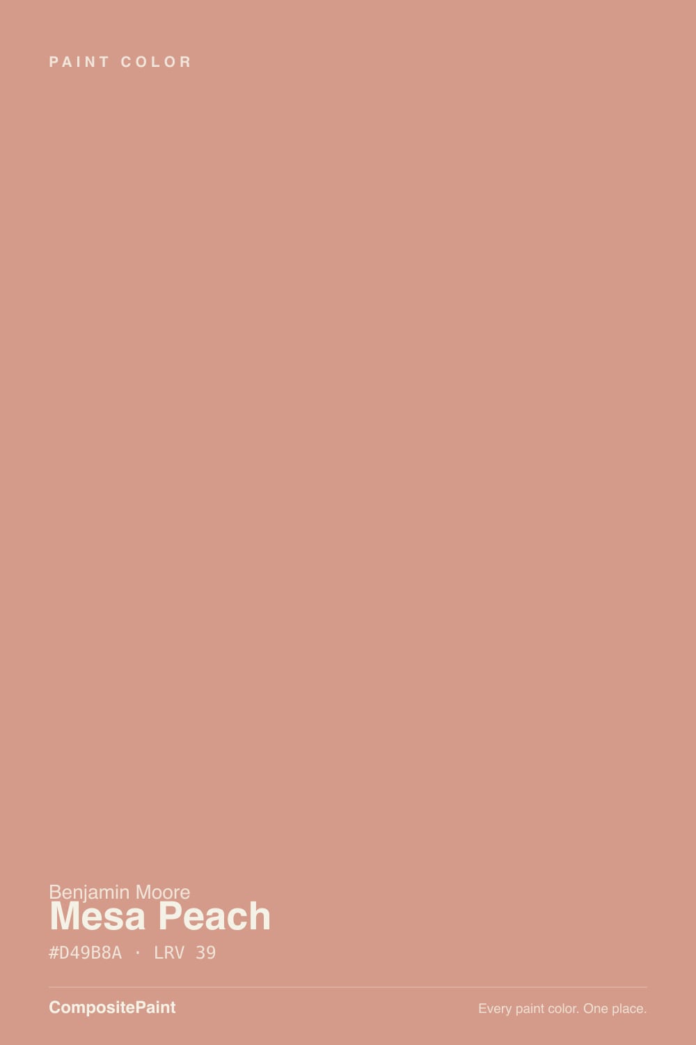
- 3Mesa Peach39
- 4Osage Orange45
- 5Colonial Yellow59
The Fast Verdict
Mesa Peach is not the sugary, pastel peach people brace for. It is a muted coral built over a genuine brown-terracotta base, closer to sun-baked clay than to a candy dish, and Benjamin Moore keeps it in the Classics collection for exactly that reason — it predates every peach trend and just keeps quietly selling. At LRV 39 it holds real color instead of washing out, but it needs warm light to stay terracotta instead of sliding toward dusty salmon.
Bedrooms that want warmth without going pink · Southwestern and adobe-style exteriors · powder rooms and nurseries that want a soft glow · anyone who wants terracotta without committing to full orange
Your room only gets cool north daylight or cool-white LEDs · your trim is a stark blue-white · your countertops or floors are cool gray stone · you want a safe, resale-neutral color
- A real terracotta-peach, not candy pink or neon coral
- Mid-depth LRV 39 holds its color without needing full sun
- Reads warm and grounded next to brass, walnut, and rattan
- A genuine option for Southwestern and adobe-style exteriors
- Small-room color — powder rooms and vanities take it well without a whole-house commitment
- Cool north light and cool-white LEDs drain it to a dull, muddy salmon
- Bright white trim pushes it toward candy-pink instead of terracotta
- Clashes with cool gray or blue-toned floors and countertops
- Not a safe neutral — it reads as a real style commitment, not a background color
What Color Is Mesa Peach, Really?
Mesa Peach is not the sweet, bright peach people brace for — it is a muted coral tucked over a genuine brown-terracotta base, closer in spirit to sun-baked clay than to a candy dish. Benjamin Moore keeps it in its Classics collection, the same shelf as Heritage Red and Chestertown Buff: colors that predate every design trend cycle and just keep quietly selling. The 'mesa' in the name is honest — this reads like desert rock at golden hour, not a pastel.
At LRV 39 it sits at a real mid-tone, deeper than most 'peach' paint chips people picture. That depth is the reason it does not slide into baby-pink: put it next to a genuinely pale pink like Benjamin Moore First Light (LRV 76) and Mesa Peach suddenly looks like a different color family — earthier, more orange, more grounded. On a wall it holds its color through the day instead of washing out, and it survives sun exposure on an exterior far better than a paler blush would.
Undertone in one line: coral-brown first, pink second, never a true clean orange. If your sample looks dull, gray, or 'salmon' instead of peach, that is cool daylight or cool LED bulbs talking, not the paint — warm it up before you judge it.
Where It Shines
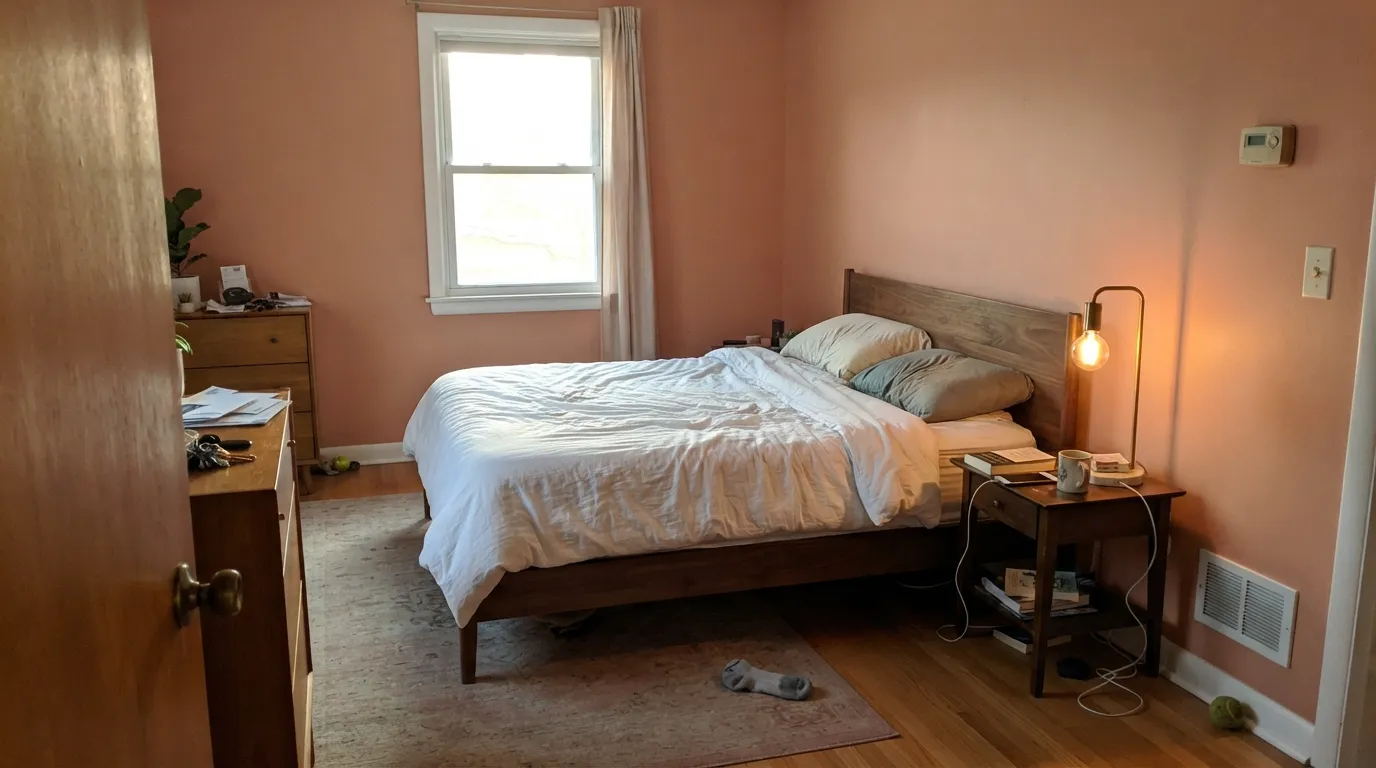
Give it real warm daylight — south or west sun — and Mesa Peach glows like sun-baked adobe. It is one of the few Benjamin Moore colors genuinely built for Southwestern and desert-modern exteriors, and indoors it turns a bedroom or powder room into the kind of room that feels sunset-lit even at noon. Pair it with brass, walnut, rattan, or raw wood and it stops reading like 'peach' entirely and starts reading like terracotta.
Where It Fails
Almost every complaint about Mesa Peach traces back to one of three predictable mismatches — light, trim, or the wrong neighbor material. None of them are the paint's fault, but if your room fits one of these, sample big before you commit.
Cold daylight strips the warmth out and leaves a flat, dusty salmon that readers call 'muddy' or 'dingy.' The color did not fail — the light did. Warm 2700K bulbs help; a permanently dim north room will still disappoint.
Pair Mesa Peach with a stark, blue-white trim and the contrast pushes the wall toward candy-pink instead of terracotta. Go warmer — White Dove or Swiss Coffee — and the wall reads earthy instead of sweet.
Blue-gray stone and cool LVP sit at the opposite temperature and fight Mesa Peach's orange lean outright — both sides end up looking slightly wrong. It wants warm wood, terracotta tile, or brass, not cool stone.
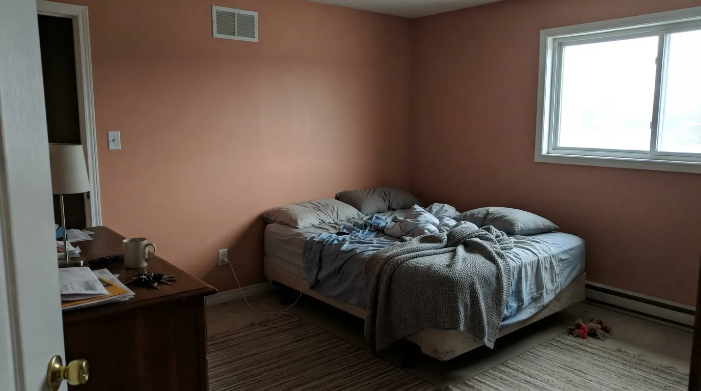
Room by Room
In warm daylight or lamplight it is a soft, sunset-toned backdrop that never feels overpowering. Eggshell on the walls; keep the bulbs at 2700K and the trim warm.
Gentler and earthier than a true pastel pink, so it avoids the sugary look some nursery pinks get. It reads more desert sunrise than baby shower — but test it if the room is north-facing.
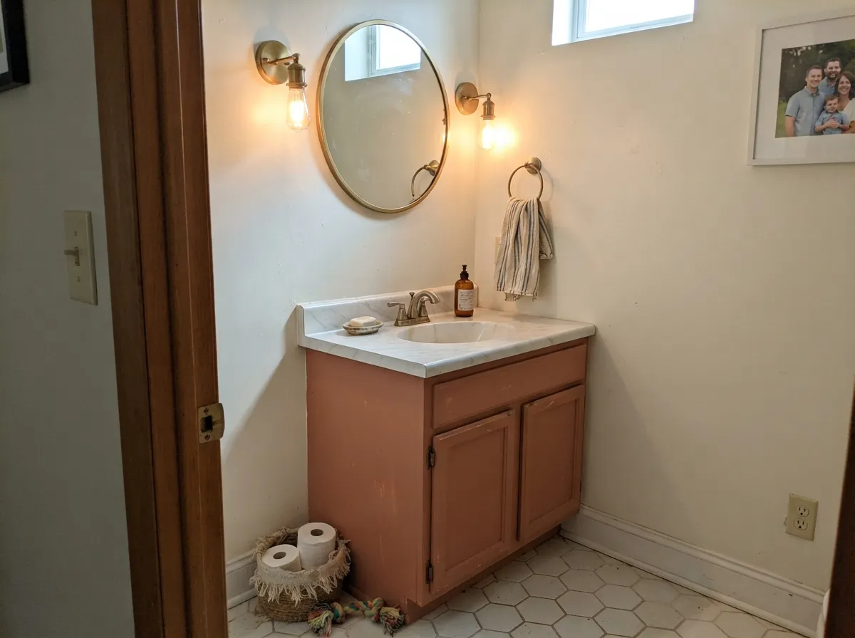
A whole powder room in Mesa Peach, or a satin vanity under a Swiss Coffee wall, gives a small room real personality without betting the whole house on peach.
Under evening lamplight it turns genuinely flattering — warm skin tones, warm food, warm candlelight all work with it. Skip it if the room only gets cool overhead LEDs.
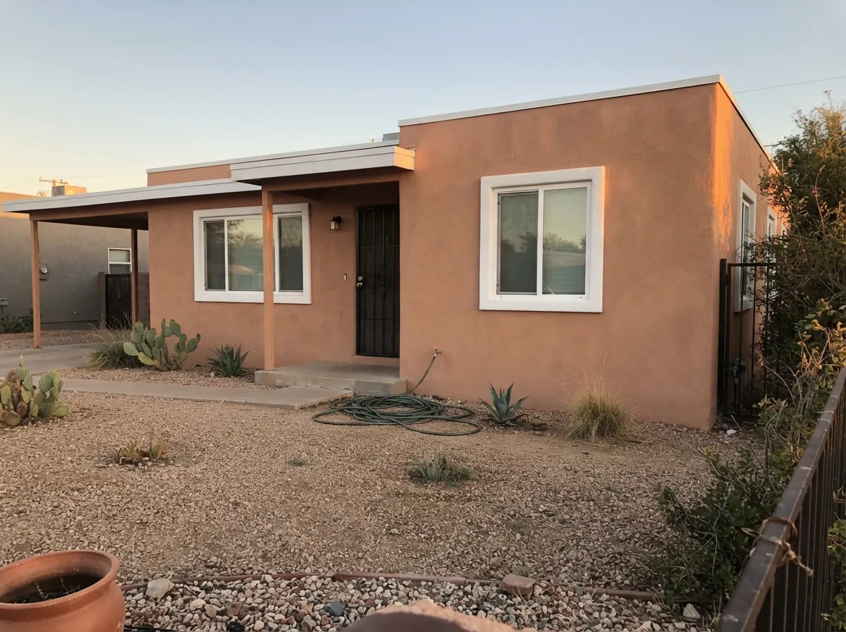
One of the few Benjamin Moore colors actually built for adobe-style and desert-modern facades; full sun reads it as sun-baked clay, not paint. Pair with a warm white trim or a dark door, not cool gray.
An island or a breakfast-nook wall in Mesa Peach against white cabinets is charming; a full kitchen of it fights nearly every cool countertop material on the market. Keep it to one surface.
Your Light Is the Risk
Full warm daylight brings out the terracotta backbone and keeps it a true, grounded peach — this is the light it was built for.
Cool, gray daylight drains the warmth and leaves a flat, muddy salmon-pink. Test a large sample before committing a whole room.
Warm and glowing at the sun hours, quieter and more neutral once the direct light passes. Expect real movement through the day.
2700K lamps push it toward its best terracotta warmth. Cool white LEDs flatten it toward a dusty, slightly gray pink.
Most complaints about Mesa Peach are a light mismatch. Upload a photo of your actual room and see it on your walls — then ask for the same wall in north light or evening lamps before you buy a single sample.
Need It From Another Brand?
Any paint counter can custom-tint Benjamin Moore 1200 directly. If you would rather stay in one brand's own deck, these are the closest stock matches, measured as ΔE2000. Under 2 is a difference you will not see on the wall.
| Brand | Closest color | ΔE | LRV | |
|---|---|---|---|---|
| Sherwin-Williams | Rose TanSW 69 · Sherwin-Williams | 3.6 | 38 | Color page → |
| Behr | Shanghai PeachT13-15 · Behr | 3.5 | 40 | Color page → |
| Valspar | Salmon Run2002-6B · Valspar | 3.3 | 40.2 | Color page → |
| PPG / Glidden | Holland TilePPG1064-5 · PPG / Glidden | 3.4 | 39 | Color page → |
| Glidden | Holland TilePPG1064-5 · Glidden | 3.2 | 39 | Color page → |
| Dutch Boy | Native Copper208-4DB · Dutch Boy | 2.9 | 40 | Color page → |
Similar Benjamin Moore Colors
The nearest shades to Mesa Peach within Benjamin Moore's own range, ranked by perceptual color distance — useful when you want the same look a touch lighter, darker, or warmer.
WCAG 2.1: AA is 4.5 : 1 for normal text, 3 : 1 for large text, AAA is 7 : 1.
Mesa Peach vs the Colors You're Also Considering
Every Mesa Peach sample board has the same rivals on it. The numbers show the real lightness gap — then it comes down to which risk you would rather live with.
Pick this for something lighter and easier to live with in an average room — Cavern Clay demands more direct light to look good.
Sherwin-Williams SW 7701 · LRV 24Cavern ClayPick this for a deeper, more overtly clay-orange terracotta with less pink in it — the real desert-orange leap.
Pick this for the lighter, more classic peach that does not invite an opinion from everyone who sees it.
Sherwin-Williams SW 9081 · LRV 27Redend PointPick this if you want the deeper, more famous clay-pink — the color that either sold out paint counters or got mocked online, depending who you ask.
Mesa Peach Coordinating Colors
The rule for coordinating with Mesa Peach: warm whites, warm woods, and near-blacks — and stay wary of anything cool gray or blue. It pairs with brass and walnut the way most terracottas do, and it accepts one cool-toned complementary accent (a spa blue-green like Palladian Blue) far better than it accepts a whole room of cool neutrals. These are the partners that keep showing up in rooms that work:
Mesa Peach on Exteriors
Outside is where Mesa Peach makes the most sense. Full sun reads it as sun-baked clay rather than paint, and it is one of the few Benjamin Moore colors genuinely built for Southwestern, adobe-style, and desert-modern facades — the kind of earth-tone palette that historic-district guidelines in places like Santa Fe actively favor over bright or cool colors on stucco.
The trim decision matters more outdoors than in. A plain warm white — White Dove, or a true no-opinion white like Benjamin Moore White — lets the body color do the work. A near-black door or shutters (Wrought Iron, Kendall Charcoal) reads modern-adobe instead of dated pastel. What to avoid: cool gray trim or accents, which fight the terracotta lean the same way they do indoors.
Mesa Peach With Wood Tones and Floors
Warm wood is this color's best friend: walnut, rattan, cedar, and warm oak all sit comfortably against Mesa Peach because their undertones agree. Brass and unlacquered bronze hardware push the terracotta forward the same way they do with any earthy color.
The floor that needs a sample first is cool gray — gray-washed LVP, blue-gray tile, or true gray stone. Those materials sit at the opposite temperature from Mesa Peach's orange lean, and the wall can read pinker and duller next to them than it does over warm wood. A large rug helps if the cool floor is staying; otherwise, test a big sample directly above the actual flooring before committing a whole room.
Three Ready Palettes Built on Mesa Peach
A color is never alone on the wall. These are complete combinations in the 60-30-10 pattern, with the reason each one holds together. Every one opens in the visualizer.
White Dove keeps the terracotta warm instead of pink, and Wrought Iron gives the room one grounding near-black note so the peach reads deliberate, not sugary.
Try this palette in your roomA plain, no-opinion white trim lets the terracotta body do the work, and a soft near-black door reads modern-adobe instead of dated pastel.
Try this palette in your roomSwiss Coffee keeps the little room warm and airy while the vanity carries the color; Chelsea Gray's charcoal-greige gives one grounding note without fighting the terracotta the way a cool gray would.
Try this palette in your roomMesa Peach FAQ
Is Mesa Peach pink or orange?
Neither exactly — it is a coral-brown terracotta that leans peach-orange in warm light and can read pink in cool light. If your room only sees cool daylight or cool LEDs, expect more pink than the name promises.
Is Mesa Peach dated, like 1980s peach?
It reads earthier and more terracotta than the pastel peaches associated with that era — Benjamin Moore keeps it in the Classics collection precisely because it is not a trend color. Pair it with brass, walnut, and warm whites and it reads current, not retro.
Does it work on an exterior?
Yes — it is genuinely built for that job. Full sun reads it as sun-baked clay, and it is a real option for Southwestern, adobe-style, and desert-modern homes. Pair with a warm trim white or a dark door; avoid cool gray accents.
What trim white goes with Mesa Peach?
A warm white — White Dove or Swiss Coffee. A stark, blue-white trim pushes the walls toward candy-pink; a warm trim keeps the terracotta lean intact.
Is it good for a nursery?
Yes, if the room gets warm daylight. It is gentler and earthier than a true pastel pink, so it avoids the sugary look some nursery pinks get — but in a cold north room it can go dull, so test first.
Does it work with gray floors or cool countertops?
Not naturally. Mesa Peach is a warm, orange-leaning color and cool gray stone or blue-toned LVP sits at the opposite temperature — both fight. It wants warm wood, terracotta tile, or brass instead.
Have you painted with Mesa Peach?
Rate it — one tap helps the next reader decide.
Ask a Question