Inner Glow
The muted gold that keeps getting recommended for kids' rooms, reviewed honestly: the rooms it lights up, the light that turns it into a highlighter, and what to pick instead.

Jessica has spec'd whites and neutrals for more than 300 rooms and keeps a sample wall of painted drawdowns in her studio. Every color review is checked against real reader rooms in the comments and re-tested when a formula changes. About the testing process →
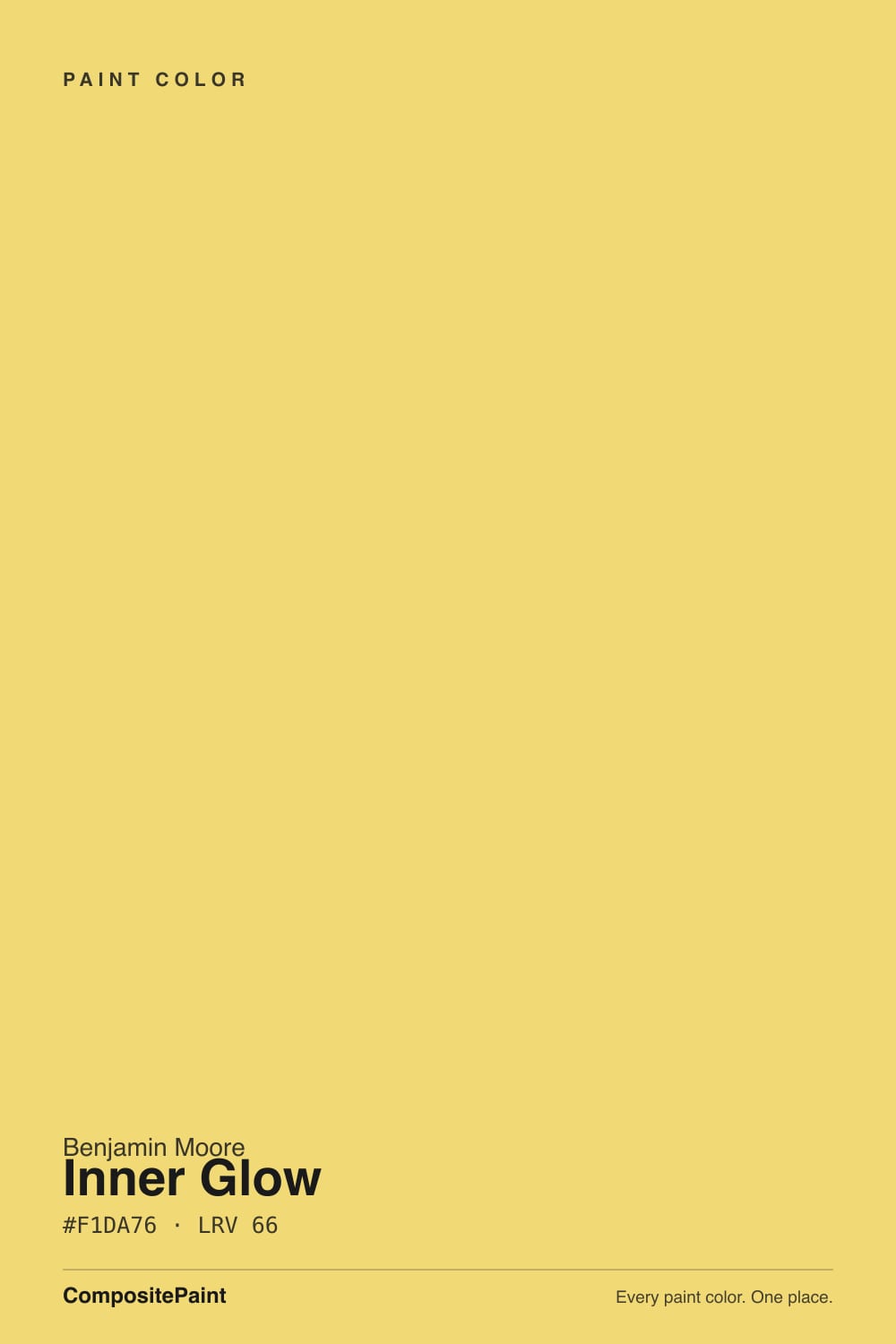
- 1Honey Tea52
- 2Tuscan Sun60
- 3Inner Glow66
- 4Banana Cream71
- 5Lemon Chiffon79
The Fast Verdict
Inner Glow is an actual yellow, not a cream with a yellow name. It sits on the gold side of the family — warm, a little earthy, no lemon bite — which is why it gets recommended for kids' rooms over the acid yellows that give parents a headache by week two.
The catch is size: at LRV 66 it is mid-light but heavily saturated, so a small room wears it beautifully and a big bright one turns into a glare box. Buy it for a kid's room, a laundry, a back entry or a hutch. Do not buy it for an open main floor.
Kids' rooms and playrooms · laundry rooms, mudrooms and back halls · small entries that should feel welcoming · a hutch, island or interior door that needs one cheerful note · north-facing rooms that need warmth put back
You want a soft butter-yellow that barely shows · the room is big, bright and south-facing · your floors are honey oak or golden beige carpet · your trim is a crisp cool white you are not repainting · you are painting a bathroom you do makeup in
- A yellow that actually reads yellow — gold, not lemon, not washed-out cream
- Cheerful without the acid edge that makes kids' rooms exhausting
- Excellent in small, dim, hardworking rooms most colors make sad
- One of the few honest fixes for a cold north-facing room
- A Classics-collection color, so it predates and outlasts the butter-yellow trend
- Reads far stronger on four walls than on the chip
- Glares and bounces gold in a big, bright south-facing room
- Melts into honey oak floors and golden beige carpet
- Yellow pigment covers poorly — plan on three coats or a tinted primer
What Color Is Inner Glow, Really?
A clear golden yellow with a trace of earth in it. Put it beside a lemon yellow and the difference is obvious: lemon has a green edge that goes acidic on a wall, while Inner Glow leans toward honey and gold, so it reads warm rather than sharp. It is not a pastel and it is not a cream — the chroma is genuinely high, which is exactly what people mean when they say a yellow finally looks like yellow. Benjamin Moore files it in the Classics collection, so this is an old, stable color, not something invented for the current butter-yellow moment.
LRV 66 is the number people misread. LRV measures lightness only, and a greige at 66 is a quiet backdrop while a saturated gold at 66 is a statement. Yellow also amplifies light more than any other hue: it bounces its own color back into the room, so four walls of it look considerably stronger than the chip in your hand, and the second wall is where most people realize how much color they bought. Sample a poster-sized piece, tape it up, and live with it for two days before you commit.
Undertone in one line: gold first, a trace of ochre second — never lemon, never orange. If your sample looks sour and flat, that is a cool LED overhead; if it looks like mustard, that is a warm bulb or late-day west sun. Both are the same paint reporting on your light.
Where It Shines
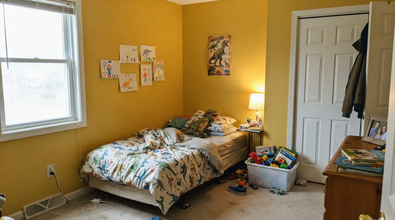
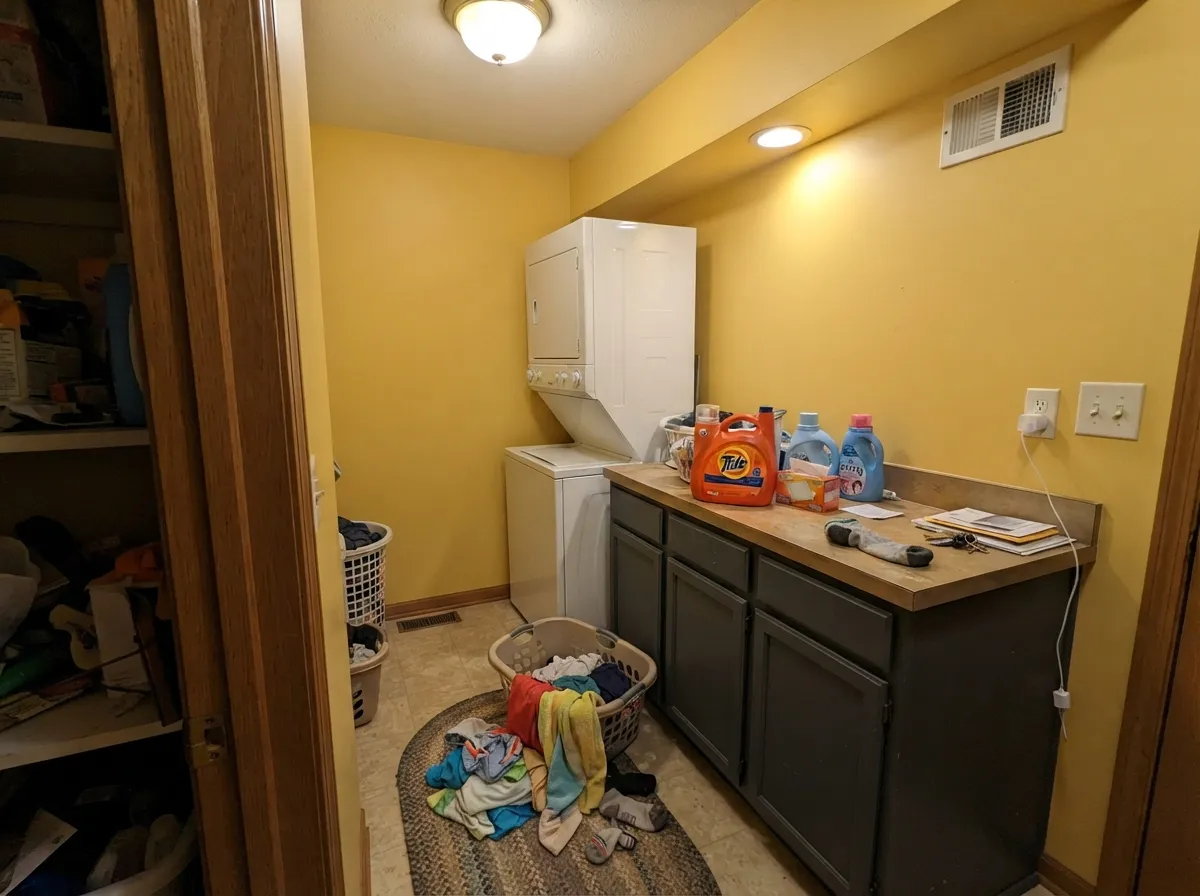
This color earns its keep in small rooms and hardworking ones. A kid's bedroom, a playroom, a laundry, a mudroom, a windowless back hall — rooms where cheerful beats sophisticated and where four walls of strong color is a feature, not a risk. It is also one of the few honest answers for a north-facing room, because cool north daylight takes the edge off the chroma and puts back the warmth that light strips out of everything else. Give it a warm white trim, white oak or cane, natural-fiber rugs and black hardware, and it reads sunny and deliberate instead of dated.
Where It Fails
Nearly every regret story about a gold this saturated follows one of three scripts, and all three are predictable before you open the can. None of them are the paint's fault — but if your room matches one, this is not your yellow, and a bigger sample will only confirm it faster.
The number that matters here is chroma, not LRV. On a two-inch chip Inner Glow looks like a soft honey gold; on four walls it is a proper yellow room and there is no hiding it. Yellow also throws its own color back at you, so the wall you painted second always looks stronger than the first. If you wanted "a hint of sunshine," go up to Hawthorne Yellow or a pale butter and stop reading here.
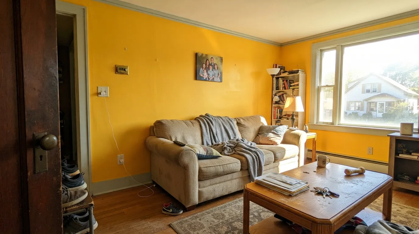
In a big south-facing room at midday the walls glare, and the bounce lands on everything: the ceiling picks up a gold cast, white trim goes faintly green-gray, and faces near the wall look jaundiced in photos. Small rooms absorb this; large bright rooms broadcast it. If the room gets hard direct sun for hours, use this color on one wall, a door or a piece of cabinetry, not on all four walls.
Two pairing mistakes, same room. Golden oak floors, oak trim or builder-beige carpet melt into gold walls and the whole room loses definition — one warm blur with nothing to read against. And a crisp cool white trim, Chantilly Lace territory, goes visibly blue-gray next to this much yellow, which makes the walls look dirty by comparison. Warm white trim like Cloud White, and a floor that contrasts — white oak, walnut, terracotta, gray-free — fixes both.
Room by Room
This is the pick when the acid yellows are too much and the pale ones do nothing. It is cheerful without being electric, it survives being covered in art and posters, and it flatters primary-colored plastic better than any neutral. Eggshell so you can wipe it, warm white trim, and one blue or green note in the room to keep it from reading like a single-color theme.
Honest answer: for a nursery this is a step stronger than most parents want on all four walls, especially with the lamp on at 3am. It works beautifully as one accent wall, a dresser or a closet interior, with a soft white or a pale blush on the rest. If you want the whole room yellow for a baby, drop down to a pale butter and keep the color as an accent.
Its second-best home. These rooms are small, often windowless, and no one is asking them to be sophisticated — a warm gold on the walls makes a chore room feel less like a chore. Pair with charcoal lockers or cabinets so the color has something to lean on, and use eggshell or satin because these walls get scuffed by baskets and boots.
A small entry in gold reads welcoming, and that impression is worth a lot for a room nobody sits in. The rule is containment: it must stop at a door or an obvious corner. Once a saturated yellow spills into an open living space it starts negotiating with every other color in the house, and it usually loses.
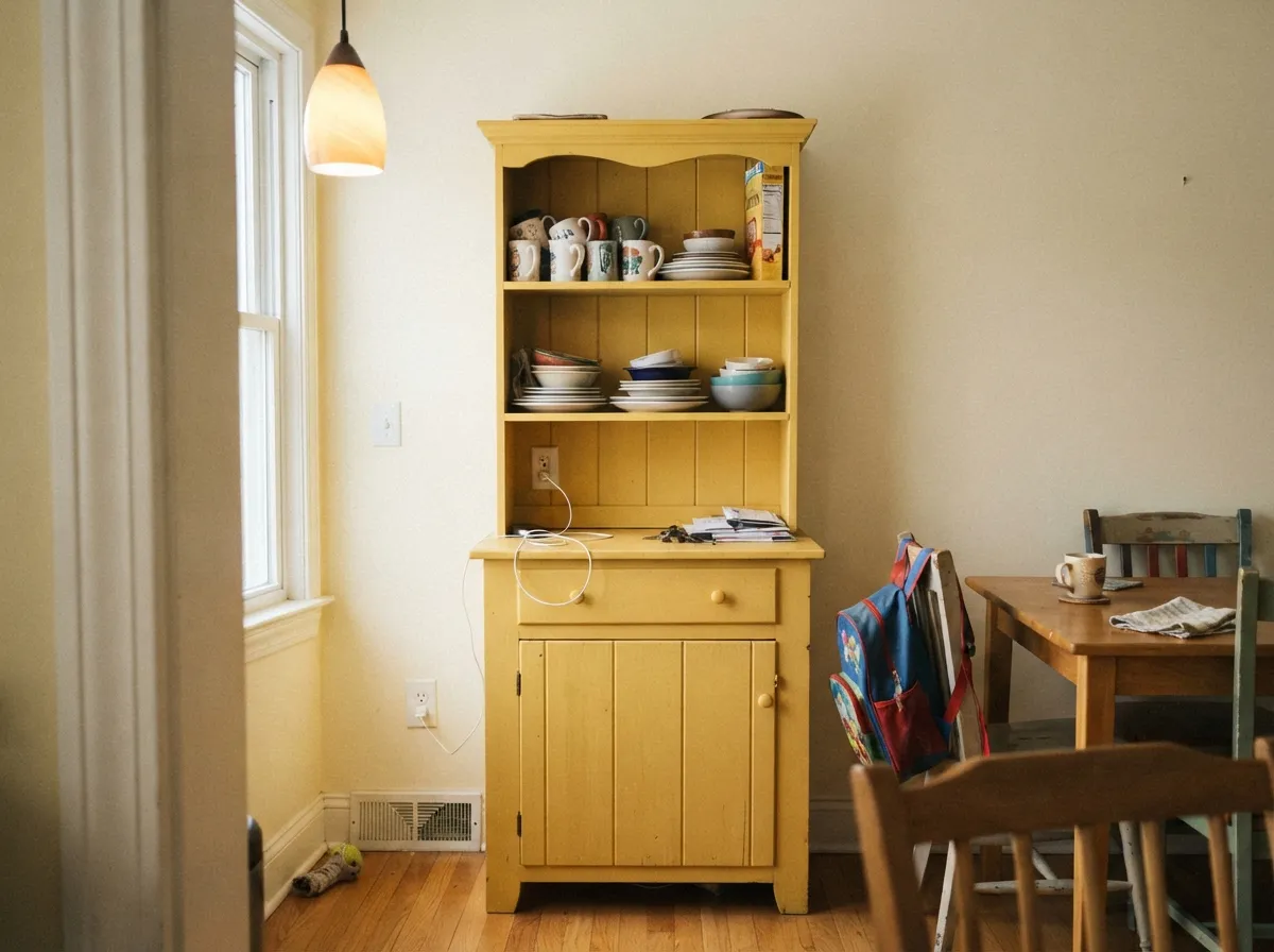
In doses, this is the good stuff: a satin gold hutch or island under cream walls, or a small breakfast nook painted out entirely. A full kitchen of gold cabinets is a big swing, and a losing one over honey oak floors. Use a urethane-fortified cabinet enamel and expect to need an extra coat — see the coverage question below.
Yellow bounce and mirrors are a bad combination: skin reads sallow in the one room where people examine their faces. Powder rooms with no mirror time are the exception. Outside, Benjamin Moore's own color page flags this one as not recommended for exterior use, so leave the front door and shutters to a color rated for it.
Your Light Is the Risk
The surprise winner. Cool north daylight takes the heat out of the chroma and the gold reads friendly instead of loud — and it puts back the warmth that light steals from every other color.
Hours of direct midday light push it toward highlighter, and the bounce tints the ceiling and white trim. This is where four walls become a mistake.
Clean and clear in morning east light, most saturated at midday, then late west sun deepens it toward honey and amber for the last hour. The evening shift is the one most owners like best.
2700K warm bulbs push it to a deeper mustard-gold — cozy in a small room, heavy in a large one. Cool 4000K LEDs drain the red out and leave it flat and slightly sour. Pick your bulbs before you judge the paint.
Most complaints about Inner Glow are a light mismatch. Upload a photo of your actual room and see it on your walls — then ask for the same wall in north light or evening lamps before you buy a single sample.
Need It From Another Brand?
Any paint counter can custom-tint Benjamin Moore 348 directly. If you would rather stay in one brand's own deck, these are the closest stock matches, measured as ΔE2000. Under 2 is a difference you will not see on the wall.
| Brand | Closest color | ΔE | LRV | |
|---|---|---|---|---|
| Sherwin-Williams | DaffodilSW 6901 · Sherwin-Williams | 3.0 | 71 | Color page → |
| Behr | Solar EnergyP310-5 · Behr | 1.7 | 71 | Color page → |
| Valspar | Island Sun3007-3C · Valspar | 2.7 | 69.3 | Color page → |
| PPG / Glidden | Forsythia BlossomPPG1214-5 · PPG / Glidden | 2.3 | 69 | Color page → |
| Glidden | Forsythia BlossomPPG1214-5 · Glidden | 2.3 | 69 | Color page → |
| Dutch Boy | Cheerful Yellow119-4DB · Dutch Boy | 2.0 | 72 | Color page → |
Similar Benjamin Moore Colors
The nearest shades to Inner Glow within Benjamin Moore's own range, ranked by perceptual color distance — useful when you want the same look a touch lighter, darker, or warmer.
WCAG 2.1: AA is 4.5 : 1 for normal text, 3 : 1 for large text, AAA is 7 : 1.
Inner Glow vs the Colors You're Also Considering
Every Inner Glow sample board has the same rivals on it. The numbers show the real lightness gap — then it comes down to which risk you would rather live with.
Pick this when Hawthorne looks washed out on your wall and you want the color to actually register as yellow.
Benjamin Moore HC-4 · LRV 71Hawthorne YellowPick this if you want the same gold turned down a stop — creamier, calmer, and the safer choice for a full room in real daylight.
Pick this when butter reads as "did you even paint?" and you want a room that clearly has a color.
Behr ICC-90 · LRV 86Butter YellowPick this if you are chasing the butter-yellow trend — at LRV 86 it is pale enough to pass for a warm white, so it never shouts.
Pick this for depth and a warmer, less sugary read; the same one-wall caution applies double in a big room.
Sherwin-Williams SW 6686 · LRV 79Lemon ChiffonPick this for the Sherwin-Williams route and a lighter, sweeter yellow — though even that one is happier on one wall than on four.
Inner Glow Coordinating Colors
The rule for coordinating with a saturated gold: keep the whites warm, give it one cool note so the room is not all sunshine, and put something dark in the scheme so the yellow has an edge to stop against. Beiges and golden greiges are the pairings to avoid — they blur into it. These are the partners that keep showing up in rooms that work:
Where Inner Glow Sits in the Butter-Yellow Moment
Yellow came back in 2025, but the yellow that came back was butter: pale, creamy, barely-there. It spread from fashion into interiors, appliance makers named their own versions after it, and by 2026 the advice had already shifted from drenching whole living rooms in it to using it in smaller, more considered doses. Inner Glow is not that color and never was. It is several steps deeper and much more saturated than a butter shade — Behr's Butter Yellow sits at LRV 86 and can pass for a warm white; this one sits at 66 and cannot pass for anything but yellow.
That has one real advantage and one real risk. The advantage: it is a Classics-collection color that has been in the deck for decades, so it is not carrying a 2025 timestamp and will not look like a trend that expired. The risk is older than the trend — a saturated gold is one styling decision away from the Tuscan look of the early 2000s. Keep it out of ochre-plus-terracotta-plus-faux-finish territory, pair it with clean white trim, black metal and pale wood, and it reads current instead of nostalgic.
Inner Glow With Wood Tones and Floors
This decision gets made at the floor. Pale white oak, blond wood and natural fiber rugs are the easy win — the wood is light enough to frame the color without competing with it. Walnut and espresso work for the opposite reason: dark, cool-leaning brown gives the yellow the contrast it needs to look intentional. Terracotta tile and cork are both good in a mudroom or laundry.
The honest no is anything golden. Honey oak floors, orange-stained trim and yellow-beige carpet sit in the same lane as the walls, so the room loses all separation and reads as one big warm smear. A large contrasting rug helps in a bedroom; wall-to-wall golden tones mean picking a different color. Cool gray LVP is the other one to sample first — the temperature clash can make the walls tip toward mustard.
Metals are simple: matte black and aged brass both work. Polished chrome and brushed nickel go cold and slightly clinical against it, and shiny polished brass can be too matchy — the gold-on-gold reads like hardware disappearing into the wall.
Three Ready Palettes Built on Inner Glow
A color is never alone on the wall. These are complete combinations in the 60-30-10 pattern, with the reason each one holds together. Every one opens in the visualizer.
Gold and sky blue is the primary pairing every kid gravitates to, minus the crayon-box version of it. Cloud White matters here: a cooler, brighter trim white would go faintly blue-gray against this much yellow and make the walls look dirty.
Try this palette in your roomSmall utility rooms can take full-strength color because you are never in them long enough to tire of it. The charcoal cabinetry gives the gold something solid to lean on and hides the scuffs baskets and boots leave behind.
Try this palette in your roomDeep green and gold is an old, reliable pairing — the green is dark enough to keep the yellow from running the room, and soft cream walls let both read as deliberate choices rather than a paint sale. Aged brass hardware, not polished chrome.
Try this palette in your roomInner Glow FAQ
Is Inner Glow too bright for a kid's room?
For most kids' rooms, no — it is deliberately on the gold side rather than the acid-lemon side, which is the difference between cheerful and exhausting. What it is not is subtle: expect a room that clearly reads yellow. If the room is large and gets hard afternoon sun, put it on one wall instead of four.
What trim white goes with Inner Glow?
A warm white. Cloud White is the default and White Dove works too. A crisp cool white like Chantilly Lace goes faintly blue-gray beside this much yellow, and the contrast makes the walls look dirty. Semi-gloss on the trim, eggshell on the walls.
Will Inner Glow work in a north-facing room?
Better than almost anything else. Cool north daylight softens the saturation and the gold gives back the warmth that light takes out — it is one of the genuine cases where a strong yellow is the practical answer, not just a brave one. Keep the bulbs at 2700K so the room does not go flat after dark.
Is Inner Glow good for a nursery?
As an accent, yes — one wall, a dresser, a closet interior. On all four nursery walls it is a step stronger than most parents want, particularly under a lamp at night. For a fully yellow nursery, drop to a pale butter shade and use Inner Glow only where you want the color to actually speak.
How many coats does it take?
Plan on three, or two over a gray-tinted primer. Yellow pigments are the most transparent in the deck, so a saturated gold rolled straight over white or over a previous dark color streaks badly at two coats. This is the single most common surprise with any yellow, and it is a primer problem, not a paint-quality problem.
Can I use Inner Glow outside?
No — Benjamin Moore's own color page marks this one as not recommended for exterior use. Warm golds do exist as exterior colors, but pick one from the exterior-rated side of the deck rather than pushing this one outdoors and hoping.
Have you painted with Inner Glow?
Rate it — one tap helps the next reader decide.
Ask a Question