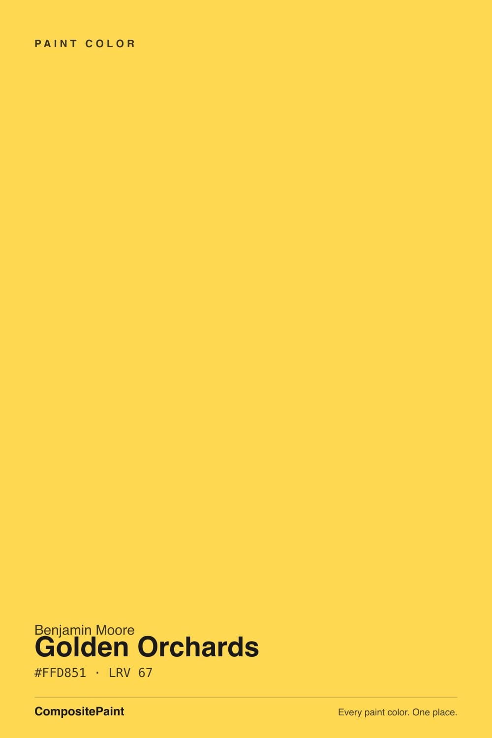
Golden Orchards
The pure yellow designers put overhead, reviewed honestly: the low-ceiling trick that made it famous, the four-wall mistake that ruins it, and what it really takes to cover.

Jessica has spec'd whites and neutrals for more than 300 rooms and keeps a sample wall of painted drawdowns in her studio. Every color review is checked against real reader rooms in the comments and re-tested when a formula changes. About the testing process →
- 1Honey Tea52
- 2Jackfruit62
- 3Golden Orchards67
- 4Lemon Twist72
- 5Lemon Chiffon79
The Fast Verdict
Golden Orchards is not a soft, buttery almost-neutral wearing a yellow name. Benjamin Moore's own description is a deep yellow with sharp orange undertones, and that is precisely what lands on the wall. At LRV 67 it is bright, but the number hides how saturated it is — which makes it superb overhead and on small surfaces, and exhausting across four walls of a living room. Buy it for a ceiling, a playroom, a laundry room or a door. Do not buy it hoping for buttercream.
Ceilings — especially low ones that need to feel taller · playrooms and kids' rooms · laundry rooms, mudrooms and other small windowless boxes · one accent wall or an interior door in an otherwise neutral house
You actually wanted a soft buttery yellow · it is a bedroom, a bathroom, or anywhere people study their own face · your floors are honey oak or orange-stained pine · you plan to roll only two coats · you need it outdoors — Benjamin Moore does not recommend 329 as an exterior color
- The best ceiling color in the deck for making a low room feel taller
- A genuine, unapologetic yellow — no cream, no beige hedging
- Bounces real light into small, windowless rooms
- Playrooms and kids' spaces read happy, not sour
- A Classics-collection color, not a trend that will be discontinued
- Far too saturated for four walls of a main living room
- Poor hide — three coats without a tinted primer
- Casts yellow onto faces, mirrors and white trim
- Not recommended by Benjamin Moore for exterior use
What Color Is Golden Orchards, Really?
A pure, high-chroma yellow with a push of orange behind it — and the orange is the part people miss on the chip. Benjamin Moore files 329 in the Classics collection, which is a deck full of unfussy, decades-old colors rather than trend inventions, and the brand's own copy calls it a deep yellow with sharp orange undertones. That word sharp is doing real work. This is not a grayed, dusty, designer-muted yellow; it is the yellow a child picks out of a crayon box, cleaned up just enough for a paint store.
LRV 67 is the number that fools people. Sixty-seven sounds mid-light and safe — Pale Oak sits at the exact same 67 and reads like a whisper of greige. LRV only measures how much light bounces back, not how much color is in it, and Golden Orchards is carrying far more pigment than any neutral at that value. So expect the brightness of a light color with the presence of a saturated one: it bounces plenty of light around the room, and it announces itself while doing it.
Undertone in one line: yellow first, orange second — never green, never cream. If your sample looks acidic or lime-tinged, that is a cool bulb or a north window doing it; if it looks amber and almost apricot, that is late-afternoon sun or a 2700K lamp. Both are the same paint telling the truth about your room.
Where It Shines
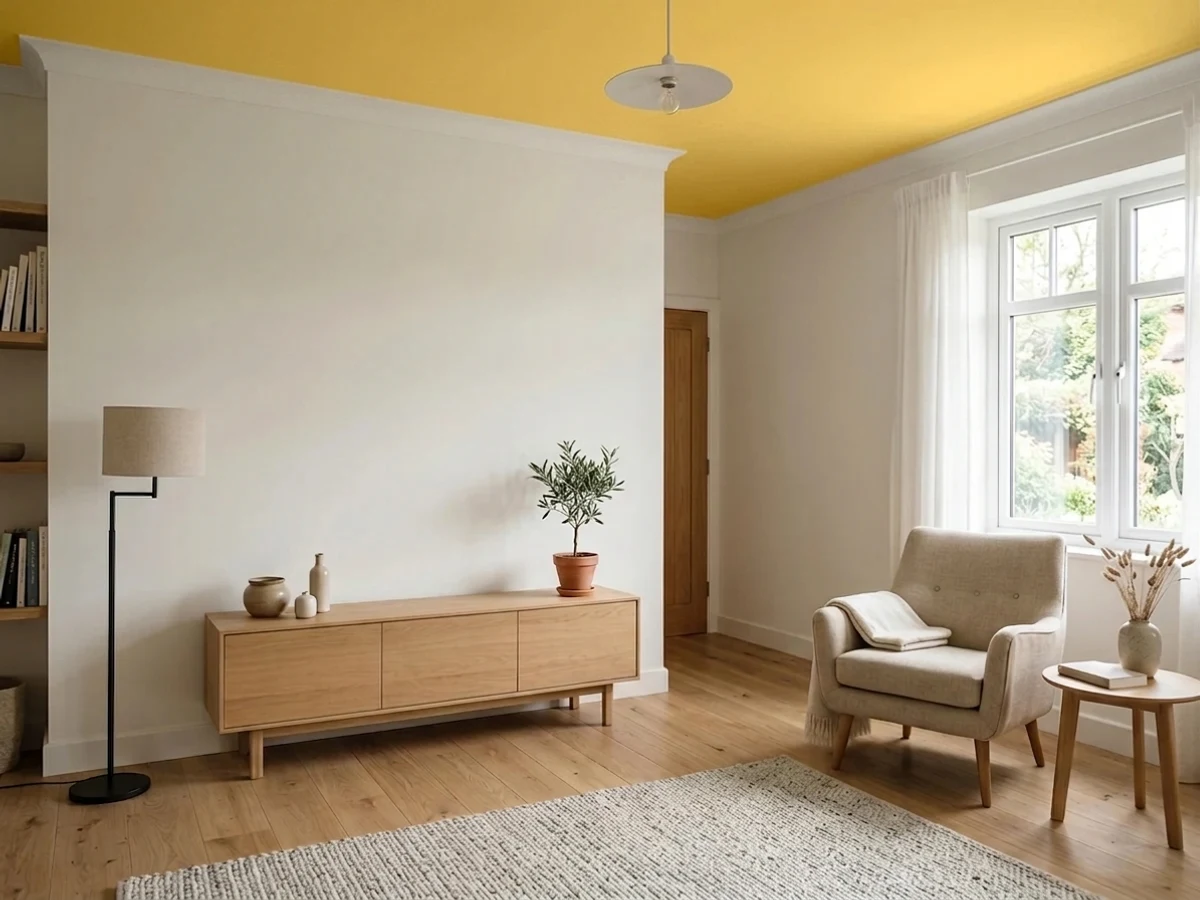
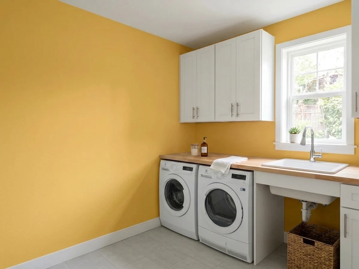
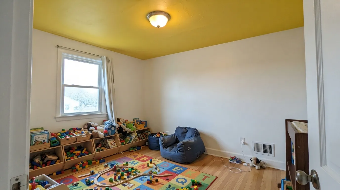
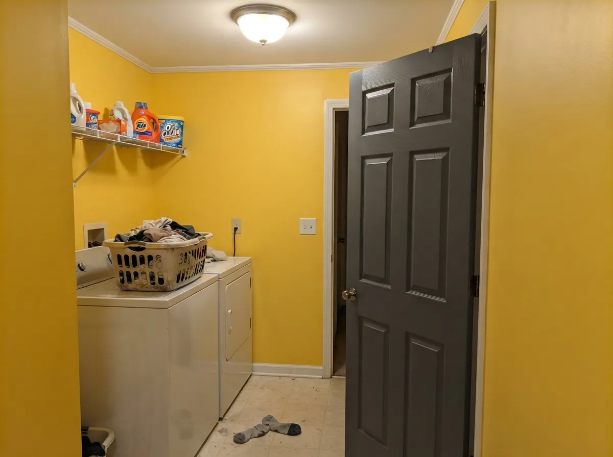
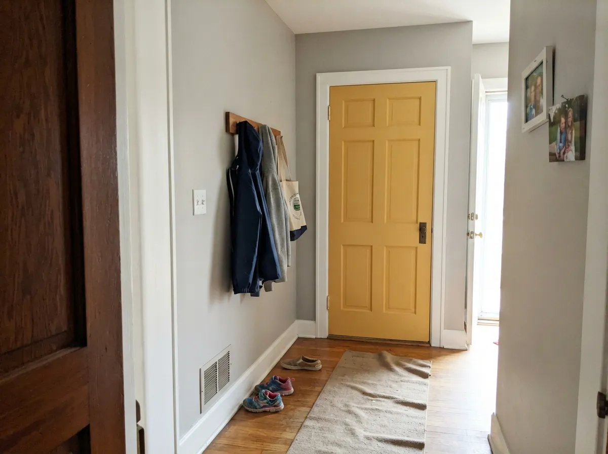
Its best surface is the one most people never paint. A designer used Golden Orchards on the ceiling of a client's grandkids' playroom in Arizona specifically to make a low ceiling feel higher, and that is not decorator poetry — a bright, warm plane overhead reflects light down instead of casting the gray shadow a flat white ceiling casts, so the eye stops reading the ceiling as a lid. Its other home is the small, bounded room nobody expects color in: a laundry room, a mudroom, the inside of a closet, an interior door. In doses, this color is a jolt of good mood. In quantity, it is a lot of yellow.
Where It Fails
The bad reviews for this color are remarkably consistent, and all three scripts are predictable before you open the can. Two of them are about expectations and one is about labor — none of them are the paint misbehaving.
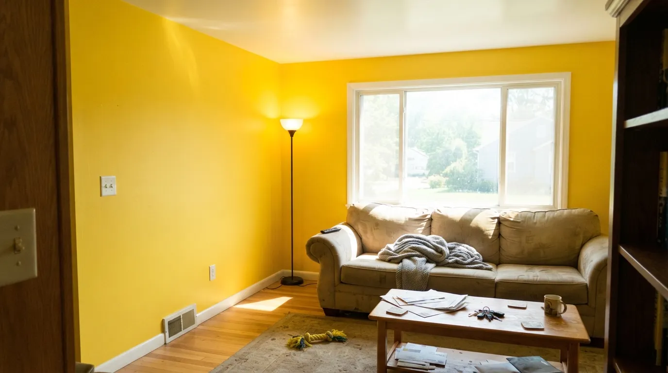
This is the single biggest regret with 329. A two-inch chip of a saturated color reads charming; two hundred square feet of it reads like a highlighter. On four living-room walls people describe feeling wired rather than cheered. If you want a yellow room you can live in all day, go pale and grayed — Hawthorne Yellow at LRV 71 or Lemon Chiffon at LRV 79 — and leave Golden Orchards for the ceiling or one wall.
Bright yellows are built on organic pigments that are physically transparent and carry very little of the titanium dioxide that gives paint its hide. Over an off-white wall, three coats is normal and four is not unusual; over anything dark, it is a losing battle. Budget for a primer tinted toward the color — most stores will tint a gray or yellow-shaded primer for you — and the finish coats drop to two. Skipping this step is why so many owners report patchy, streaky walls and blame the paint.
Saturated color reflects onto everything near it. In a bathroom or at a vanity that means a yellow-green cast on skin in the mirror, which is why this color has no business where people apply makeup or shave. It also washes the adjacent trim: a warm white like Swiss Coffee next to it goes distinctly yellow, and even a clean white can look dingy where the bounce lands. Pair it with the crispest white you own and keep it away from mirrors.
Room by Room
The reason to buy this color. On a low eight-foot ceiling above white or pale walls, a warm saturated yellow overhead reflects light down and pulls the eye up, so the ceiling stops feeling like a lid. Flat sheen so the plane reads soft; keep the walls light so the yellow is the only loud thing in the room.
The documented real-world use, and it earns it. Kids' spaces can carry saturation that a living room cannot, and the color photographs happy rather than sour. Put it overhead or on one wall behind the toy storage rather than all four, use a scrubbable eggshell at hand height, and let white take the rest.
Small windowless boxes are where bold color costs nothing. Four walls of Golden Orchards in a laundry room is genuinely delightful precisely because you are in there for six minutes at a time. Warm the bulbs to taste and accept that it will read more amber under artificial light.
A yellow kitchen is a real tradition, but this particular yellow is best as an island, a hutch, an inside-the-glass-cabinet surprise or a pantry door under white cabinets. A full run of Golden Orchards cabinetry is a strong bet that gets stronger every year you live with it. Satin cabinet enamel if you do it.
Saturated yellow is stimulating and the room's whole job is to wind you down. The one exception is the ceiling in a bedroom with quiet walls, where the color reads as morning light rather than as a wall you have to face. For yellow bedroom walls, drop to a pale, grayed yellow instead.
Benjamin Moore does not list 329 as an exterior recommendation, so this decision is made for you at the paint counter. Even matched into an exterior line, an organic yellow this bright is among the first colors to fade on a sun-facing wall or door. Keep it inside.
Your Light Is the Risk
Cool, even daylight is the one condition that tames it — the color reads clean and sunny instead of hot. Saturated warm colors are the rare case where a north room is an advantage.
Full midday sun turns it near-fluorescent, glaring off the wall and bouncing yellow onto the ceiling, the floor and everyone in the room. This is where owners use the word headache.
Morning east light keeps it clean and lemony; by golden hour the orange in it comes forward and it reads amber, almost apricot. Sample at both ends of the day, because they look like two colors.
Warm 2700K bulbs push it toward mustard and deepen it noticeably; 3500–4000K LEDs hold it closer to the chip but flatten the warmth. Small rooms that only ever see artificial light should be sampled at night, not at noon.
Most complaints about Golden Orchards are a light mismatch. Upload a photo of your actual room and see it on your walls — then ask for the same wall in north light or evening lamps before you buy a single sample.
Need It From Another Brand?
Any paint counter can custom-tint Benjamin Moore 329 directly. If you would rather stay in one brand's own deck, these are the closest stock matches, measured as ΔE2000. Under 2 is a difference you will not see on the wall.
| Brand | Closest color | ΔE | LRV | |
|---|---|---|---|---|
| Sherwin-Williams | Lemon TwistSW 6909 · Sherwin-Williams | 1.2 | 72 | Color page → |
| Behr | Buzz-inP300-6 · Behr | 0.7 | 71 | Color page → |
| Valspar | Sweet Mustard3008-1B · Valspar | 1.4 | 70.1 | Color page → |
| PPG / Glidden | Dilly DallyPPG1213-6 · PPG / Glidden | 3.0 | 71 | Color page → |
| Glidden | Dilly DallyPPG1213-6 · Glidden | 3.2 | 71 | Color page → |
| Dutch Boy | Summer's Sun118-5DB · Dutch Boy | 1.2 | 72 | Color page → |
Similar Benjamin Moore Colors
The nearest shades to Golden Orchards within Benjamin Moore's own range, ranked by perceptual color distance — useful when you want the same look a touch lighter, darker, or warmer.
WCAG 2.1: AA is 4.5 : 1 for normal text, 3 : 1 for large text, AAA is 7 : 1.
Golden Orchards vs the Colors You're Also Considering
Every Golden Orchards sample board has the same rivals on it. The numbers show the real lightness gap — then it comes down to which risk you would rather live with.
Pick this when you want the color to actually register as yellow, not as warm off-white.
Benjamin Moore HC-4 · LRV 71Hawthorne YellowPick this for yellow walls you can live with all day — it is the grayed, historical version that works on all four walls.
Pick this for the warmer, deeper read; on a ceiling the extra body is what keeps it from looking like primer.
Benjamin Moore 2022-40 · LRV 75Banana YellowPick this for the same energy pitched lighter and more lemon — a touch less orange behind it.
Pick this when pale yellow keeps disappearing into your trim and you want the color to hold its ground.
Sherwin-Williams SW 6686 · LRV 79Lemon ChiffonPick this if your painter works in Sherwin-Williams and you want cheerful without commitment — it is much paler and easier to cover.
Golden Orchards Coordinating Colors
The rule with a saturated yellow is that its partners should be quiet or dark — never warm and almost-yellow. Crisp whites keep it looking deliberate, deep navies and charcoals give it something to push against, and a muted green is the one other color that can share a room with it without competing. What to avoid is the near-miss: creams, tans and warm off-whites all get muddied by the bounce and end up looking like a failed attempt at the same color. These are the partners worth putting on the board:
The Case for a Yellow Ceiling
Golden Orchards belongs to a small group of colors that are better overhead than on a wall, and the reasoning is physical rather than fashionable. A flat white ceiling has nothing to reflect except the gray of its own shadow, so in a room with eight-foot ceilings it reads as a hard, close lid. A bright warm color up there does two things at once: it throws warm light back down into the room, and it gives the eye a reason to travel upward instead of stopping at the wall line. Designers have been calling the ceiling the fifth wall for years, and treating it as a real surface — color-drenched, tonal, or contrasting — is now one of the most common ways to fix a low room without construction.
The documented example for this exact color is a designer's use of Golden Orchards on the ceiling of a client's grandkids' playroom in Arizona, chosen because the client wanted the state's relentless sunshine indoors and the low ceiling needed to feel higher. That is a good template for anyone considering it. The conditions that make it work: light walls so the ceiling is clearly the accent, a ceiling height of roughly eight to nine feet, and a room whose purpose tolerates energy. The conditions that break it: dark or warm-toned walls, which turn the whole room into a yellow cave, and a tall room, where the color becomes purely decorative.
Two practical notes. Use a flat sheen overhead — any gloss will show every roller lap and drywall seam under raking light. And prime the ceiling with a tinted primer just as you would a wall, because a yellow this transparent over a white ceiling is the classic three-coat job, and ceilings are the worst place to discover that halfway through.
Golden Orchards With Wood Tones and Floors
The floor decides whether this color reads fresh or overwhelming, and the deciding factor is how much yellow-orange is already in the room. Walnut, espresso and dark stained oak are the best company — the depth and the red-brown give the yellow something to bounce off, and the contrast is what keeps it looking designed. Pale unstained white oak and light natural maple also work, especially under a yellow ceiling, because they stay neutral enough not to add to the load.
The honest no is golden: honey oak floors, orange-stained pine, yellowed builder trim, and beige carpet with a warm cast. None of these clash in the classic complementary sense — the problem is the opposite. They agree with the yellow so completely that the room loses all contrast and turns into a single warm wash, with the floor looking more orange than it did before you painted. A large neutral rug helps on a wall application; the real solution is to move the color to the ceiling, where vertical separation does the work that no rug can.
Gray-washed floors and cool LVP are the trickiest case. The cool floor makes the yellow look even more saturated by contrast, which some people love and some find jarring. Sample a large board standing on the actual floor before you commit. Metals are easy either way: brass and unlacquered bronze go with the warmth, matte black gives it edge, and polished chrome is the only one that reads slightly out of place.
Three Ready Palettes Built on Golden Orchards
A color is never alone on the wall. These are complete combinations in the 60-30-10 pattern, with the reason each one holds together. Every one opens in the visualizer.
The ceiling trick only works if the walls get out of the way, and at LRV 92 Chantilly Lace is the cleanest, least yellow wall white in the deck — it will not go dingy under the bounce the way a soft cream does. Navy built-ins give the room one dark anchor so the yellow reads as a deliberate design decision rather than as a leftover nursery.
Try this palette in your roomSmall utility rooms are the safest place to spend a bold color, because nobody lingers long enough to tire of it. Charcoal on the door and shelves keeps the scheme from reading like a daycare, and it is the one dark neutral that stays warm-leaning enough not to fight the orange in the yellow.
Try this palette in your roomThis is how to own the color without living inside it. Classic Gray is quiet enough that a single yellow door becomes the whole personality of a hallway, and White Dove trim keeps the handoff soft. Repainting one door costs a quart, which makes it the cheapest way to find out whether you actually like saturated yellow.
Try this palette in your roomGolden Orchards FAQ
Is Golden Orchards too bright for a whole room?
For a living room, dining room or bedroom — almost certainly yes. Benjamin Moore describes it as a deep yellow with sharp orange undertones, and at that saturation four walls stop being cheerful and start being loud. It is a different story in a small utility room, a playroom or on a ceiling, where the same intensity is exactly the point.
Why does it take three coats?
Bright yellows rely on organic pigments that are naturally transparent and contain very little of the titanium dioxide that gives paint its hiding power. Over a white or off-white wall, three coats is the normal answer and four happens. Have the store tint your primer toward the color first and you will usually get there in two finish coats — this is the single best money you can spend on this paint job.
Does painting a ceiling yellow really make the room feel taller?
In the right room, yes. A stark white ceiling reads as a hard, shadowed plane and the eye stops at it; a warm bright color overhead reflects light down and keeps the eye moving upward. A designer used this exact color on a low playroom ceiling for that reason. It works best with light walls and an eight- to nine-foot ceiling — in a tall room the effect is decorative rather than corrective.
What white goes with Golden Orchards?
The cleanest one you can find. Chantilly Lace is the right instinct — a crisp white keeps the yellow looking intentional. Warm creams are the mistake: a soft white like Swiss Coffee sitting next to this much yellow picks up the bounce and reads yellowed and slightly dirty. Semi-gloss on the trim so the two surfaces separate.
Will it work with honey oak floors?
This is the one flooring that fights it. Golden oak and orange-stained pine already carry the same yellow-orange note, so the room turns into one continuous warm wash with no relief and the floor looks more orange than it did. Walnut, espresso and pale unstained white oak all work. If the honey oak is staying, put the yellow on the ceiling — vertical separation solves what a wall color cannot.
Can I use Golden Orchards outside on a front door?
Benjamin Moore does not recommend 329 for exterior use, so the color is not offered in their exterior lines. You can have a store match it into an exterior product, but be aware that bright organic yellows are among the fastest colors to fade in direct sun — a south-facing door will look noticeably tired within a few years. If you want a yellow door that lasts, ask for a purpose-built exterior yellow instead.
Have you painted with Golden Orchards?
Rate it — one tap helps the next reader decide.
Ask a Question