Firenze
The Tuscan terracotta from Benjamin Moore's Affinity line, reviewed honestly: the warm light where it glows like fired clay, the cool light where it turns muddy, and what to pick instead.

Jessica has spec'd whites and neutrals for more than 300 rooms and keeps a sample wall of painted drawdowns in her studio. Every color review is checked against real reader rooms in the comments and re-tested when a formula changes. About the testing process →
- 1Rookwood Terra Cotta14
- 2Rusty Gate19
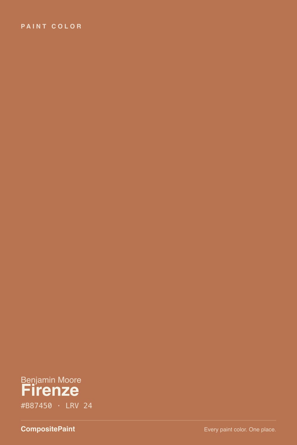
- 3Firenze24
- 4Caramelized35
- 5Venetian Plaster42
The Fast Verdict
Firenze is Benjamin Moore's answer to sun-baked Italian clay — a deep, red-leaning orange that reads more like reclaimed terracotta tile than a trendy accent-wall orange. It comes out of the Affinity Collection, the 144-color line Benjamin Moore built to coordinate with itself rather than to headline a Color of the Year campaign, so it doesn't carry the name recognition of a Cavern Clay or a Redend Point — just a quieter, more deliberate warmth for people who already know they want real color, not a hint of it.
Dining rooms and kitchen islands · front doors and exterior trim · rooms with warm wood, brass, and natural stone · anyone who wants committed terracotta, not a watered-down orange
Your room runs mostly on cool LEDs with little daylight · your counters or floors are cool gray · you want it on all four walls of a small room · you want a color everyone will recognize by name
- A genuine, saturated terracotta — not a washed-out imitation
- Holds its color on doors, trim, and cabinets even without direct light
- Outstanding with brass, warm wood, brick, and natural stone
- Reads brighter and more confident outdoors than most interior deep colors expect
- Quiet Affinity Collection pick — a designer color without the trend-chasing reputation
- Goes flat, muddy rust-brown under cool light or cool LEDs
- Clashes with cool gray stone, counters, and floors
- Too intense for most people on all four walls of a small room
- Little name recognition — harder to find inspiration photos than a trend color
What Color Is Firenze, Really?
Firenze — named for Florence — is a deep burnt-orange with a genuine red undertone underneath, closer to fired clay or old brick than to a citrus or pumpkin orange. It belongs to Benjamin Moore's Affinity Collection, a palette of 144 colors engineered to work with each other rather than promoted individually; that is why Firenze does not show up on best-of-the-year lists next to Cinnamon Slate or Redend Point even though the color itself is every bit as usable. It reads less like a paint-store trend pick and more like a color a designer already had in mind.
At LRV 24 it sits in the same depth range as Sherwin-Williams' Cavern Clay — medium-deep, absorbing roughly three-quarters of the light that hits it. That is dark enough to read as a real color statement on a wall, but not so dark that it needs a brightly lit room to register at all; on trim, doors, and cabinetry — Benjamin Moore sells it in its Advance alkyd line specifically for that kind of surface — it holds a smooth, saturated terracotta even in a hallway that only gets passing light.
Undertone in one line: red-orange first, brown second, never truly pink. If your sample looks flat and rust-brown, the room's light is cool — Firenze needs warmth to show its red. If it looks closer to brick or clay pot than to a Halloween orange, that is the color behaving exactly as designed.
Where It Shines
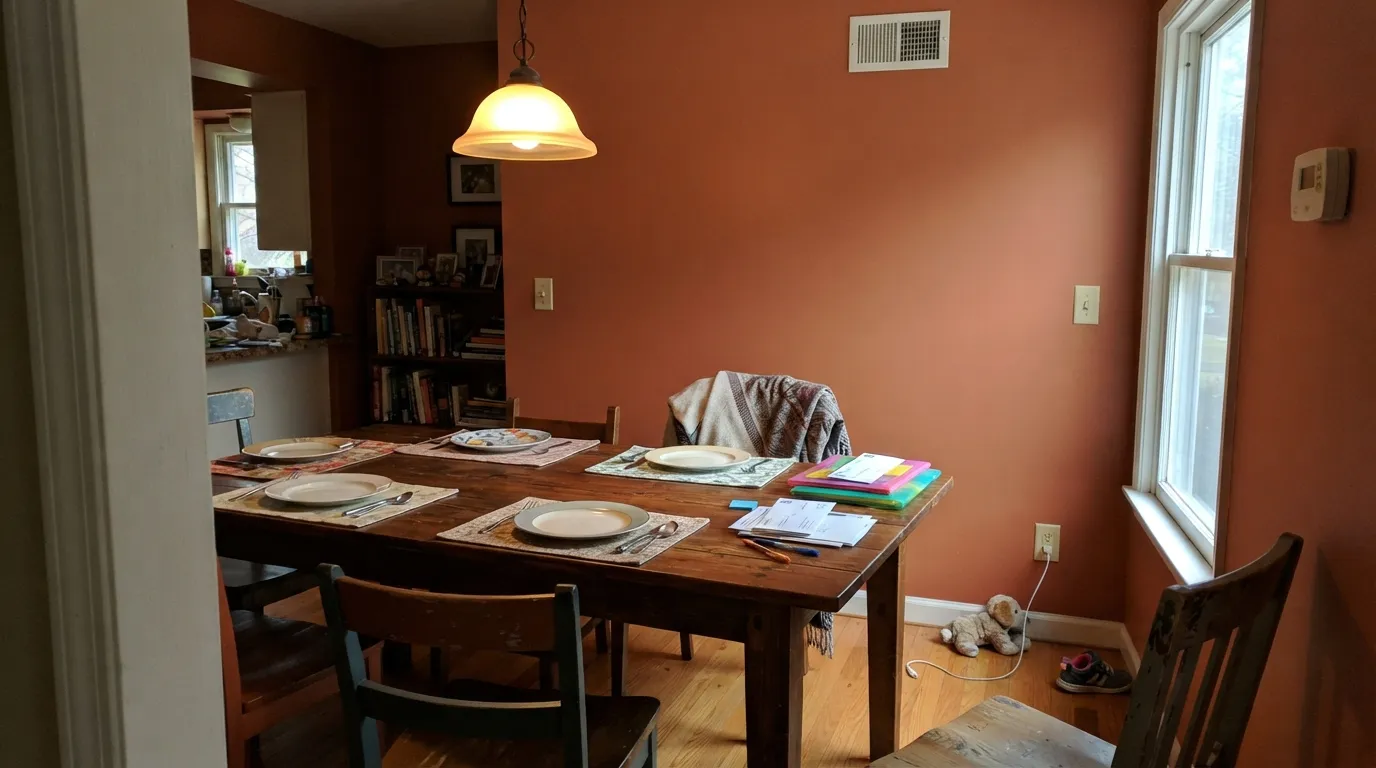
Give it warm daylight or a room full of wood, brass, and stone, and Firenze looks like it was quarried, not mixed. It is built for the rooms people actually want a bold color in — a dining room where guests sit for two hours, a kitchen island under pendant lights, a front door that needs to read as a decision, not an accident. It does not need a beach house or a farmhouse to work; it wants warm materials nearby and enough real light to let the red come through.
Where It Fails
Firenze does not have the viral Reddit-thread reputation some Benjamin Moore colors have earned — it is a quieter Affinity Collection pick, not a Color of the Year — but the same physics that trips up every deep terracotta will trip this one up too. Here is what predictably goes wrong, and none of it is a flaw in the paint.
Cool light strips the red out of any warm color, and Firenze has more red to lose than a grayed-down terracotta like Cavern Clay. In a dim north room under cool-white bulbs it settles into a flat rust-brown instead of the glowing clay color on the fan deck. Warm 2700K bulbs and a south- or west-facing wall are the fix, not more coats.
Firenze wants warm company — travertine, warm granite, honey or walnut wood. Set it next to cool gray quartz or gray-washed floors and both sides lose: the stone looks dingy, and the paint looks like it is fighting the room instead of finishing it.
At LRV 24, a full small room in Firenze with stark white trim and no wood or brass can feel closed-in rather than cozy — heavy instead of warm. It is at its best carrying one wall, an island, a door, or a room large enough to hold the color's weight.
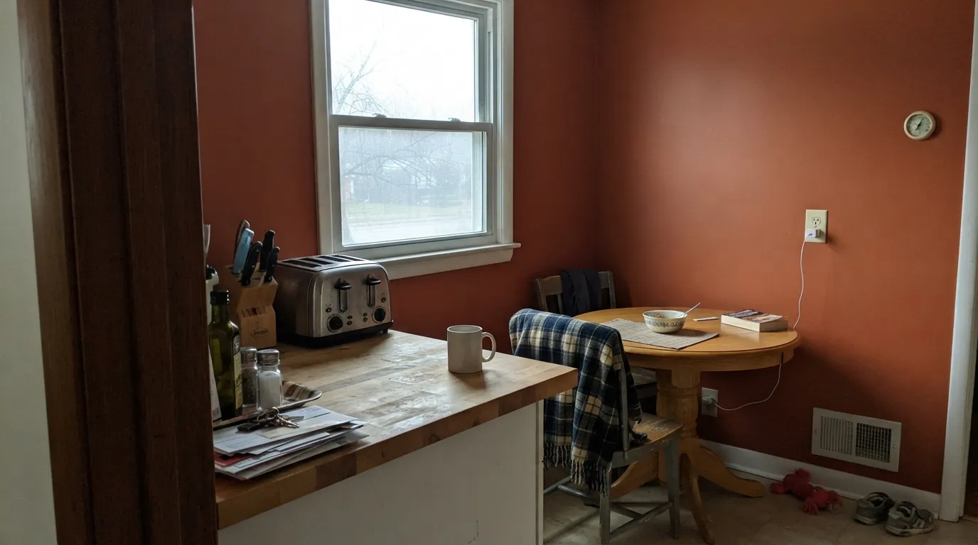
Room by Room
Two hours under a chandelier is exactly the use case Firenze was built for. With a wood table and warm-white bulbs it reads like a room that was decorated on purpose. Eggshell on the walls keeps a soft, non-shiny finish under overhead light.
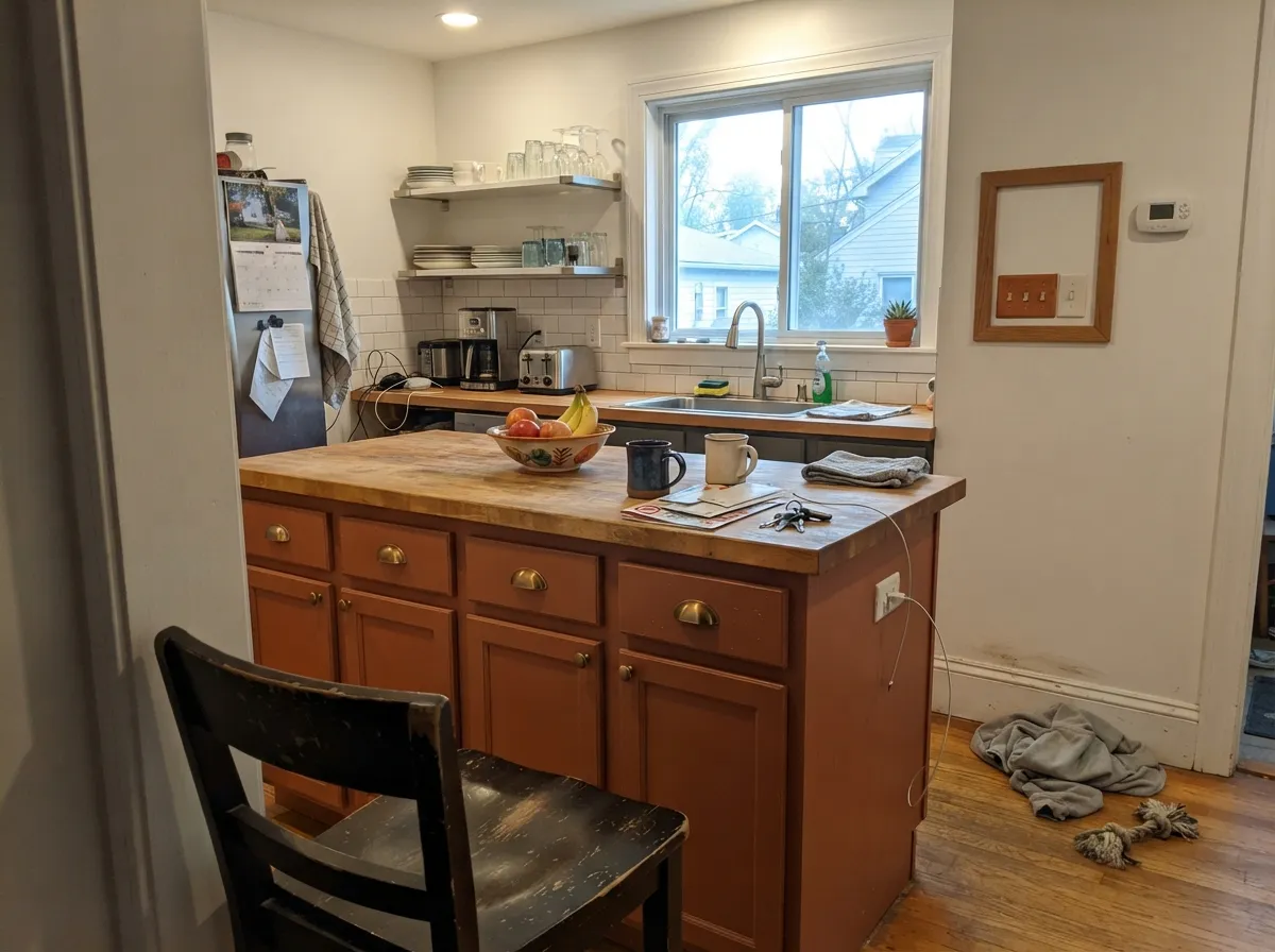
As an island or a run of lower cabinets under a lighter countertop, Firenze is genuinely striking against brass hardware and butcher block. A full kitchen of Firenze cabinets is a much bigger commitment — reserve it for the piece that gets the light.
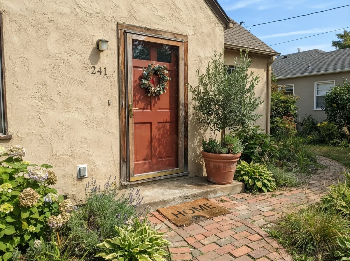
Firenze reads brighter and more saturated in full outdoor sun than it does indoors, and it pairs naturally with brick, stucco, and natural stone facades. Use the Advance alkyd line for a hard, washable, weather-ready finish.
One wall behind a sofa, or a fireplace surround, gives the room a real anchor color without asking every piece of furniture to negotiate with it. A full living room in Firenze needs real daylight and warm-toned everything else to avoid feeling heavy.
It is more assertive than most people want to fall asleep next to on four walls. It works better here as a headboard wall or on a single piece of furniture than as the room's main color.
A vanity or a powder-room accent wall can be striking with brass fixtures and a warm-white counter. A full bathroom in Firenze fights most bathroom finishes, which run cool — white subway tile, chrome, gray-veined marble.
Your Light Is the Risk
Direct warm sun brings the red fully forward — this is the closest the wall gets to the glowing terracotta on the fan deck.
Cool light drains the red and leaves a flat rust-brown. Test under your actual bulbs before committing a whole wall.
Bright and more orange at midday, deeper and more brick-red as the sun lowers — the shift reads as the color settling in, not misbehaving.
2700K bulbs make it glow like fired clay. Cool white LEDs flatten it toward a dull brown — swap the bulbs before you blame the paint.
Most complaints about Firenze are a light mismatch. Upload a photo of your actual room and see it on your walls — then ask for the same wall in north light or evening lamps before you buy a single sample.
Need It From Another Brand?
Any paint counter can custom-tint Benjamin Moore AF-225 directly. If you would rather stay in one brand's own deck, these are the closest stock matches, measured as ΔE2000. Under 2 is a difference you will not see on the wall.
| Brand | Closest color | ΔE | LRV | |
|---|---|---|---|---|
| Sherwin-Williams | TigereyeSW 6362 · Sherwin-Williams | 3.4 | 24 | Color page → |
| Behr | Campfire BlazeHDC-AC-06 · Behr | 2.2 | 23 | Color page → |
| Valspar | Cattle Drive2007-5A · Valspar | 2.0 | 21.8 | Color page → |
| PPG / Glidden | Crushed CinnamonPPG1063-6 · PPG / Glidden | 4.7 | 23 | Color page → |
| Glidden | Amber Coast50YR 23/365 · Glidden | 3.7 | 23 | Color page → |
| Dutch Boy | Desert Varnish312-6DB · Dutch Boy | 1.8 | 23 | Color page → |
Similar Benjamin Moore Colors
The nearest shades to Firenze within Benjamin Moore's own range, ranked by perceptual color distance — useful when you want the same look a touch lighter, darker, or warmer.
WCAG 2.1: AA is 4.5 : 1 for normal text, 3 : 1 for large text, AAA is 7 : 1.
Firenze vs the Colors You're Also Considering
Every Firenze sample board has the same rivals on it. The numbers show the real lightness gap — then it comes down to which risk you would rather live with.
Pick this for the punchier, more saturated red-orange that stays terracotta even in average light.
Sherwin-Williams SW 7701 · LRV 24Cavern ClayPick this if you want the same depth in a more muted, grayed-down terracotta that needs stronger light to hold its color.
Pick this when you want unambiguous orange-red warmth — Redend Point can look undecided; Firenze never does.
Sherwin-Williams SW 9081 · LRV 27Redend PointPick this if you want the lighter, pinker clay tone that reads more like a neutral than a color statement.
Firenze Coordinating Colors
The rule for coordinating with Firenze is the same one that governs every deep terracotta: stay warm. It wants warm whites for trim, near-blacks with a brown or charcoal lean (never blue-black) for contrast, and quieter warm neutrals for the walls around it when it is only carrying a door, an island, or one wall. These are the partners that hold up best:
The Affinity Collection: A Designer Palette, Not a Trend Color
Firenze never had a Color of the Year moment, and that is by design. Benjamin Moore built the Affinity Collection as 144 colors calibrated to work together — walls, trim, and accent all drawn from the same palette without the usual guesswork — rather than as individual colors competing for headlines. It is the kind of collection a designer reaches for when they already know they want a confident, coordinated scheme, not a single statement color picked off a swatch wall.
That is also why Firenze is harder to find on inspiration boards than a Cavern Clay or a Redend Point: it was never marketed as a standalone star. The color itself does not know the difference — it is just as capable a terracotta as any of Benjamin Moore's more famous ones. It is simply missing the search-engine trail those campaigns leave behind.
Firenze With Wood, Stone, and Metal
This color is decided by its materials more than most. Warm woods — walnut, honey oak, cedar — sit naturally against it because they share its base temperature; the same goes for warm stone like travertine or warm-veined granite, and for brick or stucco outdoors. Brass and aged bronze hardware are close to automatic partners; polished chrome and nickel read cold and slightly wrong next to it.
The materials to test before committing are cool gray quartz, gray-washed floors, and stainless steel in large doses. None of these fight Firenze outright, but none of them flatter it either — a big sample against the actual counter or floor will tell you more than any photo.
Three Ready Palettes Built on Firenze
A color is never alone on the wall. These are complete combinations in the 60-30-10 pattern, with the reason each one holds together. Every one opens in the visualizer.
White Dove trim keeps the terracotta warm instead of contrasty, and Iron Mountain adds one near-black note on furniture so the room reads composed, not just orange. A wood table finishes the argument.
Try this palette in your roomSwiss Coffee's cream keeps the kitchen bright while the island carries the color; Kendall Charcoal on lower cabinets or hardware grounds the scheme without competing with the terracotta for attention.
Try this palette in your roomPale Oak is neutral enough to let the door do the talking; Wrought Iron shutters add the one dark frame the facade needs so the terracotta door reads intentional, not out of place.
Try this palette in your roomFirenze FAQ
is Firenze orange or red?
Both, technically — it is a red-leaning burnt orange, closer to terracotta or fired clay than to a pumpkin or citrus orange. The red is what keeps it from looking like a seasonal accent color.
how dark is Firenze?
LRV 24, a medium-deep color that reflects about a quarter of the light hitting it. It is a real color commitment on a wall but not so dark that it disappears in a room with only passing light — it reads clearly on doors and trim too.
what is the Affinity Collection?
A 144-color palette Benjamin Moore built so any two colors in it work together, rather than a marketing-led lineup like the Classics or Color of the Year picks. Firenze comes from that collection, which is why it is less recognizable by name than colors with bigger ad campaigns behind them, despite being just as usable.
what trim goes with Firenze?
A warm white — White Dove or Swiss Coffee — keeps the terracotta from feeling contrasty. A stark cool white trim will make the wall color look more orange and less intentional than it is.
does Firenze work on a front door or exterior?
Yes — it is one of the more natural exterior uses for a color this saturated. It reads brighter in full sun than it does indoors and pairs well with brick, stucco, and natural stone. Use the Advance alkyd line for a durable, washable exterior finish.
will Firenze look good with gray floors or countertops?
Not usually. Firenze wants warm company — travertine, warm granite, honey or walnut wood. Cool gray stone or gray-washed floors fight its warmth instead of framing it; test a large sample against your actual materials before committing.
Have you painted with Firenze?
Rate it — one tap helps the next reader decide.
Ask a Question