Coral Reef
The coral Benjamin Moore has sold for decades, reviewed honestly: the rooms where it glows, the light that turns it dull, and what to pick instead.

Jessica has spec'd whites and neutrals for more than 300 rooms and keeps a sample wall of painted drawdowns in her studio. Every color review is checked against real reader rooms in the comments and re-tested when a formula changes. About the testing process →
- 1Razzle Dazzle20
- 2Coming up Roses30
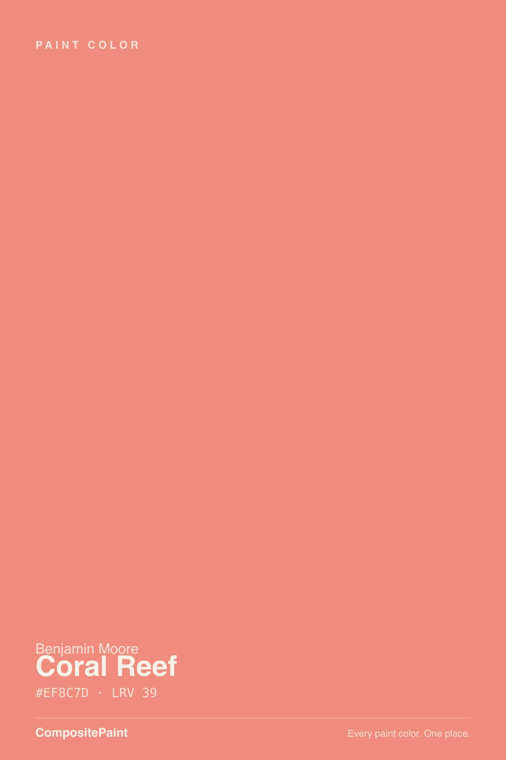
- 3Coral Reef39
- 4Pale Cherry Blossom61
- 5Romance66
The Fast Verdict
Coral Reef is what a lot of people picture when they say "coral" and can't find it — a genuine red-orange coral, not a pastel blush wearing a coral name. At LRV 39 it has real body: enough to read as a color statement on an island or a powder room, not enough to overwhelm a whole open floor plan. It wants warm light and warm company; give it neither and it goes flat.
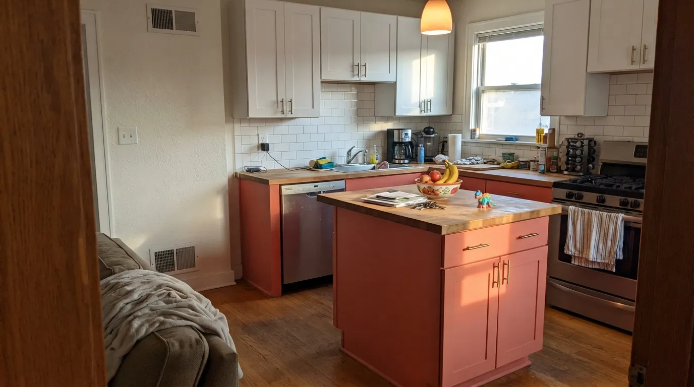
Kitchen islands and cabinetry · powder rooms and bathroom vanities · kids' room accent walls · dining rooms that want warmth without going full red
You actually want a soft, dusty blush pink · your room is north-facing with no warm lamps · you're painting an exterior door · you want a whole-house neutral
- A genuine coral, not a pale coral-adjacent pink
- Reads expensive against brass, marble, and butcher block
- Available in Aura Bath & Spa for real bathroom durability
- Confident in small doses — island, vanity, one wall, one door
- Warm evening light makes it glow instead of going flat
- Goes dull and muddy in cool, north-facing rooms with no warm light
- Too saturated for anyone who actually wanted a soft blush pink
- Clashes with cool gray and icy white instead of complementing them
- Not a color Benjamin Moore markets for exterior use
What Color Is Coral Reef, Really?
Coral Reef sits at the honest center of the word "coral": red-orange with just enough pink to keep it from tipping into pure terracotta. Benjamin Moore keeps it in its Classics collection, which is the tell — this is not a trend color chasing a moment, it is a color that has been on the deck long enough to have a settled, dependable identity. It is not shy. Unlike the pale coral-adjacent pinks that get labeled "coral" on paint chips because they have a faint peach cast, this one actually commits to the orange side of the family.
At LRV 39 it sits at genuine mid-depth — far deeper than a blush like Benjamin Moore's own First Light (LRV 76), which behaves like a warm off-white by comparison. That depth is why Coral Reef reads as a real color decision rather than a whisper of one: on an island or a powder-room wall it commands the room, which is exactly the point, but it also means it is not a safe, forgettable backdrop for four walls in every room of the house.
Undertone in one line: red-orange, always warm, never cool. In good daylight it holds a true coral-pink; push it into warm evening lamplight or strong western sun and the orange in it comes forward, sometimes strongly enough that it reads closer to a soft terracotta than the coral you sampled at noon.
Where It Shines
Give it a room with real daylight or warm bulbs and something to bounce off — brass, butcher block, white marble, cream linen — and Coral Reef looks expensive rather than novelty. It is a color built for a dose, not a whole house: an island, a vanity, one accent wall, an interior door. In those doses it photographs beautifully and reads as a confident design choice rather than a risk.
Where It Fails
Almost every disappointed story with Coral Reef comes down to one of three mismatches, and all three are predictable before the first coat goes on. None of them are a paint defect — they are a color meeting the wrong light or the wrong expectation.
Cool daylight strips the warmth out of a red-orange coral faster than almost any other family. Without a warm light source, the wall can settle into a dull, slightly muddy salmon instead of the vivid coral on the chip. If the room is north-facing, plan on warm bulbs doing real work, or pick a different room for it.
"Coral" gets used loosely for pale dusty pinks that are really just peach-tinted whites. Coral Reef is not that — it is a genuine saturated red-orange coral at LRV 39. If you sampled it hoping for something quiet and pale, it will feel much louder on the wall than the name implied. For the soft version, look at a true pale pink instead.
Next to a cool, blue-leaning gray or a stark cold white, Coral Reef's warmth gets exaggerated into something closer to orange than intended, and the pairing can read dated fast. Warm whites and creams let the coral stay coral instead of getting pushed toward citrus.
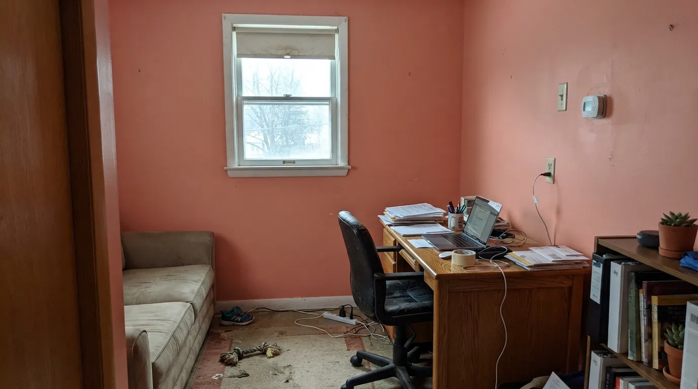
Room by Room
On an island or a run of lower cabinets, Coral Reef next to white marble or butcher block and brass hardware looks deliberate and current, not novelty. Satin cabinet enamel; keep the surrounding walls in a warm white so the color has somewhere friendly to land.
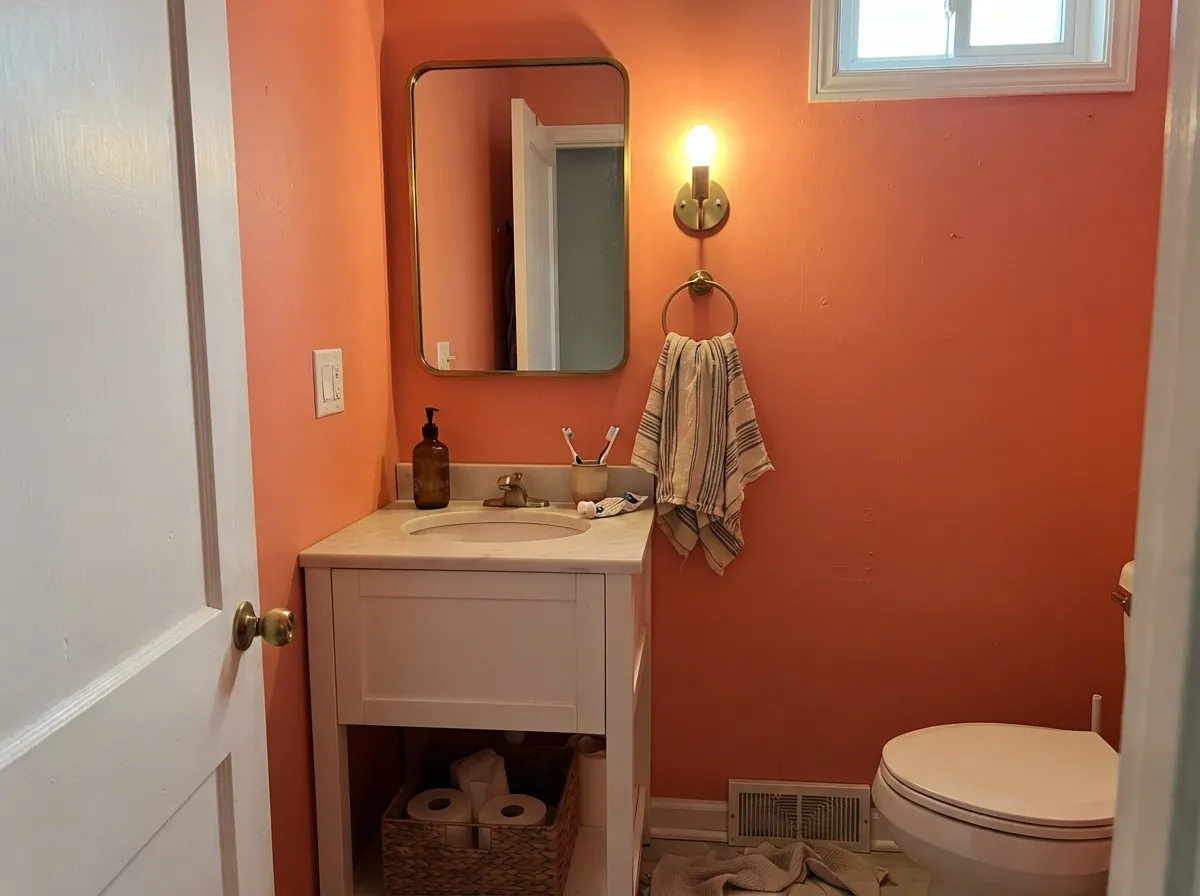
Small rooms take saturated color well, and a Coral Reef powder room or vanity reads like a design decision rather than a gamble. Benjamin Moore offers it in Aura Bath & Spa, its humidity-resistant matte, which makes it a legitimate full-bathroom option, not just a vanity accent.
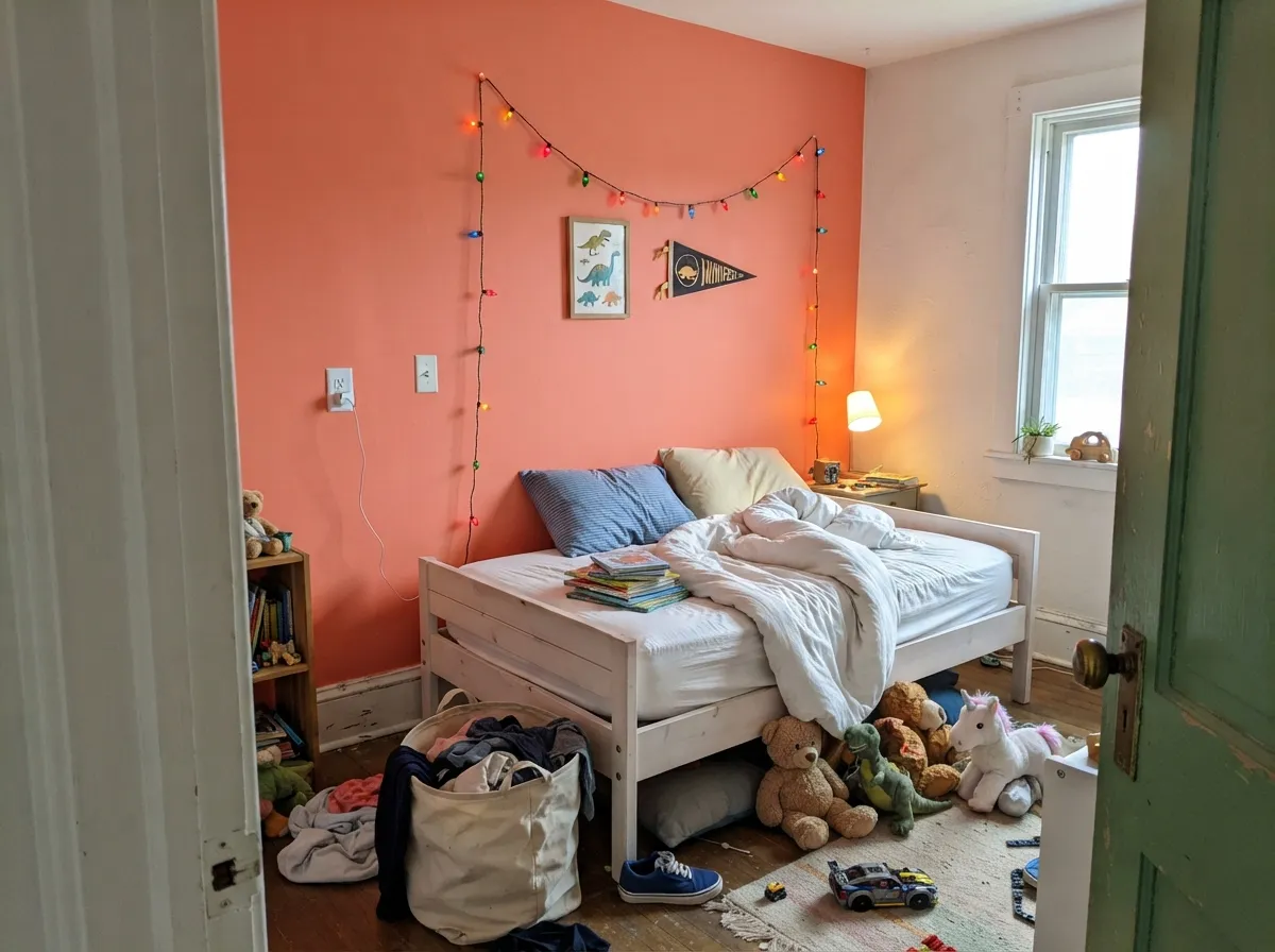
One Coral Reef wall against white bedding and a muted green or navy reads playful without tipping into candy-bright. A full room of it is a lot of color for a child's space to live in day to day; the accent-wall version keeps the option to change course later.
Under a warm chandelier and candlelight, Coral Reef gets genuinely flattering — it does for a coral dining room what a deep red does for drama, minus the heaviness. Skip it if the room only gets cool overhead LEDs.
A Coral Reef front door on the inside of the house, or a single interior door off a neutral hallway, is an easy way to try the color without repainting a whole room. Semi-gloss holds up to hands and keys.
Benjamin Moore does not position Coral Reef as an exterior color the way it does its dedicated exterior palette, and full outdoor sun will push a red-orange coral even further toward orange. If you want this look on a facade or front door, sample it outside in full sun before committing, and expect it to read louder than it does indoors.
Your Light Is the Risk
Full, warm daylight is where the coral reads truest — vivid, warm, unmistakably itself. Sample here first.
Cool daylight drains the warmth and can leave the color looking like a dull, muddy salmon rather than a coral. Test with warm bulbs before ruling it out.
Cooler and more pink in early daylight, it swings noticeably warmer and more orange by golden hour and after dark — most owners find the shift makes the room feel alive, not inconsistent.
2700K warm bulbs push it toward a glowing terracotta-orange. Cool white LEDs flatten it and can make it look slightly chalky — worth swapping bulbs before repainting.
Most complaints about Coral Reef are a light mismatch. Upload a photo of your actual room and see it on your walls — then ask for the same wall in north light or evening lamps before you buy a single sample.
Need It From Another Brand?
Any paint counter can custom-tint Benjamin Moore 012 directly. If you would rather stay in one brand's own deck, these are the closest stock matches, measured as ΔE2000. Under 2 is a difference you will not see on the wall.
| Brand | Closest color | ΔE | LRV | |
|---|---|---|---|---|
| Sherwin-Williams | Animated CoralSW 6878 · Sherwin-Williams | 1.2 | 39 | Color page → |
| Behr | CoraletteT16-07 · Behr | 1.9 | 37 | Color page → |
| Valspar | Desert Rose2004-3C · Valspar | 2.7 | 37.5 | Color page → |
| PPG / Glidden | Smoked SalmonPPG1189-5 · PPG / Glidden | 2.3 | 37 | Color page → |
| Glidden | Smoked SalmonPPG1189-5 · Glidden | 2.3 | 37 | Color page → |
| Dutch Boy | Carmela Coral104-5DB · Dutch Boy | 1.2 | 39 | Color page → |
Similar Benjamin Moore Colors
The nearest shades to Coral Reef within Benjamin Moore's own range, ranked by perceptual color distance — useful when you want the same look a touch lighter, darker, or warmer.
WCAG 2.1: AA is 4.5 : 1 for normal text, 3 : 1 for large text, AAA is 7 : 1.
Coral Reef vs the Colors You're Also Considering
Every Coral Reef sample board has the same rivals on it. The numbers show the real lightness gap — then it comes down to which risk you would rather live with.
Pick this when you want the real, saturated coral — First Light will read as a warm off-white by comparison.
Benjamin Moore 2102-70 · LRV 76First LightPick this if you actually want the soft, pale blush people mean when they say "coral" without the commitment.
Pick this when you want the pink still clearly present, not fully surrendered to clay.
Sherwin-Williams SW 7701 · LRV 20Cavern ClayPick this for a deeper, earthier terracotta that leans brown instead of pink.
Coral Reef Coordinating Colors
The rule for coordinating with Coral Reef is warmth first: warm whites and creams let it stay coral instead of getting pushed toward orange, and it pairs naturally with navy, muted green, and near-black for contrast. These are the partners that keep showing up in rooms that work:
Coral Reef's Story: A Classics Color Riding the Pink Revival
Coral Reef has sat in Benjamin Moore's Classics collection for years, which puts it in a different category than a trend-of-the-moment color: it was never invented to catch a viral wave, and it isn't dependent on one to stay relevant. It just happens that the design world's swing back toward warm, saturated color — after a decade of gray and greige — has made a real coral like this one look current again instead of dated.
What sets it apart from the pale, quiet pinks currently trending is that it does not apologize for itself. It is not a whisper of pink borrowed for a nursery accent; it is a full-bodied, red-orange coral built for a kitchen island or a powder room that wants to feel finished and specific, not neutral.
Coral Reef With Wood Tones and Metals
Warm woods are the easy answer here: butcher block, oak, and walnut all sit comfortably next to Coral Reef because their warmth and the paint's warmth are on the same side of the color wheel. White or cream marble is a classic, safe counter pairing — the cool stone gives the eye a rest without arguing with the wall.
Metals matter more with this color than with most neutrals. Unlacquered brass and warm gold hardware amplify the coral's best, most expensive-looking version of itself. Polished chrome and cool nickel are the pairing to test first — they can make the coral look slightly harder and more orange by contrast rather than soft and rich.
Three Ready Palettes Built on Coral Reef
A color is never alone on the wall. These are complete combinations in the 60-30-10 pattern, with the reason each one holds together. Every one opens in the visualizer.
Coral and navy is a pairing that never really left; White Dove keeps the kitchen from feeling like a theme by giving both colors a calm, warm-white field to sit in.
Try this palette in your roomA small room can carry a saturated color on every wall without wearing you out; a cream ceiling keeps it from feeling like a box, and the near-black frame gives the eye one place to land.
Try this palette in your roomA no-opinion white lets the one coral wall do the talking, and a muted green on the closet door keeps the room from reading as a single-note pink or orange space.
Try this palette in your roomCoral Reef FAQ
Is coral reef warm or cool?
Warm — it is built on a red-orange base, not a blue-leaning pink. It never reads cool, though cool daylight can mute it toward a dull salmon rather than pushing it blue.
Will coral reef look too orange in my room?
It can, especially under warm 2700K bulbs at night or in strong afternoon sun. If you want it to stay closer to pink, keep it away from very warm lighting and cool grey neighbors, and sample it at the time of day you actually use the room most.
Is coral reef good for a small bathroom or powder room?
Yes — it is one of its best uses. Small rooms carry saturated color well, and it is available in Benjamin Moore's Aura Bath & Spa finish, which is built for humidity.
What white goes best with coral reef?
A warm white or cream — White Dove or Swiss Coffee — rather than a stark, cool white. A cool white exaggerates the orange in the coral instead of softening it.
Is it a good kids' room color?
As an accent wall, yes — it is playful without going neon. A full room of it is a lot of saturated color for a child's space day to day; most people are happier with one wall or a piece of furniture.
Can I use coral reef on my front door?
On the inside of the house, easily. For an exterior front door, Benjamin Moore does not position Coral Reef as one of its dedicated exterior colors, and full outdoor sun pushes it noticeably more orange — sample it outside in real sunlight before committing.
Have you painted with Coral Reef?
Rate it — one tap helps the next reader decide.
Ask a Question