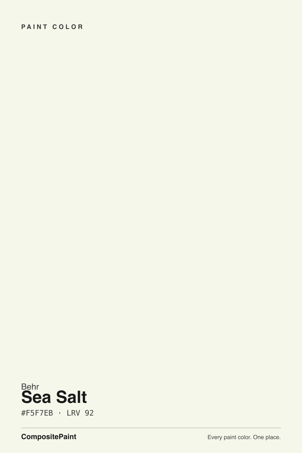
Sea Salt
Behr's near-white Sea Salt, reviewed honestly: the green whisper, the famous-name trap, and the rooms where it goes mint.

Jessica has spec'd whites and neutrals for more than 300 rooms and keeps a sample wall of painted drawdowns in her studio. Every color review is checked against real reader rooms in the comments and re-tested when a formula changes. About the testing process →
- 1Classic Gray74
- 2Alabaster82
- 3Sea Salt92
- 4Ultra Pure White97
The Fast Verdict
Behr Sea Salt is a near-white, not a spa color. At LRV 92 it throws light like the top of the deck, with a whisper of yellow-green that keeps it from going cream or blue. Home Depot even sells it as a ceiling flat, and owners who actually wanted white call it perfect. The trap is the name: Sherwin-Williams Sea Salt is a green-gray at LRV 63. Ask for 780C-1, or you will paint the wrong decade of Pinterest.
North and east rooms that need bounce · ceilings and trim · cabinets that should stay white, not cream · anyone who typed Sea Salt at Home Depot and actually wanted a near-white
You wanted Sherwin-Williams Sea Salt (the spa green-gray) · a big south wall in hard sun · beige carpet, greige walls, or honey oak that will pull mint · you want cream or a gallery-crisp white
- LRV 92 — bright enough for ceilings without blue-white glare
- Faint green keeps it from going cream or icy, as long as the neighbors cooperate
- One-color rooms (walls + trim + ceiling) work; the sheen change is enough
- Genuinely good in north light, where yellow whites go dingy and cool whites go gray
- Home Depot stocks it in wall, cabinet, and ceiling-flat bases — one code, three jobs
- The name is a trap — it is not Sherwin-Williams Sea Salt, and it is not a spa green
- Beige carpet, greige walls, and honey oak pull a mint flash
- Goes glary on a big south wall, especially above eggshell
- Looks dingy the moment Ultra Pure White or Polar Bear sits next to it
What Color Is Sea Salt, Really?
A bright near-white with a barely-there yellow-green tint — green, not cream, not blue. Behr files 780C-1 in the white family, and that is the useful fact: this is not a muted sage. The green is a whisper that keeps the wall from reading yellow the way Simply White does, and from reading icy the way an optical white does. Home Depot stocks the same code as a ceiling flat, which tells you how the store thinks of it — as a light-bouncing white, not as the coastal bathroom color the internet means by Sea Salt. Shop by the code. The three words on the chip have been used by four brands for four different paints.
At LRV 92 it sits in the bright-white band with Polar Bear (LRV 94) and Simply White (LRV 90), a step under Ultra Pure White (LRV 97) and a clear step above White Dove (LRV 85). It is also a full 29 LRV points lighter than Sherwin-Williams Sea Salt (LRV 63) and Benjamin Moore Sea Salt (LRV 63). That gap is the whole review. On a ceiling or a small north room it behaves like a true white and quietly opens the space. On four south walls it can glare. Next to a brighter, cooler white — Ultra Pure White on the trim is the usual Home Depot mistake — it suddenly looks unwashed and faintly green instead of white.
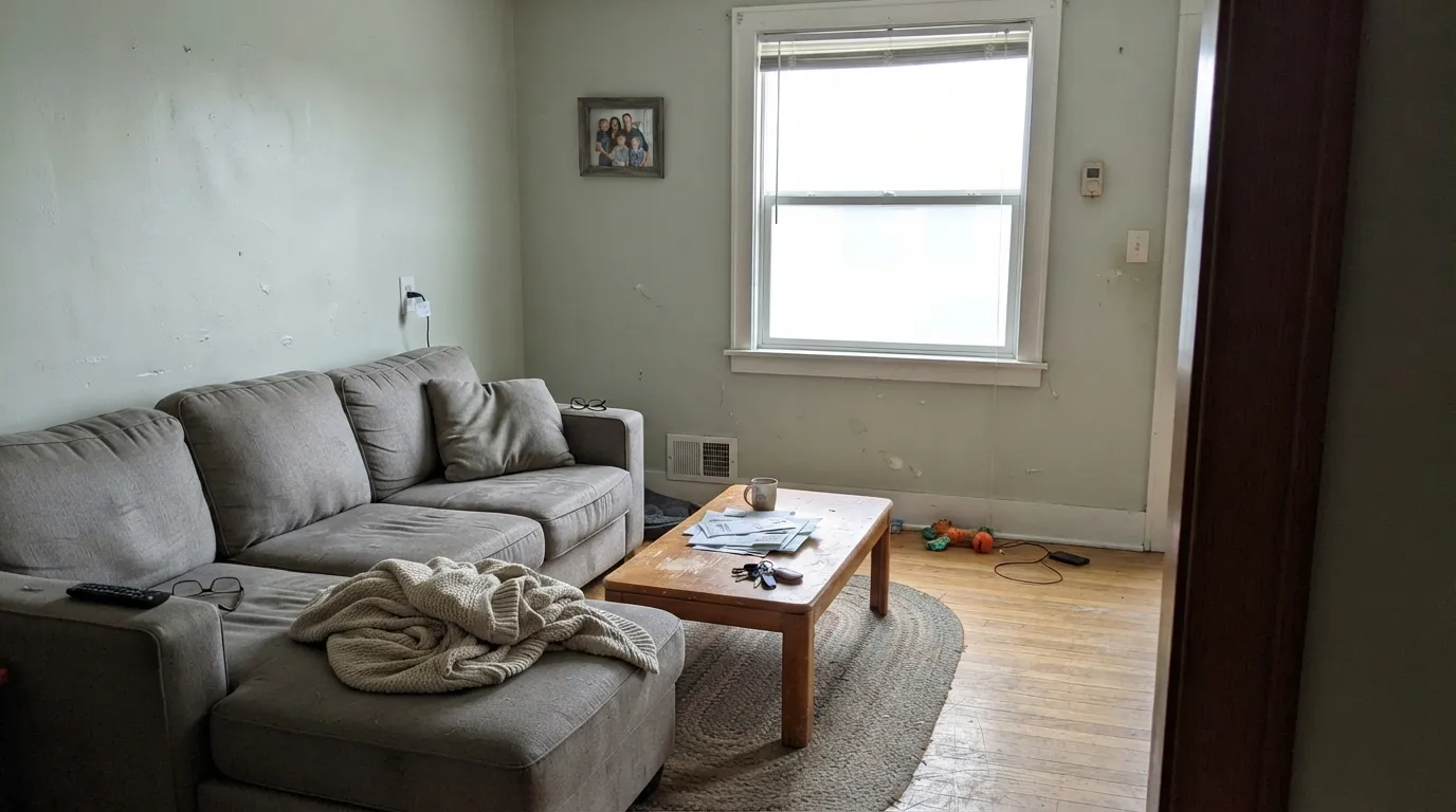
Undertone in one line: faint yellow-green, airy, never pink and never a real sage. On a chip it looks like plain white. Spread over four walls, the green registers as a cool, chalky cleanliness rather than a color you could name — until a beige carpet, honey-oak cabinet, or greige neighbor gives it something to flash against. North light supports that cleanliness. Warm 2700K bulbs cancel the green and nudge it toward cream. If your sample came out minty, look at the floor and the furniture before you blame the gallon.
Where It Shines
Give it north or east daylight, no brighter white nearby, and no beige field for the green to land on, and it does the rare thing a tinted white is supposed to do: look white, stay airy, and skip both the cream and the clinic. Ceilings are the job Home Depot already hired it for — flat Sea Salt overhead stays bright without the blue-white glare Ultra Pure White throws against warm walls. The same gallon in satin on cabinets or semi-gloss on trim will carry a house if you let the sheen, not a second white, make the edge.
Where It Fails
Almost every unhappy Sea Salt story in a Behr can is either a shopping mistake or a neighbor-color mistake. None of them are a bad mix — but if your room matches one, this is not your white, and another coat will not hide it.
The green in 780C-1 is too weak to see on a white chip and too real to hide against a warm field. Beige carpet, greige walls in the next room, builder-oak cabinets, and tan tile all shove the yellow-green forward until people start saying mint. Pale white oak, walnut, and a true navy are fine. Golden wood and beige are not. Sample a big board over the actual floor before you commit the room.
This is the most expensive way to learn the name is a trap. SW 6204 is a spa green-gray at LRV 63 that can flash blue in north light — beautiful when the light agrees with it, and nothing like a near-white. Benjamin Moore Sea Salt (CSP-95) is a quietly good greige at the same depth. PPG Sea Salt is another spa-green cousin at Home Depot. If a saved bathroom photo is the Sherwin-Williams color, buy that formula, or look at Behr Frosted Sage (N400-2, LRV 62). Do not hope 780C-1 is a cheaper version. It is a different paint.
LRV 92 has nowhere to hide. Full south sun washes the tint and leaves a flat, slightly glary white, especially in anything shinier than eggshell. The pairing version of the same problem: Ultra Pure White (W-B-500, LRV 97) on the trim or ceiling. The brighter white wins, and Sea Salt looks dingy and green around the casings. Run Sea Salt on walls, trim, and ceiling and let eggshell / semi-gloss / flat separate the planes, or drop it and paint the whole room the cleaner white.
Room by Room
Home Depot sells this SKU as a ceiling flat, and that is the tell. At LRV 92 it disappears overhead, and the whisper of green keeps the plane from going blue-white against warm walls — the usual complaint with Ultra Pure White on the ceiling. Flat sheen. Same color as the walls if you can.
Semi-gloss on casings and doors, satin on cabinets. It reads as painted woodwork rather than plastic-bright, and it is kind to pale oak, walnut, and brass. Do not park Ultra Pure White or Polar Bear next to it. One color, two sheens. Honey-oak boxes you are not painting will pull the green; paint the wood or pick a creamier white.
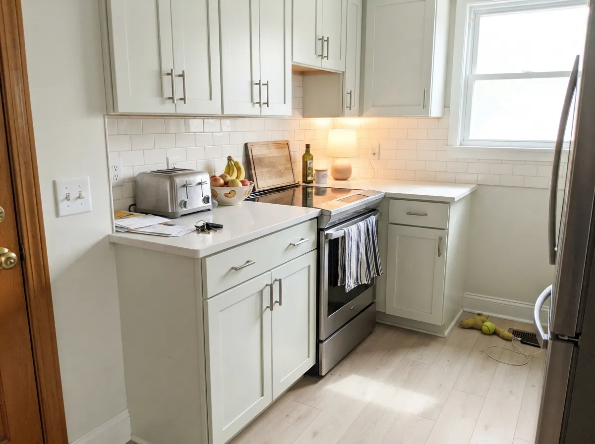
Satin Sea Salt cabinets next to white or lightly veined stone keep the kitchen bright without the yellow of Simply White or the blue hit of Ultra Pure White. Owners who used it in a real kitchen called it a perfect white. Skip it as a wall color over honey-oak floors, and do not leave cream uppers next to these lowers.
North and east bedrooms stay clean and restful; a Home Depot reviewer put it on a master and kept it. Under 2700K lamps the green drops out and it turns a hair creamier, which some people want. 3000K–3500K keeps it closer to white after dark. If the bedroom faces west and bakes in the afternoon, sample at 5pm first.
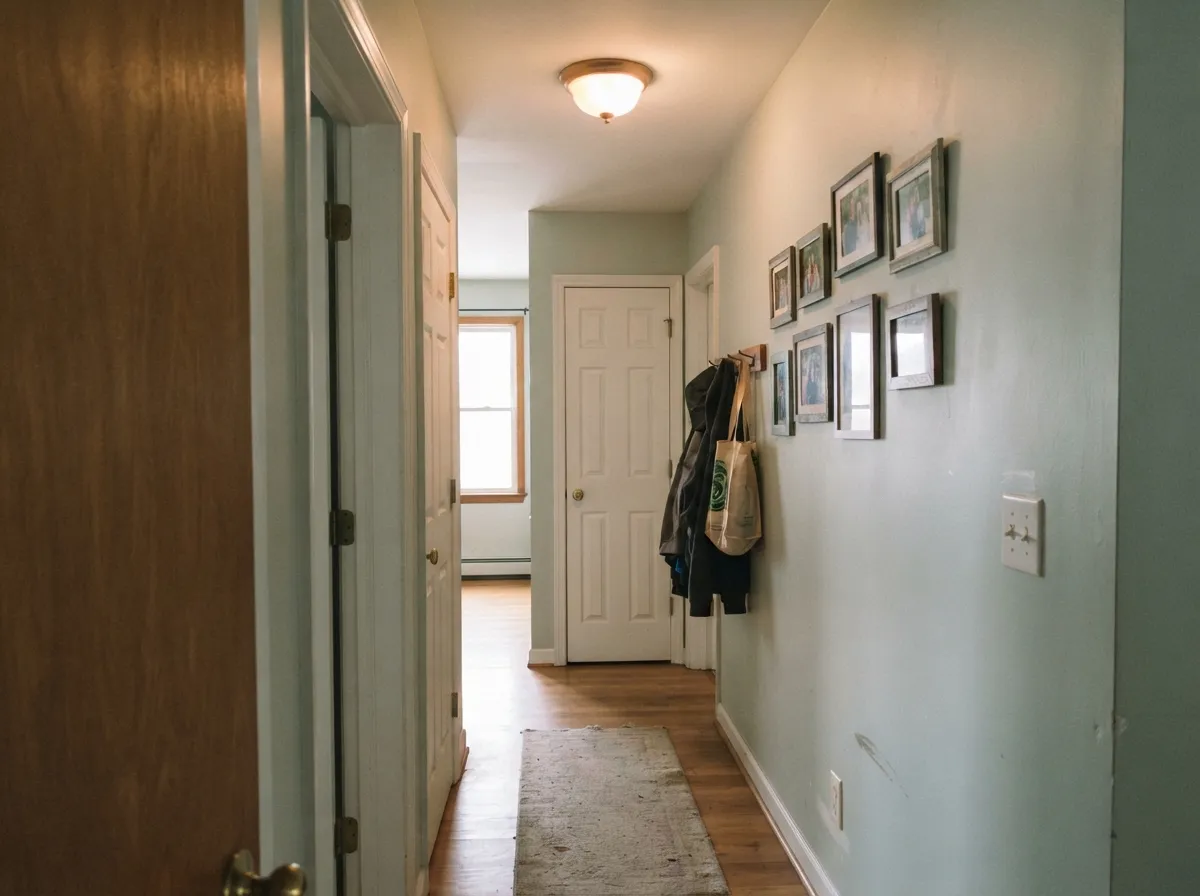
Interior halls, stairs, and laundry rooms are where LRV 92 earns its keep. It bounces the one window or the one bulb you have and stays out of the way. Eggshell on walls, semi-gloss on the door, satin on laundry cabinets. This is one of the few whites that still looks considered in a windowless hall instead of builder-flat.
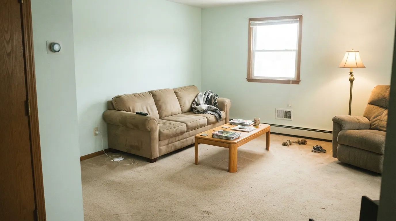
A north living room is its home turf: bright, quiet, slightly airy. South is fine until midday, when it goes glare-white on a big wall. A west living room is a maybe — sample the golden hour. Eggshell walls; same color on trim in semi-gloss so the green never has a brighter neighbor to look minty against. Skip it if the sofa and carpet are beige.
Your Light Is the Risk
Cool, even daylight supports the green as a clean, airy white instead of mint. This is the exposure the color was built for.
Hard sun washes the tint and leaves a flat, slightly glary white. On a large wall it can feel unfinished rather than calm. Sample at noon.
East rooms look a hair greener in the morning and settle to a quiet white by noon. West rooms pick up warmth at golden hour and the green drops out. The shift is small until a beige neighbor exaggerates it.
2700K lamps cancel the green and nudge it toward cream. Cool 4000K LEDs bring the mint back. 3000K–3500K is the honest middle if you still want it to read as white after dark.
Most complaints about Sea Salt are a light mismatch. Upload a photo of your actual room and see it on your walls — then ask for the same wall in north light or evening lamps before you buy a single sample.
Need It From Another Brand?
Any paint counter can custom-tint Behr 780C-1 directly. If you would rather stay in one brand's own deck, these are the closest stock matches, measured as ΔE2000. Under 2 is a difference you will not see on the wall.
| Brand | Closest color | ΔE | LRV | |
|---|---|---|---|---|
| Sherwin-Williams | High Reflective WhiteSW 7757 · Sherwin-Williams | 3.0 | 93 | Color page → |
| Benjamin Moore | Cotton Balls2145-70 · Benjamin Moore | 0.7 | 89 | Color page → |
| Valspar | Ewe8007-5A · Valspar | 1.8 | 91 | Color page → |
| PPG / Glidden | Delicate WhitePPG1001-1 · PPG / Glidden | 3.9 | 88 | Color page → |
| Glidden | Linwood Beach White71YY 87/078 · Glidden | 3.0 | 87 | Color page → |
| Dutch Boy | Ultra White002W · Dutch Boy | 3.0 | 91 | Color page → |
Similar Behr Colors
The nearest shades to Sea Salt within Behr's own range, ranked by perceptual color distance — useful when you want the same look a touch lighter, darker, or warmer.
WCAG 2.1: AA is 4.5 : 1 for normal text, 3 : 1 for large text, AAA is 7 : 1.
Sea Salt vs the Colors You're Also Considering
Every Sea Salt sample board has the same rivals on it. The numbers show the real lightness gap — then it comes down to which risk you would rather live with.
Pick this when you actually wanted a near-white and landed here because the names collided.
Sherwin-Williams SW 6204 · LRV 63Sea SaltPick this if you wanted the famous spa green-gray — a completely different paint, beautiful when the light agrees with it, and 29 LRV points deeper.
Pick this when you want the same bounce with a slightly airier, greener whisper, and you are willing to keep brighter whites off the trim.
Behr W-F-200 · LRV 94Polar BearPick this for Behr's dependable everyday white — a hair brighter, a hair less green, and the gallon most Home Depot whole-house jobs already use.
Pick this when you are at Home Depot and want a bright white that still has a little air in it, not a cold-blooded cut-in.
Benjamin Moore OC-65 · LRV 90Chantilly LacePick this for the cleanest white BM makes — cooler, crisper, and the gallery look, at the cost of being the hardest one to roll.
Pick this when yellow is the thing you are trying to avoid and a faint green cleanliness is the better trade.
Benjamin Moore OC-117 · LRV 90Simply WhitePick this if you want the brilliant warm white — same brightness band, but the undertone is yellow, and that yellow is the one loud, predictable weakness.
Inside Behr's own line the differences are small. Resort White BXC-01, #F7F7EC at LRV 92, is slightly less green and a touch warmer. Moon Rise W-F-700 at LRV 93 is a shade brighter. Ivory Mist 750C-1, #F5F5E9 at LRV 91, is the clearest step toward cream, and Palais White GR-W15 splits the difference between the two.
Across brands, Benjamin Moore Cotton Balls 2145-70, #F5F6EB at LRV 89, is the closest thing to a straight swap, with a color difference of 0.69, small enough to call the same color on a wall. Dunn-Edwards Grass Valley DEW362 at 1.28 and Valspar Ewe 8007-5A at 1.8 are visually identical in normal room light.
Sherwin-Williams High Reflective White SW 7757 at LRV 93 measures 3.01 away, so it is very close but worth sampling; it is brighter and less green. Farrow and Ball All White No. 2005 at LRV 92, measuring 3.94, is close but visibly different side by side.
Sea Salt Coordinating Colors
Stay on the cool-green and navy side of the fence, and never introduce a brighter white. Sea Salt flatters easy sages, true navies, and near-blacks — and it argues with cream, beige, and any trim white that out-brights it. These are the partners that keep showing up in rooms that work:
Four Cans Named Sea Salt
The name is doing more damage than the undertone. Sherwin-Williams Sea Salt (SW 6204, LRV 63) is the internet's spa green-gray — the one that made a decade of bathrooms, and the one that goes blue in north light. Benjamin Moore Sea Salt (CSP-95, LRV 63) is a quietly good greige stuck with the same three words. PPG Sea Salt (PPG1136-2, LRV 62) is Home Depot's other Sea Salt, a dusty green-gray sitting next to the Sherwin-Williams original. Behr 780C-1 is the odd one out: a near-white at LRV 92.
If you walked into Home Depot because a saved photo said Sea Salt, you are probably holding the wrong chip. Frosted Sage (N400-2, LRV 62) is the Behr color that actually lives in that spa-green neighborhood. Color-matching SW 6204 into a Behr base is a different conversation and a different sample. Do not buy 780C-1 hoping it is a cheaper version of the famous can. Shop the code.
Sea Salt With Wood Tones and Floors
Pale white oak, walnut, and espresso are comfortable — the wood is doing the warmth, and the wall stays a clean white. Gray-washed plank is fine. White oak with a clear finish is the pairing that makes this color look considered instead of builder.
The honest no is golden: honey oak floors, orange-stained cabinets, beige carpet, tan LVP. The yellow-green in the white has almost nothing of its own until a warm field shows up, and then it reads mint. A large rug is a bandage. If the golden floor is staying, pick Polar Bear or a creamier white and keep the green out of the conversation.
Metals are easy if the floor is. Brushed nickel and chrome keep it crisp. Unlacquered brass works, but warm metal can pull the green forward the same way honey oak does — look at a sample next to the actual hardware before you commit the cabinets.
Three Ready Palettes Built on Sea Salt
A color is never alone on the wall. These are complete combinations in the 60-30-10 pattern, with the reason each one holds together. Every one opens in the visualizer.
One white at three sheens is how you use LRV 92 without inventing a dingy halo around the trim. Cracked Pepper on the door is the single dark note the scheme needs — Behr's chameleon black, not a second white.
Try this palette in your roomClary Sage is a genuinely easy sage, and a green-whisper white is the trim and cabinet color that does not fight it. Hale Navy on the island grounds the room and loves brass. Keep the floors out of the honey-oak range or the green in the white will join the green on the wall and go minty.
Try this palette in your roomEvergreen Fog is the cabinet sage people actually keep; Sea Salt on the millwork and ceiling gives it a clean, slightly airy frame instead of a cream one. Naval on the door is a navy that still reads navy. The three stay on the cool-green side of the fence, so nothing pulls yellow.
Try this palette in your roomSea Salt FAQ
Is Behr Sea Salt warm or cool?
Slightly cool, but only just. The tint is a faint yellow-green, so it is not a cream and it is not a blue-white. In north light it reads as a clean, airy white. In west sun and under 2700K bulbs the green drops out and it can pass for a quiet warm white. It is never icy and never Swiss Coffee cream.
Is it the same as Sherwin-Williams Sea Salt?
No. Same three words, different paint. Sherwin-Williams Sea Salt (SW 6204) is a spa green-gray at LRV 63. Behr Sea Salt (780C-1) is a near-white at LRV 92. Benjamin Moore Sea Salt is a greige. PPG Sea Salt is another spa-green cousin. If a photo or a designer spec is the Sherwin-Williams color, buy that formula. Do not hope the names agree.
What trim white goes with Sea Salt walls?
Sea Salt itself, in semi-gloss. Polar Bear (LRV 94) and Ultra Pure White (LRV 97) next to it make the walls look dingy and faintly green — the most common pairing mistake in a Home Depot house. There is almost no brighter white that still matches its temperature. If you want contrast, go darker on the door, never brighter on the casing.
Is it good for ceilings?
That is its best job. Home Depot sells the code as a ceiling flat. LRV 92 is ceiling-bright, and the whisper of green keeps the overhead plane from going blue-white against warm walls, which is the usual complaint with Ultra Pure White on the ceiling. Use flat. If the walls are also Sea Salt, even better — one color, two sheens.
Will it look green or minty?
On its own, in north or east light, most people never call it green — they call it white. Against beige carpet, greige walls, honey oak, or tan tile, the yellow-green comes forward and readers start saying mint. Cool 4000K bulbs do the same trick. Sample a big board over the actual floor, at night under your own lamps, before you buy gallons.
How many coats does it take?
Two over any light existing color, after a white primer if you are covering something dark or saturated. High-LRV whites have almost no hiding power of their own — stretching the first coat thin is how you get flashing. Keep a wet edge and do not skip the primer over red, navy, or patched drywall.
Have you painted with Sea Salt?
Rate it — one tap helps the next reader decide.
Ask a Question