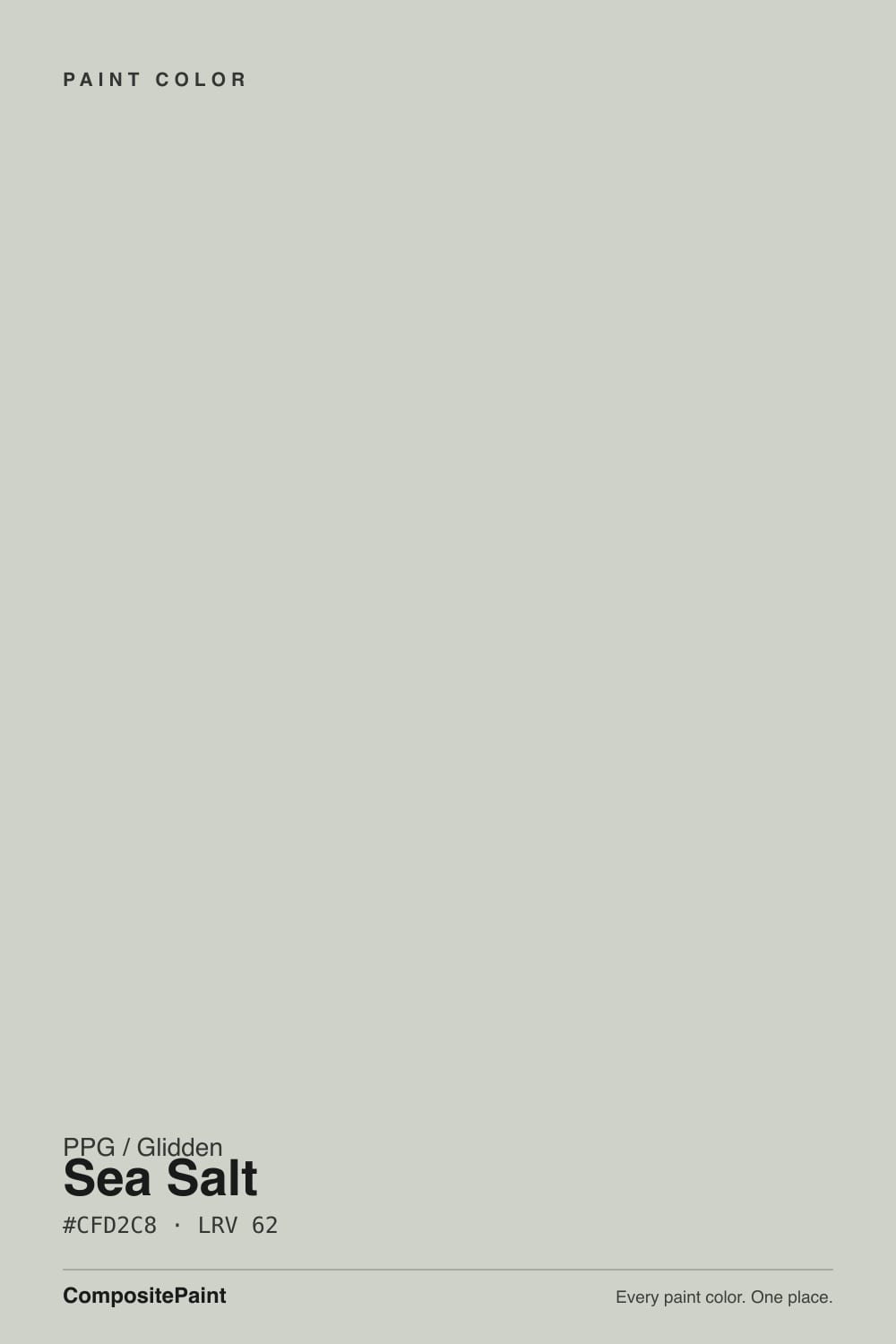
Color spec
| Brand | PPG / Glidden |
| Name | Sea Salt |
| SKU | PPG1136-2 |
| Hex | #CFD2C8 |
| RGB | 207, 210, 200 |
| HSL | 78°, 10%, 80% |
| LRV | 62 |
| Undertone | cool green tone |
| Family | Gray |
What Color Is Sea Salt, Really?
PPG Sea Salt (PPG1136-2) is a light, soft gray that carries a quiet green cast. On paper it files under gray, but the measured numbers tell the real story: the hue sits in the yellow-green range while saturation is only about 10 percent, so the color reads as a calm, dusty neutral with just a whisper of sage rather than a true green.
With an LRV of 62, it bounces a good amount of daylight and stays light without turning stark or clinical. That balance is why PPG calls it their spa-green cousin, and why it keeps landing on bathroom round-up lists year after year.
It suits anyone who wants a wall color that feels restful and a little organic but still behaves like a neutral. Think spa-style bathrooms, calm bedrooms, and open living spaces in homes that lean coastal, transitional, or softly modern.
Sea Salt leans green, but gently. Its hue falls in the yellow-green zone and its saturation is only around 10 percent, which means it is essentially a near-neutral gray with a slight lean rather than a committed green. Most of the time it will read as a soft, warm-cool gray, and the sage character only steps forward in specific conditions.
The green shows most in bright, direct daylight and against clean white trim, which gives the eye a reference point. Put it next to a stark white and the color looks noticeably greener; put it in a dim hallway and it can flatten toward plain gray.
To judge it honestly, tape a large sample beside a true gray and a true sage. Sea Salt should sit between them, closer to the gray side. Also test it against your flooring and any existing tile, since warm wood can pull the green forward while cool stone can mute it.
Best Rooms and Uses for Sea Salt
At an LRV of 62, Sea Salt is a versatile mid-to-light color that works as a whole-room wall paint without washing out or closing a space in. It shines in bathrooms, where its spa-green character earned its reputation, and it is equally at home in bedrooms, home offices, and open living and dining areas that you want to feel calm.
It also works well on cabinets, especially in a kitchen or bath where you want color that is soft rather than loud. Painted on lower cabinets or a vanity, it reads as a gentle sage neutral that pairs easily with wood and white counters.
Outside, its light reflectance makes it a plausible body color for a coastal or cottage exterior, or trim against a deeper field color. On a front door it is too pale to make a statement, so save bolder tones for the door and keep Sea Salt for walls, cabinets, and broad surfaces.
How Lighting Changes Sea Salt
With an LRV of 62, Sea Salt is firmly in the light range, so it reflects daylight generously and rarely looks heavy. But its low saturation makes it sensitive to the color of that light.
North-facing rooms get cool, even light that pulls the green and gray forward and can make the color feel slightly cooler and quieter. South-facing rooms get the most sun, which warms the color and brings out its softest, most sage-like side. East light is fresh and green-leaning in the morning, then flattens by afternoon, while west light adds a warm glow late in the day that can gray it down.
Bulbs matter just as much. Warm white bulbs around 2700K soften the green and make the room feel cozy. Cooler 3500K to 4000K bulbs sharpen the green and can edge it toward clinical, so in bathrooms and kitchens lean warm unless you want that crisp, spa-cool effect.
Most complaints about Sea Salt are a light mismatch. Upload a photo of your actual room and see it on your walls — then ask for the same wall in north light or evening lamps before you buy a single sample.
TEST IT IN YOUR LIGHT →Sea Salt vs Similar Colors
PPG offers several close neighbors, and the differences are subtle but real on a wall. Tornado (PPG1009-2) at LRV 64 is the most neutral of the group. Its hex leans slightly cooler and grayer, so it drops most of the green and reads as a clean light gray. Choose Tornado if you want the same softness without the sage cast.
Castaway (PPG1129-3) at LRV 64 goes the other direction, pushing a bit more clearly green. In a bright room it reads as a light sage rather than a gray, so pick it if you actually want the color to look green.
Merry Music (PPG1127-3) at LRV 63 is a hair warmer and slightly more yellow-green, which makes it feel a touch earthier. All three sit within a couple LRV points of Sea Salt, so the practical decision comes down to how much green you want the room to show once your light hits it.
Colors That Go With Sea Salt
For trim and ceilings, Pure White (PPG1001-1) at LRV 88 gives a clean, bright frame that makes Sea Salt's green read a touch more clearly. If you want a softer, warmer edge, Antique White (PPG1015-2) at LRV 78 keeps the contrast gentle.
For a second wall color or deeper anchor, Chinchilla (PPG1001-4) at LRV 38 is a mid gray that grounds the palette without fighting the green. To lean into the sage side, Sage Brush (PPG1125-4) at LRV 33 works beautifully on an island, lower cabinets, or an accent wall.
For contrast and drama, a dark green-black like Forest Trail (PPG1129-7) at LRV 7 is a natural front-door or accent choice that echoes Sea Salt's undertone. A soft blue such as Reflecting Pool (PPG1148-3) at LRV 51 makes an easy coastal accent. Warm woods, brass, and aged bronze all pair well and keep the scheme from feeling cold.
Need It From Another Brand?
Any paint counter can custom-tint PPG / Glidden PPG1136-2 directly — but if you would rather stay in one brand's own deck, these are the closest stock matches:
Similar PPG / Glidden colors
closest in the PPG / Glidden deckThe nearest shades to Sea Salt within PPG / Glidden's own range, ranked by perceptual color distance — useful when you want the same look a touch lighter, darker, or warmer.
Coordinated palette
Generated by hue-rotating #CFD2C8 in HSL space. Pair Sea Salt with one accent and one neutral — the swatches below are starting points, not final picks.
Accessibility (WCAG contrast)
WCAG 2.1: AA = 4.5:1 normal text · AA Large = 3:1 large text · AAA = 7:1 normal text.
The Questions Everyone Asks
Is PPG Sea Salt warm or cool?
It sits in the middle. Sea Salt is a light gray with a cool green lean, but because its saturation is only about 10 percent, it reads as a soft, balanced neutral rather than a strongly cool color. Warm bulbs and south light bring out its gentle, warmer sage side, while north light and cool bulbs make it feel cooler and quieter.
Is Sea Salt more green or more gray?
More gray, with a hint of green. The measured hue falls in the yellow-green range, but the low saturation keeps it reading mostly as a soft gray. The green only becomes obvious in bright daylight or next to clean white trim. In dim or artificial light it usually flattens toward a plain, dusty gray.
What trim white goes with PPG Sea Salt?
Pure White (PPG1001-1) at LRV 88 is the safest choice. It is bright and clean, so it frames Sea Salt crisply and lets the green show a little more. If you want a softer contrast, Antique White (PPG1015-2) at LRV 78 gives a warmer, more low-key edge that keeps the whole room feeling calm.
Does Sea Salt work on cabinets and exteriors?
Yes to both. On cabinets and vanities it reads as a soft sage neutral that pairs easily with wood tones and white counters, which suits kitchens and bathrooms. With an LRV of 62 it also has enough reflectance to serve as a light body or trim color on a coastal or cottage exterior, though it is too pale to work as a bold front door.
What does an LRV of 62 mean for this color?
LRV measures how much light a color reflects, on a scale from 0 (black) to 100 (pure white). At 62, Sea Salt is in the light range, so it bounces a fair amount of daylight and keeps a room feeling open and airy without going stark or clinical. It is light enough for whole rooms but has more depth than a true off-white.
How is PPG Sea Salt different from Sherwin-Williams Sea Salt?
They are very close. Sherwin-Williams Sea Salt (SW 6204) shares the same light green-gray character and an almost identical LRV of 63, so on a wall the two are hard to tell apart. Any difference comes down to each brand's exact tint, so if you already like the Sherwin-Williams version, the PPG match will read nearly the same in most rooms.
Will It Work in YOUR Room?
No page can promise how Sea Salt behaves in your light. Upload a photo and see it on your own walls in seconds — before you spend a cent on samples.
TRY SEA SALT ON YOUR ROOM →
Ask a Question