Greige
Behr's literal greige, reviewed honestly: the rooms where the sandy-gray balance holds, the dim light that turns it drab, and why it is darker than the greige you think you know.

Jessica has spec'd whites and neutrals for more than 300 rooms and keeps a sample wall of painted drawdowns in her studio. Every color review is checked against real reader rooms in the comments and re-tested when a formula changes. About the testing process →
- 1Anonymous20
- 2Dorian Gray39
- 3Greige46
- 4Agreeable Gray60
- 5Pale Oak69
The Fast Verdict
Greige is the rare color named after the job it does: half gray, half sandy beige, and at LRV 46 it has enough pigment to look like a decision. Behr sells it as the answer to gray-or-beige, and in a daylit room it is. The trap is the depth. Shoppers trained on Agreeable Gray (LRV 60) pull this chip expecting an airy whole-house greige and get a mid-tone that can go drab the moment the light goes cool. Sample it on the wall, not in your hand.
Daylit living rooms and bedrooms · open main floors that found lighter greiges washed out · white-trim houses that want walls with body · exteriors with a crisp white
You wanted a light, airy greige · the room faces north and stays dim · your floors are cool gray LVP · you actually want beige, or actually want gray
- Named for the job — gray and beige in one gallon, neither one winning
- Deep enough (LRV 46) to look like a color against white trim
- Hides scuffs better than the pale greiges everyone actually samples
- South light and 2700K lamps pull a sandy warmth that never goes yellow
- Exteriors read as warm stone in sun, not a washed-out beige
- Darker than the greige people think they are buying — chip vs. wall gap is real
- Goes drab, flat gray in dim north rooms and windowless halls
- Cool LEDs and gray LVP can pull a dirty blue-gray overtone
- Fence-sitter: beige-wanters see gray, gray-wanters see beige
What Color Is Greige, Really?
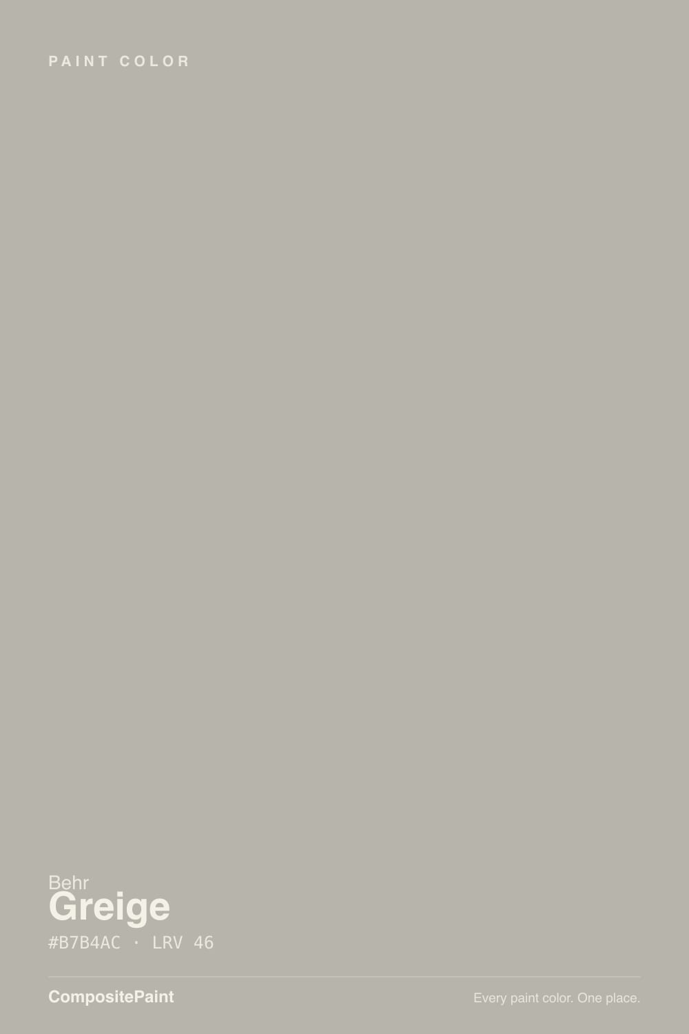
Behr put the category on the chip. Greige sits in the Designer Collection as the brand's on-the-nose answer to the question it prints on the color page: how do you choose between gray and beige? You don't. Official copy calls it a medium gray subtly warmed by sandy beige, and Home Depot's own product line warns that depending on the light it may simply appear as a gray on the walls. That is not marketing hedging. It is the color's whole personality: gray first, sand second, and neither side loud enough to win every hour of the day.
The number people miss is LRV 46. Agreeable Gray sits at 60, Revere Pewter at 56, Edgecomb Gray at 63 — the greiges Instagram trained everyone to want. Greige is a full step darker than all of them, roughly even with Anew Gray (LRV 47) and Mindful Gray (LRV 48), the two colors people keep buying as light neutrals and then calling too heavy. On four walls the chip's polite taupe becomes a real mid-tone: enough color to hide scuffs, enough gray to keep beige from going yellow, and enough depth that a dim room will feel held rather than bright. Photographers on Reddit have even used it as a stand-in for a middle-gray wall. Plan for it to read darker than the card.
Undertone in one line: gray-beige with a sandy, low-chroma warmth — never yellow, not Revere Pewter's green. Cool north light and 4000K LEDs strip the sand and leave a flat gray that some Home Depot reviewers call a blue overtone. West sun and 2700K lamps pull the beige forward until it looks almost taupe. Both versions are the same gallon being honest about the room.
Where It Shines
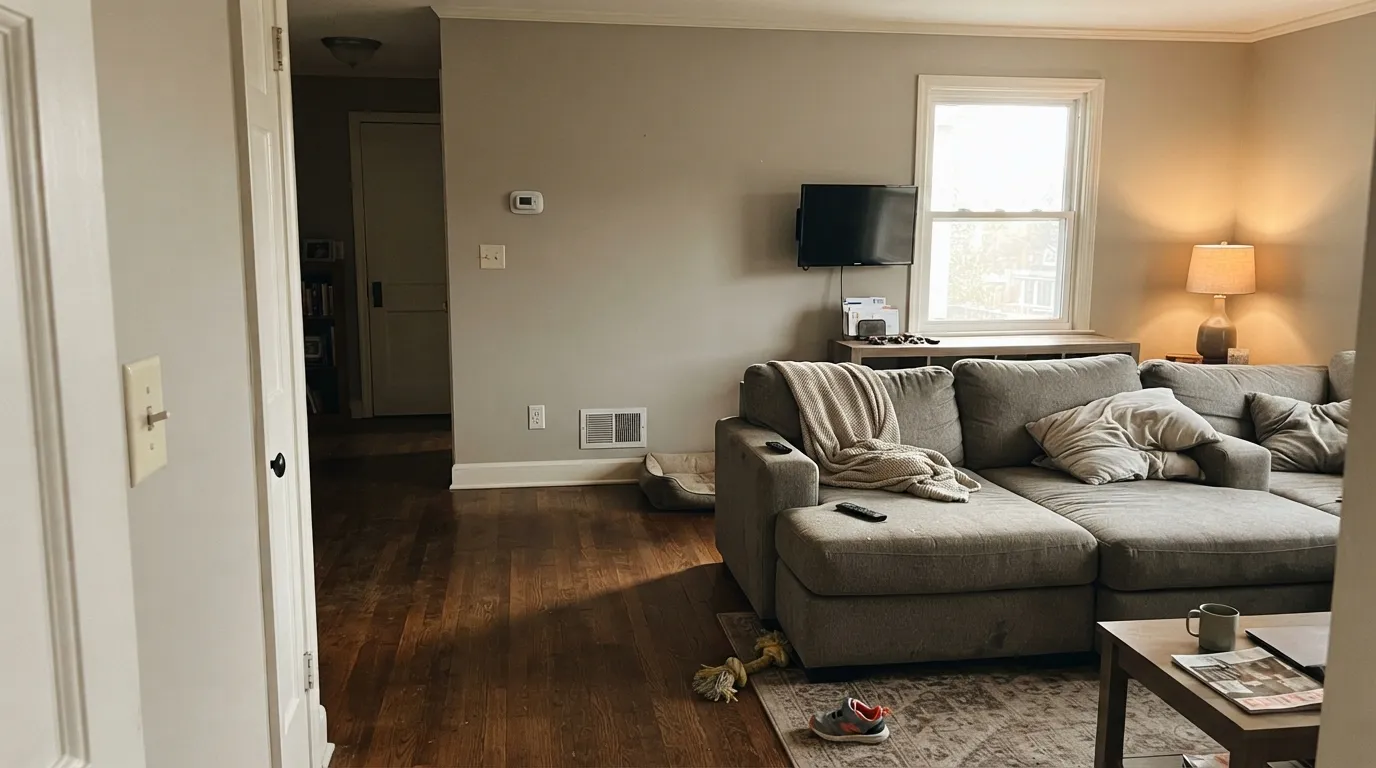
Give it real daylight and white trim and Greige does the thing the name promises: the walls have color without committing to gray or beige. Living rooms and bedrooms with two windows are its home turf — grounded, calm, and flattering to oak, walnut, linen, and brass. Behr's own Colorfully Behr rooms run it with Polar Bear trim, and that pairing is the point: a bright everyday white makes the mid-tone look chosen instead of leftover. Outside, full sun lifts it a step and the sandy gray reads like stone.
Where It Fails
Almost every regret story about Greige follows one of three scripts, and all three are visible before the first coat. None of them are a bad batch — but if your room matches one, this is not your color, and a bigger sample will only confirm it.
This is the one-star room. Cool, flat daylight kills the sandy warmth and Home Depot's own warning comes true: it appears as a gray on the walls, and at LRV 46 that gray is drab, not airy. Readers call it dreary. The paint did not fail; the light did. Step up to Agreeable Gray (LRV 60) or Edgecomb Gray (LRV 63), or commit to warm lamps before you commit to the gallon.
The name is doing too much work. People hear Greige and picture Agreeable Gray's light, whole-house wash. This is not that paint. It is closer to Mindful Gray — a mid-tone people keep buying as a light one — and on four walls it has body. If you want airy, pick Agreeable Gray. If you want this depth, sample a big board in the actual room at night.
Gray LVP, gray-washed wood, and 4000K bulbs sit on the blue side of neutral. Next to them Greige's sand drains out and the walls read dirty, slightly blue-gray — the exact overtone a few Home Depot reviews complain about. Warm the bulbs to 2700K–3000K, or pick a cooler gray that matches the floor instead of arguing with it.
Room by Room
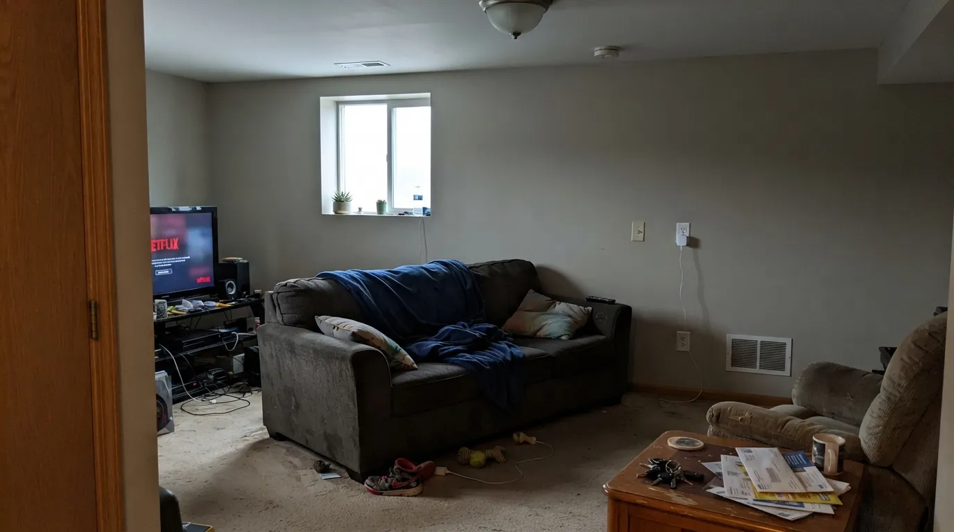
With south or west light it is the calm mid-tone that makes a worn sectional and oak floors look decided. Eggshell on the walls, Polar Bear or Alabaster on the trim in semi-gloss. One small north window and no lamps? This is not the living-room color — go lighter.
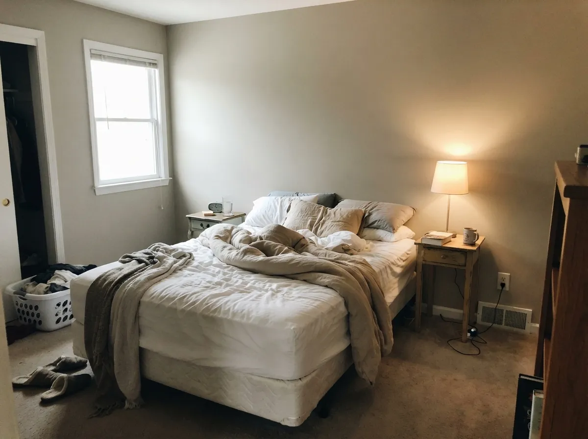
The depth is an asset here. It wraps the room instead of bouncing around, and under 2700K bulbs the sandy side comes forward so it feels restful rather than gray. Matte or eggshell; keep a lamp on each side of the bed so corners do not sink.
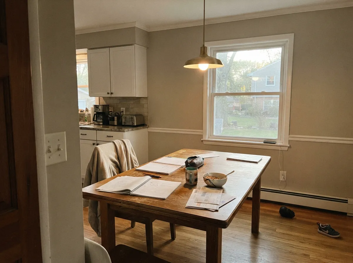
An open dining room that borrows light from the living room is a natural fit, and the mid-tone hides chair-rail scuffs better than a pale greige. A closed, lamp-only dining room needs the bulbs at 2700K or it goes drab at dinner.
On an island or lower cabinets under Polar Bear or Alabaster walls it reads custom without a saturated color. A full kitchen of Greige walls can feel heavy next to white quartz. Satin enamel on cabinets; test it at night under the actual under-cabinet lights.
An open hall that sees daylight from both ends carries well and hides fingerprints. A windowless interior hall at LRV 46 is a tunnel. Home offices with a real window are fine; windowless dens are where the dreary reviews come from.
Behr itself calls greiges welcoming for exteriors, and full sun lifts LRV 46 into a stone-gray that does not glare. Pair with Polar Bear trim for a clean contrast and a dark door — Hale Navy or Iron Ore. Hold a large sample against any pink or orange brick before you commit; the sandy-gray can look muddy on the wrong masonry.
Your Light Is the Risk
Warm, steady sun holds the sandy beige and the gray in the same frame. This is the light the color was named for — neither side winning.
Cool, flat daylight strips the sand and leaves a drab gray. Fine if you half-wanted gray; disappointing if you wanted greige.
Gray in the cool morning, sandier through west afternoon. The shift is the point of the color — sample it at 8am and at 5pm before you buy.
2700K lamps pull the sandy beige and it goes cozy. 4000K LEDs sharpen the gray and can flash a slight blue overtone — swap bulbs before you repaint.
Most complaints about Greige are a light mismatch. Upload a photo of your actual room and see it on your walls — then ask for the same wall in north light or evening lamps before you buy a single sample.
Need It From Another Brand?
Any paint counter can custom-tint Behr PPU24-11 directly. If you would rather stay in one brand's own deck, these are the closest stock matches, measured as ΔE2000. Under 2 is a difference you will not see on the wall.
| Brand | Closest color | ΔE | LRV | |
|---|---|---|---|---|
| Sherwin-Williams | Sensible HueSW 6198 · Sherwin-Williams | 1.6 | 46 | Color page → |
| Benjamin Moore | Gray Huskie1473 · Benjamin Moore | 0.5 | 46 | Color page → |
| Valspar | Soulful Grey6004-1B · Valspar | 0.9 | 45.6 | Color page → |
| PPG / Glidden | City StreetPPG1018-3 · PPG / Glidden | 2.1 | 45 | Color page → |
| Glidden | City StreetPPG1018-3 · Glidden | 2.9 | 45 | Color page → |
| Dutch Boy | Sultry Gray442-3DB · Dutch Boy | 2.0 | 45 | Color page → |
Similar Behr Colors
The nearest shades to Greige within Behr's own range, ranked by perceptual color distance — useful when you want the same look a touch lighter, darker, or warmer.
WCAG 2.1: AA is 4.5 : 1 for normal text, 3 : 1 for large text, AAA is 7 : 1.
Greige vs the Colors You're Also Considering
Every Greige sample board has the same rivals on it. The numbers show the real lightness gap — then it comes down to which risk you would rather live with.
Pick this when Agreeable Gray looked washed out on the wall and you want the same gray-beige balance with actual body.
Sherwin-Williams SW 7029 · LRV 60Agreeable GrayPick this if you want the light, airy whole-house greige — it is the safer, brighter version of this idea until the light goes cool.
Pick this for a sandier, cleaner gray-beige at more depth, without Revere's green shoulder.
Benjamin Moore HC-172 · LRV 56Revere PewterPick this if you want the famous Historic greige — slightly lighter, a touch muddier, with that one real green risk in dim rooms.
Pick this when you want the same depth with more gray and less mauve risk under cool bulbs.
Sherwin-Williams SW 7030 · LRV 47Anew GrayPick this if you have honey oak floors and want the warmer mid-tone — it is the greige that makes orange wood look intentional, with one lighting problem.
Pick this when you want the sandier, more gray-beige read at nearly the same LRV, from the Home Depot aisle.
Sherwin-Williams SW 7016 · LRV 48Mindful GrayPick this if you want the slightly browner, more taupe version of this same mid-tone — people keep buying it as a light one, too.
Behr's own neighbors are close enough to need a real sample. Ashes UL260-9 (#B7B4AE, LRV 46) is almost the same with a touch less warmth. Arid Plains PPU25-07 (#B6B4A9, LRV 45) leans further tan. Heirloom Silver PPU25-08 (#B5B6AD, LRV 46) and Stone Mill ECC-27-2 (#B6B7AD, LRV 47) both add a faint green lean. Classic 770B-4 (#B7B1AC, LRV 44) is slightly darker and a bit pinker.
Across brands, Gray Huskie 1473 from Benjamin Moore (#B6B4AC, LRV 46, deltaE 0.53) and Soulful Grey 6004-1B from Valspar (LRV 45.6, deltaE 0.94) are true matches. Piano Room from Portola Paints (LRV 47, deltaE 1.45), Sensible Hue SW 6198 from Sherwin-Williams (LRV 46, deltaE 1.59), Lamp Room Gray No. 88 from Farrow and Ball (LRV 44, deltaE 1.81), and Blowin' In the Wind DEGR52 from Dunn-Edwards (LRV 46, deltaE 1.86) are visually identical in normal room light. City Street PPG1018-3 (LRV 45, deltaE 2.13) is very close, but sample first.
Greige Coordinating Colors
The rule for coordinating with Greige: a clean or softly warm white, one dark, and stay off cool blue-gray stone. It wants contrast more than matching taupe-on-taupe. These are the partners that keep showing up in rooms that work:
Why Behr Put the Word Greige on the Chip
Most greiges hide behind a pretty name — Agreeable, Revere, Mindful. Behr just called this one Greige, stuck it in the Designer Collection as PPU24-11, and wrote the pitch as a riddle: how do you choose between gray and beige? You don't. Bob Vila's 2023 roundup of best greige paint colors put it on the list for exactly that reason, calling it equal parts gray and beige, like a moody gray morning with sunlight coming through. Colorfully Behr keeps pairing the walls with Polar Bear trim in its own greige stories.
Here is the honest catch the name does not advertise: by the time greige became the default whole-house color, the bestsellers had drifted light — Agreeable Gray at LRV 60, Revere Pewter at 56. Behr's literal Greige stayed mid-depth at 46. That is why it still looks like a color on a wall, and why people who wanted the airy version feel ambushed. The name is accurate. The depth is the part you have to check in your own light.
Greige With Wood Tones and Floors
Warm wood is the easy yes. Oak — including honey and orange builder oak — walnut, and butcher block all sit comfortably against it because the gray in Greige cools the orange instead of stacking more yellow on top. Pale white oak and gray-washed floors are safe if they still have some brown in them. Cream carpet is fine.
The one honest no is a cool gray floor plus cool bulbs. Gray LVP, blue-gray tile, and gray-veined quartz pull the sandy warmth out, and the walls go dirty. A large sample over the actual flooring in late-afternoon light is cheaper than a repaint. Metals are simple: unlacquered brass and matte black both work; polished chrome is the one that leans cold against it.
Three Ready Palettes Built on Greige
A color is never alone on the wall. These are complete combinations in the 60-30-10 pattern, with the reason each one holds together. Every one opens in the visualizer.
This is Behr's own move: Greige walls with Polar Bear trim, the pairing Colorfully Behr keeps publishing. Polar Bear is a dependable everyday white, not a creamy stand-in, so the contrast is crisp — 48 LRV points of it — and the navy door is the one dark note the scheme needs.
Try this palette in your roomAlabaster is a softer white than Polar Bear, so the wall-to-trim line does not cut. Evergreen Fog is the muted sage that sits comfortably next to a sandy gray without going forest-theme — one color note, not a second personality.
Try this palette in your roomSwiss Coffee is the warmest of the safe off-whites, and it shows — which is what you want at night, when Greige needs the cream to keep from going gray. Kendall Charcoal is the best-behaved dark gray for one grounded note; keep the bulbs at 2700K so neither color goes cold.
Try this palette in your roomGreige FAQ
Is Behr Greige gray or beige?
Both, and that is the point — and the complaint. Official copy calls it a medium gray warmed by sandy beige, and Home Depot warns it may appear as a gray depending on the light. In south sun it reads greige; in cool north light or under 4000K LEDs it reads gray. If you actually want beige, pick Accessible Beige (LRV 58). If you actually want gray, this is the wrong chip.
What trim white goes with Greige?
Polar Bear is Behr's published partner and gives a crisp, high-contrast edge. If that everyday white makes the walls look dingy, step to Alabaster for a softer handoff, or Swiss Coffee if you want the whole room warmer — knowing Swiss Coffee is a cream and it shows. A cooler, brighter gallery white next to LRV 46 will make Greige look dirty. Semi-gloss on the trim, eggshell on the walls.
Is Greige too dark for a whole house?
For daylit open rooms, no — the depth is why it works. For a whole house that includes windowless halls, a north bedroom, and a basement, yes. It is a mid-tone at LRV 46, not the light greige people use wall-to-wall. Run it in the rooms with windows and step up to Agreeable Gray (LRV 60) in the dark connectors.
Does Greige work with honey oak floors?
Usually, yes — the gray in it cools orange oak instead of amplifying it the way a yellow beige would. Walnut, espresso, and pale white oak are even easier. The miss is cool gray LVP: the floor pulls the sand out and the walls go dirty. Sample a big board over the actual floor in afternoon light before you roll.
How does it compare to Agreeable Gray or Revere Pewter?
Agreeable Gray (LRV 60) is the light, safe version of this idea. Revere Pewter (LRV 56) is the famous Historic greige, slightly lighter and greener. Greige sits at 46 — closer to Anew Gray and Mindful Gray in depth — so it has more body against white trim and more risk in dim rooms. If those two bestsellers looked washed out, this is the next chip. If they looked perfect, stay there.
Can I use it on cabinets or the exterior?
Yes on both, in doses. Satin Greige on an island or lower cabinets under a lighter wall is a strong custom look; a whole kitchen of it can feel heavy. Outside, sun lifts it toward warm stone — Polar Bear trim and a Hale Navy or Iron Ore door. Always test against existing brick; pink or orange masonry can make the sandy-gray look muddy.
Have you painted with Greige?
Rate it — one tap helps the next reader decide.
Ask a Question