Classic
An honest look at a Behr color almost nobody writes about: a numbered gray-greige built for house siding, reviewed for what it actually does on a wall.

Jessica has spec'd whites and neutrals for more than 300 rooms and keeps a sample wall of painted drawdowns in her studio. Every color review is checked against real reader rooms in the comments and re-tested when a formula changes. About the testing process →
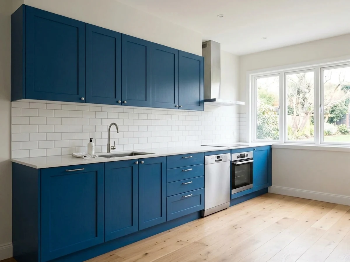
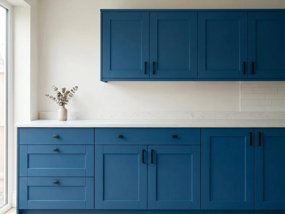
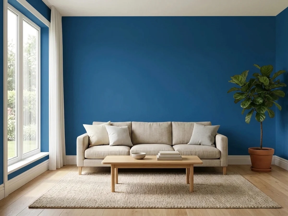
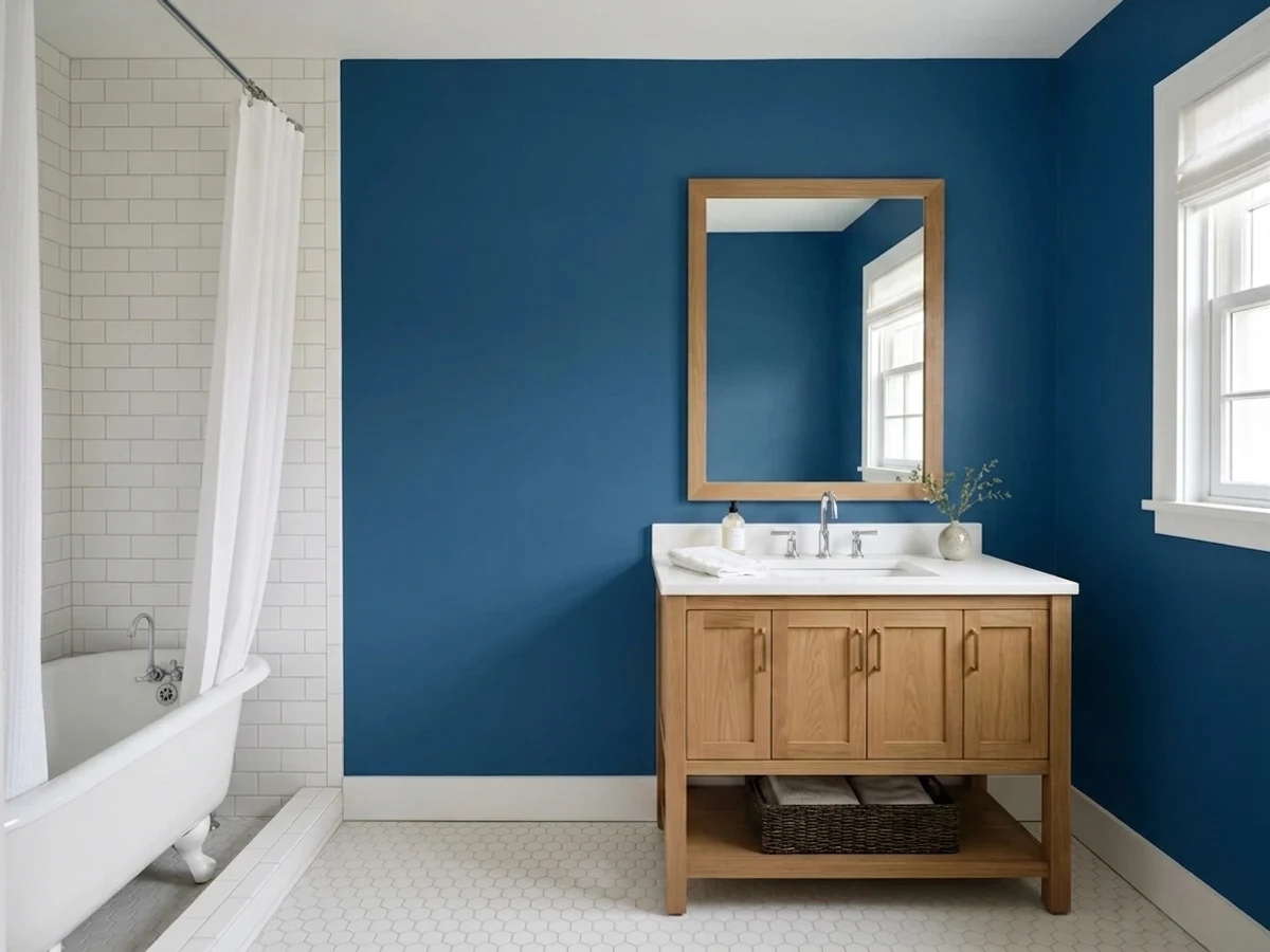
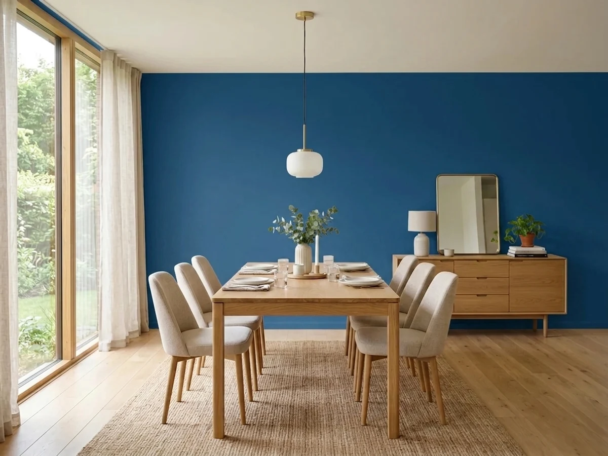
- 1Anonymous20
- 2Dorian Gray39
- 3Classic44
- 4Agreeable Gray60
- 5Pale Oak69
The Fast Verdict
Classic is not a color with a story. It never got a marketing name, never sat in a curated "Collection," never had a design blog moment — it's one of Behr's plain numbered mixing formulas, sold mostly through exterior product lines. What it does have is a genuinely balanced, low-saturation gray-greige that doesn't tip pink like a lot of Behr's warmer taupes and doesn't tip blue like a lot of "greige" that's secretly gray. It's a color for a house, not a headline.
Exterior siding and the main body of a house · trim or a garage door under a lighter-body exterior scheme · a quiet interior backdrop that isn't trying to be a feature · anyone repainting a home that's already this color and just wants the can
You want a color with online reviews and Pinterest boards to lean on · your room is small, north-facing, and dim · you were hoping for real warmth, not just "barely warm" · you want the wall itself to be the interesting part of the room
- A genuinely balanced gray-greige — doesn't skew pink like a lot of warm taupes
- Built for exteriors and behaves well against brick, stone, and most roof colors
- Unlikely to feel trendy or date the way a named "moment" color can
- Quiet enough indoors to sit behind furniture and art instead of competing with it
- Sold across enough Behr product lines (Marquee, Premium Plus, Ultra, Premium) to match almost any project
- Goes flat and cool in dim, north-facing rooms with no warmth left to rescue it
- No real personality — a poor choice if you want the wall to make a statement
- Almost no online documentation or design-blog coverage to lean on before buying
- Reads plainer and grayer than warmer greiges if that's what you were expecting
What Color Is Classic, Really?
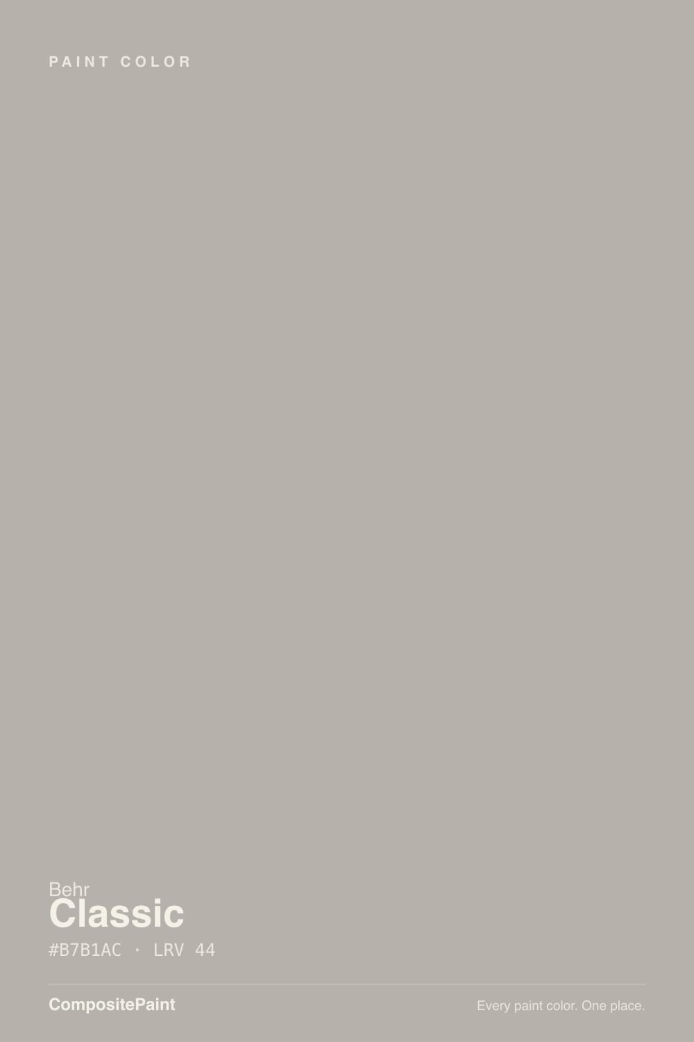
Classic 770B-4 is a Behr color from the old numbered deck, not one of the named, marketed colors like Blank Canvas or Whisper White that get a Color of the Year push and a design-blog following. It shows up almost entirely in exterior product lines — Marquee flat exterior, Premium Plus satin and semi-gloss exterior, Premium alkyd interior/exterior enamel — which tells you what it was built for: house bodies and trim, not accent walls. On the wall it reads as a genuinely balanced gray-greige, with the warm and cool sides nearly canceling each other out rather than one winning.
At LRV 44 it sits at exactly the same depth as Benjamin Moore's Pashmina, a warmer greige with a similar mid-tone weight — useful context, because Classic is noticeably grayer and less taupe-leaning than that comparison. It's light enough to avoid feeling heavy on a full exterior, dark enough to hide dirt and streaking better than a pale trim white, and it holds its own next to brick, stone, and most roof colors without arguing with any of them.
Undertone in one line: a near-neutral gray-greige, barely warm, never pink, never blue. If your sample looks flatter and cooler than you expected, that's dim or north light doing what it does to every midtone neutral — not the paint turning on you.
Where It Shines
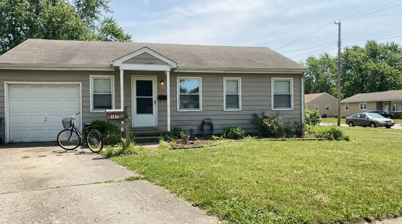
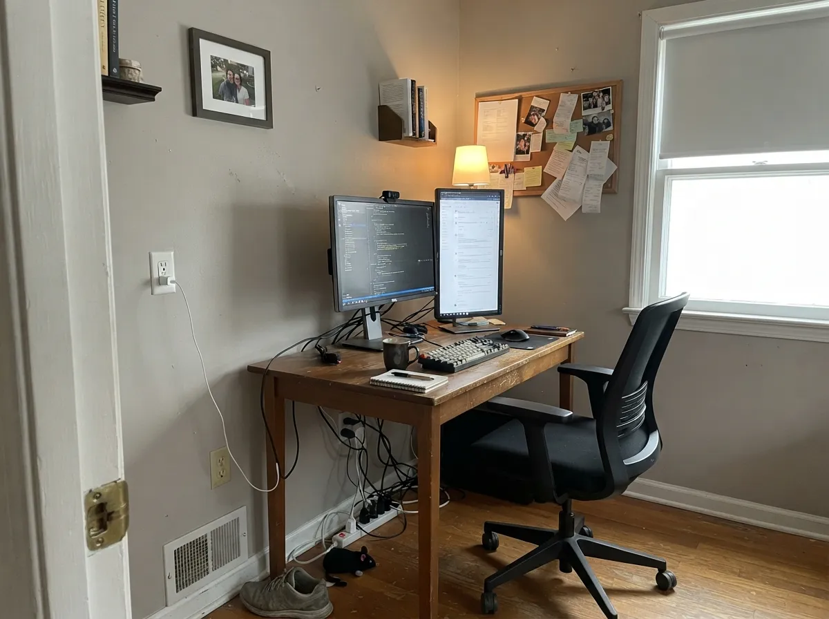
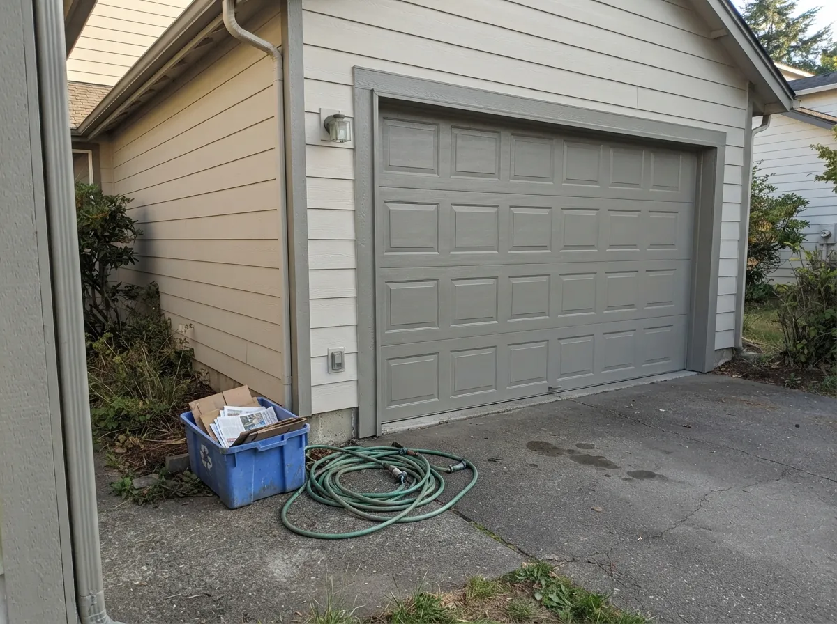
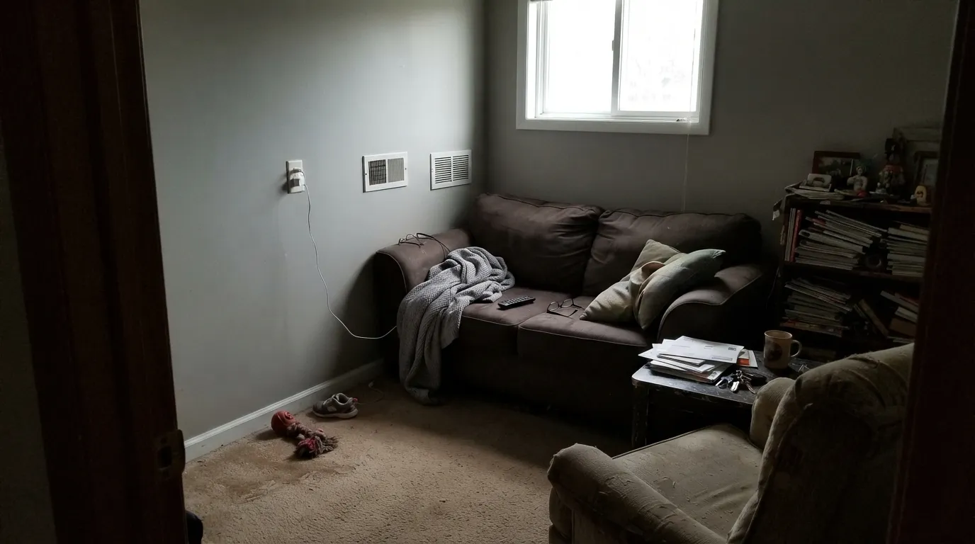
This is an exterior color first, and that's where it earns its keep: a gray-greige body that doesn't fight brick, doesn't fight a gray or brown roof, and reads calm and current on a production home or a one-off remodel alike. Indoors, its best job is the room that isn't supposed to demand attention — a home office, a hallway, a den where the furniture and the light are the point, not the paint.
Where It Fails
Because almost nobody has written about this color, most of what goes wrong with it is predictable from the physics, not from other people's regrets. Here are the three ways it disappoints.
Classic's whole personality is balance — it doesn't lean taupe the way Revere Pewter or Pashmina do. If you were picturing something cozier and browner, this will read flatter and grayer than you expected. Test it next to a genuinely warm greige before you commit a whole house to it.
Like every midtone neutral without much saturation to spare, Classic loses its balance in cool, flat daylight and reads as a plain, slightly cold gray with none of the warmth the chip suggested. It needs real light — south or bright east/west — to look like anything other than gray.
This color was never built to be the interesting part of a room or a house. On a large exterior with strong trim contrast it looks intentional and calm; on a small, plain elevation with white trim it can just disappear into "generic gray house." If you want the paint job to make a statement, this isn't that color — pair it with a darker door and shutters instead of expecting the body color to do the work alone.
Room by Room
This is what the color is for. As a house body it works with red brick, tan brick, most stone, and gray or brown roofing without a fight. Flat or satin on siding, semi-gloss on trim; give it a darker door and shutters for contrast, or it can read flat from the street.
With real daylight and warm-toned furniture it's an easy, unobtrusive neutral. It won't carry the room the way a more saturated greige would; it stays out of the way, which is exactly the point if the furniture or the art is meant to be the focus.
This is arguably its best interior room. A workspace doesn't need a personality-driven wall color, and Classic's low-key balance keeps a small room from feeling either cold or busy. Eggshell for durability against a desk chair scuffing the wall.
It'll read calm and unremarkable rather than cozy or dramatic. If you want a bedroom with more warmth after dark, a genuinely warm greige will do more with lamplight than this near-neutral will.
Under a lighter main body color it makes a good quiet trim or garage-door choice — enough depth to read as a deliberate second color without introducing a whole new family. Semi-gloss for durability on exterior trim.
Not a common cabinet or wall choice, but against white cabinets and a neutral counter it does the same job an interior wall does: quiet backdrop, no fight with the wood tones or the hardware.
Your Light Is the Risk
South-facing exteriors and sunlit rooms keep the warm and cool sides in balance — this is the color at its most "classic," doing exactly what the name promises.
Cool, flat light strips out what little warmth is there and leaves a plain, slightly cold gray. Sample it in the actual room before painting walls, not just the exterior sample chip.
On a house exterior, the sun-facing elevation reads a full step warmer and lighter than the shaded side. Walk the whole house with a large sample before ordering paint for all four walls.
Warm 2700K bulbs pull it slightly toward its greige side at night; cool LEDs flatten it back toward plain gray. Neither is dramatic — this color doesn't swing hard either way.
Most complaints about Classic are a light mismatch. Upload a photo of your actual room and see it on your walls — then ask for the same wall in north light or evening lamps before you buy a single sample.
Need It From Another Brand?
Any paint counter can custom-tint Behr 770B-4 directly. If you would rather stay in one brand's own deck, these are the closest stock matches, measured as ΔE2000. Under 2 is a difference you will not see on the wall.
| Brand | Closest color | ΔE | LRV | |
|---|---|---|---|---|
| Sherwin-Williams | Requisite GraySW 7023 · Sherwin-Williams | 1.9 | 45 | Color page → |
| Benjamin Moore | Baltic Gray1467 · Benjamin Moore | 2.0 | 45 | Color page → |
| Valspar | Winter Calm4001-1B · Valspar | 2.2 | 44.1 | Color page → |
| PPG / Glidden | MercurialPPG1006-4 · PPG / Glidden | 1.1 | 44 | Color page → |
| Glidden | MercurialPPG1006-4 · Glidden | 1.1 | 44 | Color page → |
| Dutch Boy | Sultry Gray442-3DB · Dutch Boy | 1.9 | 45 | Color page → |
Similar Behr Colors
The nearest shades to Classic within Behr's own range, ranked by perceptual color distance — useful when you want the same look a touch lighter, darker, or warmer.
WCAG 2.1: AA is 4.5 : 1 for normal text, 3 : 1 for large text, AAA is 7 : 1.
Classic vs the Colors You're Also Considering
Every Classic sample board has the same rivals on it. The numbers show the real lightness gap — then it comes down to which risk you would rather live with.
Pick this when you want that same mid-tone weight without the warm lean, especially on an exterior.
Benjamin Moore AF-100 · LRV 44PashminaPick this for real taupe warmth at the exact same depth — Classic is grayer and more neutral by comparison.
Pick this for the more neutral, less committed-to-warm version of a similar mid-tone greige.
Sherwin-Williams SW 7030 · LRV 47Anew GrayPick this if your painter works in Sherwin-Williams and you want a touch more warmth and a touch more depth.
Classic 770B-4 Coordinating Colors
Because Classic is so low in saturation, it coordinates with a wide range of whites, darker greiges, and near-blacks without much risk — the challenge is usually finding enough contrast to keep a house or a room from feeling flat, not finding a color that clashes. These are the partners that do the most work with it:
Why It Never Got a Name
Some Behr colors get the full treatment: a marketing name, a spot in a curated collection like the Blank Canvas or Whisper White family, sometimes a Color of the Year campaign. Classic 770B-4 never got any of that. It's part of the older, plain numbered deck — the colors mixed to order at the counter without a story attached — and it earns its keep almost entirely through exterior product lines rather than a wall-color marketing push.
That's not a knock on the paint. It means Classic has been quietly used on real houses for years without ever generating a design-blog post or a viral before-and-after. If you're the kind of buyer who wants social proof before committing, this is the wrong color to lean on secondhand opinions for — a real sample board in your own light does more here than it would for a famous color with a hundred Pinterest photos to check against.
Classic With Brick, Stone, and Roofing
This is where the color's low saturation is genuinely useful. Red brick, tan brick, buff stone, and most gray or brown asphalt roofing all sit comfortably against it, because there's not enough color in Classic to clash with anything strongly colored nearby. Warm cedar and most stained wood trim work fine too.
The one situation worth testing first is a very saturated brick red or a very cool blue-gray stone accent — both can make Classic look slightly washed out or muddy by contrast, since it has so little chroma of its own to hold its ground. A large sample board held up against the actual brick or stone, in the actual light, settles it faster than any online color-match tool.
Three Ready Palettes Built on Classic
A color is never alone on the wall. These are complete combinations in the 60-30-10 pattern, with the reason each one holds together. Every one opens in the visualizer.
A balanced gray-greige body with crisp white trim is the most common way this color gets used, and it works because neither element is fighting the other. The near-black door and shutters give the one dark note a numbered neutral needs to look deliberate from the street instead of just plain.
Try this palette in your roomWhite Dove trim keeps the room from reading cold, and Pashmina at the identical LRV gives one room a warmer cousin of the same neutral instead of an unrelated color — the house stays quiet without feeling monotone.
Try this palette in your roomA lighter, warmer body carries the house, and Classic steps in as the mid-depth trim and garage-door color instead of a bright white — enough contrast to define the architecture without adding a third unrelated color. The near-black door finishes the classic three-tier exterior scheme.
Try this palette in your roomClassic FAQ
Is behr classic 770b-4 warm or cool?
Neither, strongly. It's a genuinely balanced gray-greige — the warm and cool sides nearly cancel out. In good light it can read a touch warm; in dim, north-facing light it reads flatter and cooler. It never tips fully into taupe-pink or blue-gray.
Why can't I find reviews of this color online?
Because there mostly aren't any. Classic is an older, numbered Behr mixing color, not one of the named colors Behr markets with a Color of the Year push or a curated collection page — so it never picked up a design-blog or Pinterest following. That means a real in-person sample matters more here than it does for a famous color; you can't lean on other people's photos.
Is classic 770b-4 good for a house exterior?
Yes — that's its main job. It's sold almost entirely through Behr's exterior product lines (Marquee, Premium Plus, Premium alkyd) and reads as a calm, current gray-greige body against brick, stone, and most roof colors. Pair it with a darker door and shutters if you want the exterior to read as more than plain gray.
What behr collection is classic 770b-4 part of?
None. It isn't part of one of Behr's named, curated collections the way Blank Canvas or Whisper White are — it's one of the standard numbered colors in the full Behr deck, available across the Marquee, Ultra, and Premium Plus product lines.
What white trim pairs with classic 770b-4?
On an exterior, a crisp trim white like Behr White does the job cleanly. Indoors, a warm white like White Dove keeps the room from feeling cold; a bright, cool white can make Classic's grayer moments look dingy by comparison.
Is classic 770b-4 the same as behr's other greige colors?
Close in family, not identical. It sits near other Behr and Behr-adjacent greiges in color-matching tools, but it's grayer and less pink than a warmer taupe like Creamy Mushroom, and less saturated than a deeper beige like Even Better Beige. If you've been shown a "close match," still sample Classic itself — small shifts matter at this low a saturation.
Have you painted with Classic?
Rate it — one tap helps the next reader decide.
Ask a Question