Battleship Gray
A gray with a steel name and a green soul, reviewed honestly: where the maritime name earns its keep, the light that outs it as sage, and what to pick instead.

Jessica has spec'd whites and neutrals for more than 300 rooms and keeps a sample wall of painted drawdowns in her studio. Every color review is checked against real reader rooms in the comments and re-tested when a formula changes. About the testing process →
- 1Black Fox7
- 2Pewter Green12
- 3Battleship Gray30
- 4Stardew43
- 5Palladian Blue60
The Fast Verdict
Battleship Gray is not a battleship gray. Read the RGB and it is unmistakably green-leaning — a muted sage-gray at mid-depth, not the flat steel neutral the name promises. Behr sells it heavily as a direct-to-metal enamel for shutters, doors and railings, which tells you what it actually is: a quiet, useful exterior-and-trim workhorse that also happens to make a fine cabinet or accent-wall color, not a design-blog darling. Judge it on what it is — a genuinely versatile mid-tone green-gray — and it earns its keep. Judge it on the name, and you will be disappointed.
Exterior shutters, front doors, railings and garage doors · kitchen or bath cabinets · a calm accent wall with real daylight · anyone who wants an unfashionable, uncrowded gray-green that won't date
You want a true neutral steel gray, no green allowed · your room is dim and north-facing with no lamps · your floors or trim run reddish (cherry, redwood, red brick) · you're shopping by the name alone without a sample
- A genuinely useful mid-tone sage-gray, not a trend color chasing a moment
- Sold as a direct-to-metal enamel — one color does shutters, doors, railings, garage doors and interior trim
- LRV 33 holds its color in real daylight without a bold, all-in commitment
- Pairs cleanly with warm white trim, brass and matte black hardware
- So under-the-radar it will never look dated — nobody was ever chasing this trend
- Named "gray," reads unmistakably green on the wall — the single most common letdown
- Dim, north-facing rooms drain it toward flat, muddy olive
- Fights reddish wood and orange-red brick — green and red are complements
- Very little real owner feedback online to lean on before buying; you're mostly on your own with a sample
What Color Is Battleship Gray, Really?
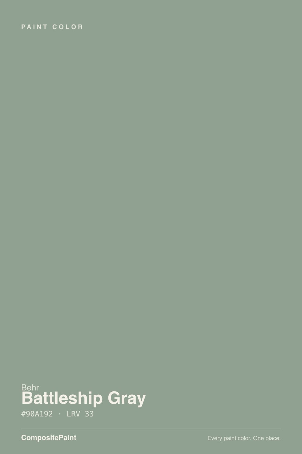
Start with the numbers, because they tell the real story: RGB 144, 161, 146. Green is the highest channel, and red and blue sit almost identical to each other underneath it. That is not a steel gray — that is a muted sage-gray, plain and simple, and it is the single fact everyone buying this color by name alone gets wrong. Behr files it under "Gray" for search purposes and leans hard on maritime, battleship-hull language to sell it, but the paint in the can disagrees with its own name.
At LRV 33 it sits at a real mid-depth — deep enough to read as a genuine color statement, light enough to still bounce daylight around a room. Behr's own retail listings sell this specific SKU heavily as a direct-to-metal enamel in semi-gloss and eggshell, meant for exterior and interior metal alike: shutters, railings, garage doors, front doors. That is the color's actual native habitat, and it explains why it has almost no design-blog presence and no famous rooms attached to it — it was built to do trim-and-metal duty, not to headline a living room on Pinterest. Used indoors on walls, it behaves like any other mid-tone sage-gray: composed in good light, quieter than it looks on the chip.
Undertone in one line: green first, gray second — never blue, never a true neutral. If your sample reads flat concrete-gray, dim light is draining the green out of it; if it looks olive or khaki, that's warm light or a nearby reddish wood tone pulling it warmer than intended.
Where It Shines
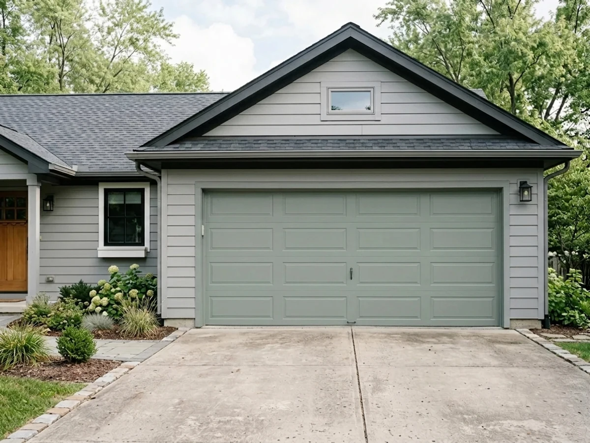
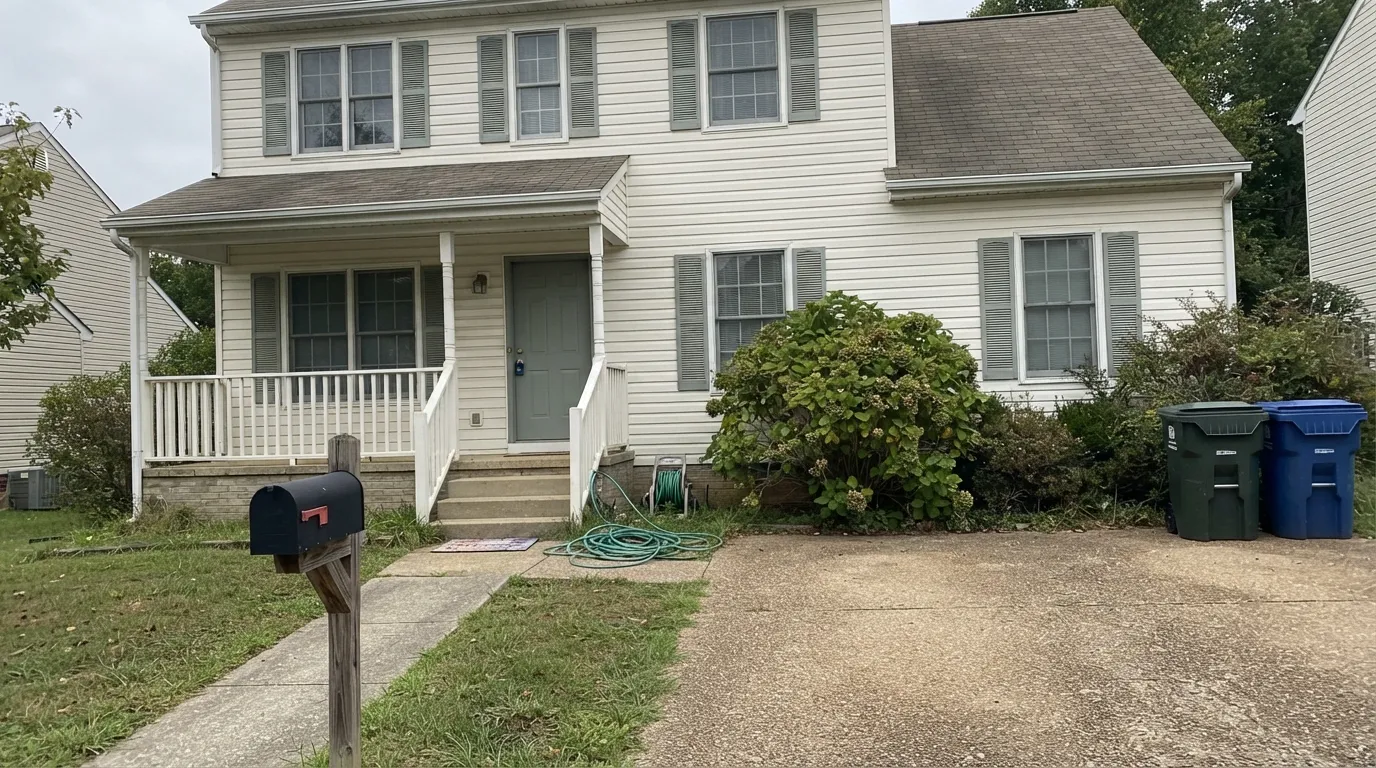
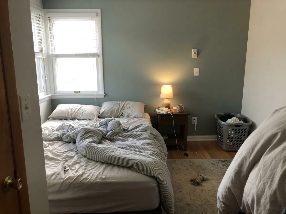
This is a color built for edges and enamel, not centerpieces, and it is genuinely good at that job. On shutters, a front door, porch railings or a garage door against white or light siding, it reads as a deliberate, slightly nautical choice — composed rather than dull. Indoors it repeats the trick on cabinets and trim: paired with a warm white and brass or matte-black hardware, it looks like a considered sage-gray, not a gray that went wrong. Give it real daylight anywhere and the green settles into something calm and grown-up instead of muddy.
Where It Fails
Almost every disappointment with Battleship Gray traces back to one of three things, and none of them are the paint failing — they're the name, the light, or the wood setting expectations the can can't meet.
The name is the trap. "Battleship Gray" promises a flat, neutral warship hull; the paint delivers a clear, muted sage-green. On four walls or a full shutter set in daylight, nobody mistakes it for gray — it reads green, sometimes distinctly so. If a true neutral gray is the actual goal, this is the wrong can regardless of what the label says.
Like every mid-tone green-gray in this family, it needs daylight to stay composed. Cool, flat north light drains the green and leaves a dull, slightly muddy olive-gray that reads tired rather than sophisticated. This is a daylight color first, an evening-lamp color a distant second.
Green's complement on the color wheel is red, so cherry cabinets, redwood decking or orange-red brick will fight it — the wood looks more orange, the paint looks muddier, and neither side wins. White oak, walnut, gray or tan brick, and matte black metal all sit comfortably next to it instead.
Room by Room
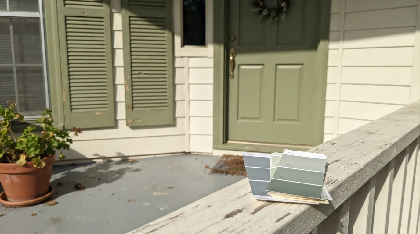
This is what the SKU was built for. Direct-to-metal enamel in semi-gloss holds up outdoors and reads composed and slightly nautical against white or pale siding — the one place the maritime marketing actually delivers.
Same enamel, smaller commitment. A garage door or mailbox in this color is a weekend project that upgrades curb appeal without betting the whole exterior on it.
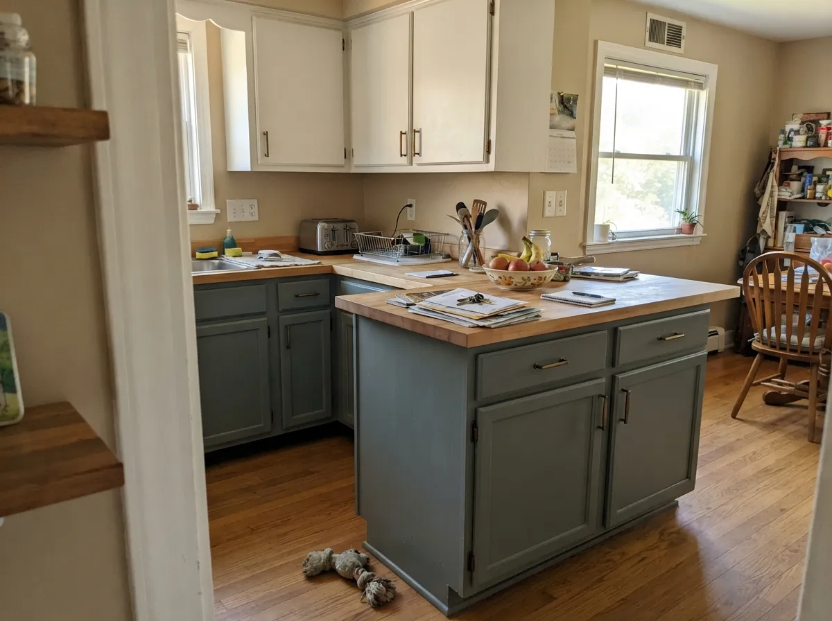
Satin finish, brass or matte-black pulls, a warm white on the walls: this is a legitimate sage-gray cabinet color that doesn't need a famous name to work. Skip it over reddish wood countertops or cherry-stained trim.
One wall, good south or east light, warm 2700K lamps at night. It reads as a quiet, grown-up color choice rather than a trend piece. Skip a dim north-facing bedroom unless you're committing to lamps.
A full room works if the daylight is real; in a dim or heavily shaded room it can slide toward flat and muddy. Pair with a warm white trim and avoid stacking it against reddish wood furniture.
Full sun reads it brighter and more clearly green than a shaded elevation does. On a whole house it is a genuine style statement — closer to a muted sage exterior than a gray one — and needs white or black trim to read intentional rather than accidental.
Your Light Is the Risk
East morning light or a bright, mostly-shaded exterior elevation is where it looks best: composed, smoky sage-gray, not muddy and not neon-green.
Cool, flat daylight with no direct sun drains the green out and leaves a dull, slightly muddy olive-gray. Test the sample here before committing a whole room.
Strong direct sun — common on exterior shutters and south walls — pushes it visibly greener and brighter, which is exactly the light where the "gray" name loses the argument.
Warm 2700K bulbs pull it toward soft moss-green. Cool white LEDs flatten the green the most — ironically, cool LED light is the closest this color ever gets to actually looking like its name.
Most complaints about Battleship Gray are a light mismatch. Upload a photo of your actual room and see it on your walls — then ask for the same wall in north light or evening lamps before you buy a single sample.
Need It From Another Brand?
Any paint counter can custom-tint Behr N360-4 directly. If you would rather stay in one brand's own deck, these are the closest stock matches, measured as ΔE2000. Under 2 is a difference you will not see on the wall.
| Brand | Closest color | ΔE | LRV | |
|---|---|---|---|---|
| Sherwin-Williams | Evergreen FogSW 9130 · Sherwin-Williams | 3.0 | 30 | Color page → |
| Benjamin Moore | Graystone1475 · Benjamin Moore | 1.1 | 31 | Color page → |
| Valspar | Gray Expose5007-2A · Valspar | 1.6 | 30.6 | Color page → |
| PPG / Glidden | Steeped TeaPPG0999-4 · PPG / Glidden | 1.7 | 30 | Color page → |
| Glidden | Steeped TeaPPG0999-4 · Glidden | 1.9 | 30 | Color page → |
| Dutch Boy | Padlock Gray438-4DB · Dutch Boy | 2.4 | 31 | Color page → |
Similar Behr Colors
The nearest shades to Battleship Gray within Behr's own range, ranked by perceptual color distance — useful when you want the same look a touch lighter, darker, or warmer.
WCAG 2.1: AA is 4.5 : 1 for normal text, 3 : 1 for large text, AAA is 7 : 1.
Battleship Gray vs the Colors You're Also Considering
Every Battleship Gray sample board has the same rivals on it. The numbers show the real lightness gap — then it comes down to which risk you would rather live with.
Pick this if you'd rather buy the direct-to-metal exterior version and want one gallon to cover shutters, doors and trim.
Sherwin-Williams SW 7732 · LRV 32SagePick this if you want almost the same color from another brand, one that's honest about being green in the name.
Pick this for a quieter, less-recognized sage-gray that won't show up in every third renovation photo.
Sherwin-Williams SW 9130 · LRV 30Evergreen FogPick this for the famous, design-blog-tested version of this mood — a decade of real kitchens back it up.
Pick this for the warmer, earthier mid-tone that still reads organic in a dim room instead of cold.
Benjamin Moore HC-165 · LRV 36Boothbay GrayPick this if you actually want the gray the name promises — Boothbay Gray leans blue, not green, and reads far closer to true gray.
Inside the Behr deck the differences are subtle. Hillside View ECC-52-3 at LRV 33 is nearly the same with a slightly softer edge, Modern Mint T16-12 at LRV 34 pushes cooler and mintier, and Laurel Leaf PMD-56 at LRV 32 pulls warm and olive. Green Trellis MQ6-17 at LRV 35 is the lightest of the set.
Across brands, Benjamin Moore Grenadier Pond 698 at LRV 34 is 0.94 away, which makes it the same color in practice. Valspar New Patina P061 at LRV 33.2 is 1.5 away and Farrow & Ball Chappell Green No. 83 at LRV 35 is 1.6 away, both visually identical in normal room light.
PPG Farm Fresh PPG1129-5 at LRV 31 is 2.41 away, a little darker and more olive, so it is very close but worth sampling first. Sherwin-Williams Jasper Stone SW 9133 at LRV 32 is 3.55 away and reads noticeably cooler and bluer side by side.
Battleship Gray Coordinating Colors
The rule for coordinating with Battleship Gray: warm whites, near-blacks, and cool-toned wood — and keep reddish wood tones away from it. It plays a supporting role well, which fits its identity as a trim-and-metal color first, a feature-wall color second. These are the partners that keep it looking composed rather than muddy:
A Gray Name on a Green Paint
This is the whole story of Battleship Gray, and it is worth stating plainly: the name is doing marketing work the formula doesn't back up. Behr's own listings lean on steel-hull, high-seas language, and the color sits filed under "Gray" in the deck — but the measured RGB (144 red, 161 green, 146 blue) is unambiguous. Green is the dominant channel. This is a sage-gray, the same family as Sherwin-Williams Sage and Evergreen Fog, wearing a name built for a different color entirely.
That mismatch is also why it has almost no design-blog footprint. Colors that get famous — a Color of the Year, a viral kitchen, a celebrity renovation — earn that fame by being photographed and discussed under their real character. Battleship Gray never got that chance, because most people encountering the name expect a flat steel neutral and either buy it for the wrong reason or skip it looking for gray elsewhere. What's left is a genuinely competent, quietly useful color that almost nobody talks about — not because it's bad, but because nobody found it looking for what it actually is.
Where It Actually Gets Used: Metal, Trim, and Exteriors
Behr sells this specific SKU heavily as a direct-to-metal (DTM) enamel — the same can works on interior and exterior metal and standard trim, in semi-gloss and eggshell. That is the practical reason to reach for it: shutters, a front door, porch railings, a garage door, a mailbox. One color, one trip to the store, several jobs done.
Wood and metal pairings follow the same red-versus-green logic as the walls. White oak, walnut, weathered gray wood and matte black metal all sit comfortably next to it. Cherry, redwood, warm reddish stain and orange-red brick fight it — the wood reads more orange, the paint reads muddier, and the fix is either a different color or putting real distance between them (a large rug, a change of surface, a different elevation of the house).
Three Ready Palettes Built on Battleship Gray
A color is never alone on the wall. These are complete combinations in the 60-30-10 pattern, with the reason each one holds together. Every one opens in the visualizer.
This is the color's actual home turf: a white body, sage-gray shutters and door, and near-black accents to sharpen the composition. The name promised battleship steel — this palette is the honest, better version of that idea.
Try this palette in your roomWhite Dove's warmth keeps the sage from tipping cold, and Kendall Charcoal grounds the room without introducing a competing undertone — both read as neutral partners to a green-gray, not a fight.
Try this palette in your roomAlabaster keeps most of the room soft and warm-neutral while the single accent wall carries the color; Chelsea Gray's charcoal-greige grounds furniture and trim without adding a second, competing undertone.
Try this palette in your roomBattleship Gray FAQ
Is Battleship Gray actually gray, or is it green?
Green, honestly — the RGB values (144, 161, 146) put green clearly ahead of red and blue. Behr markets it with steel-hull, maritime language and files it under "Gray," but on the wall or on a shutter it reads as a muted sage-gray, not a true neutral. Buy it for what it is, not for what the name says.
Is it good for exterior shutters and doors?
Yes — this is the color's strongest use case. Behr sells this SKU heavily as a direct-to-metal enamel, meant for shutters, front doors, railings and garage doors, and it holds up well there in semi-gloss against white or pale siding.
What trim color goes with it?
A warm white keeps it from reading cold; a cooler white sharpens the contrast and leans it more clearly green. Either works — pick based on whether you want the sage-gray to feel soft or crisp.
Can I use it on kitchen cabinets?
Yes, and it's a genuinely solid choice — satin finish, brass or matte-black hardware, a warm white on the surrounding walls. Avoid pairing it with reddish wood countertops or cherry cabinetry nearby, which will fight the green.
Does it clash with wood floors?
Only the reddish ones. Cherry, redwood and other red-toned wood sit opposite green on the color wheel and will fight this paint. White oak, walnut and most gray or tan-toned floors are fine.
Is Battleship Gray a popular or trending color?
No — and that's not a knock. It has very little design-blog presence and few real owner reviews online, mostly because Behr positions it as a practical exterior and metal-trim color rather than a feature wall color. That obscurity cuts both ways: less inspiration to copy, but also a color that will never look dated because it was never trendy to begin with.
Have you painted with Battleship Gray?
Rate it — one tap helps the next reader decide.
Ask a Question